Park / SPECTRE
-
 08-October 09
- Views 6,526
- Downloads 818
- Fans 0
- Comments 31
-
 62.31%(required: 65%)
 Design Submission

Ozone 90% inVersed 75% Six Frags 75% Xcoaster 75% chapelz 70% posix 70% Fr3ak 60% geewhzz 60% Steve 60% CedarPoint6 55% Kumba 55% nin 55% zodiac 55% Nokia 45% 5dave 40% 62.31% -
 No fans of this park
-
 Full-Size Map
-
 Download Park
818
-
 Objects
196
-
 Tags
Tags
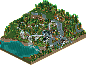

SPECTRE
NE Honorary Mention
(Fast Aerial)
downloads: 490
[CREATORS NOTES]
So here it is, my first complete performance in RCT2
I would really appreciate for the comments in the accolade discussion to be posted here, 1) they were really nice, and very honest, and varied, 2) they were all useful in some way. well mostly.
i am not at all dissapointed that this didnt win design, i never really have high expectations of my work tbh.
darn self esteem.
the readme should clarify any other problems.
Please download and comment
things I like:
+ foliage
+ supports
+ architecture
+ drink stall
+ goats
things I didn't like:
- layout
- short queue
- black holes
- concept
- naked carousel with queue
When he advertised the coaster as it looked really nice support-wise and the foliage in the screens was nice too as far as I can remember - so it was in the final product.
But I missed the theme a bit. I know it was themed after a ghost, but it didn't really had a creepy or scary atmosphere at all. Maybe some more ruins, a graveyard or dead trees would have helped.
I wasn't a fan of the layout either. IMO the loop, which is the clear highlight of this design was too early in the layout, which took away the surprise right at the beginning.
Also I didn't like the start over the water, which is a bit unrealistic to me. Why would a park build a coaster over the water at high costs when there is much room in the park on land?
The queue was a bit too short for my likings, but that's just a minor flaw.
The black holes are also quite a problem. Sure - I also don't know how to remove those but I'm sure someone else does and helps you.
Oh I must add I really liked the pathing in the park, where you made it look like newer/older concrete!
Congrats to this design, it seems you had fun with it and I'm looking forward to other stuff from you!
"MFG"
I'm suprised this didn't win as well, how close was it?
Xcoaster Offline
A lot of Really good points there, i cannot blame any of the critisism
thankyou for writing taking the time for writing this back then
ill take that as a compliment, so thanks
12.46
just proves i neeed that little bit extra to get myself an accolade
of whom do you reference?
thanks for the comment Xcoaster, glad you spotted
fanks maaaaahn
i think just by planning the standards of my work have doubled :L
but that of course, is not for me to decide
please keep commenting people, i would apreciate any comment made about this, even if it is just "i didnt like the foliage"
theming & architecture were great.
The ideas were pretty good aswell, like the hens or the custom supports.
Moreover the foliage was well done.
I don't see much negative points in this design,
so I would have scored:
15
Well done, Sammy
btw, what was the score of it?
inVersed Offline
the park i sent to Casimir (and looked over myself) was the exact same file i sent in to NE
and neither of us noticed the black holes.
cause there arent any there.
its really freaking wierd.
thanks gir,i apreiciate it.
I think the paths really helped in giving this a nice look. The supports on the coaster were really nice. The layout itself had a nice flow and speed. I was impressed. Good job with this, I look forward to seeing more from you!
FullMetal Offline
Other than that, I would've given it either a 13 or a 14. The layout wasn't all that impressive, but it was good enough to be considered a design, I think.
I really like this little design. Good layout and a strong atmosphere.
Unlike 5dave i actually like the naked merry-go-round. I can see what you were aiming for with it and I understand perfectly why Dave doesnt like it. Its not something you see very often anymore in real life but its nicely done. Pity you cant remove the base from it though.
There were some little details too that caught my eye. Like the fenced in copse of trees at the corner of the map.
On the down side like I said when i saw this before I wasnt a massive fan of the supports. But again i guess its like Marmite, You either love it or hate it
All in all a good design and one im dissapointed (although not suprised to see it narrowly miss out.
thanks for your confidence FM, i will take it all into consideration.
im glad you caught what i was aiming for Roomie, thanks for the comment, i appreiciate it.
firat? and i chose it not to be banked for a reason, you just have to zoom out with your understanding and see what i was going for. banking would have ruined it, belive me, it was in the first design.
as for the foliage, i dont even know what you mean by that. any clarification?
thansk buddy! thats a big compliment
To be honest im really surprised at the amount of people giving this praise and deeming it design worthy, thanks you guys.
-JDP