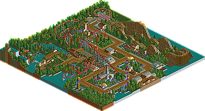
Park / Pleasure Point
-
 04-September 07
- Views 3,419
- Downloads 634
- Fans 1
- Comments 8

-

-
1 fan
 Fans of this park
-
 Download Park
634
-
 Tags
Tags
 04-September 07


 Fans of this park
 Download Park
634
 Tags
Tags
 Similar Parks
 Members Reading
Please post comments below.
It shows a huge improvement over the first screens you showed me, and it also proves you have a good future ahead of you in the LL world.
inVersed Offline
Otherwise I loved the layouts of both; but 'Falcon' really stole the show. The hang-time in the loop would be epic, the little dip right before the MCBR seemed strangely natural and the interlocking corkscrews were among the best laid out I've ever seen. 'Sidewinder' held it's own too; one of the few woodies I've seen in RCT lately that would actually make as good of a ride as it is to look at (that thing would have plenty of varied blasts of airtime; which is exactly what I look for in a coaster).
The rest of the park is quite elegant and well-polished. Your architecture seems to have made some leaps in refinement since this was finished, but the arrangement of things like flower gardens, queue lines, fencing, and trees were all very professional and well done. Which brings me to one of the other small flaws: the flat landscape. Other than around 'Crystal Clear Rapids' the park was basically a pancake: Completely flat. I suppose since this was a "point" though that can be forgiven. One of the few completely flat parks I can think of include that other award winning point... Cedar Point.
Anyway I think this park shows that you've mastered the basics of everything other than architecture and landscaping; thus the atmosphere is engaging and comfortable, the rides well constructed with good attention to detail, and overall impression is that great things could be coming from you in the future.
Ride6
Upon first glance the park is just a conglomeration of a few coasters, some flats, and relatively simple architecture, but there's a charm to it that makes everything more than the sum of the parts. Falcon sweeps magnificently over the park on one side with a well-built beemer invert layout, and Sidewinder provides a classic wooden counterpoint to it over the opposite edge of the map. Between are a good number of flats, some fair-to-good foliage work, and multitudes of dirt path edged with endless rows of varyingly colored flowers. The endless edging with the flowers is the weakest point here, i'd say. The buildings, while small and relatively simple, fit well here.. they just don't jump out at you screaming "hey, i'm amazing!" In fact, not a lot here does.... but several things jump out and say "Hey, i'm a good idea that shows a lot of potential!" Take, for example, the cobra roll on Falcon. my pick for 'best screenshot opportunity' of the park, by far. The path is slightly elevated on either side to create trenches that would be thrilling to fly through, but they also serve to make the element stand out against a vanilla-flavored-foliage backdrop. The nearby enterprise has almost perfect placement. Another excellent example of the massive potential shown here is the work with mini-golf stations ans track, and the wooden custom supports on sidewinder. While neither coaster layout was espescially eye-popping for me [noted cobra roll excepted] they were both solid enough to merit watching a few times to soak in the goodness. RCTCA, i would suggest working on the finer points now- you've got the basics, from what i can see. Start using more complicated forms in your architecture and foliage, and be a little more adventurous. One thing i have yet to see you do is to pull off a themed area completely.. i think a set theme would help you fill in the little details that are presently absent from an otherwise very well-founded parkmaking style.
I'd like to see you continue to develop your architecture and try to add some more details to it. Try some themed areas too. Just keep playing and you could really live up to the potential this shows.
/RCTCA\
Tom