Park / Sierra Mine Carts
-
 07-October 09
- Views 4,541
- Downloads 636
- Fans 0
- Comments 55

-
 45.00%(required: 65%)
 Design Submission

geewhzz 65% Xcoaster 65% Nokia 60% posix 55% 5dave 45% inVersed 45% Katapultable 45% Kumba 45% SSSammy 45% zodiac 45% Fr3ak 40% chapelz 35% CedarPoint6 30% Six Frags 30% Evil WME 10% 45.00% -
 No fans of this park
-
 Download Park
636
-
 Tags
Tags


![park_4122 [H2H8 R4] Park Guell](https://www.nedesigns.com/uploads/parks/4122/aerialt3861.png)

![park_3359 [H2H7 R4] #diamondheights](https://www.nedesigns.com/uploads/parks/3359/aerialt2984.png)
![park_4102 [H2H8 R3] Castles-n-Coasters](https://www.nedesigns.com/uploads/parks/4102/aerialt3848.png)
Evil, im glad you came and straightened things out.
I never said they were unfinished, I said that they feel unfinished. There are alot of empty plots of dirt and grass. To you they seem ok, but I think they feel unfinished, and everyone is entitled to their opinions.
And to some other things, the reason most designs are B&Ms is because that's what most people build and submit. So when that's your majority submission, it's hard *not* to have a lot of coasters like that winning. If people want to change that, submit some other coasters. But don't expect it to win on the grounds of being different. I still judge them on the very same guidelines I would everything else. I put focus on the layout with emphasis on realism and then look at atmosphere, architectural design and the rest of it. But simply if the layout isn't good.. I'm not going to vote it overly great.
That is the reason why B&Ms are usually the only rides that get a design, because they can have the best, most complex layout. Woodies and inverts are also common, but there prabably will never be a flume, rapids, wild mouse, bobsled coaster ect.
Yes, but I really think this is underrated.
Xcoaster Offline
Anyways, I gave this a 13. I agree that a 2 is harsh, but I've seen many submissions get pounded before, and that's just how some panelists vote (not just WME). I tend to give scores on the upper end, other people vote more dramatically.
Thanks for your feedback. I know not everyone gets an accolade and I know not every accolade is a B&M....... I just felt a 2 was a bit low and didn't know how the score was based on. It was submitted anonymous but a day later I posted screens too. I also knew it was you that gave a 2 since I was emailed the results. Thank you for your honesty and to the other judges that gave me feedback too. That's what I really wanted to hear. I have no bad feelings to anyone. I just wanted clarification.
I consider this case closed but would always like to hear feedback on this or anything else I have done over the last 10 years.
Seriously man if your that desperate build a wildmouse a bobsled, hell any unusual coaster, win accoldale then prove your point.
Just make sure its different
What I was personally let down about with this design was the strong RCTish building standard. It felt like you followed the way the game expects you to play scenarious very much. While this of course is nothing bad, I would've liked to see you apply some of your own ideas of how the park and rides are layed out and function together.
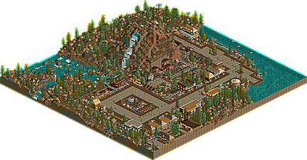
The main ride itself, while looking very interesting, was kinda fun but also very hard to watch. I repeatedly paused the game, hid textures, tried to follow a specific car, etc. Wasn't very easy. I think it's important to build rides in such a way that they're easily comprehensible to a viewer of your park. This is often also very hard. What you did add as 'guidelines' so to speak were little banners saying stuff like "don't enter the mine". I liked that. But those were only possible to see if you carefully examined the whole ride, and even then, I missed the train I was watching a couple of times and it may well be that I thus missed some of the other stuff you added as well.
Finally, what I always find desirable in RCT creations is a clear direction in style. Either fantasy or realism. I've seen it too frequently that people end up with something semi-realistic because it isn't really their aim to build realism, which is fine, but then they add a bunch of little details attributed to real life (custom supports, questionable transfer devices, lift hill cat walks, restaurants with tables, car parks, etc.) for mostly conventionalistic reasons, 'impurifying' the applied style of the creation. While this wasn't very strongly the case with your design, it had some of this aspect, too. It was nowhere near a clear cut fantasy, fictitious ([inside joke] sammy, i think i haven't told you 'i love you' today) world nor something that could exist in real life. As mentioned above, to my eyes, it looked like it was merely just following RCT building standards, not attempting to create something that truly distinguished it as something of its own, something special. You had done this a lot in Hollywood Hills but for some reason not in this design.
What I did like about this was the finishedness. It looked like it was very much complete. Always a peeve when people submit stuff that looks half done.
I'm glad everything's been sorted in this topic then and I hope you might agree with some of my comment.