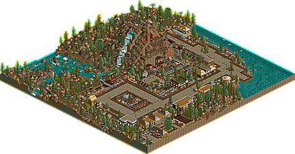
Park / Sierra Mine Carts
-
 07-October 09
- Views 5,402
- Downloads 722
- Fans 0
- Comments 55

-
 45.00%(required: 65%)
 Design Submission

geewhzz 65% Xcoaster 65% Nokia 60% posix 55% 5dave 45% inVersed 45% Katapultable 45% Kumba 45% SSSammy 45% zodiac 45% Fr3ak 40% chapelz 35% CedarPoint6 30% Six Frags 30% Evil WME 10% 45.00% -
 No fans of this park
-
 Download Park
722
-
 Tags
Tags

![park_3359 [H2H7 R4] #diamondheights](https://www.nedesigns.com/uploads/parks/3359/aerialt2984.png)

![park_4122 [H2H8 R4] Park Guell](https://www.nedesigns.com/uploads/parks/4122/aerialt3861.png)


you dont make stuff to win stuff
if it deserves an accolade, it will get one.
if it doesnt, cry about it for abit,
and realise that playing to achieve accolades is harmful to your abilities in the long term, sure, its an insentive, but its not what the game is about.
Jag and sam are both right as no one is wrong, its just what drives more people to build and succeed. I agree Jag's attitude isn't the best of sending something to somewhere else to receive a better accolade but that has its drawbacks for that option as well. If it was just a good design it wouldn't even qualify for Bronze as there wasn't enough of it so you'd kinda shoot yourself in the font there. Plus it could be seen as a lower tier of Bronze work which isn't the best.
Think about things, its more how good your work is than the name it holds. I have a spotlight but I'm not 100% happy with it because I know it could be executed much better. Thats why I want to build another one to better my work. Its funny how I'm not happy with a spotlight as such, thats when you know you don't build for accolades but you build for your personal standards and a way to better yourself.
Holy Cow Wanda Sue, reel me in I'm pretty deep!!!!
Thanks... I appreciate that.
And I know that 2 was dropped from the score, but it's the principal of it all. A 2 goes toward a completely noob park which this is not and I honestly feel his score was based on who made it, not the work itself since he's been critical of me and my past connections prior to this.
one panelist gave a park 20 that 14 other panelists awarded zero.
Mmm you see there’s something sour about your words. I liked this entry don't get me wrong but just because you didn't make the grade you shouldn't curse all other people who did. A 2 is pretty disrespectful, agreed but Steve got fucked in the pro tour and he took it on the chin and got on with it. Beemer or no Beemer they had something that got them the accolade. Yours had something but that something wasn't design worthy.
I don't get it. When Cork told me my first design submission didn't get it I just worked even harder to get my first design. And yes that first design was a Beemer.
Sorry Mike Robbins, I really liked your design, but some of the main components, although very oldschool style, which can be aprreciated, looked a little underskilled. Even though you personally are not underskilled, the style let you down here I'd say.
i thought the whole idea behind the design was almost like a centerpiece for a park, their main attraction of sorts?
Edited by Lowenaldo, 17 October 2009 - 10:28 PM.
get out you silly little boy.
Yeah, so if you have a good layout but nothing else, It'll win design. Those beemers aren't that good though. They have very similar layouts and all look kinda unfinished. Maybe a few years ago, it was about the centerpiece of the park, but now it is if the accolade panelists (which aren't very accurate) decide who wants the design and I have seen many 12.50's and I really hate to see that.
Well, whoever voted that 2 prabably didn't do it for the design, but because of the creator.
will you shut up you stupid child!
Was I talking too you just now? Or are you just finding ways to tell me to shut up...
either way, im entitled to tell you to shut up.
How am I lying or being an idiot. It is true that most designs are beemers with very similar layouts, and the previous designs do look kind of unfinished such as the hidden pond, and why else would someone give this design a 2. Can you point out the lies or ignorance in this post? Can you stop trying to prove me wrong and get on with it for once?
find me five designs that fit that discription.
otherwise, shut up.
I base my scores on my own enjoyment of the design. I thought the landscaping was quite unnatural, I disliked the use of the edges, I did not like the coloring of the trees. (I think it can be pulled off, but this wasn't it.) The architecture was very basic, dull and uninspiring to me. The ride itself did not make any positive impression on me, either.
The 2 is based on how much I liked the design.
As you know, it was anonymous when it was sent in so no reason to take it personal.
I just wanted to reveal myself, since I was named in the topic, and I have no problem backing up my opinion. I just looked again and my thoughts on it have remained the same.