Park / Angelica Lakes

Park_65 Angelica Lakes

34 Comments

  • Kumba%s's Photo
    Posted Image

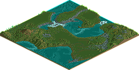
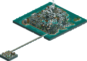
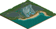
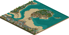
    Can it be? Timothy Cross with a new release? at NE3? Well yes, yes and yes. The man who brought you fantastic wonders is back. NE is proud to present the second ever released RCT creation of Timothy Cross, a NE Concept Creation called Angelica Lakes!

    Please post your comments below.
  • JJ%s's Photo
    Can't wait to view this :p

    I would view it now but my rct2 is screwed up so I need to reinstall (I can't open half of parks :p)
  • Ge-Ride%s's Photo
    That was incredibly disappointing. It was good, but I was hoping for a little more to it than that. This is the RCT equivalent of the Orange Head joke.

    Edited by Ge-Ride, 06 November 2007 - 05:17 PM.

  • disneylhand%s's Photo
    Looked a bajillion times better zoomed out...
    Which doesn't surprise me. But quite good all the same.

    It must have taken a lot of patience to build something like this, and it's nice to see that your getting this kind of recognition.

    -disneylhand
  • JDP%s's Photo
    An amazing thing you can do with this is make it into an amusement park...

    ...Good luck with that.
    -JDP
  • Levis%s's Photo
    if this is a CC I think Old red makes a changes again also :p .
  • ekimmel%s's Photo
    Good to see some high quality landscaping get some recognition...
  • CF%s's Photo
    Amazing landscape :o
  • Comet%s's Photo
    Yeah, the landscaping was definitely amazing and I could see this being some type of national park.

    Would've been cool if you made a little log cabin style hotel (keeping it nature friendly like the Awahnee at Yosemite) in the middle of it all. In my opinion that would've added another aspect and make this 100% worthy of a Concept Creation.
  • RCTNW%s's Photo

    Would've been cool if you made a little log cabin style hotel (keeping it nature friendly like the Awahnee at Yosemite) in the middle of it all. In my opinion that would've added another aspect and make this 100% worthy of a Concept Creation.


    I disagree. The "Concept" around this entry was the landscapping and the landscapping only. By adding a hotel to this would have pulled the focus off of the landscapping. Here, the landscapping is the star!

    Well done TC!

    James - rctnw
  • Jman%s's Photo
    I need to open this up, but absolutely gorgeous. Definitely deserves the recognition for such an overlooked part of the game.
  • ][ntamin22%s's Photo
    i think there's not much question this deserves an accolade of some sort, and CC seems to be the perfect category for this type of thing. a beautiful landscape and an excellent portrayal of what RCT can be besides the most obvious uses. It probably looks best from the farthest zoom out, since the less-than-natural-looking things come out more the closer you look. Some of the coastlines, waterfalls, and to a much more limited degree the ridgelines were a little too square to look completely natural, and the use of a single plant/tree type in most areas kind of limited the believability up close. Unfortunately there isn't much that can be done here.. you almost have to make everything over-natural-looking to ensure that a few straight lines aren't misinterpreted when landscaping in RCT.

    This one got me to thinking a little. Mostly that was because i opened a map supposed to be landscape only and had to wait for the download of at least 20 new scenery objects....
    .. but also that i would very much enjoy a good half-hour spent poring over, say, a 1600x1600 in-game map recreating Yosemite or something... its almost like being in a low-flying plane. a different kind of good-looking than is the norm here, and a refreshing change.
  • Timothy Cross%s's Photo
    Thanks for all the posts guys, even though not all of them were all that positive, i still appreciate everyone that took time to download the map and comment. Also thanks to Kumba for making this a CC and thanks to the maker of the logo. :)
  • Cocoa%s's Photo
    Hmm... I thought the landscaping was sort of iffy, but nice. For example, on one of the coasts it was a ton of weird green round bushes that just looked strange. It did look better zoomed out. Anyway, congrats on the CC.

    I love concept creations. It was a great idea.
  • Smokingace%s's Photo
    It looks good from what i can tell from the pictures.

    Keep it up! :biggrin:
  • Kevin Enns%s's Photo
    It seems to me that Timothy Cross (great last name by the way, if my name wasn't Kevin Enns it would be Erich Jacob Wilhlem Cross) is possibly the next Mala.

    "ultra-creative recluse legend"
    could be
  • Gwazi%s's Photo
    ahahahahahahahahahahahahah. haha.
  • Timothy Cross%s's Photo
    .
  • Gwazi%s's Photo
    hello there
  • Kevin Enns%s's Photo
    I revoke what I just said.

    Clearly, Timothy Cross has not used his obvious advantages in life (cool last name, good RCT skills) to bring him anywhere; He is a trolling idiot fucking tool.

    In fact, I would go so far as to say Tim is more of a FUCKING TROLL (their back!) than what most people perceive me to be even though I'm not.

    p.s. Evidentally Gwazi diagrees with me.

    p.p.s. As somewhat interesting as the map is, the logo is horrible and doesn't suit it at all.

    Edited by Kevin_Enns, 07 September 2008 - 06:16 PM.