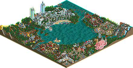
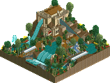
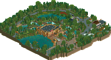
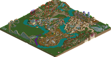
Park / Lake Cerulean Amusement Park

14 Comments

  • geewhzz%s's Photo

    Lake Cerulean Amusement Park Logo


    With all the great talent of 2009, New Element is proud to add another newbie to the list. Splitvision certainly introduces himself with a bang, bagging him a Bronze and showcasing his new semi-realist park, Lake Cerulean Amusement Park. Read On...

  • In:Cities%s's Photo
    congrats split! :D :clown: :D

    i'll post more of my thoughts later tonight after i download and view it.

    but it looks great from the overview:]
  • SSSammy%s's Photo
    congratulations splitvision.
    i liked this. it was pleasaant. i hope my feelings are reflected in my score ;)

    the areal leads to a page 404.
    im guessing that will be fixed imminently.

    again, congrats.
  • Luketh%s's Photo
    Good job, Split! Looks really good!!
  • Liampie%s's Photo
    It looks really good on the overview! Congrats on Bronze, although I think Silver would be more fitting! I'm downloading now and I might do a writeup sometime.
  • inVersed%s's Photo
    I wasn't to crazy about this to be honest. Thats why I gave it below a 10
  • Jaguar%s's Photo
    This could have gotten a silver, because it has good quality, but it doesn't have anything amazing or unique, something you don't see very often, but I liked the park, but I looked at it for less that 10 minuits, because there is nothing too special, so I think bronze is the perfect award for this.
  • Ozone%s's Photo
    Congratulations; the park was clean and professional in appearance. It was quality work, just nothing groundbreaking or extraordinary to put it over the top. I see good things in the future coming from you!
  • CoasterForce%s's Photo
    I really liked the medieval area-the ghost train-type ride was pretty cool and the castle was nice. The 4D area was nice but the coaster desperately needed a different color; it was wayyy too much white for my tastes. Everything else was pretty good, I'd say a bronze was accurate for me
  • RCTNW%s's Photo
    Congrats on the park and it looks like a fun one to explore. I'll take a look this weekend.

    Gee/Phil - You might want to change the header on the forums to reflect this as the latest release as it still indicates Krustyland.
  • Hepta%s's Photo
    My biggest problem was the foliage. It made the whole thing sort of unpleasant to look at. Congrats on the win nevertheless
  • Splitvision%s's Photo
    Thanks for the replies everyone, and thanks accolade panel for rewarding me so richly :nod: The write up is great, well done whoever made it ;). I've dreamed about making the first page since I joined 5 years ago, and even though this is just a bronze, I'm a damn happy man today :mantis: I agree about the park being pretty consistently okay quality, but lacking that extra something. I hope to be able to add that something to future projects. And I'm surprised that you're the only one to mention the foliage so far, Hepta, since that was the main criticism I got when showing screens. Foliaging is something I also really wanna try to improve. And of course every other aspect of the game :D Again thanks everyone!
  • Katapultable%s's Photo
    I'll stick with my opinion, it should've won at least Silver. Accolade Panelists know what I said: it's bullcrap that this won Bronze and Manhasset Meadows won Silver. Congratulations, anywayz, Splitvision.

    I'll go from the start:

    The entrance is very well executed, being diagonal. I would have made the roof of the entrance gray myself.

    Going left you'll see the best area of the park, in my opinion. The architecture overall inb this area is nice and the little ships give the finishing touch. The present coaster's layout is unique and really good.

    Moving on. The Aztec area is my least favorite area of the park. This area just lacks detail and the foliage is also a minus. The coaster, however, does have a nice layout. A plus for this area are the faces, the buildings are supposed to represent.

    The futuristic area is nicely realised. It has a good amount of rides, nice architecture and it contains some nice hacks and ideas, like the rockets. Bioforce would be painful in reallife, but I don't give a shit about that, as it looks awesome.

    The Chinese/Oriental area has a lot of nice detail and a good watercoaster. Too bad only that it's really small. %-)

    Next up is a Spanish-like area, isn't it? It looks Spanish, anyway. Home to arguably the most awesome coaster in the park. Again, this area contains nice architecture, but seems a bit empty, as there's a lot of path.

    Pink. Yep, pink. A pink castle. I would've have made the roofs of this castle either darker pink/purple or black, as it seems a bit dull, the way it is now. The structure itself is really nice, though, especially the tower.

    Overall, this park has a lot of potential. It should have won Silver, but still. The realism-fantasy mix is very good in being not too fantastic (fantasy-esque) and still being realistic. There's a lot to be discovered and it's fun to look at. Nice job, I can't wait to see more of you.
  • Louis!%s's Photo
    Some parts of this were great, other parts weren't. The coaster layouts weren't amazing and neither was their surroundings but I would definately say this was worthy of an acolade.

    With the 4-D why didn't you add seat rotation? Also is it just me or is there no path connecting some of the areas?

    Well done on getting Bronze though.
  • Splitvision%s's Photo
    The reason I didn't have any seat rotation on the 4D was simply I wasn't sure how the seats were "supposed" to rotate. I tried to look at other 4D's for clues of when to rotate and how much but I couldn't bother enough to make anything out of it. I could of course have had the seats rotate as I wished but I felt it was better to have no rotations at all rather than a lot of misplaced, misangled ones. Next time I build a 4D I'll make enough research to get it right. And you're right about the paths, especially the Biopolis area is very badly connected, only reachable trough a single wide path or canoes. This is a result of bad planning, the park suffers from that overall. Looking back at this I'm very glad it won anything at all, I've come to realize it has so many flaws.