Park / Krustyland
-
 11-September 09
- Views 12,443
- Downloads 1,028
- Fans 1
- Comments 37
-

-
 55.33%(required: 50%)
 Bronze

Xcoaster 75% SSSammy 70% CedarPoint6 65% zodiac 65% Fr3ak 60% inVersed 60% Nokia 60% geewhzz 55% Katapultable 55% Kumba 55% nin 55% posix 50% Ride6 50% 5dave 45% Evil WME 45% Casimir 40% chapelz 40% 55.33% -
1 fan
 Fans of this park
-
 Full-Size Map
-
 Download Park
1,028
-
 Tags
Tags
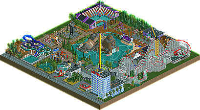
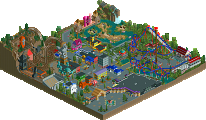
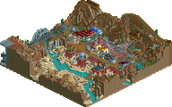
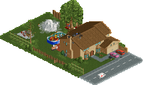
Sometimes the smaller parks are the most fun to build. Quick and simple, they’re a good way to showcase talent. This park certainly shows two new up and comers making a statement with their new Bronze park Krustyland! Read On...
i mean, concept is cool and all, and the coasters are nice, but overall, its kindof meh to me.
i think it just comes down to personal preference lol.
its not that your work isnt great, i guess its just the fact that i tend to like parks that are much more 'full' and dont have as many empty spaces.
but anyways, congrats on the accolades guys!
i hope to see more from you two in the future:]
(oh, and by the way, one of the signs near the back of the park says 'Kurstys';] )
Not that I should talk with Manhasset Meadows but it seem like each of you just did three small buildings a coaster and a flat. High quality at though, and congrats with the accolade.
I agree with a bronze here, and I hate to question the accolade panelists, but when you guys choose your number do you think to yourself "I think this is a mid level Bronze so I'll give it an 11". Because I want to ask Xcoaster and SSSammy about your scores, do you really think this should have been a gold?
For those of you who didn't knew, this was originally our (=Alpha Legends) park for round 5 against the Whzz Kids.. But a day before the deadline it wasn't completed, and we had another park (Schweizer Valley Amusements) as a backup that we decided to use, as we really needed as much votes as possible to advance to the playoffs, in case more teams had the same score..
I still think you guys could have gotten more out of this concept, and some pieces of the park look very unrefined and almost unfinished still.. But there is a certain 'fun' factor to it too, which I can appreciate.. Bronze seems right though..
SF
The landscaping was awful, one of the worst I've ever seen & the foliage wasnt good, too.
Missing custom supports and a bad layout makes me hating the rollercoaster in the middle
of the park.
The woody was okay, nothing special, but not bad.
Some houses were nice, like the Haunted house, but the rest was...not that good.
All in all I'd have voted 8, sorry.
I know better things from you two, especially Sulakke.
Yannik
Do you think this should have been a gold though?
Congrats guys, I think the woodie was a refreshing change and I loved the krusty entrance.
inVersed Offline
It's okay, I suppose. Some real nice ideas, but overall I feel like it totally lacks the whimsical atmosphere I would have expected a Simpsons park to have. I don't know anything about The Simpsons ride, but I feel like you had so many more options going with a park from one of the episodes. Look at that Praise Land park that was built a while back (forget the NE member). Like, the only thing that really felt "Simpsons" about this park was the wooden coaster maybe.
I kind of feel like how eyeamthu1 probably felt when he saw the Canes' Spider Man park. Being a Simpsons fan for so long, this concept is something that I have not only hoped somebody would take on, but have also tried to tackle myself. I just feel like it was an idea that never reached full potential. I think it passes as a bronze, though, as it was enjoyable. Nice job guys.
And I'm with Comet on the way some people vote. I'm not calling anybody out for having an opinion, but how could this be a gold? Look at past gold parks. Indigo Hills, Bocastle Heights--hell, even the Masterpiece used to be a gold park. I'd consider these among the best parks ever made. When my paramount park got a "Blockbuster," (now referred to as gold), there were a few people saying things like, "just good enough for blockbuster." And I agreed. I spent two full years working on that, though. This park has probably 1/20th of the content, and I guess some people see it as a gold. Either that, or they are compensating for anticipated low votes. Don't take this is me being bitter or something...I just wanted to point out that the voting system seems to be a bit more lenient nowadays.
No disrespect to any of the rookies in the accolade voting but they're only starting to develop their game so anything better then them can seem awesome perhaps?
That’s where I think the problem lies but I do believe this should be a Bronze and it got what it deserved. Anyway I'm not trying to ruffle any feathers, I'm just stating what I think is happening.
Just so you know guys Cedarpoint and I did the review together so I’m not just whoring your topic out with off-the-subject content.
Sammy voted as he should, unfortunately other people aren't doing so.
The idea is that everyone votes on a scale how much they enjoyed the park. The 15 votes then decides the accolade, but the individual votes are based (or should be based) on individual enjoyment. I believe it's not working out as originally intended, and posix is working on that.
My vote was a 9, but I do feel bronze is the appropriate accolade.
The idea of the accolade panel has always been to get a diverse view on things, and never based on how anything ranks with past parks (although, of course, in an indirect way, it does matter) Thus, what was said above, does not agree with the original intention of the voting system.
Xcoaster Offline
SF
I agree it's better than previous accolade decision making, but it's far from perfect in my opinion at this moment..
Don't get me wrong though, I REALLY appreciate the effort you guys put in to come up with a good way of judging submissions (and having access to the accolade forum I can see it took a lot of time and effort) and DO think it's the best way yet the site has seen, but the road to perfection on this is a long and bumpy one..
SF