Park / Hammerhead
-
 23-August 09
- Views 4,620
- Downloads 691
- Fans 0
- Comments 20
-

-
 65.00%(required: 65%)
 Design

posix 75% Casimir 70% Katapultable 70% Xcoaster 70% 5dave 65% CedarPoint6 65% chapelz 65% Fr3ak 65% Kumba 65% nin 65% Ride6 65% Evil WME 60% geewhzz 60% SSSammy 60% zodiac 55% 65.00% -
 No fans of this park
-
 Full-Size Map
-
 Download Park
691
-
 Tags
Tags
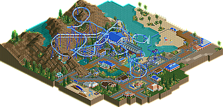
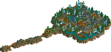
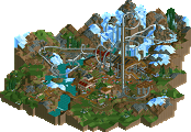
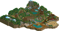
Its layout is the strong point, which is good since that's the number one thing I'd look for in judging a design. If that ride layout was built on an open patch of land with no theming / landscaping, it'd still provide a good ride experience. I'd like to have seen an ascent into the final brakes (makes it seem like it's going a little fast into the brakes with the descent). Also, the 'water splash' - didn't really think it worked; it felt really forced and chucked in for the hell of it. Manta has it positioned in a really great spot, for maximum visual impact - I don't think you really captured that. Other than those points, the layout was nice and flowing and well paced.
The flow of the rest of it didn't really work, and someone's used the phrase 'park composition' here - I noticed that too; there's not much thought there really, or it just doesn't work. It's like you've built the design and then chucked in a load of other bits n bobs to fill up the space. The buildings all seemed kinda pointless (and too much blue used I thought!). I did like the station building though - simple and clean. So yeh, overall, the ride itself was solid, but it just lacked something in the other departments... and actually just lacked something a bit special. I'd probably have scored it as a 12. Congrats on the spot though... and definitely was worth the download!