Park / Manhasset Meadows
-
 20-August 09
- Views 4,487
- Downloads 678
- Fans 0
- Comments 26
-

-
 64.00%(required: 60%)
 Silver

Fr3ak 80% Nokia 80% SSSammy 80% Xcoaster 75% zodiac 75% inVersed 70% Kumba 70% nin 65% posix 65% CedarPoint6 60% chapelz 60% Evil WME 60% 5dave 55% geewhzz 55% Ride6 50% Katapultable 40% Six Frags 30% 64.00% -
 No fans of this park
-
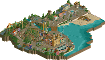
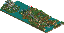
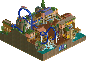
 Full-Size Map
-
 Download Park
678
-
 Objects
273
-
 Tags
Tags
inVersed Offline
Airtime Offline
Yes I did just really do a guestspot to help comet finish it... I only really did kind of touch up work and filler stuff. Just finished comet's ideas, weather they were finished to what comet wanted is another matter. lol.
I personaly think, that yeah, the park was just aiming to be an amusement park, nothing special, nothing amazing just a nice, little sterotypical american amusement park.
I think the hack on the kiddie coaster isn't needed but I didn't feel it wrecked the kiddie coaster at all.
InVersed and Six Frags I'm curious to what you mean by copying CP6's style and what not? I don't understand, lol, do you mean me or comet? Thanks for your comments though, guys!
Liampie thanks for the comment. I understand what your saying, I'm not sure I completely agree though but it's your opinion and I respect that. I think your lastest park was alright maybe a high bronze not really a silver IMO. Thanks for the comment though
Steve thanks for the great commnet there!
Thanks Jazz, Reflex, CoasterForce and Chapelz.
Thanks J K for the great logo! And thanks for the nice review.
JJ and InVersed once again. Yer I know how to make good use of foliage but I felt I was just finishing the foliage by just copying comet's style of foliage around the park.
Thanks for the comment Katapultable.
K0NG that kinda means a lot coming from you, thanks man!
And thanks for the comment Xophe. By the way I love Zippo's, it's simply amazing, lol.
Edited by Airtime, 26 August 2009 - 07:09 AM.
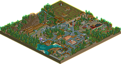
I quite liked the GCI coaster... although train stopping at lift - sort out those dispatch times (just a little detail, but still). Didn't really like the other Tivoli coaster - I thought the additional hacked on track was fairly pointless and made it look a bit ugly. There wasn't really enough from the other rides - they were for the most part, all 'placed' rides... there was nothing really custom to them, other than the Log Flume which I felt was totally forced in its layout, almost to specifically make it interact with the woodie.
The rest was all mostly ok - all kind of 'nice', without being anything that exciting. The buildings are all nice and quaint, and you've definitely created the correct atmosphere. Really liked that Beer Garden area. And a few good details here and there like the Cool Zone. Also thought the Corn Maze was a cool idea, but perhaps wasn't executed as well as it could have been - it seemed to take up too much space. But I liked the idea.
Basically, it's not a boundary-pushing park, but did what it said on the tin I guess.
Comet, i've never really enjoyed your style, yet this was something I did happen to enjoy immensely.
There were parts of the park that seemed lack-luster and parts that were old (the entrance being Clockworks work) but overall the park had great charm and skill.
I hope to see more work from the both of you in the future, whether it be solo or another duo. I will give a more in depth review at a later date, as usual time is restricted.