Park / Manhasset Meadows
-
 20-August 09
- Views 4,487
- Downloads 678
- Fans 0
- Comments 26
-

-
 64.00%(required: 60%)
 Silver

Fr3ak 80% Nokia 80% SSSammy 80% Xcoaster 75% zodiac 75% inVersed 70% Kumba 70% nin 65% posix 65% CedarPoint6 60% chapelz 60% Evil WME 60% 5dave 55% geewhzz 55% Ride6 50% Katapultable 40% Six Frags 30% 64.00% -
 No fans of this park
-
 Full-Size Map
-
 Download Park
678
-
 Objects
273
-
 Tags
Tags
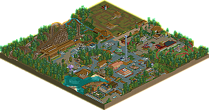
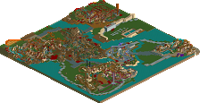
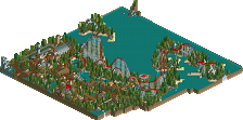
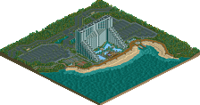
Over the past few years realistic parks have been dominating the community. It dates back to great legends like posix and RRP driving their hardcore realism into some memorable releases. Head-2-Head 4 was another pivotal moment concerning the realism movement as other great players like geewhzz and CedarPoint6 emerged creating realistic parks in amongst semi-realist and fantasy parks. One park even went on to beating one of the great fantasy parks of that season. Ever since this movement hit we’ve been watching some rookies emerge. Comet, a guy who has shown skill in Head-2-Head 5, even being nominated for Rookie of the Year, producing two strong realistic parks and Airtime, a newer member on the boards who has proved to posses a superb style. When two bright stars collaborate to produce a realistic park it's not only nice to see who will carry the flame in the future but also what new things they can bring to the game. Manhasset Meadows certainly proves the realism wave is strong as it’s bagged these two guys a Silver Accolade! Read On...
inVersed Offline
From the accolade topic:
The coasters, as I said, also did nothing for me; Terrier was way too slow and short (especially for a GCI) and Buzzer slowly meandered quite boringly over an uninspired field of fern bushes.
I also didn't get any thorough theming that got any atmosphere going. As I said, I did like what seems to be Comet's style (like what he did Kidderbrook) but it just wasn't enough for a Silver imo.
Congrats on the Silver though,
SF
Pros:
- Gril(l?) Grove
- Tables at the Beer Garde(n?)
- The parklayout was quite good, although the entrance was very crammed into a corner while there was a lot of empty space (filled with trees...) next to the GCI. Why didn't you place the theater there?
Cons:
- The zierer coaster; why the hack? It didn't add anything but glitches
- The foliage, it was bad
- The corn maze was a nice idea, but the execution was bad again. The paths were extremely wide for a maze and the layout was just easy.
- Nothing was innovative, the concept has been done (better) a hundred times before.
Congratulations on winning Silver, but I don't think it's deserved. I'd give it probably a 9/20...
I was expecting this reply. Think about this: If Xophe swapped the location of the Kabompo Kanyon and Zippo's Oriental Odyssey areas, changed some colourschemes throughout the park and resubmitted it, would it win spotlight again? Why not? For the same reasons Faceman's Paradise Island won Blockbuster instead of Spotlight a while ago.
Of course that's an extreme example, but it shows how I feel about this park...
congrats guys was a weak silver or a strong bronze for me hence my vote but that was based mostly on the size and a lack of refinement in some spots.
Completely agreed, I'm just too lazy to write this out.
This park was originally meant for clockworks, but I got pretty much no where other then the GCI, cornmaze, and basic ideas down. So I brought in Airtime after the deadline and he really helped me get this done to the point where it was much more then a guest spot and the park was really split between us. We wish we had room to add more coasters but with the small mapsize already down that wasn't option leaving a rather lackluster ride selection, I'd agree. Airtime is in the progress of doing a 2010 season for this that should help things out in that regard. So I wish we could have started from the beginning together with a slightly larger map and co-op plans, but that wasn't the case here. Anyway...
inVersed- Thanks for the comment. I'm not sure if I see the over treeing but I guess others could see it that way. Originally we had all fall foliage with orange and yellow trees and such which after look at for so long looked pretty shit, in my opinion so we changed. Now that I think about it we probably should've kept it and it probably did look bad because there were too many trees. I don't know maybe you're right, haha.
Six Frags- The coasters weren't the best I agree but Terrier already took up so much of the map it couldn't really afford to be any bigger under the circumstances. The opposite goes for Buzzer, which I think is fine for just a junior coaster, it takes up too much land and it really shouldn't. What you said didn't seem to justify the score of a 6 either, but whatever.
prodigy- thanks for the kind words.
Liampie- I'm kind of confused by your suggestion to build the theater on the other side of the lake. First of all, what's wrong with where it was placed, and I honestly don't think it would fit where you are suggesting. And of course this concept has been done before and better, same with most parks, including your recent park I'd say. We're not good enough to make this the best park of it's kind, so that's kind of like saying don't build a normal amusement park if it's not gonna be the best.
Jazz- Thanks, I agree with you said mostly.
Steve- That is what I was trying to say up above to Liampie, I agree with what you said.
Edit: Thanks reflex and chapelz too.
Edited by Comet, 21 August 2009 - 11:05 AM.
The size combined with the other things I didn't like that I mentioned before 'justified' my 6 I think.. And it's all opinions in the end anyway, as others seem to rate this park much higher than I do, obviously.
As I said, I do like your style a lot, so keep building and looking forward to parks you did, like Bayside Amusement Park (if only that was finished)..
SF
They are both spotlight submissions and therefore should be judges in the same way. Zippo's could've been Silver too if the panel had a different opinion.
I don't intend to degrade people, but NE accolades should reflect quality* and not the amount of fun the makers had during the construction if it doesn't have effect on me as an independent viewer. In Zippo's (coincidentally the same example) it was clear that Xophe had fun during the making and in that park it contributed to the quality. I never said this was bad as a whole, it's just the same old song.
*In this context, to me, it means the amount of fun the viewer has
If spotlight submissions are about the amount of fun it's creator had, I have at least five spotlights here. If spotlight submissions are about the amount of fun the viewer has, the five parks I mentioned before wouldn't even get bronze if you combined the scores.
I'm really sorry if I sound harsh. I replied to Kidderbrook in a similar way back then, but months later when I was reading the topic again I noticed how harsh I was... I still agree with those posts, however.
Moving the theater to the other side would give the entrance some more space to breath. The theater would easiliy fit there if you modified that area a bit which shouldn't be hard, there's plenty of room over there.
I can show you at least ten examples of parks with this concept. Show me ten examples of Wunderland's concept and I'll retreat. Maybe there are plenty in the German community, but I've seen very few or maybe none in the past four years...
That's not how my posts are supposed to be interpreted like. Could be a result of not being a native English speaker...
Edited by prodigy, 21 August 2009 - 01:15 PM.
I think a silver is well deserved, to me bronze is for parks that could have been so much better yet more skill was required. Silver seems like an option for this park when the skill and the atmosphere was there but it didnt break any boundaries. I feel if this was on a bigger scale and you carried on this quality, few more layouts you guys would been onto something.
I understand that this was for clockworks yet now you've finished this up, released it and you have an accolade on your hands. All I say is congrats, a lot of people these days have so much skill but can't even finish a park like this.
I can see where Liampie is coming from as thats his opinion and we can't deny that but also there are 15-20 people on a panel, your always gonna get mixed reviews but the votes average out into what accolade a concept should recieve. This to me was a middle class silver.
Congrats guys I don't go for this style as my preffered choice but I think you guys will release some nice stuff in the future hence my review.
Also hope you guys like the logo
Kinda Sabretooth revisited...
Let's start from the entrance. The parkinglot is there just to have a parkinglot, isn't it? The entrance is quite small, but I guess it's 'okay'. The ''Gril Grove'' is to be entered from outside the park? Kinda weird, I thought. The theatre is big, made of wood and not a feast for the eye. Left, dodgems, right park map (parkmap is good). Moving on, we come to those flowers, wich are too neatly lined up. I don't like the roof of that building opposite of the flowers. And with that, I mean the upperpart. The placement of the swinging ship is good. ''The Bakery'', Comet, was that your idea?
Kiddie Grove, why (the fuck) is that coaster hacked? It seems unnecassary and it's ugly too. The rest of that area looks okay.
I like the bandstand in the middle of the park.
The Cornmaze has broad paths, and from the peep-point of view It's possible to look through the ''hedges''. The barn and the slides are nice.
The log flume has a boring layout, in my opinion. I think the supports are a bit overdone too.
The GCI's station was really long, and brown, and boring. The layout itself wasn't that special too.
Overal the park was 'okay', but very boring, with just three colors (brown, green and gray). ''Ultra realistic''? It was realistic, but not ''ultra''. I wouldn't say this was worth Silver, sorry.
P.S. The sign in ''Beer Garde'' spells ''toliets''.
?!
I believe the point of a parking lot is to have vehicles park there while their drivers are in the park.
Liampie I still don't get what you're saying besides the fact that this is unorginal and that your park is better.
I feel like I am taking crazy pills.
Mozilla in my opinion it was better then just having plain path there, and the map isn't big enough for a larger parking lot. Also the Grill Garden is outside the park to accommodate guests who brought lunch to the park. It's not uncommon for real parks to have picnic areas set up outside the park gates.
Thanks for the write-up and logo JK, wasn't sure who did them but they're both great.
Edit: Haha, Mozilla I didn't even think about that when I made The Bakery
Edited by Comet, 21 August 2009 - 03:41 PM.