Park / Garden of Light
-
 12-August 09
- Views 5,247
- Downloads 923
- Fans 4
- Comments 25
-

-
 55.77%(required: 50%)
 Bronze

chapelz 90% Evil WME 80% zodiac 80% 5dave 75% Xcoaster 75% CedarPoint6 70% geewhzz 60% Fr3ak 50% Casimir 45% Kumba 45% RCTFAN 45% Magnus 40% SSSammy 40% posix 20% riven3d 20% 55.77% -
4 fans
 Fans of this park
-
 Full-Size Map
-
 Download Park
923
-
 Tags
Tags


![park_4121 [H2H8 R4] North Fork Mountain Park](https://www.nedesigns.com/uploads/parks/4121/aerialt3862.png)
![park_2847 [PT4 R5] I Am the Elephant Seal](https://www.nedesigns.com/uploads/parks/2847/aerialt2500.png)
![park_4114 [H2H8 R3] Forum Caeleste](https://www.nedesigns.com/uploads/parks/4114/aerialt3853.png)

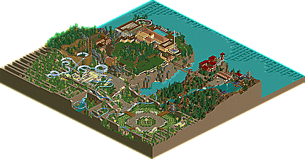
First off, the cross-stitching of the land threw me off. I'm not sure what's going on there, but after looking through the park I kind of like the effect and I'm not quite sure why. I don't know what it's purpose is, but it's neat looking. I felt easily immersed in the park, the buildings were quite beautiful I think. I liked the pool, the bridge into the little Chinese area, and the maze at the entrance was pretty impressive after looking at it for awhile.
Quite a wide range from the panel on this! I would have given it a decently high rating I guess, because after looking at it it was just kind of fun and gave off a good vibe.
Congratulations, Wicksteed!
I'm really interested in hearing why some of you gave it such low scores.
This is by far my favorite release since H2H, it reminds me of something chapelz would do on a smaller scale, and I could see why you gave it that high of score based off of that. Anyway, I really loved and glad to see you release something Wicksteed.
Very nicely done, Wick
Edited by K0NG, 13 August 2009 - 12:01 AM.
What you did with normal rct objects like the stalls was incredible. The sandstone bluff/ cross things look amazing in my opinion and remind me of the FDR memorial in DC (strange, huh). Some of the japan was not as good as the other areas but I still liked the nature area leading up from the entrance to the mountain.
I think it was really your placement that really made this park work. The entrance area was so strange with the elevated paths... but still good.
The park also made a nice change from evil wme's chaotic mala-esque park (which was also pretty good)
When I look at your parks that I can remember you have Trains, Engarde (amazing), This park and your released park that was unfinished. Each release has always offered the game something different and I am a massive fan of the different approach you take to the game.
Congrats to the new land weaving you did, It could get repetitive in another release but here it actually seemed natural and organic. My only suggestion would be to work on your parks main coaster as if it was as memorable as some of your parkmaking it would be very good indeed. Also custom supports, I'd like to see you bring some new things to the game with them as I think that would suit your style of parkmaking.
Overall enjoyed it. En garde is still my favourite release from you but I love the stuff your doing with the game.
Over all it was still pretty enjoyable and nice on the eyes. I would have probably gave it a 10.
-JDP
inVersed Offline
FullMetal Offline
When you look at it as if to interpret it, you get a much better sense of what Wicksteed was trying to accomplish, even if your interpretation is completely different from the park's intended meaning.
The entrance area, to me, symbolizes a beginning. In the beginning, there was darkness, and then Wicksteed said, "Let there be light so that peeps won't fall off the edges of the unfenced pathways." (I found those to be a bit odd, but that's just me.) It is a birth of creation, I think. Why else have a coaster called Blueprint? To emphasize that this is where the ideas started flowing. It harkens back to a time when our layouts sucked and theming was near nonexistent. But playing the game was all that mattered, and it was fun. I noticed the lack of buildings, but a large amount of blocky landscape. Perhaps this is symbolic of LL? Again, a reference to where it all started. I think, then, we are meant to travel to the Japanese area, where there is much to look at, but you notice that the "fun" factor dies a little. There's a nice log flume, but not much of anything else. (That bridge was cool, though.) Finally, the Spanish area where the focus is soley on architecture and attention to detail. But it is dull. This is intentional, and it too, serves a purpose. All the "fun" has been sucked out. It looks detailed, but it's drab and boring compared to the entrance, which is bright and cheerful.
To me the message is clear: We are moving away from our roller coaster roots and entering into the dark chasm of minute detail. True, detail is wonderful, but what happened to building roller coasters? Who in the community builds without custom supports on their coasters anymore? We seem to be forgeting where we came from, and I think Garden of Light serves as a reminder of where we came from and where we are going.
Of course, that's just my interpretation.
I did enjoy it though, and I think it is completely deserving of the award it received.
Edited by FullMetal, 13 August 2009 - 05:38 PM.
Edited by Philly, 13 August 2009 - 06:15 PM.
Wicksteed Offline
I'm still on holiday right now, so I'll respond to your comments when i'm back home.
Wick, ever since Trains I have been probably one of your biggest fans, but this one when I first saw it I was a bit let down, but I must say I now think it's as magical as Trains was. Keep up the good work and keep us updated on all of your future projects.