Park / Evil WME's Mount Doom

34 Comments

  • geewhzz%s's Photo

    Evil WME's Mount Doom Logo


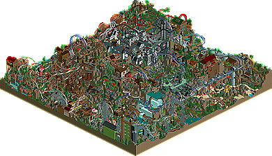
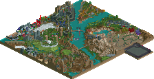
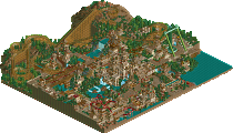
    When I first opened this park my jaw dropped. I thought Mala was back! On closer inspection I recognized the park from screens in the Advertising District and knew it was Evil WME's scrapped Pro Tour 3 entry. Still having your work mistaken for Mala's is a great honor. Seems the guy who brought the community classic parks such as Candlelight Times, Glyphindel Oasis Dunes, The Lehseban Wilderness, Music After Time, Universal's Lost World and of course New Element Spotlight winner Lost Era Resort is back and ready to kick some ass in RCT2 as he brings us Evil WME's Mount Doom! Read On...

  • turbin3%s's Photo
    From the overview it looks very chaotic, but really good.

    Will look at it ingame later and write a small review. :p

    Congrats btw. ;)
  • Ozone%s's Photo
    Mark, nicely done! I wish I had RCT2 so I could open it up and watch the coasters in action; the overview really leaves me wanting more. From what I can see, I really like the center castle. Also, the support work on the light green coaster in the corner is beautiful. I'm sure that the rides are a lot of fun to watch. Maybe I should order RCT2 off ebay or something...
  • Jipalu%s's Photo
    :OMG: FANTASTIC, chaotic and a nightmare for some but I love it, good work on the coasters and themeing. Lots of things i love, too many to write down, well deserved accolade. Concrats

    jIp<
  • Wanted%s's Photo
    OMGOMGOMGOMGOMG THE MONSTER!!!!

    Seriously Evil WME this was genius. The coasters were fucking awesome and the architecture was great too. I'm not going to do comparisons to Mala because there is only one Mala but MAN this park was amazing.

    Edited by Wanted, 12 August 2009 - 07:29 AM.

  • 6000000flags%s's Photo
    This is glorious insanity! An instant download.
  • Jazz%s's Photo
    i actually didn't like it that much, probably more due to personal taste than anything else. just way too chaotic for me, too many coasters that seemed forced into the area. there are spots of brilliance here and there, but i can't even look at one particular portion of the park without an overload of disorientation. anyway, congrats on the park, but i prefer the more organic styles of your work on god's isle and rapa nui, on the whole the park didn't really come together for me.
  • inVersed%s's Photo
    This is not really my type of park, but to deny its greatness would be stupid. Though not particularly appealing to the eye, this park was very fun to watch. I enjoyed watching the peeps and the insane rides you built. This park to me back a little bit and I was definitely impressed. Congrats on winning a very well-deserved accolade for this
  • turbin3%s's Photo
    Well, it's really impressive how you put 20 coasters on such a map. xD
    The landscaping was really nice.

    + landscaping
    + castle in the middle
    + interaction between coaster/coasters and coaster/landscaping
    + some layouts
    + the face or what it is in front of the flying carpet

    - some colors
    - some layouts

    Overall i'd have voted 16. :)

    Well done and congrats! :D
  • K0NG%s's Photo

    This is not really my type of park, but to deny its greatness would be stupid. Though not particularly appealing to the eye, this park was very fun to watch. I enjoyed watching the peeps and the insane rides you built. This park to me back a little bit and I was definitely impressed. Congrats on winning a very well-deserved accolade for this


    My thoughts exactly, definitely 'old-school' and killer to watch in game. Congratulations!
  • Jaguar%s's Photo
    it isn't the best looking, but the layouts are awesome, This park is packed with coasters that have great ratings and aren't exactly appealing to the eye. Kinda reminds me of an old rct designer called lunatim.
  • zburns999%s's Photo
    I actually thought it was a mess. Sorry. There were some neat ideas, but overall it just seemed like you were trying to fit as many coasters on one map as you could. The Station for Demons was awesome, though. The park deserves an accolade, for sure, but this really wasn't my cup of tea.

    And the logo is great, so kudos to whoever did that.
  • Comet%s's Photo
    This park reminds me of Micro Madness on a larger map from the overview.
    Will give it a look later and hopefully I can find my way around ;)
  • Kumba%s's Photo
    I wrote the review and gave it a 19, so you all know my opinion.

    Those of you that don't like I think need to go into parks like this with an open mind and try to enjoy something different.
  • SSSammy%s's Photo
    sorry guys, i found it hard to enjoy this.
    it was fun, but it was to disorientating for me and my tiny brain.
  • posix%s's Photo
    i'm with the people who found it chaotic and hard to enjoy. i mean sure it was cool, but it just didn't have what i look for in parks. it's really a very personal hit or miss question with this kind of style.
  • Sulakke%s's Photo
    I really liked this park, but I think it could have been much more. You could have made the park a bit more interesting by adding more small details and by building some more interesting buildings, like the castle. Now, the park is filled with plain buildings, awesome coasters, some sculptures and the cool castle. There weren't real and original details, which made me lose interest in the park fast. All in all I would have voted this 16, I think.
  • J K%s's Photo
    I know this is a hit or miss park and it really is a hit in some ways for me. The ideas like the forest tree and the face on the side on the cliff were so well done. If there were even more of those ideas amongst the chaos of your multitude of rides it would have framed some of the ideas and really built up something epic.

    Awesome Gold entry and I think your the closest thing we have to the god of fantasy himself. Maybe some refinement and bigger concepts with some more detailed archy and your'll be a legend.
  • Wanted%s's Photo
    Definetly a hit or miss park. And it was sure a HIT!!!
  • JDP%s's Photo
    Gave me a headache. But it was fun... eh that's it. Felt like I dropped acid and played rct2... The World of WME :) haha.
    -JDP