Park / MultipliCity
-
 31-January 09
- Views 4,611
- Downloads 761
- Fans 0
- Comments 9
-

-
 77.50%(required: 65%)
 Design

nin 90% FullMetal 85% Magnus 85% Milo 85% RCTFAN 85% Xcoaster 85% Evil WME 80% Fr3ak 80% chapelz 75% posix 70% zodiac 70% 5dave 65% geewhzz 65% CedarPoint6 60% 77.50% -
 No fans of this park
-
 Full-Size Map
-
 Download Park
761
-
 Tags
Tags
![park_3791 [NEDC4 5/15] - Arevik](https://www.nedesigns.com/uploads/parks/3791/aerialt3450.png)
![park_3230 [MM2014 Final] The Time Traveler](https://www.nedesigns.com/uploads/parks/3230/aerialt2951.png)
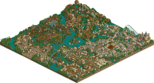
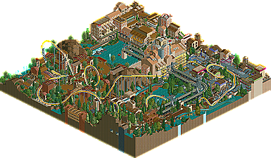
There's still room for firsts here at New Element and our latest release marks the very first collabo design. MultipliCity is the final product of The Experiment, a community project started way back in 2005 by Roomie. The main idea was that each member would have to do a quarter of the mini-park, including any parts of tracked rides that go through their area. They would then pass on the parks to the next two members in a tree and those people would add their own sections and pass those maps on. Due to inactivity and dissapearances the original project fell apart quickly although x-sector did manage to get a good start. With this map, Roomie revived the project in his recent return to the community and enlisted the help of fellow RCTLLers, Loopy and spartan to finish off the map. The result is a wacky collection of rides and areas. Read on...
Looking back I probably voted a little high because honestly I didn't care much for the main ride... it wasn't really bad in any sense, I thought it had decent pacing and good interaction. It just didn't seem to really fit in imo and seemed too cookie cutter in style. I based my vote more on the surroundings which were very nice. This was more of a park concept to me anyway.
congrats on the Design guys and to Roomie for finally getting some closure on the Experiment
I should probably say that my area was built a while ago, when I was building IOA if I remember correctly, which is why it looks like my earlier style.
Spartan and Roomie did a real nice job of finishing this up. The rapids ride and log flume are awesome. I always loved those tram supports. Some real nice stuff in spartans area too. Using the crashed trains as smoke for the buildings is an awesome idea.
Real nice job finishing this up guys and thank you to the panel for making this a design.
Thanks for the comments.
it was certainly an interesting little park to work on and im glad we finally got it out after almost 4 years.
I think most of the issues people have with the coaster can be explained by the way the park was built. with each person doing 1/4 sequentially. It is actually quite hard to build a ride in such a way and it certainly disrupts the flow. I dont know if the others agree but its quite odd just doing a small segement.
However i am happy with the way it all panned out and would love to do another one one day. its certainly a different way of building
anyhow thank for helping me get this finished guys. Its great to get it out there
The park as a whole had a lot of nice details. The ride itself, while a nice idea, didn't really do anything for me. I was always bad at coaster designs, so my saying that doesn't really mean much; I just felt like too much stress was put on making the ride go through every section without back-tracking. That was the whole idea to begin with of course, I just didn't enjoy watching it because it seemed to... goal oriented? If that makes any sense...
Anyway, it was fun to look at, I like all the detail that went into every structure. Nice work to you all.
you guys need to finish a park together, because somthing this small with this much atmosphere just shows how well your styles mesh an the overall flow from the areas on such a small map is very nice, great work guys
When it was finished though i was not entirely sure what to send it in as. I did mention in the e-mail i sent in that it could be put in Designs, Group Parks or Concepts, the guys at the site picked Design.
So although i am well aware its not the best design i feel it should be viewed in a different light at least
Cheers
Roomie
Hope to c some of ur designs up 2 cum