Park / Kesler Gap Rumbler

Park_639 Kesler Gap Rumbler

23 Comments

  • gir%s's Photo
    readme:
    KESLER GAP RUMBLER - DESIGN SUBMISSION
    ======================================
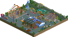
    Kesler Gap Family Recreational Area (1998-pres.)
      a fictional mountain amusement park
    
    :Attractions
      Kesler Gap Center Stage - added 1998
    	  outdoor ampitheater, weekly local music
      Wonder Wheel - added 2003  
    	  a basic ferris wheel offering a gorgeous
    	  view of Kesler Gap
      Kesler Gap Rumbler - added 2006
    	  Great Rides International (fic.) custom
    	  wooden coaster that dives and twists
    	  through the property
    
    :Dining
      Old Oak Steakhouse - added 1999
    	  despite its modest exterior, a local
    	  favorite for fine dining
      Kesler Gap Soda Company - added 2003
    	  a basic drink stand serving Coca-Cola
    	  products
    
    :Areas of interest
      Kesler Orchards
    
    ======================================
    Please enjoy this design! I understand that
    for some it may be a little bit "raw." For
    instance, there are really only 3 buildings.
    But, nonetheless, it turned out better than I 
    had envisioned. -gir

    screens:
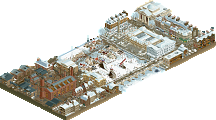
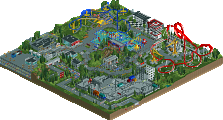
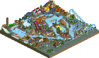
    Posted Image

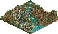
    Posted Image

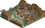
    Posted Image

    Thanks to those who download, it was fun to make and see it "come to life" in-game. The final evaluation was 12.85, missing the mark by .15 points. I've attached the version that I submitted, and a revised release version. I'm curious to know which version you like better, so download both if you want. Otherwise, I suggest just downloading the "release" version. Thanks again!

    gir

    Attached File  gir___Kesler_Gap_Rumbler__Submission_.SV4 (316.42KB)
    downloads: 227

    Attached File  gir___Kesler_Gap_Rumbler__Release_.SV4 (312.05KB)
    downloads: 285
  • 6000000flags%s's Photo
    ouch, 12.85 must hurt.

    Anyways, the flow of the track was nice, but there wasn't enough surroundings to support it.
  • Milo%s's Photo
    that queue cover is nice
  • Ozone%s's Photo
    I like the changes you made. I think this was a great design, and I especially loved the creek for some reason. The steep banks just looked really good to me! Sorry that this didn't quite score high enough for the design spot.
  • Comet%s's Photo
    I love the amphitheater especially the lights and stage
  • geewhzz%s's Photo
    i voted it a 16 and really am saddened to see this not win, especially because some other designs i don't think were as good won barely scraping by with a low score.
  • gir%s's Photo
    Thanks for the comments guys. I'm not really upset that it didn't make design, but thanks to those who think it should have--it gives me a bit more encouragement.
  • SSSammy%s's Photo
    i cant remember what score i gave it, but it was very high.
    i happened to adore this.
  • FullMetal%s's Photo
    Wow, I'm really digging those queue awnings! Will check this out later when I get home.
  • Cocoa%s's Photo
    those tables inside the land is an interesting hack- pretty cool. shame you can't make the arches go higher so you can see it better!
  • Xcoaster%s's Photo
    I liked this one as it was simple and elegant, but it was just a bit too empty, and the coaster layout didn't do that much for me. I think I gave it a 13.
  • Wanted%s's Photo
    Meh, I agree with the not design quality voters no offense.


    Okay maybe I did mean to be offensive.
  • geewhzz%s's Photo
    i know i've said it once, and i have to say it again after watching this for a while last night. the layout is so fantastic. easily one of the best woody layouts for 2009 and it deserves a lot more recognition than it has received.

    please tell me that you will build something else, gir?
  • RRP%s's Photo
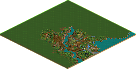
    id love to see a full overview since i dont have LL anymore
  • RCTCA%s's Photo
    here you go.

    Attached Thumbnails

    • Attached Image: kesleygapoverview.gif

    Edited by RCTCA, 22 February 2010 - 05:35 PM.

  • RRP%s's Photo

    here you go.


    cheers although i meant a zoomed in view so i could actually view it
  • gir%s's Photo

    please tell me that you will build something else, gir?

    Oh you never know. I've been toying with entering a mini to Kumba's contest, then there's some other projects I could pick up work on (old H2H3 with Alec???, a certain trio, who knows?). To be honest I wouldn't expect anything during the school year though. The summer looks much more promising right now.

    I'll try to upload a full aerial if I get some time later.
  • dr dirt%s's Photo
    I wish I could download this! The screens are so classy, it's unbelievable. I must have missed this earlier, and I regret it because LL was working for me then. You're one of my favorite parkmakers and I'm so disappointed I can't see this in game yet.
  • gir%s's Photo
    aerial and park map

    Attached Image: kgr_aerial.gif

    Attached Image: kgr_map.gif
  • Themeparkmaster%s's Photo
    The layout for the coaster is by far the strongest aspect of this creation and probably worthy of a design. However, the theming and general surrounding area is in my opinion what lets this down and with all due respect overall doesn't warrant this worthy of a design accolade.

    There are some nice ideas in here and flashes of future potential but on a whole it feels very haphazard, especially the ferris wheel. If I'm honest it looks like something from when I was playing the scenarios back in the stone ages.

    I'm quite shocked this came so close to getting a design, I don't know if it's easier for me to notice being away from the site for a while but I think the general standard of releases has slipped a little, though I guess it's needed in interests of regular updates and is by no means a criticism, just an observation.

    Anyway, I hope I haven't come across too harsh, you have the coasters down gir and that's the hardest part, the rest really just takes a bit of practice and it'll all come together. In time hopefully we'll see more LL designs on the front page.