Park / Moody Park
-
 22-September 09
- Views 3,675
- Downloads 882
- Fans 1
- Comments 19
-

-
 62.69%(required: 60%)
 Silver

Fr3ak 75% SSSammy 75% zodiac 75% 5dave 70% geewhzz 65% inVersed 65% Katapultable 65% CedarPoint6 60% Kumba 60% nin 60% Ride6 60% chapelz 55% Six Frags 55% posix 50% Nokia 40% 62.69% -
1 fan
 Fans of this park
-
 Full-Size Map
-
 Download Park
882
-
 Tags
Tags
![park_3211 [MM2014 R3] Heart of Darkness](https://www.nedesigns.com/uploads/parks/3211/aerialt2825.png)
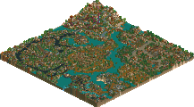
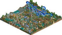
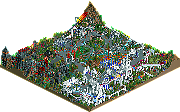
New work from old faces is a defining feature of New Element; the constant evolution of the way RCT is played means that there’s always a new generation of “old-school” parkmakers, and it’s always a pleasant surprise to see them active and releasing new work. That said, we bring you Moody Park by CoasterForce. Read On...
I think both the scores and the obvious lack of feedback are a testament to how much the RCT community has changed. Maybe it's just because I'm a 'veteran' with a nostalgia for the past, but had this park been released during the prime of Iris' reign, or even that of Corkscrewed, I guarantee you the overall score would have been higher (had the panel system been instituted then). It seems now that the focus has shifted toward uber-realism and/or coupled with an unsatiable desire to pack things with superflous details that serve no purpose other than shallow aesthetic appeal. I am very biased towards fantasy I suppose, but still: much of the write-up reveals a shock at the scenery chosen and how its implemented - and it's only the Pro Tour 2 bench! It's amazing how half of the panel wasn't even around then. Old school is the way to go, and this park is a fantasy paradigm at its finest. It's a shame that the majority of the community has grown accustomed to simply ignoring works that don't qualify under their post-modernized spectrum.
Edited by Jazz, 25 September 2009 - 12:11 PM.
The coaster had a good layout and moreover a good interaction with path,
theming and landscaping.
Your theming was easy, but the easyness really fits with the theme,
so i really liked this.
The theming-ideas were pretty good.
I am not sure about the pink supports though.
Really good logo and writeup.
All in all a park, which deserved the silver-win.
Yannik
The RCT community has changed, there's more realism than fantasy nowadays and detail obviously is the main focus... However, the fact that there's more realism currently doesn't mean that 'unrealistic' parks are automatically considered to be less good. I think the panelists are all people who can judge parks objectively. The reason why this park didn't get a higher score is probably the lack of detail compared to current standards. Moreover, the park is outdated. That doesn't mean it's bad, but is does mean there's less innovation which is also very important, to me at least.
BTW, the replies in Krustyland's topic are mainly off-topic. I agree though that this park deserves some more replies though, in that way this park actually might be underrated.
I haven't viewed the park ingame yet but I surely will, it looks pretty cool! Judging from the overview, I'd give it a 13/20.
Coasterforce, congrats on finishing and winning Silver! I hope to do a writeup sometime, but I made similar promises before and it takes a long time before I actually make them.
Jazz I fully agree with your point though. Rct has changed a lot and things have got smaller and detailed. You either have to embrace that and go with it or pull out all the stops to make sure your parks still have the same effect as the newer ones. It’s cool to see how rct have trends that people follow and I'm aware of the preferred realism style now.
My main problem with this park was nothing really. I thought it was all ok maybe some buildings were too minimalist with some blocky items, but that was the bench you used so I can see your problem then.
For this style more fantasy ideas and things that made the park different would have helped. Fantasy to me is a chance to explore my ideas and create architecture that would defy the rules set by us to create realistic parks. This didn’t do that imo and I could see this as a realist park more than a fantasy take on things.
Anyway it’s sounding too critical now but that’s because I know you’ve been around for a while so I think crit like this is good. A solid silver for me but I want innovative ideas and good ideas before I could give this a gold.
I for one was very happy that Zippo got 3 pages of replies, something that rarely ever happened to a spotlight released through the last 2-3 years.
The reason why Krustyland got more replies was because the conversation shifted from discussion about the park towards another topic that excited people more.
Edited by Jazz, 25 September 2009 - 04:29 PM.
I found moody to be unique and sort of raw. The monorail bridge over the waterfall was very pretty, and the castle structure just got more impressive every time I looked over it. I kind of wish the whole thing had been further refined- more distinctive areas with more fleshed-out ideas, more up-to-date construction, etc... but to change the park would be to take away from what appears to have been a hell of a good time making it.
Well done on getting Silver
I still want to do a write-up but I don't have much to say... I was pleasantly surprised! The parked showed more skill than I expected, I had fun exploring it and it was something different to most other parks we see these days. Thanks and congratulations again. 13/20
Edited by CoasterForce, 13 December 2009 - 11:58 AM.
I completely agree with Jazz to be honest. Parkmaking has gotten so small and detailed that everything anyone builds looks the same as the guy who did it yesterday. Long gone are the days where we would see a screen and seriously think 'wow' because the atmosphere jumps out at you and just takes you into the screen. People seem to think that more detail means more atmosphere, and it just doesn't.
There are a lot of good non-parkmakers out there right not, but just how many fantastic players are there? I know I could count them on one hand. Things that we used to see as fantastic are no longer fantastic, and are just good because it's what everyone builds now. Whether it's because of the smaller scenery, or just because people have progressively gotten better to the point where there isn't much room for improvement, it's kind of disappointing in my opinion.
Edited by trav, 22 December 2009 - 02:50 AM.
You see we weren't in a slump because no one was interested but all the productive people that played didn't play that much anymore. All we were doing was waiting for the new wave of parkmakers to start and it did slowly but surely. Don't get me wrong but you and coasterforce are people that didn't play for a while and then came back from a break. I did the same and thats because we all love the game that much. The way I see it is you and coasterforce and myself saw the old style every day and its something we built ourself. We are only going to take that into account when building our own work. I definitely don't think my style is the new wave rather than just my own distinct way of building.
I agree that we could only count the few players ready for parkmaker status on one hand but thats just more exciting to see who could come a long and progress their building even further. This new wave of building I agree is more minimalist and yes your right that more detail does not mean atmosphere. Thats the side the newer players actually struggle with. They have the details down but no atmosphere to bring the whole thing together. It's just a work in progress.
How the object argument is viable I think it only betters our playing experience. The older players never had those objects so their parks were a lot different but the game has developed such a big following, that people have taken the time to broaden the game they love. Don't you think its fantastic how the game you've played for years just keeps getting better?
I am for one a player who has seen the community for four years and I was bang in the middle from the old style to new style, I can safely say RCT is a lot better in terms of variation and what you can do with the game.