Park / Wunderland Erlach
-
 08-August 09
- Views 4,783
- Downloads 1,129
- Fans 2
- Comments 18
-

-
 62.31%(required: 60%)
 Silver

Casimir 80% Xcoaster 75% CedarPoint6 70% chapelz 70% zodiac 70% 5dave 65% Magnus 65% nin 65% Fr3ak 60% geewhzz 55% Katapultable 55% Kumba 55% RCTFAN 55% Evil WME 50% posix 45% 62.31% -
 Description
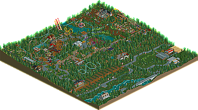
Wunderland Erlach is meant to be a middle-sized park in central Germany. The idea was to show the community that a park doesn't need extensive theming, great coasters or wild concepts to be enjoyable. I think the idea worked out well: I won Silver with a park that doesn't contain any big memorable rides, contains very little (deliberately ugly/fake) theming, and has imperfections all over the place! What makes me most proud of this park is how I created a strong and characteristic atmosphere through minimalism. I'd like to mention as well that this was my first park that was seriously influenced by NE.
-
2 fans
 Fans of this park
-
 Full-Size Map
-
 Download Park
1,129
-
 Tags
Tags
![park_4113 [H2H8 R3] A Year in Winkelheim](https://www.nedesigns.com/uploads/parks/4113/aerialt3858.png)
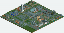
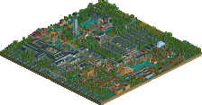
Looking back at some of the greatest players to ever grace RCT, we find most of them have a park that represents a transitioning period. These parks generally lapse over long periods of time as the parkmaker improves their skills as they work through the building process, possibly dabbling in other contests or projects across the community, these projects sometimes fade out, get released unfinished or capture a New Element Accolade. Though these parks might not be the perfect park, they do represent a blooming of the parkmaker's signature style and can be looked back at by the parkmaker and bring back memories of when they really caught grasp of the game. Liampie, who put on quite a show for Head-2-Head 5 being nominated for Rookie of the Year, has been very prominent in the community lately and cleans out his closet capturing a Silver Accolade with Wunderland Erlach. Read On...
Edited by reflex, 09 August 2009 - 09:12 AM.
But I miss some custom supports and some more theming.
The rides were okay, nothing special.
All in all my vote would have been 12.
right, lets start again.
firstly, congrats to you on this accolade, my FG pal!
well deserved. i love the attitude you took upon creating this park. we dont need beautiful, expensive, perfect parks all the time, this is exactly what we need once in a while, an old cheesy park
Area "A" was nice, the architecture was very pleasing considering its some of your older work. the bridge was a little irregular, i dont htink that would get past the drawing board with that ascent to the top... haha, you did the best with what you could. the landscaping/foliage left a little to be desired though(im a cock when it comes to this
Area "B" was pretty awesome. eagle was epic, i liked the station. really cool ride. the Soquet coaster was... blue. i didnt really like it to be honest, very little flow to it. overall, i would have scrapped it if i had made it. each to his own though, you wouldnrt have put it in if it didnt do something for you. nice path interaction though. flat rides looked good. the monorail looked cool too. again im peeved by the foliage
Area "C" was a little iffy. the macks station was ugly indeed, but bad ugly, not realistic ugly. it kinda feels like you only tried to make that building ugly, and as a result, that building stands out like a sore thumb, compared to the other not ugly buildings. i actually rather like the other buildings. the log flume portrayed the "cheap" theme better though. i liked its layout too :l0l:
Area "D" was my favourite. as usual the layouts were abit iffy, but i still enjoyed watching Märchenwald go round a couple of times. i absolutely loved the archy in this part. fantastic. the folige was a little more interesting in this area. the resturaunt was really cool.
overall, vfer deserving of the silver acolade. i would have given it around a 12-13
Definitely deserved more than Silver imo, althoughI can kinda see the coaster designs probably held it back from Gold..Also kind of shocked at Posix low score, I thought you would've liked these kind of nostalgic-traditional-realistic parks..
Anyway, here are my +/-;
+:
- Peep-friendlyness
- Car system outside of the park
- Traditional atmosphere
- Little things such as the wide benches
- Marchenwald
- Architecture of the restaurant left from Marchenwald, and architecture of Marchenwald's station
- Supports of Marchenwald
- Little river running through the park
- Landscaping
- 'Wasserrad' + architecture
-:
- Coaster designs; Too short and a little uninspiring/boring
- Foliage; At places some overtreeing and some places too bare
- Sides of paths; Sometimes there is no fence or an bad looking one
- Queue lines; Hate the white, some custom ones would've been more aesthetically appealing
- Parking; Why don't the cars park, like in your Dreamworld indoor park? Would've been so much cooler
Altogether a very enjoyable park, and I get it's kind of an old park you finished, but this makes me even more curious to your future parks!
Good job Liampie.
SF
edit; Silver is the right award.
But one thing I'm gonna take away from this is the foliage under the chairlift, I found that to be absolutely brilliant and I might need to use a few ideas from that in my new park. You really pulled something off that I've been trying to do for ages and it looks perfect in that setting.
I like your theme park, is simple is good.
Continue your good work.
[quote name='reflex' post='454237' date='Aug 9 2009, 05:50 AM']I really liked this park. Märchenwald was pretty cool, and I like the cars driving around. =) Eagle was an interesting ride aswell. Great atmosphere indeed yet little architecture. Nice work Liampie.[/quote]
Thanks mate!
[quote name='Turbin3' post='454283' date='Aug 9 2009, 01:44 PM']Well, I liked this park, nice atmosphere.
But I miss some custom supports and some more theming.
The rides were okay, nothing special.
All in all my vote would have been 12.
I agree with you except for the theming. I easily could've added more theming, but it wouldn't fit the concept. I wanted to do a different kind of park, something that hasn't been done before over and over again, although that isn't necessarily bad.
[quote name='Sulakke' post='454298' date='Aug 9 2009, 04:01 PM']You already know I love this park, Liampie. I just loved the atmosphere in the park. It's one of the only parks in my opinion with an atmosphere that is similar to an atmosphere of a real theme park.[/quote]
You already know I'm grateful for your opinion.
[quote name='Level' post='454303' date='Aug 9 2009, 04:53 PM']It was nice...maybe an 11 from me. There wasn't much architecture and there were no standout rides -_-[/quote]
Thanks. There indeed aren't any standout rides, a lot of them actually sucked I think.
[quote name='SSSammy' post='454306' date='Aug 9 2009, 05:06 PM']i love the attitude you took upon creating this park. we dont need beautiful, expensive, perfect parks all the time, this is exactly what we need once in a while, an old cheesy park
Exactly my thoughts!
[quote name='SSSammy' post='454306' date='Aug 9 2009, 05:06 PM']the Soquet coaster was... blue. i didnt really like it to be honest, very little flow to it. overall, i would have scrapped it if i had made it. each to his own though, you wouldnrt have put it in if it didnt do something for you. nice path interaction though.[/quote]
The Soquet coaster was one of the first things I built in the park, and actually I never really liked it. It remained on the map despite, and when I was renovating parts of the park I thought of redoing this part, but I had to draw a line somewhere. You can't redo every part of the park you like less than others, in that case the park won't be ever finished. I wanted to move on!
[quote name='SSSammy' post='454306' date='Aug 9 2009, 05:06 PM']the macks station was ugly indeed, but bad ugly, not realistic ugly. it kinda feels like you only tried to make that building ugly, and as a result, that building stands out like a sore thumb, compared to the other not ugly buildings.[/quote]
It wasn't intended to end up this ugly.
[quote name='SSSammy' post='454306' date='Aug 9 2009, 05:06 PM']Area "D" was my favourite. as usual the layouts were abit iffy, but i still enjoyed watching Märchenwald go round a couple of times. i absolutely loved the archy in this part. fantastic. the folige was a little more interesting in this area. the resturaunt was really cool.[/quote]
Glad you like this. The restaurant area is one of the oldest in the park, I think it's the first thing I did after the watermill-area. Back then I thought it was some of my best architecture ever, and apparently it still isn't bad!
[quote name='SSSammy' post='454306' date='Aug 9 2009, 05:06 PM']overall, vfer deserving of the silver acolade. i would have given it around a 12-13
Thanks! I really appreciate these huge reviews.
[quote name='Six Frags' post='454315' date='Aug 9 2009, 06:12 PM']Definitely deserved more than Silver imo, although I can kinda see the coaster designs probably held it back from Gold..[/quote]
If this park won Gold, I'd probably lose some faith in the panel.
[quote name='Six Frags' post='454315' date='Aug 9 2009, 06:12 PM']- Sides of paths; Sometimes there is no fence or an bad looking one[/quote]
When there's no fence that's probably done on purpose. There are plenty of parks in reallife that don't have fences everywhere. Landscaping is important in this park, not placing fences between the landscaping and the visitor helps to give a feeling of freedom from a peep's perspective, I guess.
[quote name='Six Frags' post='454315' date='Aug 9 2009, 06:12 PM']- Parking; Why don't the cars park, like in your Dreamworld indoor park? Would've been so much cooler[/quote]
I understand, but when I finished Wunderland that idea wasn't around yet, in my mind.
[quote name='Six Frags' post='454315' date='Aug 9 2009, 06:12 PM']Altogether a very enjoyable park, and I get it's kind of an old park you finished, but this makes me even more curious to your future parks!
Good job Liampie.
SF[/quote]
I want to finish and submit some parks that are even older; My first park with custom objects from 2005 is finished but it sucks. I would be surprised if the panel gave it a score higher than 5, so I think I have to renew the whole park. The first version will be included in the package as a bonus-park of course, it has a lot of personal value to me. It marked the start of a hobby. Other than that, my upcoming parks are better than this I think. Expect a bombardment of submission somewhere in the next two/three months, I think I'll have multiple parks finished at somewhat the same time.
Thanks.
[quote name='Comet' post='454321' date='Aug 9 2009, 07:00 PM']I really didn't understand the purpose of the blue coaster near the entrance, that was probably the biggest low in the park.
But one thing I'm gonna take away from this is the foliage under the chairlift, I found that to be absolutely brilliant and I might need to use a few ideas from that in my new park. You really pulled something off that I've been trying to do for ages and it looks perfect in that setting.[/quote]
Thank you. To me the foliage looks pretty average, but okay.
[quote name='X_Fusion' post='454336' date='Aug 9 2009, 08:40 PM']Liampie Congratulations!
I like your theme park, is simple is good.
Continue your good work.[/quote]
I will, thanks.
[quote name='CoasterForce' post='454337' date='Aug 9 2009, 08:51 PM']I thought this was pretty good. The simplicity worked for me. However, the creativity seemed to be lacking in spots, noticably the coaster with the Giga track was pretty dull and uninspired. The wild mouse-esque coaster was charming, though, as was the area around the Boomerang.[/quote]
Totally agree! Thanks.
One: I didn't like how some of the train lengths where under a realistic perspective. I can see if you weren't shooting for realism, but you're wacky worm and boomerang layouts obviously show that you were.
Two: No custom supports... self explanatory.
Three: I feel like the park could have either been much more or it could have been much less (size wise). You filled the park with mostly foliage which kind of killed it for me. I can see if it was surrounded by woods, but even if it was, a park would never be that spread out with that amount of attractions. You have the right idea, but I feel you didn't pull it off correctly.
Over all, it was a nice park to look at and fun to watch, but your designs were slightly boring and I lost interest after looking through all the attractions first time through. I would have rated it an 11 or 10, but either way, congratulations man and I hope to see something greater from you in the future! Good job.
-JDP
SF
The park itself was pretty good - ok, but not that inspiring. I think to pull this kind of park off - and to really get it to hold a viewer's attention - it really needs to be something special. I think you pulled off the concept well - I can totally see a park like this existing in real life, but when viewing it on RCT, to keep the viewer entertained, it has to be just perfect, or have that little something special - whether it be an interesting hack or something else original. Nothing really grabbed me - it was all just quite 'nice'.
Coaster-wise... again all just 'alright'. The Gerstauler Bobsled - decent, but seen it before... and also (minor point) - why does it have 2 cars per train? I've seen this done a couple of times now, and to my knowledge, all these types of ride feature single cars? Ummm... other stuff... there needed to be some more rides there. I thought this park may lend itself to some of those really old-school rides you see in some German parks - like those boats which 'jump' into the lake, or those 'boomerang' mini-coasters... I don't know... it just needed something more to grab my attention. So, all in all, decent - well worth the download... it's either a high Bronze or low Silver from me. I think the front-page sums it up perfectly as a 'transition' park - hope to see more from you.
Thanks, for judge the park for what it is supposed to be!
[quote name='JDP' post='454466' date='Aug 10 2009, 11:08 AM']Okay three main things that bothered me.
One: I didn't like how some of the train lengths where under a realistic perspective. I can see if you weren't shooting for realism, but you're wacky worm and boomerang layouts obviously show that you were.[/quote]
If I wasn't shooting for realism, this would be a map full of over-the-top theming and coasters that would make 'The Island' look silly.
The Boomerang has a short train because... just because.
[quote name='JDP' post='454466' date='Aug 10 2009, 11:08 AM']Three: I feel like the park could have either been much more or it could have been much less (size wise). You filled the park with mostly foliage which kind of killed it for me. I can see if it was surrounded by woods, but even if it was, a park would never be that spread out with that amount of attractions.[/quote]
there are plenty of parks like this. I think this park is pretty compact...
[quote name='JDP' post='454466' date='Aug 10 2009, 11:08 AM']Over all, it was a nice park to look at and fun to watch, but your designs were slightly boring and I lost interest after looking through all the attractions first time through. I would have rated it an 11 or 10, but either way, congratulations man and I hope to see something greater from you in the future! Good job.
-JDP[/quote]
Thanks! There are a lot of greater things coming up.
[quote name='Six Frags' post='454467' date='Aug 10 2009, 11:18 AM']^^^Yeah, sorry, I was exaggerating a bit too much (maybe because I liked it so much first time I went through it).. After looking at it again I think Silver is the right award for this park..
SF[/quote]
No need to apologize.
[quote name='jaguarkid140' post='454519' date='Aug 10 2009, 07:52 PM']It is a good park, not great but good so it deserves a silver, mainly because its coaster layouts (you've prabably heard this already) aren't much. The park does look good though, and there is some neat little hacks, and I thought the scenery actually looked beautiful. It would have won a gold if it was a bit bigger and the coaster layouts were larger, but overall, I would give it a 12-13 for the quality.[/quote]
Thanks!
[quote name='eyeamthu1' post='454531' date='Aug 10 2009, 08:37 PM']Good read-me with the park - immediately puts the whole thing into context and explains why you haven't gone with big coaster designs etc. Also interesting comments about a map needing to have surroundings away from the park - I never really thought of it in that way before, but have taken it on board
Haha, you read the readme! While writing that I was thinking that most people won't read it anyway, but I'm glad people did.
[quote name='eyeamthu1' post='454531' date='Aug 10 2009, 08:37 PM']The park itself was pretty good - ok, but not that inspiring. I think to pull this kind of park off - and to really get it to hold a viewer's attention - it really needs to be something special. I think you pulled off the concept well - I can totally see a park like this existing in real life, but when viewing it on RCT, to keep the viewer entertained, it has to be just perfect, or have that little something special - whether it be an interesting hack or something else original. Nothing really grabbed me - it was all just quite 'nice'.[/quote]
It wasn't made to blow people's minds. I didn't expect many other opinions than just 'it's nice', so thanks!
[quote name='eyeamthu1' post='454531' date='Aug 10 2009, 08:37 PM']I thought this park may lend itself to some of those really old-school rides you see in some German parks - like those boats which 'jump' into the lake, or those 'boomerang' mini-coasters...[/quote]
Those are rides my Heege I think. I didn't think of adding those, if I did I'd probably built them... Also I now realise I didn't add any playground. Shit, that's a huge flaw!
[quote name='eyeamthu1' post='454531' date='Aug 10 2009, 08:37 PM']I don't know... it just needed something more to grab my attention. So, all in all, decent - well worth the download... it's either a high Bronze or low Silver from me. I think the front-page sums it up perfectly as a 'transition' park - hope to see more from you.[/quote]
I hope to see more from you too! Both parks and nice extensive replies like this one. Thanks a lot!
[quote name='Brent' post='454678' date='Aug 11 2009, 08:39 AM']Should've made Spotlight based on the sheep alone... lol... seriously though, those were awesome.[/quote]
I can make you a 256x256 sheep park, no kidding. Do you want it?
[quote name='Brent' post='454678' date='Aug 11 2009, 08:39 AM']That blue coaster in the front really was weak (you should've made it go through twice like the electric mine coasters).[/quote]
I think it did...
[quote name='Brent' post='454678' date='Aug 11 2009, 08:39 AM']Liked the red coaster in the back though, those had some pretty sweet supports. Overall I really did like it...[/quote]
I'm glad, thanks.
Thank god for inventing the word 'thanks', I can't live without it. I can't believe how many people I thanked these days...