Park / Brighton Glen
-
 26-July 09
- Views 5,469
- Downloads 900
- Fans 3
- Comments 28
-

-
 78.46%(required: 70%)
 Gold
Gold

Milo 90% RCTFAN 90% 5dave 85% Casimir 85% Xcoaster 85% Kumba 80% posix 80% chapelz 75% Evil WME 75% Magnus 75% nin 75% zodiac 75% CedarPoint6 70% geewhzz 70% Fr3ak 60% 78.46% -
3 fans
 Fans of this park
-
 Full-Size Map
-
 Download Park
900
-
 Tags
Tags
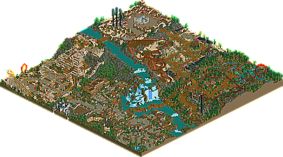
![park_4114 [H2H8 R3] Forum Caeleste](https://www.nedesigns.com/uploads/parks/4114/aerialt3853.png)
But the park really is awesome, i'm just gathering a few small screens together and then i'll give you a review of my favourite parts etc
My bad on the western theme. Excellent on the upcoming review, complete with screens!
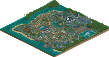
Looking at the aerial, the first thing I laid eyes on was that awesome waterfall in the centre. The skill that you have is brilliant. I've never been really interested in waterfeatures and waterfalls but this really grabbed my attention and I had to see it in game. I don't think I've ever seen such a beautiful landscape, if only real life parks had waterfalls as their centerpiece.
The entrance area is one of my favourite areas in the park. The use of colour is brilliant and really helps to add detail to the buildings. It stops the area from being drab and boring. It's amazing what a little bit of colour can do to an area. You've inspired me to try and put more colour into my own work. Moving onto the coaster, I didn't think that Passageway had that great a layout. It was a nice addition, and a much needed one with all the other thrill rides in the park, and it's placement was brilliant. I just felt that it didn't particularly flow all that smoothly, I did like how the colour scheme matched the area though.
The Ampitheatre was simple yet brilliant. The way it was sunken into the ground was really nice. Another superb piece of architecture with The Veranda, and again it's location was fantastic. How good would it be to be eating a 3 course dinner overlooking the falls? What I love about your work is how you think about the peep's point of view, it makes you feel as though you are in the park yourself.
Coetzle showed just how good you are with Codex. Whilst Plunder, again, didn't have the best layout, it had amazing supports and building interaction. The area as a whole seemed a bit lackluster, there wasn't much there compared to some of the other areas, but the giant temple ruin made up for it. A nice idea to have an indoor rollercoaster too, it was completely hidden away, I almost missed it completely.
Again, the landscaping here is outstanding, I've never seen jagged rocks look so good, especially how you incorperated the architecture into it. Top notch.
Carasonne seemed very plain compared to the other area, however it had charm. The abbey was executed brilliantly, by far the best thing in that area. The lilypads as tables was a really nice touch and I loved the portculis, another highlight of the area.
Now we get to my favourite area. I love Western themes in LL and Larado City is no exception. The little touches here, like Panning for Gold and the Watering Troughs are what made it special. The fact that you include these little details makes you think just how much effort you've put into creating this park. The haunted manor was a brilliant idea to include in this area, but I didn't think it's architecture went with the rest of the area, it seemed a bit out of place, maybe you were going for that, I dont know.
Wildfire had the best layout in the park. I loved how it dominated the area and that you could see it from everywhere in the park. It's colours were also fantastic, colour is definately one of your strengths. The surrounding architecture was exactly how you'd expect it to be in a Western area and the different facades stopped the area from becoming repetative.
Probably my least favourite area now, but it's still great work. The use of the wooden coaster track under the queue line for the rapids was a brilliant technique, one i'm going to steal myself
The foliage here really helps to set the theme and the yellow flowers really brighten up the area. Voodoo's layout was one of the better layouts of the park, but I didn't like the lift. That was the only downside to the coaster, the rest of it looked very fun, especially with the queue and path interaction. Headhunter was a nice addition as well, it looked quite spectacular set into the landscape.
The best part of this area for me was the path back to the entrance. It would be magnificent to walk along that path after a long day of riding, watching the waterfall.
Overall the park was outstanding. Whilst the layouts could be a little better, the interaction with their surroudings was brilliant. The park aerial is one of beauty and you should be very proud of what you've built.
Congratulations on Gold