Park / Brighton Glen
-
 26-July 09
- Views 5,460
- Downloads 896
- Fans 3
- Comments 28
-

-
 78.46%(required: 70%)
 Gold
Gold

Milo 90% RCTFAN 90% 5dave 85% Casimir 85% Xcoaster 85% Kumba 80% posix 80% chapelz 75% Evil WME 75% Magnus 75% nin 75% zodiac 75% CedarPoint6 70% geewhzz 70% Fr3ak 60% 78.46% -
3 fans
 Fans of this park
-
 Full-Size Map
-
 Download Park
896
-
 Tags
Tags
![park_4114 [H2H8 R3] Forum Caeleste](https://www.nedesigns.com/uploads/parks/4114/aerialt3853.png)
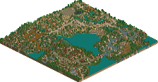
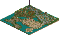
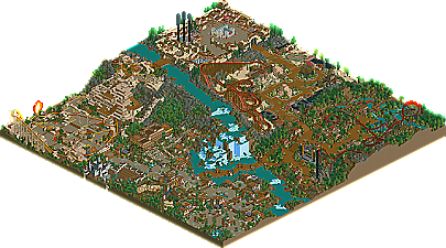
Recently the front page has seen many accolades from old members returning to the game. Today, the trend continues as former Parkmaker Ozone gets another release after a 5 year hiatus. He left at the height of his RCT career, after the release of his Spotlight DreamWorks Great Australia but has found the time and the inspiration for the game again. While his newest solo wasn't quite enough to get him a second Spotlight, Brighton Glen does manage to showcase Ozone's adjustment to new styles and tools in RCT and earns him a respectable Gold. The park is built in a similar progressive style he used in his previous works, only this time with things like codex stacking thrown in the mix. Overall it has a very relaxed atmosphere and is a pleasant mix of nostalgic and current styles. Read On...
inVersed Offline
I haven't downloaded the park yet, but the overview quickly brought a smile on my face! I can't wait to take a look in a few hours!
edit: Fuck my schedule; I'm downloading now!
Edited by Liampie, 26 July 2009 - 04:24 AM.
I can't download it, but I did look at the overview, and this was very inspirational. The pyramid type building at the top of the park was brilliant.
Only thing is I think the park would have been a little bit more settling if the coaster colors were less 'vibrant', I guess. For example I think the woodie would have been fine just brown, much easier on the eyes.
Perhaps a personal preference, though.
-JDP
I think a lot of LL parks (especially older ones, I admit) are very cluttered and chaotic. In Brighton Glen, the atmosphere was very relaxed. The waterfall, which was perfectly exectued, is the climax of this atmosphere. A lot of parks lack some space to breathe, Ozone nailed it here.
The jungle area is the weakest area of the park I think. There wasn't much to discover, and this is the only spot in the park were it becomes chaotic in a 'bad' way. I think that's mainly due to the foliage and the covered terraces. There were some excellent thing too however, the 'inverted corkscrew' was a great part of the coaster. When I first looked at the aerial screen, I disliked the lift. Ingame, from a few angles, it was awesome however. It helped the area somehow to have a creepy atmosphere.
My favourite area is the western area. There were a lot of very cool details, which are mentioned somewhere above and in the write-up. The architecture was relatively basic, but very effective and the atmosphere was nearly perfect. The coaster with its landscaping also looked beautiful, I totally love it! The only major flaw here is the foliage I think, the flowers had a wrong colour (should you even include flower at all in a western area?) and mixing it with cactusses looked even more wrong. A more barren look like around the wooden coaster would've been more fitting I think.
Other highlights:
- Entrance-area. Somewhat chaotic, but a very good atmosphere and perfect colours.
- The inverted's lifthill. Very simple, but again also very effective. Beautiful.
- The restaurant by the waterfall.
- Amphitheatre - looked much better ingame than it did on the screen in the AD!
- The big temple. Its shape didn't make much sense, but it looked cool which is most important IMO.
Ozone, I really can't wait for you to take revenge on the accolade panel. I consider this park as a warming-up after your absence; your next park will be probably even more stunning! If not, no problem.
I enjoyed this park very much. It made me smile, and now hours after I viewed the park ingame, the smile returns because I just think of the park. Thanks a lot for this memorable park! It surpassed my high expectations.
I think Gold was fair, there was nothing earth shattering in the park to make it stand out among submissions. As the artist behind it, my goal wasn't to shock or awe you, the viewer. I was really going for something that was fun to look at and worked together as a whole. Also, I gained a lot of familiarity with the codex trainer as I built this park.
I hope the park looked like it was built around the landscape, as that is what I originally wanted to accomplish with this; a park that was built because there was a huge waterfall there. All the other themes are really just whatever I felt like building. Codex helped my creativity out a lot, and I look forward to using it to more of it's potential.
Keep the responses coming, I really enjoy hearing what people think about it. Thanks!
I'm not suprised this ended up just Gold however. It looked great and really was great but upon repeat glances it just lacks a certain magic. I actually think you accomplished everything you wanted to with this work but really nothing more. The landscape was great, the waterfall a great centerpiece and the park as a whole had a nice flow. Things like the temple being a sort of "gateway" to the next area which is at the summit really add to it. I think you actually made some steps forward in the game by focusing on aspects like that but as this was also a "warming-up" you are still a bit rusty on creating a captivating "experience".
The coasters were lacking for me. They really didn't help nor hurt the park and I can only turn to the term "white noise" when I think about the rides in the park. With the exception of Voodoo's lift it was all fairly standard and even outright boring. I did like what you did with Passageway and the diagonal lift as well as a few other spots but it was mostly architecture, landscaping and details which kept me moving from area to area in this park. That isn't really a good thing.
I do hope you have some more work coming because I am really looking forward to whatever it might be. You always do well at what you focus on, even in your older work, but I'd like you to foucs on everything for once
Great park Ozone. and even greater to see you back
I have to agree that it didnt quite have that special something to make it a spotlight park but I think Gold is an excellent achivement.
Love the landscaping around the park and the waterfall is epic. The coasters didnt do a whole lot for me but the architecture was enough to keep me interested for quite some time
Congrats.
Bah... Rubbish
Great work, congratulations OZONE!
-JDP
inVersed Offline
Next from me is a park with peeps in it. I'm having a lot of fun building it, and it is quite a bit different from Brighton Glen. I'm catering to the peeps, and I've never done that while trying to build a park before. You can see a couple of unfinished screens in the Dump-Place thread - page 200 and page 212 now.