Park / New Sun Park
-
 10-November 08
- Views 5,133
- Downloads 708
- Fans 1
- Comments 25
-

-
 36.43%(required: 65%)
 Pro Tour 3

Kumba 70% ChillerHockey33 65% FullMetal 55% posix 50% Xcoaster 50% Evil WME 40% geewhzz 40% Fr3ak 35% Magnus 35% RCTFAN 35% zodiac 30% CedarPoint6 20% Milo 20% postit 20% chapelz 15% nin 0% 36.43% -
1 fan
 Fans of this park
-
 Full-Size Map
-
 Download Park
708
-
 Tags
Tags
(click logo to go to page)
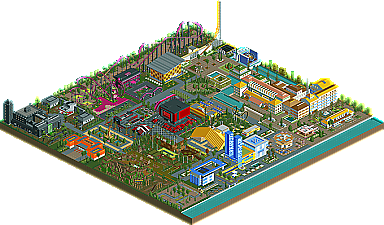
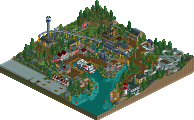
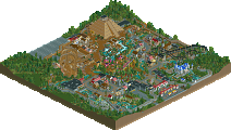
You guessed it. ProTour3 release have started to roll out. If you haven't already, please refer to the main newspost on our frontpage about this event. In seventh place, we present to you "New Sun Park" by X_Fusion. Please find out all about it by clicking the logo above. This topic is meant for comments on the park.
FullMetal Offline
Although the execution was flawed, I thought that X-Fusion knew what he was doing. The ideas were definitely there, he just needs to improve his parkmaking skills. If you don't look at it so critically, it's a nice entry, especially in regards to the hotel. It had a certain nostalgia to it, which always catches my eye.
On the PT3 release page: nice job! I don't have to click on stuff to see who made what, or see the park's score. Although I would change the yellow stuff to blue, just to match NE.
And very nice page release prep group!
FK
Showed some good ideas and just lacked a bit in execution in my opinion.
But a good start to PT3 and well done for getting an entry in
Man, must've taken aaaaaages to figure out who did what when, and then to code everything, judge, do the artwork, do the write-ups etc..
Great job magnus on the aerial(s?).. You'll get a fair idea about the park when viewing those..
I haven't seen the park yet, but looks like a good start to the PT3!
SF
Oh and excellent job on the PT3 guys. Glad they've finally gotten started.
The park itself isn't bad. Good effort and you really should be proud that you submit an entry, not many people and any of the 7 deserve to be congratulated on that.
Also just out of interest why does it say Search Content in the nav trail?
Edited by JJ, 11 November 2008 - 12:47 PM.
The graphic is prefectly fine and nothing is squished there.
Will reply to the submission later.
I could of, but I wanted to do it the way it was done in the PT and PT2. That would have been the way it was done this time, but I am not an admin anymore, so I did not have a say in that
jj, i understand what you mean about the logo. it is in fact reduced in size a little. we intended to have them all in the same height so it would look uniform. we didn't expect people to send us logos with their entries, so x_fusion couldn't read the resolution we specified to the release prep guys, of course. about submission or entry, does it really make such a difference? i think it's fine. we like to call pt3 entries "submissions", too. they are submissions to the temporal discipline of "pt3". the other disciplines (spotlight, design, concept creation) are continuous.
Can see where you spent the time, good job
No complaints though really, just a minor thing.
EDIT: and I see it has been corrected. Very nicely done.
As for the park itself I was pleasantly surprised by the atmosphere. The area around the trucks seems good and gritty, the city seemed clean and airy. It was also nice to sorta "stumble across" rides all over the park, like the river boats (Chute the Chutes) that I didn't notice from the overview.
The actual entry (as a whole) though, was rather bland. It seems incomplete as the flat landscape with lots of open ground pair up to make gaps between buildings, rides, and paths exceptionally obvious. The coasters could use some work, though I enjoyed the LIM quite a lot. It seems like it would be a really fun ride if it were real (even though from the overview it's rather awkward).
Anyway I wish you (X_Fusion) good luck in the future, and congratulate you on finishing an entry. Something I didn't do despite my best intentions.
Ride6