Park / Worlds of Tim Burton
-
 21-July 09
- Views 28,431
- Downloads 1,854
- Fans 4
- Comments 108
-
 80.63%(required: 70%)
 Gold
Gold

Coasterbill 85% no G Force 85% no Kumba 85% no SSSammy 85% no Jaguar 80% no Poke 80% no trav 80% no Xeccah 80% no csw 70% no Liampie 70% no 80.63% 0.00% -
4 fans
 Fans of this park
-
 Full-Size Map
-
 Download Park
1,854
-
 Objects
517
-
 Tags
Tags
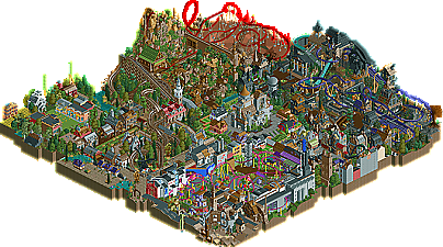
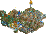
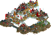
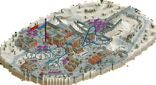
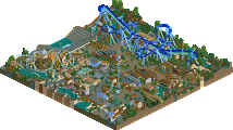
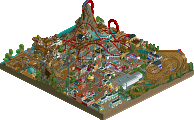
As for World's of Tim Burton
Pros:
-Architecture. Showed the brilliance of all 3 parkmakers.
-Coaster Layouts. Although I would have prefered if that one ride didn't breakdown ever minute =P
-Park Layout. You managed to get many areas into such a small area and allow them to transition from one to the other.
-ATTENTION GRABBER. The parkmakers grabbed a wonderful idea and executed it perfectly.
Cons:
-Bad selection for areas. Needed Beetlejuice!!!
-Bad selection for ride names. WHERE ARE JACK AND SALLY?
-I didn't like that one grassy area and the desert area. Didn't seem as exciting as the other areas.
Edited by Wanted, 23 July 2009 - 05:50 PM.
Level: About Kumba walking the walk... Ahem?
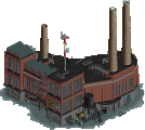
Ok first off well done guys on making it onto the finals and making such a great park. The park worked really well, the transition to ares, the coasters, the architecture, the themeing and all the little things to look at. My favourite area was easily Charlie And The Chocolate Factory. I loved the movie so it was great to see all the resemblances. Th chocolate pipe with Argustus was very clever, props to who ever thought of that. I also really liked how you placed all the Oompa Loompas all around the river, loved the waterfall too, very nice there. The coaster was good, nothing spectacular. I liked the layout and the station but i just thought it could of been better. The planet of the apes part was my next favourite. The amount of detail around the lifthill for esacre was incredibly beatiful. Loved the outdoor section of the coaster too, some great themeing there. The rocks and trees at the start were what really made this area say "look how awesome this park is!". The rest of the themes that you did were movies that i haven't seen so i don't know much about them. The Big fish area was nice, i liked the architecture alot in there, good job for that aswell. The invert was by far one of the highlight coasters of this park. Well paced, great layout, very cool elements, great theming, all around spectacular coaster, good job there, very nice. The ara in the bottom corner that looked like a run down town was nice, good architecture there too, never even heard of that movie. The Castle in the middle was awesome, great job on that one. It had great resemblences o the castle in the movie, so props for that. The houses, i hate to say it were bad. I didn't like them. I just thought that you put them in there to have more resemblences to the movies, they were also very squashed in. Sleepy hollow, where to start! By far my favourite area in the whole park! That woodie, holy shit! It was great! The layout was very good, the pacing was great too and the finale by the path around the tree was extravegant! I also really really liked the station for that ride as well. The architecture was also nice too. The entrance area could of been better, i'll say that but it past the test as an entrance, better then a park entrance underground with nothing i suppose. The Sweeny todd section i didn't look at because of my extreme fear of horror so i watched the coaster and that was it, the movie sounds really bad with how he kills people so i didn't want to see more resemblence to the movie. The coaster was good though, nice layout but could of had more inversions to make it better. Overall incredibly epic park, second on my list this season.
9.7/10
Few questions directed at the builders:
1. Did you face any problems when building on the park?
2. What area do you think is the best?
3. What did you enjoy doing the best?
That is all.
Edited by Goliath123, 24 July 2009 - 04:34 AM.
1. Did you face any problems when building on the park?
I myself found it very hard to build in such a confined space. This however was crucial as we wanted the park to seem quirky and busy, a lot like Tim’s movies. I also had trouble with Charlie’s coaster at first. It went through 3 different layouts. The first I built which wasn’t incredibly realistic. The second Robbie tweaked which was very good yet it took up to much room. The third version I tweaked again to make room for the 9 area which worked out best.
2. What area do you think is the best?
I personally think the greatest areas of the park are; Nightmare, Charlie, Planet of the Apes and Sleepy Hollow. Robbie literally built sleepy hollow in a few days without any problems which amazed me. Sleepy was an amazing section of the park that I loved from day 1.
The other three themes were harder imo as they needed something to move the architecture towards the Burton traits we were trying so hard to build.
Nightmare was a massive struggle for me and Drew. I knew the buildings needed to defy some physical attributes that buildings hold and I knew the theme needed to be dark while having comedic character. We built the architecture with a darker tone yet added the pumpkin patches and bubbling cauldrons with brighter colours so it didn’t seem so morbid. I think the tough archy in the area is a crowning achievement in my park making. I'll always remember the facade for the water ride as it’s certainly one of my best.
3. What did you enjoy doing the best?
Probably Charlie the most even though I loved every single second of building this park. I loved the common traits of the film like the outside facade of the murky factory and the inner location being so lively and full of life. The Sweet trees were also so fun to experiment with and I really enjoyed that.
Robbie Drew and I have talked so much about this park and we've always been there to bounce ideas off each other and tester screens to see if they fit the park. The Sweeney section went through 2 changes and it was relocated once till we got it right. There were highs and there were lows as I always wondered if I was good enough to tackle such big themes. I'm sure everyone feels this way but when you achieve such a goal of completing such a challenging park it is so rewarding.
All in all this park was hard to build on as you had to meet several disciplines that went past your normal park-building method. It was hard but once you let go it was awesome to build. I'm sure you all realise now that this isn’t just any park to me. I love it and I have done ever since I thought of the idea.
I'm almost sorry I inflicted this theme on Robbie and Drew but as you can see the results shine through.
So you did have a problem with the park, lucky you had the backups to cover you though. Thnaks for answering.
Really though, shame it turned out this way. Thought it was a cruel joke at first, oh well. Congrats to Kumba and your team.
Yes. If you review the 3rd place match, I'll review your park.
Yeah, it looks nice, I have to agree, when you like empty maps.
Maybe he means the shown pictures from K0NG.
However, I have a new PC now, and there wasn't even a single slow down. So crazy ...
To sum up my thoughts: This was like 50 dishes of the finest gourmet food creations thrown together into a mixer, producing one big inedible mass, sorry.
I really think you need to tear things apart, give them their own space to live and breathe and guide the viewers' eyes through the park. It has to be clear you want them to look at this, then this, then that, and then ... like a chain. Imagining to walk through your own park while making it helped me with this.