Kudos for showing that you don’t need to sink endless hours into a project to take part in NEDC! I really enjoyed the overall vibe of Mirage – especially the use of water as a void, which gave the map a unique and refreshing atmosphere. Parts of it felt very old-school in the best way, and I really appreciate the choice to go for no custom supports, adding to the classic charm.
The foliage and color choices are lovely and help create a soft, inviting mood. That said, the map did feel a bit empty in places and didn’t hold my attention for very long. Still, it’s a refreshing and stylish project, and I’m glad you decided to share it!
+ Nice park, lovely and simple, good to see the coaster as it was intended
+ The overview for this park is great, so glad you went with the full water for the background
+ Great work getting this done and over the line with such a tight timescale
+ Foliage was perfect, a huge strength of yours taking centre-stage
- With such a simple concept I was hoping for a few more basics to be met, the coaster actually broke down in the first minute of viewing so it was quite a boner-killer. Just switching the coaster to no breakdowns would’ve stopped this happening unless you were going for no cheats.
+ The coaster station was brilliant, I want to see you revisit that theming style on a more epic scale. Please revisit that.
Lovely viewing but I’d be dropping my standards for Designs on NE if I voted this any more.
Another submission with a charming, classic feel - what a treat! Once again, I think the landscaping and foliage were standout. The deep purple of the flowers provided a nice contrast to the rest. Enjoying the Land Land vibes with the station. I appreciate the focus being on the coaster as well. 75%
Mirage feels very early RCT2.. circa 2003/2004. No frills, just a simple idea and a banger of a layout. Foliage was neat, as well as the overall look and feel of the island itself. This entry though lacks stuff. This map could've used 1-2 supporting rides and perhaps a deeper exploration on the sand castle architecture.
Totally understand that you didn't go all out and spend hours and hours of time on this.. but it's oozes with potential. Fun to see Land Land rise again!
The dedication that went into building an aesthetically pleasing map within the span of a few days (hours?) is admirable, and while I'm not sure there is enough here to constitute a Design, the effort given the timeframe is still apparent. My favorite thing about the map is how great the island itself looks from a distance. Excellent beachscaping here - any map that taps into my inner pirate is a winner in some sense.
The coaster is just sort of... there. Painting it and the lifthill invisible further showcase the thoughtful terrain painting, which is the map's strongest attribute, but it also reinforces how non-essential the coaster is to the map as a whole. I would love to see more buildings made of sand; the station being the only such structure (and pretty much the only building on the map) left me wanting more from this theme.
Overall, a testament to the art of speedbuilding that proves that a map can be very rushed but still very pretty.
I considered a speedbuild for this contest since I had very little time and motivation but ultimately decided against it. Looking at this makes me wish I committed.
+ Beautiful aesthetic. Limited colors, recurring motifs, classic objects; it just does not get old! Very John-esque which is not surprising your recent endeavors with his unfinished park.
+ Love the very simplistic crunch attempts with the differing path types on the bridges and the sand. It really does not get easier than that and it still works!
+ Sand castle station is a really nice idea and work well with the land blocks and castle windows. Some real dr dirt vibes.
- I said in voice chat that this design kinda does what it needs to but no more than that. Not always a bad thing, but in this case you could have worked in some setpieces to really accentuate some of those elements without wasting too much time.
Pretty cool map! I know that this was a speed build for you but it turned out pretty nice! The macro was unsurprisingly pretty good and I like the classic feel to it. I also liked your choice to use water as void, it added a lot to the feel of the map. Goes without saying but the coaster layout is great haha. I thought that the path interaction that you did with the coaster was also really well done and impressive.
Foliage and Landscaping: The landscaping was fun with the land textures being well utilized. I would've liked to see you do something more interesting with the rockwork even if it was just using land textures and the landscaping tool. I feel like some rocks along a part of the shore line would have added a lot to the atmosphere. The foliage was really well thought out throughout this park. Everything seemed very strategically placed and the variety you chose was great. This scene in particular was lovely:
Architecture: There wasn't much here but I kinda like that. I think that including no formal buildings and using what seems to be a man-made mud building to house the station to the coaster was a clever and interesting choice given your time restraints. This scene was super nice:
Overall: I thought this was a nice submission and really impressive given how quickly you built it. I would probably rate this 55%.
I like how both Otter and CC9 mentioned Land Land... While I hope that park, or something like that eventually sees the light of day, it's a joy to see the 'dirt building' idea used here.
The paths do a great job adding to the 'crunch' of this entry... while I was skeptical of that pebble path in the teasers, and usually mixing multiple path textures doesn't work, it is done extremely well in this case. The usage of path-as-terrain also helps with what would otherwise be empty land on the beach.
Regarding the foliage, it is amazing in areas where it is clumped, but feels random in areas where it isn't. If I had to guess, this missed design because it's not super-detailed and was made in a few days, but it's definitely a nice park that would probably be beautiful in real life, and one that utilizes clever scenery strategies with the very limited object selection that it has.
I like the overall island shape, and the foliage is done really well. Pathing has some very good texture choices and the bridges have some nice woodwork around them. The station is really unique, I like the whole rocky castle look of it.
Overall feels very classic PT2 with more modern planning/macro and I'm all for it, also really impressive for how fast this was built.
As part of this series reviewing the fantastic NEDC6 entries, I will enter into a commentary on how the builders have decided to approach using Pacificoaster’s layout, and how those decisions compare and contrast one another. I encourage reading all my reviews on NEDC6 to get the most out of this more fragmentary commentary you will find interspersed here if you find this interesting or desire clarity.
Mirage has big “I built this on a train while swiping everyone on bumble” energy. In that regard, it shows Liam’s clear and intuitive talent when it comes to composition - after all, there’s not really much else to talk about on this map.
The dominant viewing angle appears to be “inside L”, where the predrop curve appears over the cobra roll. There is, of course, a bridge of path over the track where it enters and exits the cobra roll. The path continues under the barrel roll, and off under the drop. This makes the ride feel extremely natural in context.
The ride queue begins under the first corkscrew - a great moment, but lacks the fanfare of proper plaza placement. I would argue that it would be more appropriate to have the queue begin behind that gold statue further into the plaza. That would give the queue adequate fanfare, rather than beginning it at the elbow of a regular footpath. The queue continues tastefully under the next corkscrew. Before it reaches the earthen station.
This station is really cool. There really isn’t much to it, much like the rest of the entry, but it shows a clear vision that carries it beyond the sum of its parts. It becomes a true sandcastle on this island oasis, and comes off as a bit of a show-off moment. Liam doesn’t even need wall textures.
The balance of the map is extremely strong, with great understated landscaping and foliage, all to accent the ride and footpaths.
Liam, this shows what you can do with top-tier coaster design. You’ve got the magic touch. I kind of appreciate it all the more for its lack of content. Don’t hide behind object spam, kids. Less is almost always more.
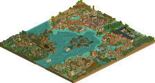
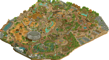
A classic style speedbuild, and yet Liam easily produces lots to love.
Kudos for showing that you don’t need to sink endless hours into a project to take part in NEDC! I really enjoyed the overall vibe of Mirage – especially the use of water as a void, which gave the map a unique and refreshing atmosphere. Parts of it felt very old-school in the best way, and I really appreciate the choice to go for no custom supports, adding to the classic charm.
The foliage and color choices are lovely and help create a soft, inviting mood. That said, the map did feel a bit empty in places and didn’t hold my attention for very long. Still, it’s a refreshing and stylish project, and I’m glad you decided to share it!
H2HC does NEDC!
+ Nice park, lovely and simple, good to see the coaster as it was intended
+ The overview for this park is great, so glad you went with the full water for the background
+ Great work getting this done and over the line with such a tight timescale
+ Foliage was perfect, a huge strength of yours taking centre-stage
- With such a simple concept I was hoping for a few more basics to be met, the coaster actually broke down in the first minute of viewing so it was quite a boner-killer. Just switching the coaster to no breakdowns would’ve stopped this happening unless you were going for no cheats.
+ The coaster station was brilliant, I want to see you revisit that theming style on a more epic scale. Please revisit that.
Lovely viewing but I’d be dropping my standards for Designs on NE if I voted this any more.
60%
Another submission with a charming, classic feel - what a treat! Once again, I think the landscaping and foliage were standout. The deep purple of the flowers provided a nice contrast to the rest. Enjoying the Land Land vibes with the station. I appreciate the focus being on the coaster as well. 75%
Mirage feels very early RCT2.. circa 2003/2004. No frills, just a simple idea and a banger of a layout. Foliage was neat, as well as the overall look and feel of the island itself. This entry though lacks stuff. This map could've used 1-2 supporting rides and perhaps a deeper exploration on the sand castle architecture.
Totally understand that you didn't go all out and spend hours and hours of time on this.. but it's oozes with potential. Fun to see Land Land rise again!
I considered a speedbuild for this contest since I had very little time and motivation but ultimately decided against it. Looking at this makes me wish I committed.
+ Beautiful aesthetic. Limited colors, recurring motifs, classic objects; it just does not get old! Very John-esque which is not surprising your recent endeavors with his unfinished park.
+ Love the very simplistic crunch attempts with the differing path types on the bridges and the sand. It really does not get easier than that and it still works!
+ Sand castle station is a really nice idea and work well with the land blocks and castle windows. Some real dr dirt vibes.
- I said in voice chat that this design kinda does what it needs to but no more than that. Not always a bad thing, but in this case you could have worked in some setpieces to really accentuate some of those elements without wasting too much time.
Pretty cool map! I know that this was a speed build for you but it turned out pretty nice! The macro was unsurprisingly pretty good and I like the classic feel to it. I also liked your choice to use water as void, it added a lot to the feel of the map. Goes without saying but the coaster layout is great haha. I thought that the path interaction that you did with the coaster was also really well done and impressive.
Foliage and Landscaping: The landscaping was fun with the land textures being well utilized. I would've liked to see you do something more interesting with the rockwork even if it was just using land textures and the landscaping tool. I feel like some rocks along a part of the shore line would have added a lot to the atmosphere. The foliage was really well thought out throughout this park. Everything seemed very strategically placed and the variety you chose was great. This scene in particular was lovely:
Architecture: There wasn't much here but I kinda like that. I think that including no formal buildings and using what seems to be a man-made mud building to house the station to the coaster was a clever and interesting choice given your time restraints. This scene was super nice:
Overall: I thought this was a nice submission and really impressive given how quickly you built it. I would probably rate this 55%.
I like how both Otter and CC9 mentioned Land Land... While I hope that park, or something like that eventually sees the light of day, it's a joy to see the 'dirt building' idea used here.
The paths do a great job adding to the 'crunch' of this entry... while I was skeptical of that pebble path in the teasers, and usually mixing multiple path textures doesn't work, it is done extremely well in this case. The usage of path-as-terrain also helps with what would otherwise be empty land on the beach.
Regarding the foliage, it is amazing in areas where it is clumped, but feels random in areas where it isn't. If I had to guess, this missed design because it's not super-detailed and was made in a few days, but it's definitely a nice park that would probably be beautiful in real life, and one that utilizes clever scenery strategies with the very limited object selection that it has.
I like the overall island shape, and the foliage is done really well. Pathing has some very good texture choices and the bridges have some nice woodwork around them. The station is really unique, I like the whole rocky castle look of it.
Overall feels very classic PT2 with more modern planning/macro and I'm all for it, also really impressive for how fast this was built.
Mirage has big “I built this on a train while swiping everyone on bumble” energy. In that regard, it shows Liam’s clear and intuitive talent when it comes to composition - after all, there’s not really much else to talk about on this map.
The dominant viewing angle appears to be “inside L”, where the predrop curve appears over the cobra roll. There is, of course, a bridge of path over the track where it enters and exits the cobra roll. The path continues under the barrel roll, and off under the drop. This makes the ride feel extremely natural in context.
The ride queue begins under the first corkscrew - a great moment, but lacks the fanfare of proper plaza placement. I would argue that it would be more appropriate to have the queue begin behind that gold statue further into the plaza. That would give the queue adequate fanfare, rather than beginning it at the elbow of a regular footpath. The queue continues tastefully under the next corkscrew. Before it reaches the earthen station.
This station is really cool. There really isn’t much to it, much like the rest of the entry, but it shows a clear vision that carries it beyond the sum of its parts. It becomes a true sandcastle on this island oasis, and comes off as a bit of a show-off moment. Liam doesn’t even need wall textures.
The balance of the map is extremely strong, with great understated landscaping and foliage, all to accent the ride and footpaths.
Liam, this shows what you can do with top-tier coaster design. You’ve got the magic touch. I kind of appreciate it all the more for its lack of content. Don’t hide behind object spam, kids. Less is almost always more.
Score: 75%, but oars aren’t included