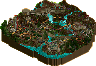
Park / Luminescence
-
 13-April 25
- Views 0
- Downloads 28
- Fans 0
- Comments 9
-
 69.50%(required: 65%) Design
Recurious 85% SSSammy 75% Terry Inferno 75% CoasterCreator9 70% J K 70% RobDedede 70% Scoop 70% Xtreme97 70% pants 65% RWE 65% Turtle 65% deanosrs 60% 69.50% -
Description
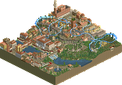
"Enter the jungle - let the fireflies guide you..."
Built by Isao and myself for the DKMP Bobkart Contest, RCC71.
(A Bobkart is like a powered Bobsled Coaster)
Hope you enjoy! -
No fans of this park
-
Full-Size Map
-
Download Park
28
-
Objects
3
-
Tags
Similar Parks
-
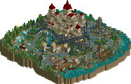
Serpentine
-
Bi Zou Long She
-
Century of Progress
-
Taste of Tuscany
-
Apothicon Servant
-
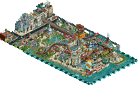
2 8 1 4 - Birth of a New Day
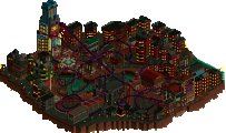
Argh such a cool map, the bright water was a sick touch and the buildings and their detailing was great to see. The ruined half diag building you did was chef's kiss then covered by that great rock work... oh Mami.
My only gripe because you know I'm a big fan was the coaster choice. I know it was chose for you in a different competition, but the coaster itself needed more dominance around a theme that overpowered it. Switched out for an RMC or a suspended would've seen my score soar on this one. I also wanted much more water work (rides, waterfalls etc) as the whole parks stylistic choice was the luminescent water. Small gripes, but big moves.
Changing all the track to bobsled instead of dinghy slide is a big upgrade. I'm sorry you had to put a 'bobkart' on this map, it's gorgeous otherwise. The rock work is awesome, top of the meta stuff I think - and they way the architecture and grid breaking blends in is sweet. I love the vibe and the palette, but I think you could have turned up the effect in a few dark corners to really emphasize the dark / light extremes where the fireflies are - of course that might not be fore everyone. Excellent work Timmy and Isao.
Great palette, such a vibe. The ride type is just a bit unfortunate, i almost wonder if a reformat of this ride into a couple different water slides would have raised the stakes for me. Lovely foliage and rockwork, and some rather nice architecture as well. Does feel a bit underbaked in spots, but all in all a cool map to look at.
Positives:
1) Foliage is top notch.
2) The shape of the upper building is outstandingly done.
3) Love the palette. Evocative and distinctive.
4) The flow of the map is great with my eye being drawn to the right spots.
Critiques:
1) Rockwork is good, but could use a bit more diversity in the upper spots. I'm also not sure the electric fences work in the lower part.
2) The bobkart is fine, but I was hoping for a more interesting twist on the ride type.
It's a 70 from me.
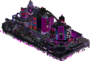
First Impressions: Damn this is so cool. The atmosphere is so dark and spooky and everything looks so nice. The log flume building is really highlighted as a set piece. I also loved the music and the atmosphere is great. Those purple flowers are slapping.
Foliage and Landscaping: This is the highlight of the park for me. Honestly, the is some of the best foliage and landscaping that I've seen in a hot minute. There is not a single thing I would change in the whole park. The rockwork looks natural, the purple flowers add so much colour, the trees are used strategically and effectively, Land textures are used amazingly and add a lot to the beachy areas. This scene below is a perfect example of the amazing execution.
Architecture: What is here is awesome. I love the log flume station. Everything else here is also really well done. I'm really liking all of the green and red roofs to add a bit of colour to everything. Also how tf did you guys make a NCSO half diagonal here? I'm genuinely blown away
This area is also just beautiful
I will say that I think something is missing architecture wise. I kind of wish more attention was paid to the station for the bobsled coaster. A big detailed center piece would have gone a long way here.
Rides and Coasters: No issues at all in this respect. The interaction that you guys pulled off is great. Every single flat ride has some sort of cool interaction and the log flume is absolutely great. The bobsled coaster looks fun and I love how it weaves throughout the whole park.
Overall: I think this park is underrated. I rated it 75%, this definitely deserved to win a high-ish scoring design
Some cool-ass DKSO right here. The water color is striking and immediately confirms the park name. In terms of sheer park content, I generally loved the map. The half-diagonal building in the rocks - are you serious?! That was amazing. In general, I am a fan of the rocks and the foliage in this map, although I think a bit of finesse with the foliage to swap out a few WW/TT objects would have made it even better. But that's a minute critique because I actually like the foliage the more I look at it.
For me, where I am left asking the most questions is ride design. I almost want to vote this as a design for the log flume, especially if it were more centralized! However, it's my understanding that the alpine/bobsled coaster is the design choice. For what this ride is, it is done very very well, with cool integration and a complex layout that forces the viewer to keep their eye on it. At the end of the day, however, the ride type is a bit limiting in terms of scope, excitement, intrigue, and aesthetics, even though it is done pretty well here. I landed on a vote of 70%, and I hope this park clears the design bar!
i like this aesthetic, new and really nice to look at. the dark tones do make it a little difficult to see what's going on, especially landscaping-wise... i almost could have gone for even more of the super bright colors in the foliage and things to break up the darkness.
plenty of really cool theming ideas but some parts did end up feeling a little haphazard. the area with the green roofs for sure. still, the map overall felt new and fresh, would love to see something even further palette wise, potentially towards nighttime in pandora kinda thing.