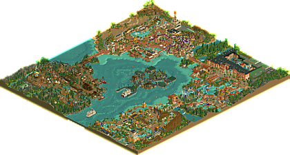
Park / Lake of Lost Worlds
-
 09-February 25
-
Lake of Lost Worlds
- Views 1,801
- Downloads 278
- Fans 12
- Comments 20
-
-
 82.50%(required: 70%) Gold
CoasterCreator9 85% yes Milo 85% yes Mulpje 85% yes Recurious 85% yes RWE 85% yes Scoop 85% yes deanosrs 80% no J K 80% yes pants 80% no Turtle 80% yes Xtreme97 80% no RobDedede 75% no 82.50% 66.67% -
Description
Welcome to Lake of Lost Worlds, your gateway to lost civilizations!
-
12 fans Fans of this park
-
Full-Size Map
-
Download Park
278
-
Objects
1
-
Tags
Holy shit that area near the river rapids ride station with the coaster and the maze wrapping around is so good man. I will leave a more detailed comment later but really great work and congratulations on finishing such an awesome park!
You know my thoughts already on this park (I'm honored you asked me to test, btw. <3), but I'll share some more. I do want to say though, I'm super proud of you for not only this park, but the RCT journey you've had. You've improved so much since the first time I saw your work, which was probably right before h2h8. Your ride design is so well executed on this map. Your previous full scale had my favorite ride from you up until this point which was the log flume simply because of it's design, but the majority of this map feels superior to that. The beemer is such a slick layout and the best you've created I think. I love the additions of the ferry boats from when you showed me the park before. It adds some much needed context. Much love to you Fred, and may your bus rides be joyus!
Oh yeah!!! First of all I like the pack included with your park: the nice little guide, the historical explanations etc... I like it, it gives you a warm-up and gets you in the mood before opening your park. People don't make brochures any more, it's a shame... The logo is nice too!
I think you've made a lot of progress with your rct, firstly the choice of palette is excellent, the rendering of the warm colours is very beautiful, especially in the red tones.
At first look, I was a bit sceptical about the island in the middle, but then I realised what a great idea it was, and the portal is wonderful! I also really like the way access to the different zones has been arranged here - very clever!
Babylon: I love the rendering of the colours, it's warm and that blue is beautiful. It's rare enough to be mentioned, but I really enjoyed watching Gilgamesh's layout. Rivers of Babylon is also very cool, I really like the coaster drop.
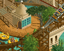
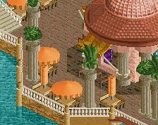
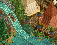
Atlantis: Once again, the colours are great, and the trident sculpture gets a huge nod. I would've pushed the submerged effect more, it seems a bit shy, looks like you didn't go all the way with it! The Great Flood station is very cool (Discobelix vibe?). The highlight of the show is of course Quest for Atlantis, and you show enough of it to give us a real feeling of immersion.
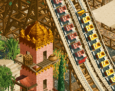
Wagadu: This red tower is superb, and I also really liked the diagonal layout of Pelican's Flight! My main criticism here is this band of landscape on the corner, which looks a bit sad imo, and the area also feels a bit emptier than the others !
Vineland: The mix of natives and Vikings is daring haha. I'm a big fan of Leifs Knarr and the shipyard around here. The architecture of Ragnarok is also really cool! Once again, I really liked the layout of Big Totem (what's happening to me?). There's also some really nice landscape work. If I had one criticism here, it would be about the very dark brown used for the Viking architecture, which is a bit opposed to the warm colours of the other zones!
Now some general criticism:
- I've noticed that you've made a good effort to use diagonals, a first step before you start using half-diagonals?
-You've also done a great job of adding details, well done! But I still think there are sometimes a lack of small elements to add variation. If I had one piece of advice: plan 1 hour (or more or less) sessions from time to time where you're going to make different pieces of furniture: little stalls, lamp posts etc... You'll then be able to dispatch them with sm
I don't know yet what rating it deserves, I need a bit of distance. But I can tell you that’s a great park, really really good job Fred!
I haven't reread my review, so maybe it's a bit of a mess and I'm not very good at that !
Edit : I've just realised that I haven't talked too much about the architecture here but it's really really cool, lots of detail work, it's lovely and very immersive!
This is such an enjoyable piece of RCT. I'll go area by area!
Babylon first, because why not! Maybe the blue is over-played just a little here, but there are so many wonderful moments. The Rivers of Babylon ride's drop out of the tower with the path underneath it is wonderful. Some great "back stage" details around there too. The flatrides in this area are done to a really high standard too. The boats play on Turtle's in herakleia with some lovely variations. I love the path patterns throughout - the G outside the Gilgamesh queue is a nice one too. The coaster flows very well but I wasn't totally sold on the RMC/woodie track mix.
Between Babylon and Atlantis it's a close call for me for area of the park. Abyssus I think is the coaster I enjoyed the most. The facade for Quest is wonderful too, with great little splashes of colour and texture.
Arabia feels to me like a really solid foundation that has some really nice details, that just needed to be threaded together a little more. For instance, there are a few different pergola styles in this area, and the one right next to the lake is to me by far the best. I'd have loved to have seen more of that throughout. The density of the foliage is really nice and some of the architectural forms are refreshing and very pleasant to look at. The water rides in this park are a highlight and Wild Wadi might be the best of them all - simple, but effective!
The Viking area to me is close to being great but in places washed out with too much of the dark brown. Where there are red and white splashes it comes to life, and some more great boats here, especially around the swinging ship. Again some lovely pergolas by the lake that I'd have loved to have seen echo'd at the back area of the park some more. The duelers remind me a lot of the 'phobia duelers in the original RCT scenario (forget which!) and that's a great moment for this park which does a lot of older styles modernized with better, newer objects.
The landscaping throughout is largely "LL"-style, but then there's also the tolsimir rocks, which to me creates a little bit of an inconsistence, and it doesn't help for me that they are one of my least fav objects. This was probably not one of the park's strengths, but I can also personally testify to the amount of time landscaping can eat up in the game, and I have a lot of respect for playing the game the way you want to and if that isn't using half diagonals or spending hours on landscaping, more power to you Fred!
Most aspects of that approach is so lovely to me and create a more classic viewing experience. It's a more straightforward but enjoyable build style; perhaps the relative lack of detail to the "meta" could have been countered with a larger map and more content, in chasing the spotlight?
Great work, I really enjoyed this and was so excited to see it drop - it didn't disappoint! This is a park anyone would be proud to have in their catalog.
Just a great park to explore. First, I love the Supporting documents especially the brochure. Adds to the realism and helps with the navigation around the map.
As for the park, really enjoyed all the little touches you added and attention to detail. I REALLY like what you did for the underwater portion. I could never do that and must have taken ages to do. Would love to do something like that with my project but would never have the patience to do that,
overall, really enjoyed the park and well done. You have come along way since your early parks. Thanks for sharing it with us.
For the love of God, FredD, I was like a child admiring your work (lol), which must have been a lot of work, especially the details and colors. The way you worked with the water was magnificent. The MEAT SIDES DRINKS was beautiful. You managed to create a harmony between the roller coaster and the path/objects around it, in other words, it's great. The paths, squares, bridges are all incredible. the boat is charming. I'm in love with this work, I could never do something similar. Your imagination and skill are to be congratulated. You deserve GOLD for sure. And congratulations also to SSSammy who somehow contributed something.
My full review will come later, but my initial thoughts are that this is a great, classic NE full-scale park with lots to love. Awesome work, Fred!
This would definitely be an easy spotlight for me, it's such an awesome park. 'The four corners based on real world location' park has been done so many times before, but the choice of mythological themes and places allows for a lot more creative freedom than usual for this park format.
As an example of this, I think the most interesting part of the map for me would be the Vinland section. It's so cool seeing a Viking theme and a Native theme mixed together and it works so well. I'm also a fan of the dueling Schwarzkopf... looks like something you'd see out of a scenario in a good way.
For the other areas, Wagadu is a cool theme, we don't see very many African themes and the landscaping for this section is incredible. The Vekoma suspended coaster is an interesting ride choice too. Atlantis feel like an obligatory inclusion with these kinds of parks, but it's beautiful nonetheless and has arguably the strongest coaster in the park with Abyssus. The queue for the ride is very nice as well.
Finally there's Babylon which is probably the highest quality part of the park imo. The foliage is beautiful, especially where it covers the buildings. The architecture is great and has some extremely good forms. The coaster's interactions with the paths and other rides are incredible. The blue and tan color scheme works perfectly. This is such a good section.
Overall, congrats on finishing a large-scale park like this on such a level of detail; most people would find a project like this daunting.
Okay, so like I said in my initial review, I do like this park. It has a nice, classic feel to it. Generally I like the theme of each area, though a small nitpick is I felt the Vinland area presents a cursory knowledge of indigenous American history - tipis were only primarily used on the great plains. That said, it was a cool area, especially with the Viking influence, and the tipis did not influence my score.
I went back and forth on my vote. On the one hand, here we have a classic four corners map with a central lake. The areas are well-themed for the most part. The ride design, frankly, was solid but did not stand out to me, with each anchor attraction feeling around 75% quality in terms of uniqueness, area integration, and theming, with a few exceptions like how the wooden coaster (Gilgamesh) worked itself into the Babylon area. That was awesome!!
My vote ultimately came down to how I weighed technical execution with map composition. For me the park was not consistently of spotlight quality in terms of its technical execution. It had flashes of brilliance, like the aforementioned Gilgamesh area and some of the facades of the dark ride, but many parts of the park felt solidly in the 70-75% range in terms of quality. However, I still had to weigh that against the fact that this park is a well-made, full park, which almost pushed me to 80%.
The reason I did not ultimately make the push to 80% on this park is because the macro was very safe, and, at least for me, did not demonstrate the requisite complexity and finesse of a spotlight. That is to say, each area is very much on its own and isolated in each corner. It would be easy to photoshop each area and make it a seperate mini map totally on its own. For me, when a park is wavering between high 70%s and low 80%s in terms of technical execution, and at the same time does not demonstrate some of the more complex macro techniques that we often see, like area blending, transition areas, advanced park infrastructure, double-area ride integration, and immersive landscaping, I just barely didn't vote 80%.
For that reason, I landed on a vote of 75%/no. Trust me when I say I took my time with the decision, and I had to ignore my strong personal liking of your character, Fred, and the understanding that you have poured so much into the park. At the end of the day, however, it's my job as a panelist to reflect an accurate score for the interest of integrity and fairness to all the other parkmakers. With that said, I am sure I'll be on the lower end of the vote, anyway, and that you'll get a great score. Regardless of how it scores, this park is a great achievement and was very enjoyable!
To reiterate, my favorite area was absolutely Babylon! That shit was awesome!
The macro of this map is complex, exquisite, and has the finesse of a spotlight map. Great work Fred. This is classic NE at its finest, and absolutely a spotlight worthy park.
Good for you for not caving to the pressure of adding crunch, half-diagonals, and build styles for the sake of it. This park feels very Fred in the best possible way.
I know this park was an absolute labor of love, and I hope you're rewarded for your immense efforts. I know there were many times where you refined and rebuilt sections of the map after receiving feedback from others, and your dedication truly shows. I'm proud of you for bringing this park over the finish line!
crazy good! It's all you as well, as I prefer that the most. really shows "the man behind the mask" so too speak. I can't even imagine how many hours you have spent on this dude, kind of blown away by some of it tbh.
Especially the entrance.
I'm not sure if that's been done like that before or not, but it's something I have personally never seen.
I think idea's and shit like that opens closed doors, Also inspires heaps of plebs like myself.
You're style is O.G as fuck, I feel like this is how it is suppose to be done in a sense.
I really appreciate dudes such as yourself, that can start and finish something like this honestly.
Truly an amazing feat, standing ovation type shit!
Also lol.
the Viking boats being built in the ship yard are all time aswell.
I love these little aspects that are through out this park the most.
I love the clean and regular diagonal style of this, the architecture has some great trim work, great object choices all around for a look that's 2005-ish (In a good way, love that era) but enhanced with modern features.
And I think the color choices are fantastic, some of my favorites, especially in the Babylon and Atlantis areas with how the brighter colors pop against the beige and stone textures, with the palette chosen it's vibrant and colorful yet not overly bright at the same time.
Ride design has some great moments, solid layouts, great interaction and some great clean support work. And that dueling coaster is sawyer-like with the timing and interaction there, feels like it'd be right at home in a title screen.
Only real thing I'd say for critique is maybe a little more going on around the backstage areas or some extra context of the park with the outside world would've been nice, but that's very minor to me.
And I'm impressed by the level of polish. Minimal glitching, clean presentation and supports that rarely clip into or leave gaps with the track (Something I can never get right).
Overall a ton of fun to look through this, never get tired of seeing this classic style of RCT.
Awesome release! I loved looking through the brochure, made me reminisce of being a child, looking at the phantasialand map! Its such a charming way to give a small overlook into the park.
The coaster lineup is absolutely fantastic. My favorite is probably Abyssus, awesome layout and supports, with Gilgamesh being a close second, because of the teriffic map integration and interaction! I only wished the titan track would align a bit better, but thats not your fault. I also want to mention Kaya Maghan, with its beautiful color scheme. That dark purple makes it pop so nicely against the beige - stunning!
For areas, I think i like them about equally as much, with only Vikings/Natives being a touch behind the others. I like that it stands out from the rest in terms of color and atmosphere, whereas the others all feel a bit similiar in that regard. However a lot of browns and darker color make it feel slightly more subdued. Big Totem is great, but i think the dueling coaster could've maybe had a different, more contrasting color to make it stand out a bit more.
For architecture i think you did a very good job overall. Highlight here is the Quest for Atlantis building for me. The structure itself maybe is a touch large, but my god the facade is amazing! The lack of half diagonal buildings did not subtract from my enjoyment, though i would not have complained if they were used either ;P
From what i can tell with my limited knowledge you did a fantastic job of capturing the styles and architecture of these areas!
All in all, an absolutely fantastic release! I heard you worked on this park for quite a long time and it really shows with the amount of high quality content and love put into the areas.
Firstly, congrats on the park Fred! It's quite a beautiful park and the best we've seen from you yet. There's a new level of maturity and style to the park and all so well done.
I think I'd like to start with things I didn't like as much to get that out of the way. Overall, the park layout is a bit confusing to me having a U-Shaped park and the park entrance is via boat. While I do like the center island's theming, it's still a bit of a swing and miss for me. Also not as big of a fan of the Vinland area. I can see where Pants is coming from, but I also just think theming-wise, it's the weakest corner of the park. The racing coaster is very neat though.
So on to the good stuff! Coaster line up is quite nice. Kaya Maghan and Abyssus are quite fun. I'm always a sucker for good wooden coasters, and Gilgamesh fits that billing. Really well integrated into that corner of the park.
In terms of the theming/immersion, Babylon and Wagadu are top notch. Who needs RoB when you have Fred's Babylon? Would enjoy walking around these areas - dense theming, lush foliage, great sightlines, super colorful. Also, there is a lot of consideration to things like queue covers and spots where peeps can see major parts of rides.
While I do agree that the Atlantis show building facade is a bit too big in terms of scale, I totally get it. After getting flak for my Pirates of the Carribean building, I can empathize with trying to make an immersive indoor ride while balancing scale and believeability. The ride theming is solid and I love the added touch of a restaurant. Also, kudos for the fireworks guy on the roof.
Again, congrats on another wonderful park. A lot to be proud of here.
fantastic achievement finishing a map of this size, and unlucky not to get spotlight in my opinion. I can understand not, as personally I was pretty close, but I felt it was strong enough to fall on that side of the line.
it's a hard park to score when ranked against other recent parks - there's obvious areas where this was not as intricate or detailed, and i'm guessing that's just not something you enjoy doing in this game, which is perfectly fine. just unfortunately means that you're being ranked on the same scale as more detailed work. that's just part of the game i suppose.
now, onto the park itself, which i very much enjoyed. my overall takeaway is that this is a person who really loves building these themes. there were really fantastic parts of each and every area, with a very consistent quality level throughout (not always easy with large parks built over time). there were a few screens that were just magic - the station/launch/colors of Kaya Maghan, the station/queue peninsula for Abyssus, the station for Gilgamesh (actually i'm noticing a pattern here), the dark green colors on the central hub area.
that pattern is interesting, and shows a real focus on the more important areas of the park - the rides, and the stations of those rides. i'm sometimes guilty of letting stations/queues blend in with the theme, but you've made them stand out and feel special, which i really loved.
i also really liked the Big Totem ride - really unorthodox but very interesting. that whole area probably falls under that description actually. not sure i totally understood it, and maybe would liked to have seen the two themes meshed a bit more, that could have been interesting.
i would guess that the thing holding some people back from spotlight on this one was that some areas of the map felt a bit awkward. mostly a compositional thing rather than an actual quality of work thing. the areas are quite a long way from each other, but have to be linked, so you have these long bridges between areas that felt a little underwhelming. you could have fit another couple of whole areas in those spaces and fleshed out the map a bit, although i completely understand wanting to get a park of this magnitude finished. maybe just a planning thing for your next (hopefully) full scale solo.
one other overall takeaway was "here's someone who understands theming, colors and atmosphere". really really strong, and made me want to build with you someday!
What a park! so proud to have helped in the little way i did. I was very impressed with how much attention you paid to each area - nothing felt neglected, which is a sign of your pride as a builder.
I sense you were eager to see this finished, which is relatable and respectable, though i think with some more feedback sessions and letting it simmer for a week or so before submission would have allowed you to reflect a little more. for example i would have loved to have seen the atlantis theme pushed further like we discussed in the stream and others have suggested. that being said i would rather have a released fred park than an endlessly redeveloping one. so this is definitely the lesser of those two evils and i respect the call you made.
i know you voiced a small concern that maybe the lack of modern meta features would hold this back, but i hope how close to the line you got proves that no one should just jump onto the trends just because they're big. there are no replacements for solid fundamentals, and FredD proves that. I don't think chucking a half diagonal in here would have changed the outcome if it wasn't part of your vision.
such a cool concept executed to a lofty quality. keep doing your thing man, we're all the richer for it