Park / Wind Wawardward Voyage
-
 02-February 25
- Views 1,128
- Downloads 156
- Fans 1
- Comments 11
-
-
 68.00%(required: 65%) Design
SSSammy 80% Milo 75% Recurious 75% pants 70% Scoop 70% Terry Inferno 70% deanosrs 65% Liampie 65% Mulpje 65% posix 65% CoasterCreator9 60% RWE 60% 68.00% -
Description
Therty and I made a park.
-
1 fan Fans of this park
-
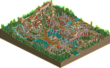
Full-Size Map
-
Download Park
156
-
Objects
3
-
Tags

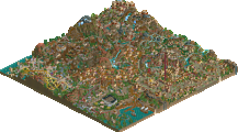
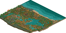
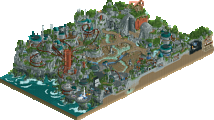
Main coaster is really good, some nice interaction and sweeping turns over the water, some cleverly done supports and overall nails the Arrow suspended feel. Like the choice of an open station too.
Park had a few rough edges to me, like the volcano rocks being a bit repetitive and maybe squared off, but there's a lot I like, the supporting rides and their bases, the town in the corner which has a which has a really nice color, texture and building shape combination and those stairs.
I really love the coaster - the layout itself it smooth and has some great interaction points. Supports are also done perfectly. Though I think I enjoy the water coaster even more. Such a perfectly executed little ride. The landscaping and rockwork in that corner are also top notch. Big fan of the flat ride style throughout the park. Each one has just a bit of design flair added to really elevate the style. I particularly enjoy the flume track underneath the swingers. I also really like the use of the pizza stall roofs throughout the village. One suggestion would have been to expand upon the color usage a bit. The yellow awnings used at the coaster station would have looked really great if used throughout the park. Overall, the technocratic use of beige has won me over and I think you've succeeded in creating a beautiful, well balanced map.
Loved to see this in-game after seeing the DK video. I love the lay-out, it is so good! I like how it uses just a small lifthill after the station and afterwards goes deeper, taking full use of the terrain. The coaster is very flowing with lots of cool turns and twists. Would love to ride irl.
Custom support is aced, done very clean. The open station is nice, but I'll never be a fan of those objects used there. The wave swinger was cool, just as the supersplash. The Italian village was very nice, lots of atmosphere there with the narrow streets and height differences.
But those stairs, wow, so clever! It works so well. Really enjoyed this map, design for me.
Decent map. I enjoyed the open station and how you integrated the flowers. Also looks like some of the NCSO tricks have won in cleanliness here which is nice. I also thought you captured the mediterranean vibe decently. Just some parts were still very very basic however, like some of the open paths with not much to them. The main ride itself was also somewhat boring and uneventful.
im going to be a bit anal here because you guys are plainly skilled enough that i will highlight some next steps
in terms of the big picture, i think it would have benefitted from some more path going to the map edge implying a wider picture beyond the map edge. there is only one very understated entry point, and although the view as you enter the area is awesome with the beautifully framed turnaround, it could do with a bit more fanfare as you're leading out of a chokepoint into a contained section.
the main coaster is also kind of secluded away on narrower, more contrived pathways. having more of an "artery" go to the headline ride rather than a "vein", usually helps with the balance of an area.
then in the back there is a lovely dense bunch of buildings, however it feels like theyre all swept to the back into the corner - if there were a little more plaza to it, that would help! and also connecting that area to a map edge would imply more beyond and make it feel less cramped.
i wish i had more time to make more of a comment! great wortk and ill be back to say all the things i enjoyed
great work!
Ah some interesting ideas Sammy, thanks!
I think this map has a lot to like! I very much enjoyed the Italian-looking town in the corner, and the overall colour scheme on this side of the map. Rides like the Coastal Plunge and most of the flats are very nicely done, it's clear that an above average effort went into making these rides interesting. Successfully so. I must say that the main ride was fairly unspectacular, and I thought the bright red was dissonant. Some good details that stood out to me are the sign for the gyro yacht itself (though way too large and poorly placed), the custom trees, the open air station with flowers as posix pointed out, the terraced area with stairs alongside the Coastal Plunge, the seating area here with the red parasols on a wooden deck also complements the aesthetic very nicely. I also have some criticisms outside those already mentioned. For how much effort went into the theming, it'd be nice if this map actually had an actual theme or premise. Coastal Plunge actually having nothing 'coastal' about it to me is evidence of how random this map feels. The volcano rocks are always an eyesore to me, and some of the ncso-isms I think were not mitigated well enough - unintended path texture variations (steel blocks) for example, but glitchiness in areas that should be simple as well. And... that 'logo'.
Narrow 65% from me, but I'm happy to see it win. Congratulations!
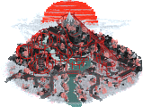
```Somewhere along the coast of the Mediterranean lies the rocky cliffs and thrills of Verdalia Cove. Its star attraction, Windward Voyage, is the latest from Arrow Dynamics which takes riders soaring over this coastal beauty.```
I get your point though, it could certainly bit a bit more cohesive overall.
There are also plenty of rough edges, it was finished on a flight from DFW-CDG ?
Thanks everyone for taking the time to look at the park and leave a comment, I always enjoy reading them.
But i cant explain the logo, it’s unhinged.
haaa I'm crying failed to load game - invalid data
Loving the Ninja inspiration here! The Therty Step trick works wonders as always and I think is a better implementation than the first time I saw it in mine train. Like Posix said, the Mediterranean vibe is captured exceptionally well and I love the interaction that the coaster has with the pathing elements and landscaping. I think the one thing I'd criticize is here is the station for the main coaster. I do wish it were more defined and less "spamy" if that makes sense. Overall though it's a very solid map. Keep up the good work!