Park / Himmelfall
-
 12-January 25
- Views 1,793
- Downloads 223
- Fans 1
- Comments 14
-
-
 71.00%(required: 65%) Design
J K 80% bigshootergill 75% posix 75% Recurious 75% Terry Inferno 75% Milo 70% RobDedede 70% RWE 70% Scoop 70% chorkiel 65% deanosrs 65% Turtle 60% 71.00% -
Description
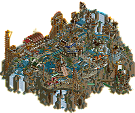
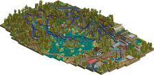
Welcome to Himmelfall, a steampunk mountain village that completely lives off the energy of a single huge waterfall. And as if the rocky landscape, steep cliffs and blasting waterfall were not already exciting enough, the citizen also decided to built a bronze rollercoaster throughout their land transforming the village into a tourist attraction for thrillseekers.
Built for the DKMP Triple Launch Rollercoaster Contest, RCC67.
But since a triple launch was too ordinary for the contest i spent a long time shoestringing the coaster to make it a backwards launched quadruple launch with a holding brake at the very top instead. Certainly more of a fantasy layout, but i still hope you enjoy the ride hacking and busy steampunk setting! -
1 fan Fans of this park
-
Full-Size Map
-
Download Park
223
-
Objects
2
-
Tags
Similar Parks
-
Hakugei
-
Prairie Fire
-
VooDuel
-
Laguna
-
Expedition Amazonia
-
[H2H7 R1] Circus Circus & Adventuredome Atlantic City
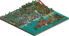
![park_3324 [H2H7 R1] Circus Circus & Adventuredome Atlantic City](https://www.nedesigns.com/uploads/parks/3324/aerialt2970.png)
Another big welcome to NE with your first release, this feels pretty epic! More detailed comments coming.
I really like how much motion is in this park, tons of animated objects, hacked ride effects and animated peep scenes all add a bit of action along with some dramatic waterfalls and heights make this a lot of fun to explore. Some cool ride design too, love the ride mechanism and functioning holding brake on the spike, also some nice interaction.
Very old school DKMP design, lots to see and certainly follows a similar formula to pack it with as much content as possible. The steampunk-esque theme has certainly been done plenty before but this is one of the better examples of it.
Coaster is pretty solid, I definitely like a good sprawling layout with lots of interaction. I find myself enjoying the stuff around the edges of the map most. I do think the architecture can get a bit bland in spots; it looks great as a whole from afar, but some of the structures up close are perhaps a bit formulaic or underbaked
There is an absurd amount of content in this map, the time and love that went into it really shows. I think the coaster hacks are excellent - the holding break on the swing launch is such a beautiful touch. There are so many great scenes and little flourishes it really is fun to zoom all the way in and just explore.
I have 2.1 criticisms:
1) I think there are 2 angles of this map which are far stronger than the other 2. the 'back' 2 angles from behind the waterfall are a bit of an afterthought, which is OK, but with how packed and detailed this map is I wish it shined a bit more from all 4 angles
2) I think the color choice for the coaster could be improved - as it stands the layout is a bit hard to follow. Perhaps a contrasting color would help separate coaster form map and help it to stand out.
2.1) The default color scheme green you used for a few of the dinghy slide tubes hurts my soul (a criticism given in jest )
)
Overall a lovely park which oozes character and is worth taking the time to load up and dig into. A really fun map, and something you should be proud of - sorry it took me so long to write a review.
And congrats on your first release on NE!
I agree with both the praise and criticisms above. A different usage of color for the coaster would help break up the murky-ness. My general rule of thumb is to have the coaster color contrast the background. Still, a solid park with much to look forward to with future entries.
I really like how full of life and energy this is - cool stuff!
Very nice debut. Good to see new talent.
Good detail level, but mainly a good ability for aesthetic object combination, which despite being so dense allowed room for abstraction. That was lovely to see and is a rare skill nowadays.
I see you have a desire for micro, and your work reminded my of Butterfinger or Splash-O, mixed with some Korean influences in terms of ride design.
I think I would suggest to become more purposeful in your design choices. Sometimes the object density falls into a spammy and forceful formula.
I agree with Posix. It's not easy to do such a difficult job and at the same time create harmony between everything. The objects were very well placed, it turned out well. I loved it.
This parks feels like Constellations and Bugs and Bots had a baby.
Awesome theme done so well, loved the coaster storming through the area and the custom supports were chefs kiss.
I wanted a little bit more from the supporting rides even though Walkenkratzer was so well framed on that coaster element.
The tower pistons with the rapids rides were so fun, I would've doubled the amount of these across the map as they were pretty iconic.
Some items on the map kinda snapped me out of that steampunk illusion specifically the dolphin and the elephant fountain and the bobbing buoy. I think something more creative would've been great replacements.
Would love to build with you some time, you went there with this park and I feel it's pretty iconic.
busy! such a busy map, appreciate the time and energy put into creating something so full of life. i think for me, it fell a little short aesthetically, but the skill level is definitely there.
the coaster supports were one area that i felt shone quite well - lots of thought put into those. i wish the coaster had a color that made it stand out a little more, and i think with some scenery object-choices done differently next time, you could have a more cohesive theme.
good to see someone new releasing good work, thanks!
Very busy, dense work that mostly works but sometimes can be too much as well, as others have noted. I was overall a fan of the coaster and how it interacts with the rest of the map. You have very, very strong micro technical abilities when it comes to NCSO, which I think may even be lost on a few people here. Some of the things you've done on this map on that front are nothing short of brilliant. I think if those abilities were combined with perhaps some more thought-out map planning and eye for sight lines/macro, you'll be an absolute powerhouse. For now, this park is really solid and fun. Nice work.
Nice work!
Thank you all so much for the accolade, but even more so for the nice words and feedback! This was a huge passion project for me, so this really means a lot! I had a blast creating a fantasy map like this and filling it with life and intricate machinery to fullfil that shoestring itch that i love so much. I thought it mightve been a bit too out there, chaotic and unrealistic, but im glad you all seem to enjoy it!
Great score for your first accolade, the only way is up! One to watch.