Park / Le Tonnerre
-
 29-May 09
- Views 6,168
- Downloads 363
- Fans 0
- Comments 25
-
 62.69%(required: 65%)
 Design Submission

RCTFAN 85% posix 70% Xcoaster 70% CedarPoint6 65% Evil WME 65% Milo 65% nin 65% 5dave 60% Casimir 60% chapelz 60% Fr3ak 60% geewhzz 60% zodiac 60% Magnus 55% Kumba 50% 62.69% -
 No fans of this park
-
 Download Park
363
-
 Objects
182
-
 Tags
Tags
![park_4392 [MM3 R1] Audubon Society's Field Guide Series I - Black Bear](https://www.nedesigns.com/uploads/parks/4392/aerialt4157.png)
![park_4129 [H2H8 R5] Disney's Frontierland](https://www.nedesigns.com/uploads/parks/4129/aerialt3870.png)
Airtime Offline
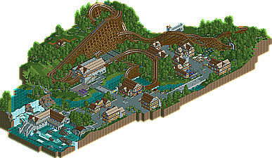
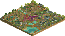
I just think the woodie could have been longer. I didn't like the entrance sign arch near the merry-go-round, I think it was to bulky. I think the main probablem with this is there is no hardly no land textures apart from grass and rock. Try and use a mixture of mud and grass underneath the foliage, I think it'll make stuff like this loads better. And I think blue was used to much as well.
As I said I really liked this I think you did a great job with it! I can't wait for what ever next you cook up.
Oh and heres your camera:
I don't see how this didn't win design..
I like it, but i don't love it. I dislike the repetitive buildings. Regardless of the fact you were going for a cohesive theme, the buildings should be more varied than having different color windows.
FullMetal Offline
Thanks for the comments everyone!
Also, Airtime found the camera, so keep your eye out for a PM with the screen inside! (I didn't think anyone would find it that fast. I thought I hid it well...)
@Comet: I did change the color of the scrambler, I just forgot to add a screen of it. It's more of a grey color now.
Edited by FullMetal, 20 September 2009 - 08:04 PM.