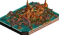
Park / Bi Zou Long She
-
 12-January 25
- Views 1,775
- Downloads 200
- Fans 4
- Comments 15
-
-
 69.50%(required: 65%) Design
Mulpje 75% Recurious 75% Terry Inferno 75% Xtreme97 75% J K 70% ottersalad 70% Turtle 70% deanosrs 65% RobDedede 65% RWE 65% Scoop 65% posix 55% 69.50% -
Description
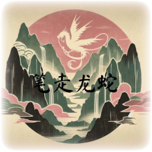
Therty wanted to make a realistic take on Soaring With Dragon, and I had this idea back of my mind for a while.
So we decided: why not put it in a Chinese painting? Hope you enjoy exploring this small experimental park.
"The aim of the traditional Chinese painter was to capture not only the appearance of their subject, but also its inner essence, its energy, its life force." -
4 fans Fans of this park
-
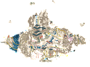
Full-Size Map
-
Download Park
200
-
Objects
2
-
Tags

This is beautiful guys, congrats on getting this map created!
Dreamy AF
Really classy work. Screenshots I saw a few weeks back don't do this justice. Much much better viewing in game. Very dreamy and feels very not-RCT. Can't find really much at fault here. With the beautiful scenery/landscaping, this map is calling out for a long adventure queue a la Ancient Worlds or Ririku. But that's just my wishful thinking. Good seeing more work from you BPW and same goes to you Therty.
This made me want to pick Stonehenge back up. Yeah, consider me a fan.
Per se quite decent, and good use of the new track pieces with what was an interesting layout, but most unfortunately this is just another over-palettisation-victim for me. The colours obscure the creation way beyond a negative tip off, and it just looks bad. The dreamy intention doesn't even manage to come into play for me.
I changed the submission category to Design. Panelists please check it works correctly when the time comes and ping me if not.
I don't have much to nitpick. Maybe the layout could have been slightly more elaborate or less square, but I think it all works in the context of the park. Well done.
Yeah i just straight up dont get the palette critique here; this is a very recognizable look and one that I think should be celebrated for it. But yeah english II or bust, do better.
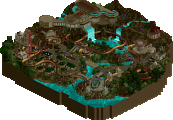
Solid layout, neat effects with the coaster dipping below the clouds. A few transitions are a bit drawn out for my taste, but the core elements are good and have nice interaction with the landscape. I do wish there was a bit more gridbreaking here, I agree with the sentiment of it feeling a bit boxy, but it doesn't necessarily detract for me.
Argh I'm torn with this one. On the face of it I love it, great palette, artistic touches throughout, beautiful playoff between the foliage and the clouds and the mountains, it really is great blending into this dream like atmosphere.
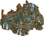
The large elm tree for the clouds was great and the Japanese junk ship on the water looked so serene.
I struggled with the peep colours at times, some were fully committed to the palette but then there was a few that had coloured outfits without the stylistic effect, felt a little strange.
I also found myself loving mostly everything on the map except the main coaster. It just didn't have the impact or vision that the rest of the park had.
After this I saw one custom tree in the mountains with the flower power rides as dancing leaves, wow, jaw dropping moment.
Big tip for next time, when you find these jaw-dropping touches of brilliance across the map, execute the same idea again elsewhere to start to bring that visual language up a notch. Make me remember the entire park, not just the micro.
Specifically;
+ More junk ships on the water or in a dock
+ More custom trees on the mountains
+ More dancing petals in the trees
+ More of those red dragon heads on the archy helping it break up the squarer shapes.
---
70% for me... just. Massively bought into the style and artistic vision it had to bring this park together but I was really missing some iconic rides to let that final score soar way about 70%.
I'm willing to engage with this park on its own terms, and I respect its commitment to the Chinese Painting idea. Where I think there could have been improvement is actually with the palette + color choices. Traditional Chinese paintings have this sort of brownish tint to them based on the material on which they were/are painted that I think is missing here. The main contrast in traditional Chinese artwork tends to stem from very dark blacks, blues and greens, with pinks and reds to add pops of color. The color choice of yellow for the coaster, in particular, detracts from the aesthetic experience for me. It feels like a typical Chinese coaster plastered on top of a serene aesthetic, and frankly it's not my favorite combination!
I think I also would have liked to see the character drawings in black only. The reason I am being so picky about color choices and aesthetics is because that's the main goal of the park, so it seems.
As for the park itself, it's quite good. Despite the blended colors (in general) the viewer gets a good sense of scale and depth with the landscape, and the coaster has a fun layout. I actually like the invert more aesthetically, but the yellow coaster has a better layout. I think making the coaster supports dark brown or black would have helped a lot with contrast, as well.
Sorry if this all sounds so picky. Maybe I'm just in my grumpy era. This park is really cool, and I appreciate the idea. There is a lot to like here, especially the temple section around the spinning ride called "Inner Peace." I thought that temple was way more texturally interesting and well-blended into the park overall.
i think JK's feedback is really relevant here - my favorite parts of this were little "wow what a good idea" moments, but there was only one instance of them on the map, so they didn't feel totally integral to the theme.
the pink tree with the moving ride as leaves is the best example - this was an amazing visual, added some movement to the map, stood out as a pop of color. i really wished you'd expanded that idea and made it such a key part of the theme that when people think of this park, that's what they remember. as it is it was one tiny part of a larger map that got kinda lost amongst a bunch of other parts.
that said, overall i really appreciate seeing something new and unique. not super familiar with the reference material but the end product is definitely striking and overall aesthetically strong, which should be the base question (does it look good?). great work appreciate you guys tackling this idea and making a great end product.
Really like the atmosphere of this, the peaceful and surreal feeling. The palette may be intense but I don't think it's too much as it really works well with the concept, I also think the pops of color for contrast help with readability. Coaster itself is really good with how it's wound through the map, some really cool interaction moments and nice themed support work. Really good pacing too.
Thanks for the votes, comments and the little red ribbon NE'ers.
I'm glad some more people got to experience our park - probably the most fun I had building something in 2024.
I’ll also point out one of the things I love most about the park (that the other comments didn't mention), which is that the high up floating clouds blend into the map when you rotate it. Each one creates a little “new landscape” in a part of the map from a different angle, so they not only don’t obstruct any views, they enhance each rotation.
Appreciate all the comments! I figured the palette would be a "make or break" for many people. Personally, if it can provide some kind of reaction, it tells me what you're looking at makes you *feel* something, and that's something I like to go for in my submissions. Messing with the void and doing weird RCT builds is usually where I have the most fun when playing, so I think my next submission would be something similar although I have no idea when that will be. I spent a lot of time in 2024 building between Busch Gardens Egypt, head-to-head 10, Fun Spot Atlanta, and some of the collaborative designs which was all fun, but I need some fresh air to come back with cool or fun ideas lol.
I hope you all enjoyed what you did see in this park.
In light of Stonehenge finally finished, I’d like to revisit the map that inspired me to pick up the pieces, and actually post a review as to why it’s so good and inspiring to my own work.
Gonna kick things off with the fact I disagree with all the dissenting opinions. There is a claim that traditional Chinese paintings have this brownish tint to them based on the material on which they were/are painted. This is not a fully accurate characterization of the art medium. Traditional Chinese painting is taught by studying and copying masterworks. After taking a visit to the Cleveland Museum of Art, I came across a collection of paintings by Arnold Chang, who was inspired by Dong Qichang. Dong originally had quite a few paintings without the brownish tint in his Comparatives Landscapes in the Manner of Old Masters.
Arnold Chang has a collection of paintings that not only deviate from the aforementioned description, but took up the vast majority of the Chinese painting exhibit. Some notable examples include Mapping the Universe (2013-24), Reclusion (2020), and provided below, Chilly Mountains (2020) and Secluded Valley in the Cold Mountains (2008).
If anything, Bi Zou Long She actually has more of a tint to it than the aforementioned works, while also providing something fresh and unique with color.
As others have mentioned, the Sakura pedal ride is outstanding. It’s a subtle, yet impactful addition to the park. Seeing 2 more of the same style, one extending from each side of the tall mountain, could have added some more depth, but I don't think it would have made a tremendous difference in score.
I think the palette is even more impressive since it was created with the landscaping in mind. As a whole, it’s the best topography I’ve seen outside of full-on CSO. The textures are smooth, nothing looks grading or noisy.
The coaster is good. The best parts for me are where the track changes color, as it dips in and out of the clouds, and the interactive moments with the landscape (the ending comes to mind). Changing the overall track color from bright yellow to light water would have enhanced the picture. There's better coaster layouts, like Teutonic Plates in Harmony, but I think this does a nice job being integrated into the map.
I can understand a park like this caused some division with opinions. It's striking, and probably not going to land with everyone. But the fact this scored below 70%? I'm not sure what was going on there, with all due respect.
Reading the description for this before opening the park was key for me and how I wanted to make sure I experienced it how the creators intended and my thoughts accordingly.
This really did capture a Chinese painting in RCT form. The color pallet, the various shading and the overall atmosphere for me really worked. Sadly, this opening view is the money shot for me but I wish the other view provided that same feeling but it didnt pan out that way and I feel that was be design as a painting only has one side. Overall, really gorgeous creation. Well done