Park / Mystic Mountain
-
 18-November 24
-
 Mystic Mountain
- Views 794
- Downloads 35
- Fans 2
- Comments 8
-
-
 76.00%(required: 70%)
 Gold
Gold

Milo 85% RWE 85% chorkiel 75% deanosrs 75% G Force 75% ottersalad 75% pants 75% Recurious 75% Terry Inferno 75% Turtle 75% Xtreme97 75% posix 70% 76.00% -
 Description
In the hilly forests of Mystic Mountain, build a theme park from scratch.
-
2 fans
 Fans of this park
-
 Full-Size Map
-
 Download Park
35
-
 Objects
1
-
 Tags
Tags
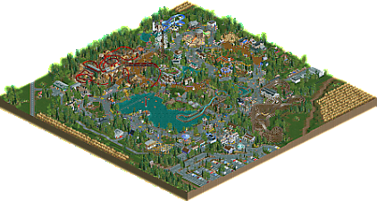
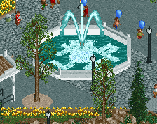
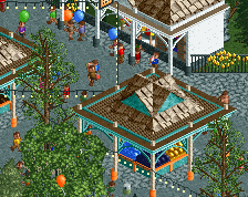
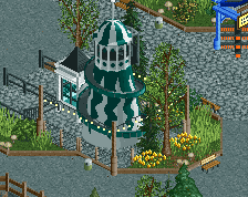
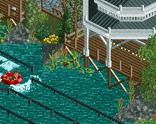
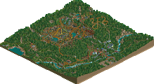
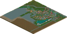
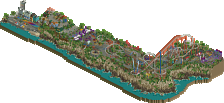
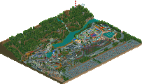
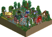
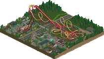
All the little waterfront scenes are so atmospheric and cute, just really nice use of a mix of foliage and in particular love the flowers. The pond by the car ride might be my favorite. The little entrance plaza nestled on the low ground there is also just really aesthetic.
The aesthetic really captures that classic RCT scenario feel, from the ride design to the vibrant foliage and landscaping to the colorful architecture, it's a great mix of nostalgia and modern objects and building methods.
Tons of fun to explore, so many cool moments scenes like the RC boats with the mini lighthouse, the gardens with the jumping fountains and all the little stalls, midway games and vendor carts. Also noticed the things like money being enabled and breakdowns sometimes happening, just to add to that retro feeling.
Always great to see a new Jappy park appear. As ever I don't know the scenario it's based on, but it does feel very classic rct. This little park is so charming, coming over as a little local park that locals love to flock to.
While you might disagree with this, I do think this park has some of the best aesthetics you ever build. My favorite bits are the entrance (plaza), the area between car ride and the flume (seems like a nice resting point to walk and hang out), splash landings and the restaurant nearby, the plaza in front of the woodie with the arcade games, the car ride with the pond with rc boats... Lots to love!
As you know, a little less fan of the invert which sticks out weirdly in this parks catalogue. How many fires did this park had to get to recieve so much insurance money?! I'd also wish you went with grassy ground textures, the sand sticks out in a not so good way. Nonetheless, the theme is CRATE. C R A T E!
Lovely park, very enjoyable to explore. Have to admit it's a nice breeze of air between some of the super-technical parks we've seen lately this year. A good classic rct park. Thanks for that.
Congratulations on this release Jappy! This might be one of my favourite parks of yours, up there with Bumbly Beach. I think I just really like when you tackle amusement parks which are lighter on theming because then your signature style shines through the most. You're really good at making vibrant and atmospheric path scenes and midways. Highlights for me are the entrance, carousel + swinger plaza, the area outside the woodie station and the gardens on the hilltop.
This was a very nice cute little park. Highlight for me was definitely the TNT station. That station was so fun and so well made. I did think the pacing of the ride was a bit off, especially through that roll.
I also really liked the log flume,it makes for a nice eye catcher on the lake.
I also like that this is a scenario adaptation, although I do feel like it strays a bit to far from the original scenario to really count.
Overall a really fun park though! Congrats on the release!
What a wonderful park, Jappy!
Upon opening the park, the park entrance is quite lovely. While your Laguna Adventura entrance is bigger and more detailed, this has a higher coziness factor that is hard to ignore. The subtle theming throughout definitely feels very "Jappy" in a good way. But also reminds me of early G Force work too, also in a good way. There's a familiarity to it all that is your signature style. The midway games, stalls, booths, etc really elevate this and feel as a part of that forementioned signature.
Thunderbolt and Scratch are less memorable rides compared to TNT, but they feel appropriate for a park of this scale and size. Splash Landings is a bit interesting of a ride choice which I applaud for it's uniqueness.
Going back to TNT, I see where Fred is coming from, but the thinly themed queue seems on par for an amusement park. Slap down some shipping containers, some boxes labeled TNT, paint the coaster red and viola you got a coaster. It works for me!
I might be in the minority here but my favorite ride is Happy Hill Highway. That ride is class.
This park was full of charm. The sweet little entrance made the carousel organ style sound ever more nostalgic and warm. Overall the atmosphere was incredibly relaxing and inviting. It brought the classic strength of RCT to the fore which I really enjoyed. Thanks a lot for this little gem Jappy.
This park was not meant to be a scenario recreation in the same way as Canary Mines or Bumbly Beach were. To be honest, I just picked the name because I thought it sounded good! No further relation to the park! Am I glad the location of TNT in its rocky setting sorta corresponds to the quarry in the original scenario to give it at least SOME relationship with my park!
This park was first and foremost as an ‘easy’ project after Laguna Adventura. Laguna was constantly focusing on hyper-theming and detail. I was sick of it and just wanted the classic theme park feel. Without too much hassle like special rocks or bothering with theming. Look at Scratch for example, the ride doesn’t even have custom supports. Or the lakeside itself. All just good old-fashioned landscaping, with just a few 1k rocks.
The idea came once again from a collection of park ideas I had during a dream. The twister on the water for example came from this, and more infamously: the invert. I dreamt about a red coaster that was inverted, but also could go sideways, slid through a rocky landscape and had the weirdest theme ever: C R A T E S. Just wooden crates! While incredibly random and sadly no sideway sections, I matched the feel I wanted almost spot on.
The rest of the park came from an assortment of inspiration. Both real life (Alton Towers for the entrance, plenty of real life American parks for shops & stalls… Thank you Google Streetview!) As well as RCT parks: Baker Lake and early G Force for instance.
One thing that I always find important in pretty much all my work is capturing the original RCT feel. The graphics by Simon Foster are something I hold close to my heart as those have that essential RCT look to them. That’s why I like to use original base game objects, mixed with objects that have their origin in these such as the tree selection. If you look closely, you’ll spot the good old wooden mine huts in certain locations, or the mine theme barrels. Nonetheless, some modern trends were followed as I thought these would be of merit to the park: these are for example some new land textures (but only if they are close to Foster’s original ones!), and some crunch to the paths for example to add that lived-in theme park feel.
This comment has become a lot longer than I expected, but that’s the reasoning behind this park. Next park will be a classic Jappy scenario recreation, as I finally started the process of re-imagining my all-time favorite scenario: Crumbly Woods. I’ll post some screens of that when they’re ready. But until that time, enjoy Mystic Mountain!