Park / DreamLand Europa
-
 10-November 24
- Views 1,136
- Downloads 57
- Fans 4
- Comments 11
-

-
 82.50%(required: 70%)
 Gold
Gold

RWE 90% no deanosrs 85% no Milo 85% no posix 85% no Recurious 85% no Turtle 85% yes bigshootergill 80% no G Force 80% no pants 80% no RobDedede 80% no Scoop 80% no Xtreme97 80% no 82.50% 8.33% -
 Description
On 27 November 2021, DreamLand officially opened its doors.
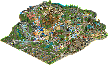
3 years later, welcome to DreamLand Europa, second park of the franchise!
Since a long time I wanted to work again on a project in the DreamLand vibe. Initially I wanted to take a break after H2H. Too much of too much, the contest had tired me out mentally, I overdosed of H2H content and I really wanted to move on something else, so I took a little break from NE for a few weeks and be in my comfort zone.
Initially, my intention wasn't to build a full park, just a design of a Smurfs-themed rollercoaster (because Alex proposed some works around the trunks and release the new mushroom domes, which really inspired me). I let myself be carried along, adding new zones gradually, and finally I thought it would be a good opportunity to make a more ambitious park than my usual releases. -
4 fans
 Fans of this park
-
 Full-Size Map
-
 Download Park
57
-
 Objects
2
-
 Tags
Tags


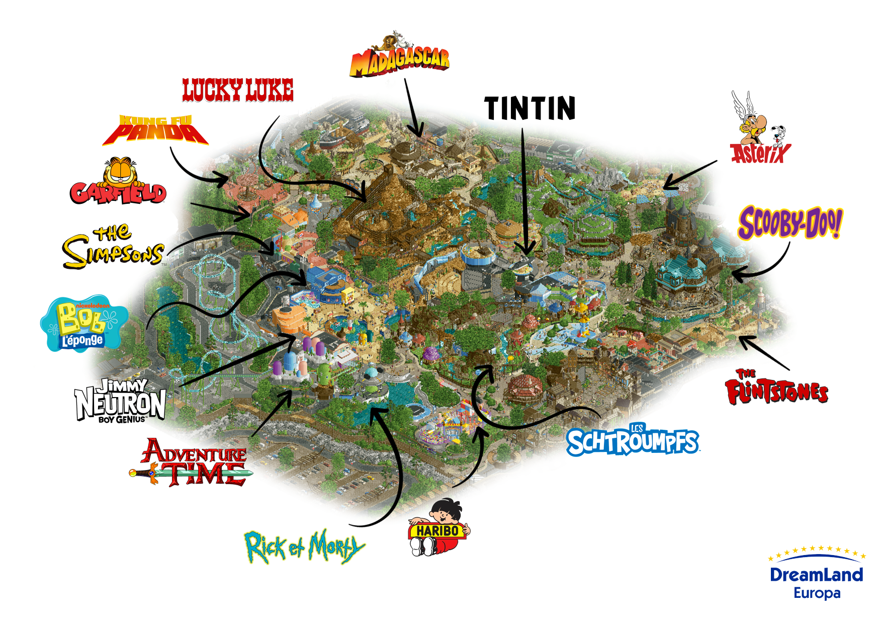
If you miss a ref, here's a quick summary !

Congratulations Babar. So much to explore here. On first glance I love Asterix land - perfect colours!
Wow wow wow, this park is packed. Excited to check it out and leave a proper comment soon, but you are a beast.
Great park Babar! Love that you bounced back from H2H so quickly and built this much work to your level of detail. I'm envious of your drive and speed in extruding the vision onto the screen. With a park such as this I suppose I can see where your strengths lie with such a variety of properties imagined within the shared theme of animation. On the one hand the approach provides a great deal to keep your attention, more than you can take in on a single viewing I believe. The flipside of this is that the space is quite eclectic with a lot of areas visually overlapping, and audibly much moreso with the music sometimes clashing.
It's a small price to pay though, and I think with the themes you've taken a shine to the payoff is worth it. I'd say the left half of the map is the more interesting side in terms of its theming, IPs and character - the Asterix flume, Smurf village and Lucky Luke mountain are wonderful setpieces, and the Asterix-styled entrance is very beautiful, reminiscent of your previous Asterix map.
Very glad to see a Bob L'éponge reference theming here is solid, just wish there was more of it and it didn't have to share the space. Can't say I'm a fan of the car park coaster. The speed-roll after the loop looks pretty painful and the ride doesn't appear to serve much of a purpose beyond needing to fill some space. I struggle to imagine a park going to such lengths theming their other rides and sticking a big e-ticket attraction in a dishevelled tarmac plot.
As with your other works, I think your strengths in micro-theming, sculptures and cleverly themed buildings is a highlight and elevates the map. The pagoda and stranded ship are fun weenies for the back of the park and anchor their respective areas well. Very well done on the release!
Charming and full of life, was a ton of fun looking though all the setpieces and seeing all the references, and I like the overall map shape and macro, feels very natural and flowing. Also, said before but wow your productivity is unreal, to complete something this good in that length of time after the amount of work you put into H2H, just never stops amazing me. Awesome stuff.
I wish I had just a little bit of your productivity and creativity Babar! Such an inspiring park once again, and it shows you had a lot of fun building it.
It has that typical loony (in a good way) style you have, and I also see some styles you've used in H2H, such as the tent style Cirque Macabre roofs in Scooby Doo land and the Madagascar ship that reminds me of Tropico.
Also love to see more uses of that pipe set I made for the Yards. I remember you've showed some other uses in the Gardeners Discord a while back, but you've nicely integrated them into this park with creative color choices as well.
The ride design Xtreme was talking about didn't bother me that much, but I can see where he is coming from with the disconnect with the rest of the park.. Overall I really like how well themed the rides are, would be a blast riding them IRL I reckon!
Well done Babar and keep up the good work!
Babar, I don't know how you crank out parks this quick.
I'd get it if they were quite sparse in detail, but the opposite is true: if anything, they would benefit from some more negative space!
The entrace is classic Babar. I love the curved shade structures in the car park - such a unique shape in-game. The tarmac and rock crunch game over there is strong, too! Headed through the gates, this area reminds me a lot of the village area in Troubadours, and the way the Studio Tour starts right here is really cool, with the ride advertised so well to guests as they arrive.
The Flintstones area to me is probably the weakest of the park. I think it just needs an injection of red, perhaps. Guests seem to agree and don't venture over there too often!
In Scooby-Doo, you're using those marquee pieces like a true Evergreen Gardener going crazy on h2hx round 2! Using cutaway, I'd have liked to have seen some more themeing around the ride itself. Interiors generally I don't really expect in game, but for rides, it's a little dissapointing to lower down the roofs and just see track.
As a francophile, the Asterix area gave me great vibes. Love the geometric shapes, the A-frame building, and the scene setup over there.
The 2x2 facade architecture around the Tintin feature building is just classic Babar. That lovely moment when you recognize someone's style so clearly and just love it for what it is.
At the back, your Madagascar area really shines. The ship serves as a really nice contrast to the rest of the area. Again would have liked to see more themeing on the adventure ride, but this area does a great job of capturing the feel of the movies while also looking great in-game.
The mine train does waht you put it there for - it's a decent family-style mine train coaster which doesn't blow me away but definitely ticks a box for the park. Avoiding crashing down into the rocks on the first drop is a nice moment.
I'm grateful that the Smurfs is a lot easier to spell in English!! I remember getting these out of kinder eggs on Brittany holidays way back when. The way the paths point to the Smurf sculpture out front is a great touch - those sculptures are super tough to do, and it's very recognizable. The buildings around here again capture the feel of the cartoons really well, sticking to roundness and textures to get the job done. The ride is nice but could be longer.
The Haribo area is where I would be bound to spend most of my time in the park watching kids try to injure themselves! I need a nice bench to sit on somewhere where you can a) block off the entrance to the area and b) see most of it haha! The area is a little on the plain side and could have used maybe a touch of crunch to liven it up. But the giant ball pit is a moment.
The next few areas from Rick and Morty through to Kung Fu Panda blend together really well. It reminds me a lot of the Toon Lagoon area at IoA, it's brought to life here really well - lots of guests, a fantastic spongebob sculpture, and otherwise typical Babar architecture. The krusty sculpture was another good one!
There's so much here that I can't imagine myself being capable of doing, and so much I enjoyed seeing.
It feels like there's tons of content, on, for a full size park, a relatively small map. I'd love to see what a Babar map looks like with a pre-planned macro that's more spaced out - maybe with a forced central lake or something like that. But, perhaps the way you build is simply a celebration of how you work and think, and that should be embraced, not criticized.
I really enjoyed checking out the park and definitely will revisit, as I do all of your work, especially when I need to steal ideas on how to work on half diagonals!
What a fun, warm and inviting park. This kind of concept is so perfect for your style. So much to see and explore, all in a beautiful cell like path structure that breaks the grid effortlessly. And really in a very successful way. Sometimes this can be a bit forced, but no single half-diagonal in this park looks forced to me at all. It all clicks together very well and makes for a super impressive macro. As such, I think this park is definitely a level up for you.
The only thing I may criticise is that I've found a lot of rides a little bit inaccessible. Surely that's due to the nature of them being indoor rides. But also ride entrances were often hidden indoors, and so the flow of exploring all the rides was sometimes a little bit challenged.
But overall, a great achievement, not to mention how you continue to be the miracle of productivity. Not sure I remember anyone with quite as pronounced an ability here in my time on NE.
It's honestly quite impressive how many distinct themes and IPs you have been able to squeeze into this park. At first pass, it is just so joyous and full of life. It has that classic Babar "feel," just like many of your parks that have come before this one. You have done a fantastic job of establishing a clear style. I would have immediately known who built this park, even without seeing the creator.
As I noted earlier, it is indeed notable how much you have packed into this park. However, I wish some of the more unique themes, like the Tintin area, were more fleshed out and obvious. I think some themes at times feel a bit difficult to distinguish.
Nevertheless, this park was a joy. I think your ride design is improving from your previous works, but I would be remiss if I didn't note how most of them felt very "serviceable." For such a large-scale park, I would have liked to see more emphasis ride integration. The mine train coaster does a great job of that, as does the Smurf coaster, but maybe less so for the parking lot coaster.
I also think the architecture was slightly hit-and-miss. Some areas, like the Smurf area and the Tintin area, were awesome. The miniature facades you made near the mine train coaster were superb. However, for me as a viewer, one of my personal priorities and tastes is coherence and the use of motifs. There is simply a lot going on in this park, and it can be a little hard to digest.
Overall, it's a superb park. Don't let my criticisms draw away from that, please. However, I think the next step for you as a builder is going to be marrying your endless joy, creativity, and micro with focused macro and complex and meaningful ride integration. Nice work!
a very well-deserved gold Babar, congrats! i voted yes to spotlight but i also am not surprised i was in the minority doing so.
i very much enjoyed the park, there is a ton going on and i definitely think it's a step up from your previous couple of parks in terms of composition and overall polish. it was great to see you tackle a couple of coasters, although i did agree with a couple of people about the rick and morty coaster, i could have done with some more theming for the largest ride in the park.
my favorite areas were Asterix, the little Kung Fun Panda area (felt so real with the pink paths, something a real park would do), the burger building with the curved path around it (so organic), and the Tintin building (great mix of angles).
I think your style lends itself well to the cute, small scale that this park is built in, and it's obvious that every area is approached with so much love. I can totally see it working great for a Disney studios park or something similar, if that's where you choose to go next.
In terms of score and spotlight, if that's what you're aiming for, then fleshing out the areas more, upping the scope a little and layering on more finishing touches (interiors, additional layers of realism etc.) would probably get you there.
Appreciate your work, really enjoyed it!
I really enjoyed this map, a great solo with some great IP's in them. You manage to combine having a lot of details together with making a clean park. There's also good grid-breaking pathing, bringing in the curves which makes it help to make it feel more real.
There's a lot to love here. My favorites:
- entrance square
- Smurfs village
- Scooby's haunted mansion
- Sulfurix flume and its station, and the whole Asterix zone as a whole. The best area of the park imo
- The Asterix vs Ceasar soundtrack! Love it!
- The Madagascar village and how the queue is interlaced in it
- The Simpsons facades
- Spongebob area
As a Belgian I was also very happy to see a Tintin ride! Though I think there's more to get out than just 1 ride. Maybe an idea for a following project, a whole Tintin park?!
While this park is far above my level, there was some stuff I think that could be done better and are the only things keeping it from spotlight. Since the park is already really great, it's maybe a bit nitpicky, but hear me:
- I think the next step to focus on is coasters. I'd love to see some bigger coasters from you, as you tend to go with quite small coasters. Some of them are ok and fun, but most parks have more bigger coasters.
Land of Oo was the only big coaster here and it has it flaws. It's not unrealistic to have a parking coaster, but having it mixed in in the park would make it way more interesting. Not only for us rct viewers, but also the peeps! I mean, when we visit a theme park we also like to see as much of the coasters as possible It also lacks a bit of flow. Having a small zero g roll near the ground right after the first big loop would feel very painfull irl.
Building (big) flowy coasters can be hard, and sometimes you just have to keep re-iterating a layout to get to a good version of it.
- Really minor nitpick but the tracks of Madagascar and Spongebobs School Boat Tour could've been made invisible.
- I liked the Ceasar's Challenge ride, and it def fits near next to the entrance square which on itself fits perfectly near the Smurfs but could also fit perfectly near the Asterix zone. But it's kinda a shame that the Asterix zone itself is located elsewhere, with the Flinstones and Scooby zone between it.