Park / Aviator
-
 13-October 24
- Views 1,970
- Downloads 227
- Fans 0
- Comments 13
-
-
 73.50%(required: 65%) Design
J K 80% Milo 80% CoasterCreator9 75% Mulpje 75% Recurious 75% RWE 75% SSSammy 75% Turtle 75% pants 70% Xtreme97 70% Scoop 65% posix 60% 73.50% -
Description
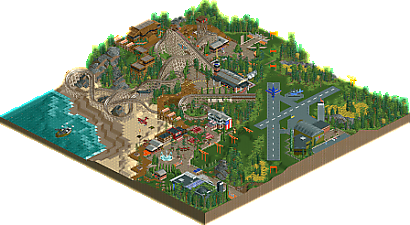
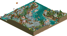
Welcome to Daffodil County, home of a former airport that played host to pilot training in World War II. Pilots would frequent this area to practice their flying skills in modest aircraft, and their legacy can be felt in the surrounding visitor center to this day. The marquee attraction is the wooden coaster, aptly named “Aviator.”
Come, and earn your wings!
Logo credit: Scoop -
No fans of this park
-
Full-Size Map
-
Download Park
227
-
Objects
3
-
Tags
Similar Parks
-
Baker Lake Amusement Park
-
Funafuti Airport
-
A Day at the Races
-
DisneyAir
-
Warbird Cove & Essex Naval Museum
-
[H2H8 R2] Studio Ghibli
![park_4098 [H2H8 R2] Studio Ghibli](https://www.nedesigns.com/uploads/parks/4098/aerialt3844.png)
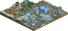
A cool theme, and a nice choice of a coaster type for it, less expected than something like flying or invert, and I really like the layout, it flows well and works with the terrain, a couple of nice interactions also. Modern architecture is especially nice here, and the terrain, foliage and overall macro are very pleasant.
Really nice layout, good pacing and quite unique. The architecture is quite nice too, but I admit I'm not huge on the chibi-airfield. I almost wonder if it would have been better to imply it was part of a larger off map airport? Regardless, I was mostly focused on the coaster and the coaster is lovely.
Great park, lots of variety and nuggets everywhere you look.
+ Coaster layout was great
+ Foliage was stunning, big bold section of the yellow flowers won me over, confident and artful.
+ Small touches down to the different vehicles, moving radars on buildings, the lines on the runway, so much innovative object usage to get the job done
+ Good play on ride vs environment happening, the context of the airfield added so much interest
More please!!!
Wow! This is super pleasant. I'm glad to see this get released.
The overview and layout of the park are done great, balancing the water with the runway is smart. The plane motif is carried well throughout. The ‘earn your wing’ entrance pathing wing shape is so cute. Then carrying the orange from the runway to the coaster train, flags, awning, and gardens is sweet. The airport in the runway, on the coaster station, and the wooden one near the drop are all done super well.
The coaster itself is nice! Watching it interact with the tower and path is fun, plus I love how the path goes under the lift hill and over the last dive! That tunnel is super good!!! . This is just such a nice layout, that dive down further is so sick .I like the new pieces being used, but to me I think the smooth pieces don't work as well for the tops of hills!!
The architecture in this is good. There are like 4 different styles going on, it makes sense, but I think unifying it a touch could make this even stronger. The details are all there, and youve always been super good about trying cool things! Im thinking about your rmc single rail with the art garden and buildings, your college build, and in this park the g force training building is sick! But its in a super modern style, while the runway airport is kinda green army style, then youve got some woodsy style up top, the beach area is kinda southern looking, and the station is a mix of them all. They’re all done well, and it makes sense… but what if there was an even stronger throughline?
Now the foliage has my heart- the underbrush is done perfectly. Outstanding! Love the large grassy patches using the invisible color is always a favorite. They stark yellow patches are GREAT!!! I think you can take some of that slay ingenuity into your gardens and manicured landscaping!! Some other details like the fire on the beach, the custom audio (LOVE! The air chatter) and the american flag just send this into excellent territory! Love this!
Nice little design - good ideas, good execution, nice atmosphere, and a nice coaster. my favorite parts are the little touches using track/rides/scenery in a new way (at least for me) - the flags, the helicopter, the radar, the booster track archy.
foliage is top notch and easy to miss the depth of. appreciate that!
+ amazing layout
+ loved all the planes
+ great outskirts and foliage
+ enjoyed the architecture and the simplicity you chose with just enough detail to recognize what it is
- beach created nice negative space but unsure of its overall placement in relation to the rest of the park. Typically I like it to border areas rather than be in a corner
Great job on this Rob. The high points here for me were the foliage/landscaping and the coaster layout. I love how the woodie's main drop was 1/3rd of the way through and dived down onto the beach, and then in general how flowy the whole second half of the layout was. I thought the grey rockwork was really well crafted and then lastly the foliage is some of the best I've seen in NCSO, but I'm a sucker for this style of contrasting dense swathes of trees and underbush with open meadow areas. Beautiful!
Such a nice design Rob. I remember this was a rough one for you to work through so it's awesome seeing you come out the other end. A good word for this design is mature. It's not insanely flashy but knows what it wants to convey and does so very efficiently. It doesn't feel the need to fill in every tile with details either. Layout itself is really nice; I believe this is the first NE submission to ever use the new flat-to-steep pieces? I do agree with AJ; they work better for the bottom of a hill than the top in a layout like this. I want to remark on the foliage; arguably some of the best I've seen in NCSO. The yellow dandelion fields add a lot of character. Really nice work, so glad you got this one done and got a great score off it.
yeah I agree, that biplane on the beach is fantastic
Great use of the elevation for the layout, the second drop being the big one is handled expertly
Congratulations on the release Rob!