Park / Fun Spot Atlanta
-
 06-October 24
- Views 1,318
- Downloads 65
- Fans 1
- Comments 11
-
-
 69.50%(required: 65%)
 Design

Mulpje 80% RobDedede 75% Scoop 75% Terry Inferno 75% ottersalad 70% Turtle 70% Xtreme97 70% CoasterCreator9 65% posix 65% Recurious 65% RWE 65% chorkiel 55% 69.50% -
 Description
I visited this park last year and fell in love with Arie Force One. Here's a NCSOpen interpretation of Fun Spot Atlanta with a mix of its time periods (including the mini golf) and more of a "rough" translation of some areas with minimal additions.
Special thanks to bluetiful_monday and Swagtitties for looking at this park before submitting it here. For the NE edition of this park, I added quite a bit of detail in comparison to the DKMP version, so I would appreciate it (if you have that version) if you would delete it and view this one instead. Some subtle custom sounds are included in the save, so if you want, check it out with sound on. -
1 fan
 Fans of this park
-
 Full-Size Map
-
 Download Park
65
-
 Objects
3
-
 Tags
Tags
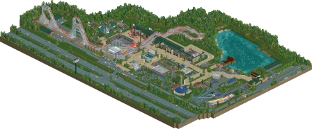
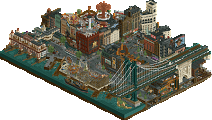
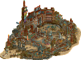
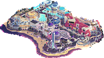
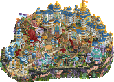
Overall really solid work BPW! Really love the coaster - it's a great recreation imo. The hacked flats throughout are really neat. Never seen a batting cage before so that was definitely unique. The paratrooper flat was cool too. The mini golf was well themed as well.
One thing that perhaps I wasn't a fan of was the base block pathing. It looks a bit too washed out and smooth relative to the gritty/crunchy realism everywhere else.
This is so fun (spot). I loved digging into all the details here, the path pavement lines, the tire marks, the peep scenes, every little detail just brings the park to life.
I think this is the best RCT minigolf I've ever seen, no caveats.
Aire force 1 sits lovely and rambles through the park, like it doesn't belong there... just like in real life. And the supports are excellent.
Surroundings paint the park nicely and just wrap it up in a bow
Really nicely done BPW, one of the best NCSO parks of the year so far, in my opinion.
This park is seriously lovely. So many expertly designed rides and vehicle editor food shops. The cutaways at so much character and the Peep editor scenes you've made fill areas of the park that might seem dull with LIFE! The traffic and parking lots are clean. The central ride is well done for the real life crazy coaster.
I especially like the joy ride employee and the employee warehouses at the edge of the coaster.
This is a great lively recreation, the portable and carnival style rides are so good (Paratrooper is probably the best one I've seen in RCT), so many great vehicles and pieces of equipment and a lot of very clever vehicle hacking to pull stuff like that off. Main coaster is a good recreation, go karts has a nice way of doing wider track, and I like how the mini golf holes are done.
supports work is extremely cool here!
Great park, I'm a bit surprised this park doesn't have more traction because the detail here is fantastic. Certainly upper echelon NCSO, lots of great pathing and roadwork (though the tan might be a little bright). Very good coaster, faithful to the real life counterpart, a top notch mini golf, great go karts and batting cages, and the peep scenes are sweet as well.
Super great park BPW. The park stays true to its “Dirty American Realism” roots, yet retains a lot of NCSO charm. Of course, Arie Force One is recreated wonderfully, and a highlight for me are the many custom flat rides! Pure genius.
I think the score makes sense.
First and foremost congrats on the accolade BPW. I'm glad we are seeing yourself apply to solo work. I feel like I can start building a relationship with you as a player by more clearly seeing what you do in the game and what's important to you. My first reaction was that it was great to see how this submission was quite different from your previous Kingdom Crash. The good players are typically those that showcase versatility.
I think you have many good little ideas for small micro things, and they're very sweet to see. They're not the main ingredients for a good park for me though. What hurt this park significantly for me was its atmosphere. It feels uninviting, bland, cold and sterile. I know that's likely what the source material is like, and I know it's hard to capture this kind of vibe in a positive and non-destructive way. It's why for me CP6's Washuzan was such a strong achievement, because he somehow magically presented low-budget dullness with love and warmth. I think this is a skill very few players possess. When you try it as someone who's only starting to be more serious about solo work, you run the risk of achieving a lego-like clean look that doesn't play into your favour, and I think it's what happened here.
You still show signs of having said skill a bit already though, of creating a pleasing look where it's not expected, for example in the foliage placement around the go karts track. And surely your NCSO ride design ideas are a joy to see. But in my eyes they are fighting a fight for higher scores they can't win. I wish you had some ridge in the land somewhere. It seems smooth all throughout. Thus I would love for you to make a small practice project that commits to a warm and organic theme, one that prioritises comfort and an inviting atmosphere over technicalities. And yes, fully themed rides are typically much easier to do here.
Congratulations on the second design in such a short time. Your productivity is admirable.
There were a couple of surprises for me. The first one was that it was NCSO. Took me a minute to see which always impresses me. Second surprise was that this was a design entry, although that probably wouldn't have changed my vote. But I was mostly surprised this was new work from you. My first thought was that this was something you had started prior to H2H and only just now finished.
I'm not familiar with the source material. My assumption is that it's a bit crappy or rickety in real life. Those things don't necessarily come across in your recreation. This feels very sterile. You try and add a lot of crunchy details to sell the park as lived in, but ultimately that doesn't come across. Which may more be a macro issue. In general the map was very compartmentalized and square. Each ride was on a different plot with little spillover. Almost all the buildings are rectangles or squares. Even the path is mostly made up of squares.
Regardless this park had a lot of good qualities. You show a lot of creativity with the small scenes. Those trucks are also really great. I think your creativity would come across better in a more immersive and themed park like you did in Kingdom Crash and Naam Chalong.