Park / Century of Progress
-
 06-October 24
- Views 1,378
- Downloads 116
- Fans 0
- Comments 10
-
 73.00%(required: 70%) Gold
Milo 80% Recurious 80% RobDedede 80% RWE 80% J K 75% SSSammy 75% bigshootergill 70% Mulpje 70% Xtreme97 70% posix 65% Scoop 65% Turtle 65% 73.00% -
No fans of this park
-
Full-Size Map
-
Download Park
116
-
Objects
3
-
Tags
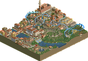
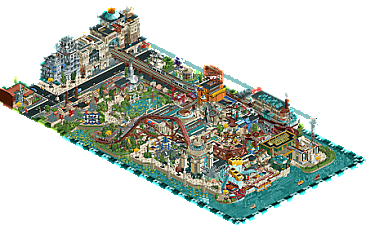
The object usage in this is top notch. Cool coaster flowing through the park, and it's so packed full of detail, I didn't even notice the underwater facades and deco the first time I looked at it. The buildings along the road are such a stand out - really excellent park, so fun to revisit a few times, you always see something new and another eye opening object.
The object usage on display in this park is downright impressive, especially toward the park's back half with the city streets. While some objects are slightly clashing with one another, I also appreciate that as simply being a part of your style. I think this park is actually one of the most refined examples of your style, which I appreciate very much. To be completely honest, while the architecture and gardens on this map wowed me over, I was not the biggest fan of the main coaster. I think the support structure was overly bulky, and the layout was a bit hard to track. However, that does not stop me from loving this gem of a park.
Really clever object use, especially in the back part of the park. Very bold and creative style, sometimes chaotic in the front of the park but also colorful and lively. Main coaster has some abrupt turns and can be hard to see but some great interaction, cool switchbacks and the streamliner train is a great touch. Also, love that pre-lift section, the customized track and interaction with the queue is great.
Overall, an excellent and really fun to explore park.
Difficult one to vote on. Clearly something else, and refreshing to see such a new look. Well done on using those objects and putting yourself up to the challenge. I think you've succeeded, mostly. Where you didn't succeed was accessibility. Sadly the seaside part became incredibly messy and chaotic, like a melange of different things that seemed to waive all concerns of composition. As such, a lot of the skill shown here sadly goes to certain waste for me.
It was a fun park to explore. The two coasters were both intriguing. Scenically, you're like the modern day Beejer, very experimental and unique. You made a very fun looking park without the benefits of modern theming and in spite or because of it delivered a very eclectic result.
I love how you play this game. At times it got a bit heavy with textures and such, I wanted a bit of balance here and there and not texture soup, but seriously impressive stuff. Object usage was off the chain and executed brilliantly. Rides across the map all had a purpose and built up the great atmosphere.
really hard to rate this honestly, it's one of those things that definitely isn't my cup of tea but i have to appreciate. i'm happy that this got made, and there was a lot of stuff that i liked / enjoyed working out how it was done.
overall the vibe was just a little chaotic for me to enjoy as an overall map. but when you've been around as long as i have there's a lot you've seen before, and you definitely learn to appreciate people doing things in a different way. thanks!
this is awesome, I really adore your maximalist clutter style. very vibey and super original
@Therty - Thank you, and happy to hear that you saw a lot of the details like the underwater facades.
@ RobDedede - Yeah, the 'good architecture/iffy coaster' definitely seemed to be the most common sentiment on DKMP. Thanks a ton though, glad you enjoyed the park.
@ Lurker - Glad you noticed certain features like the streamlined trains. Thank you. As for the abrupt turns, especially around the second switchback... they were actually kind of a dilemma for me. I settled on making the banked turns there invisible as I figured a railroad switch with banking would've looked worse.
@Posix, Thanks and I can't disagree there. In retrospect, I almost wish the contest allowed for a larger map than the 3000 tile limit here because building this with the same amount of content, on a map that's 25% larger would've definitely made it much easier to read.
@Ge-Ride - Happy to be compared to Beejer, probably one of the first builders I took inspiration from when joining this site. Thank you.
@ J K - Thanks a ton, both for the comments here and on discord. Glad you liked both the rides and atmosphere.
@Turtle - I definitely agree on the chaos/readability; especially towards the front of the park. Thank you for the feedback though, it's very appreciated.
@ Cocoa - Thank you, glad you like the style
So glad you uploaded this and nabbed the gold. Retrofuturism always has my heart and this is such an optimistic take on it. Archi is incredible; you've really gotten a ton out of the DKSO bench. The streamlined take on the mine train is really fun too. As others have said, while your style is very distinctive it can also be chaotic and hard to follow at times. It gets especially confounding at the bottom part of the map on the ocean. The top half is composed really nicely though, and overall it's a really refreshing map.