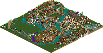
Park / Lost Tours
-
 11-July 09
- Views 4,079
- Downloads 962
- Fans 3
- Comments 17

-
3 fans
 Fans of this park
-
 Download Park
962
-
 Tags
Tags
 11-July 09

 Fans of this park
 Download Park
962
 Tags
Tags
 Similar Parks
 Members Reading
other images can be found here
downloads: 336
This is a sad, sad day for LL
inVersed Offline
There were some things I absolutely loved in this park:
-The unique selection of coasters really stood out to me... I havent seen the hybrid done that much in LL (and certainly not as good as yours), nor have I seen the Eurofighter except maybe one other time in a LL park. The tilt-coaster was the first one I have seen since Roomie put one in one of his parks a while back
-Despite the fact that I wasnt the biggest fan of the colors, Seelie was absolutely gorgeous and was my favorite coaster in the park. The theming around it is so detailed and had so much atmosphere
-My second favorite coaster, Locos Coches, was also superior and the theming gave off a vibe similar to that one park natelox never finished
-The overall theming of this park and the landscaping was just superior and your knowledge of hacks is very impressive
The only real negative to me was the layout to some of the coasters. El Rey, Sunstorm, and Tyrannosaur were all short and fairly weak layouts IMO. Still the theming and amount of details in these attractions were very high I would have just liked to have seen longer and more thought out coasters for these three
the coasters were a little weak but your ideas and execution were awesome. You really are a natural at using LL textures to their full advantage. I loved a lot of the little details and you even went the extra mile in some sections with working flats which was great to see.
Your architecture reminds me of Ouest and is very nice throughout the park. I think it does seem to follow too strict a formula as you look around though. You have some very diverse themes and you always seem to have a lot of 2x2, 1 or 2 track accents and a lot of canvas. You did seem to explore around with different stuff in certain areas and I think they worked out well. The custom trees were well done and you had a nice start on the large lab building and in the future it would be great if you expanded on ideas like those.
I'd say you do really well on your ride stations although in general they are kind of small. I think one thing you need to work on is actually creating stuff to catch the eye. Your rides and archy are usually small and it's only little things that the eye can really focus on (like toreo having mechanical stuff under the platform... that was cool) but your work starts to feel like white noise after looking at it for a while. I think in your next work you should try to work on a very captivating ride layout or layouts and also try to create some sort of thing to focus on in your areas... like a large centerpiece structure or courtyard.
great stuff though and your ideas are very good... I'd love to see some more work from you in the future because I'm sure it'll be a great release.... hell this impressed me and it's unfinished
I agree with Milo and inVersed that some of the coasters were a little weak but kudos for doing rides like the tilt coaster that aren't used all that often. Your skill with archictecture is incredible.
I'll be watching avidly for your next project.
I'm looking forward to any other of you projects for you may be the LL-messiah!
The more unique themes were fantastic. The layouts were great, a few issues with pacing, but nothing to stop them from being anything but fantastic.
The architecture was top notch, the use of texture and colour was brilliant. The only area where I thought the texture was a bit funny was in Old Torredo(?), the plain wall seemed to be a bit to plain, maybe brick would have worked better?
The fact that you didnt use generic coasters was nice. I especially liked the Vekoma and Eurofighter. The use of Mine Train supports under the GG Woodie was a great idea and really helped to distinguish from the other woodie that this was in fact made with steel supports. This along with other things is an idea i'm definately going to have to steal
I really felt submerged into the park, I feeling that I love and it is just such a shame that it's not going to get finished. It has so much potential and it's upsetting to see that it wont grace the front page like it should.
I'm glad most of you noticed the main goals I had set when building this park. Unique areas/themes with unique rides not done often and I could improve on. I was also attempting to have a custom flat within each area.
Ozone- thanks
SSSammy- I know, I really wish I could have finished, especially since this is the most I've ever done on a single park. It seems anyhing I start is doomed to unfinishedness.
inVersed- thanks, I'm glad you liked the coasters although I understand about the smaller ones and I'll have to work on making stronger layouts next time.
Milo- thanks. looking back there does seem to to be lots of smaller buildings. In the future I'll have to work on my archy and try to build some things on a larger scale.
Gir- thanks. I know it was a possibility but I don't think I would of had much more to do with the park, at the moment I don't have much interest in RCT. But who knows, it comes and goes.
Loopy- thanks, I'll make sure that next time I try to make some stronger coasters designs.
JJ- you're welcome, I better see something from you now
Liampie- thanks, that means a lot to have someone say something I did is their favorite anything.
Zodiac- hmm... I'd be down for that
LDW- thanks
Cocoa- I guess it's a possibility. If someone really wants to work on this they could.
Louis- thanks. I see what you mean about the plain walls but what I tried to do was have more than one texture in an area to add variation so it's not just "more of the same". Also the plain texture added ghost train windows so I could use different types of windows throughout the city.