Park / Expedition Amazonia
-
 15-September 24
- Views 1,595
- Downloads 118
- Fans 4
- Comments 14
-

-
 73.00%(required: 65%)
 Design

J K 80% Milo 75% pants 75% posix 75% Scoop 75% SSSammy 75% Terry Inferno 75% G Force 70% Recurious 70% RobDedede 70% RWE 70% Turtle 65% 73.00% -
 Description
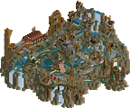
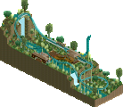
Soar in the Amazon rainforest skies along with the macaws on this Intamin triple-launch model!
Based on the likes of Pantheon and Toutatis, Expedition Amazonia was originally made for a contest on RCT Club. I pushed it off for almost 2 years even though it was 95% completed.
Please enjoy!
Special thanks to the many, many people who kept telling me to finish this thing; and also Scoop for the logo! -
4 fans
 Fans of this park
-
 Full-Size Map
-
 Download Park
118
-
 Objects
1
-
 Tags
Tags
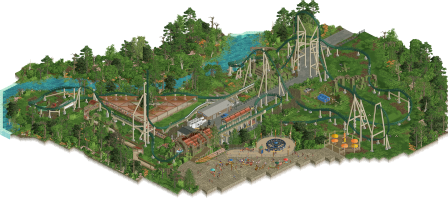
So great to see this finally released! Obviously, your ride design here is the highlight, with an awesome, flowy layout and great support work. Other highlights for me were the train colors and landscaping, as well as the realism/backstage touches. An enjoyable design and an awesome step forward for you as a solo release. Cheers all around.
I think what makes this so good is how it's classically a design. No extra frills. Just a great coaster and enough surroundings to compliment. One of your notable achievements is the smoothness, despite not having the extra diagonal track pieces. Goes to show that we don't need them to make an elegant design.
One of the strongest new-gen Intamins to date.
I am instantly captured by this naturalistic style. The design of greenery is special and wonderful to see. You've created such a warm organic note here. And it's perplexing that despite being green itself, the coaster doesn't blend in at all, but instead integrates beautifully. You win at "green is a theme" currently Hex.
Wahoo Hex! Great job getting this finished and released, to such a high quality. The mud/grass/swamp effects is right up there at Jens-level landscaping treatment, which is as high a compliment as I know to give it!
The layout is very you, I can see inspiration from IRL coasters (Toutatis?) but then really neatly translated to a setting that is simple in its macro yet nicely detailed close in.
The enterprise with the circular line under it was a really nice touch too.
I suspect the only thing holding this back is just the amount of content, but again that's by design so not really a criticism as much as an artifact of how parks are scored.
damn hexy been busy! what a treat
i think the biggest win here for me is the landscaping. i think the layman might look at it and think, "i can place a bunch of trees in the negative space and it will look good." no it won't. i can see you've picked out a palatte of trees and shrubs that really work, and created veins where they press in at the map edge. the texture throughout keeps the more open parts from feeling undercooked. just a real simple straight shot, gets the job done
I would have liked to have seen more peep-side context. i know some people don't mind, but I do. it feels a bit cheap to cut the map in the middle of the path, or is it a plaza? we will never know. unless... Son of Expedition Amazonia when? i dont think it would have needed much more to fix this issue, just that feeling of context that i would describe as a necessity when you're threatening a level of quality displayed elsewhere.
the stalls in the middle serving tower defence for the queues def feel like a symptom - they lack the broader context to not feel like an S of custom rides on the path. the seating area is a great idea but feels like its in a different era when put alongside the great crunch and fidelity of the rest of the map. that part is h2h6, some are h2h11.
the backstage of the ride is exactly the sort of quality we can expect from you, and the context it provides to the experience is top notch. i can imagine seeing a mechanic driving a golfcart through those tower supports - makes me wish we had some more peep areas to do the same. the technical aspects leave nothing to be desired. top notch
I view this as a spoiler warning for the incoming hex era. can't wait to see it happen!
Congrats on the release Hexyboi! Really excited to see more non-contest work from you (well, kinda?). The coaster is stellar as we come to expect (beside my pet peeve of coasters floating above tracks but that's my cross to bear). Agree with Posix, the colors are impressive with how natural they feel without ever going too green or getting washed out. This has an almost Alex vibe too it, even reminds me of Xophe's last design, Canyoneer, in that the design is focused on the coaster in a pleasant natural setting and with very minimalistic, subtle references. The coaster and the scenery feels very real without pushing too far outside the scope for this kinda of coaster and setting. The attention to detail for the coaster and it's infrastructure in particular is really wonderful.
I do feel that the minimalistic approach is perhaps masking some of the areas you're less confident in. While a great strategy for this release (which resulted in a really polished product) I would love to see you tackle more, particularly architecture. The plaza, for example, could have been a great opportunity to push yourself in that regard. Hit me up if you ever want archy feedback or tips, I'm always down to fiddle with things. Regardless, I think the aesthetic and style of this design being focused as they are has produced a really wonderful design. Congrats again SIR!
Great park, clearly so much skill and talent bursting out of this release. I love the coaster, I've viewed it countless times from different angles and I think it is perfect, it scares me how good a full scale solo would be from you as your coasters are always on the money.
Supports were great, landscaping was exceptional and after that the ruined blocks and small touches you added made this an extremely memorable release for me. Expecting huge things from you this next year, you're such an electric builder and I look forward to everything you build.
Coaster Layout is GOD Tier
Congratulations on your release, Hex! I really enjoyed the layout and the theme is done well. Great job!
Fun coaster, could have used some more "park" to it, but I'm a sucker for good landscaping too.
A great piece of ride design in every aspect, layout, supports, queue and backstage area. Textures and foliage are all really good too.
And also, congrats on getting the design win!
What a lovely design this is. Lay-out is great and very realistic, definitely feeling the Intamin hand there. Flow is so good, just as pacing. Also love the coaster colors, green track is underused! Also love the coaster cars colors.
Station is cool, could've been a bit bigger though. A lot of detailing in the backstage area, which is nice. Also love the diagonal queue for the enterprise, that is composed in very well there. Foliage is also spot on, very lush and green with some spots of color in between, really well done.
Great work Hex!
Alright, it's been 10 days so now feels like an appropriate time to post a follow-up.
First, thank you to everyone who has interacted with this release. It means a lot that so many people took time out of their day to look around in my little design and to comment/critique it. I hear all of your feedback. I most definitely hid from architecture in this map. It's my weakness... I'm so happy that so many people enjoy the layout, as I spent a good amount of time drawing out the track and counting the left-to-right turn ratio.
As mentioned in my description, this was built for a Multi-Launch coaster contest held by the RCT Club. Other releases on New Element from that contest are MorganFan's "Gale of Amun-Ra" and AJ's "Mato" to name a few. This just shows how old the majority of this design is and speaks to my character about not finishing things I start. The constant hounding of the community to finish this design is the reason this release was finished, so thank you to all of those that told me to finish this thing.
That said, this release is my first accolade where I'm a majority builder, and it came after ~14 years. I joined New Element as a teenager because a YouTuber that went by WrathOfFlame (That Guy on this site) encouraged his audience to sign up to New Element. I know they've been inactive for some time, but dude, if you are reading this, thank you.
This will not be the last release you see from me. I'm coming for that green name next.
With love,
Hex