Park / Kingdom Crash
-
 15-September 24
- Views 1,393
- Downloads 106
- Fans 0
- Comments 10
-

-
 66.50%(required: 65%)
 Design

Turtle 75% J K 70% Mulpje 70% RobDedede 70% Terry Inferno 70% bigshootergill 65% Milo 65% ottersalad 65% Recurious 65% Scoop 65% posix 60% wheres_walto 60% 66.50% -
 Description
A kingdom in a faraway land seeks to boost tourism through adding a mystical being called a "dive coaster" summoned through an incantation spell from their local wizard.
I built this for the Dive Coaster 3 DKMP contest earlier this year in NCSOpen. The layout has a focus on fun and fantasy. I hope you enjoy it! -
 No fans of this park
-
 Full-Size Map
-
 Download Park
106
-
 Objects
3
-
 Tags
Tags
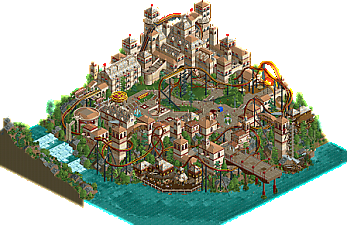
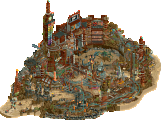
A great NCSO submission and a nice reflection of the current direction the workbench has been shifting towards. Not exactly a traditional dive coaster. But traditional dive coasters are often criticized by enthusiasts for being one-trick ponies. If anything, this should resonate a little with them. It's what a dive coaster could be. Architecture is generally pleasant. The best bits of the park for me are the docks below, the dark ride scenes behind the castle, and the structures around the cliffside.
I love the choice of textures and objects for the architecture, this feels very classic to me but has a lot of cleanly and well done subtle tricks throughout (Like the air powered car window shades). Also great use of height and I really like the color choices.
Cool stuff overall. The coaster is definitely out there, but I'm not mad about that at all. The architecture is well done but maybe a bit one note in places. Generally very nice park!
Fantastic details throughout! I think your world building was superb.
Great release, detailing on the castle was awesome and it was a joy to watch the coaster.
Things I loved...
+ Medieval patterns on the floor. More floor patterns please next time, these were great.
+ Trackitecture detailing on the castle structure (took it that step further)
+ Custom ride drop tower (more custom rides would probably push my score higher)
+ Dark ride scene with the knights of the round table was great
Great work.
I am swamped with business right now, but I want to leave a quick comment saying this is a really solid release. I appreciate its verticality, attention to detail (loved the “magic”), and architecture. The coaster layout perhaps a tad fast, but I know dive coasters are difficult to pace well. Congrats, BPW!
what a lovely map. one of my pet peeves is an area like this where there is a strong color scheme, especially if the coaster has the same one. i find it can make the coaster blend in a little too much. this almost suffered from it but got away with it overall. definitely a personal preference thing, but maybe something to think about (especially with a strong color like red/gold).
there were more than enough little parts with great execution to make up for this though:
- the floor decoration
- the buttresses
- the coaster was great and fun to follow, good pace
- detailing everywhere, but especially the air powered coaster awnings on the castle, so clever
- the hanging lights (how?)
- the center courtyard with more open space, really balanced out the map
Overall a cool little map.. archy feels a bit samey, but its a nice style I think. Feels very Venice inspired... but on a cliff lol
Coaster layout is unique and fun. Perhaps a smidge too fast?
Good to see more work from you.
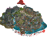
Thanks to everyone who took a look at this and left reviews and feedback! I greatly appreciate it. The architecture definitely is its weakest point in its town as well as repetitive color use. My goal was to make something utilizing forced perspective or basically make something appear bigger than it actually is to a viewer. I did this with the castle by having it casually stack higher up into the sky to give it sort of a "menacing" look on everything below it. Here's a screen early in the planning process where I thought typical cliffs before deciding on the castle taking over the skyline. This gave me the idea of having it take over the black space behind it more so the coaster feels "smaller" in comparison:

Unfortunately I had no idea what to put in the town and was disappointed I couldn't hash that out better, so I somewhat copy pasted past what I did in the harbor and the wizard's town with bare bone architecture in the vein of earlier LL and RCT2 parks. I went for a sense of nostalgia building this - like what I would of saw on NEDesigns or YouTube 10 years ago. There's a lot of modern tricks that take away from that like the stairs and invisible color use, but I am overall happy with how this did and will most definitely take a different approach to macro. This was also before head-to-head, so there's some planning tricks I picked up building with the Hurricanes I definitely plan to use in future projects. Again, thanks everyone for taking a look!