Park / Expo Miami
-
 20-August 24
- Views 6,864
- Downloads 235
- Fans 1
- Comments 23
-

-
 82.50%(required: 70%)
 Gold
Gold

chorkiel 85% no pants 85% no Recurious 85% no RobDedede 85% no RWE 85% no Terry Inferno 85% no Babar Tapie 80% no CoasterCreator9 80% no Cocoa 80% no J K 80% no ottersalad 80% no G Force 75% no 82.50% 0.00% -
 Description
Expo Miami - Transport Yourself to a Brighter Tomorrow
-
1 fan
 Fans of this park
-
 Full-Size Map
-
 Download Park
235
-
 Objects
1
-
 Tags
Tags
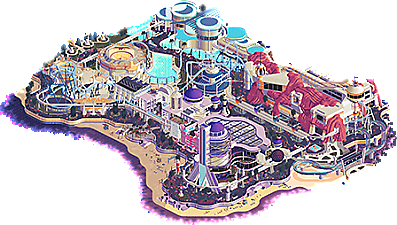
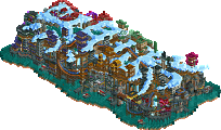
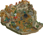
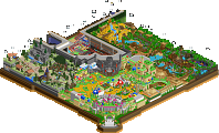
I want to fully Steve Review the Expo Miami map, but in the interim I will be sincere for a bit.
Scoop, and the rest of the Soda Jerk squad: huge congratulations. Truly. I have been in several H2H's both as a player and a captain so when I say "it's no small feat that you arrived where you did" -- I mean it. With the match being as close as it was, and with the maps scoring exactly the same... I would say we were evenly matched. How it shook out simply was at the preference of the voters it seems. I know it stings, but take solace in the fact that you came incredibly far with a remarkable season under your belts.
As for us in the Jazzcats: I also want to take this formal opportunity to congratulate not only Leon, but the rest of our gang, too. Our finals map would not be here without them. I joke around and try to gloat and take all the credit, but this was such a team effort that throughout building I was consistently stunned by the level of collaboration. In my twenty-something years of being apart of this community, I have never seen anything like it. Truly a testament not only to our team, but especially our captain's overall leadership. Leon, you deserve all the love from us and title as champion; your dedication and humility throughout this contest was inspiring. I think I speak for the whole team when I say: "thank you for everything."
OK, so, the park itself: our finals map honestly saw a few ideas and iterations before it arrived where it did. I unfortunately was teaching a month-long class for work, where I was mostly RCT-less (which is why I stopped "floating" for a while haha) in July or so, so I wasn't actively involved in those finals ideas. The rest of the squad did great trying to kick things off and pull some things together with some awesome results, still, and I hope to see them at some point. Eventually, we really arrived at something, but it didn't have steam and eventually Leon asked me to try to dive in on a new concept. We had just over two weeks until the deadline at this point.
I am really in the mindset (especially with not much time to spare) of doing something you know and doing it well. Throughout this process of building, I was fully self-aware of how this map was turning into Steve's Greatest Hits and the entire team made fun of me for it. However, the mindset I mentioned earlier meant that the end result needed to be impeccable. Did we get there? Eh, probably not. But despite the lack of clarity in the map's concept, I thought if we could make this thing look gorgeous as fuck then it might just have a shot. Even if the match was close, I hope this serves as an example going forward that even a boring theme that looks good can find success.
The loose concept though was ultimately "fountain of youth" hidden deep within an unknown jungle. We really wanted to cruise on vibes, motifs, and atmosphere. I started the theme out myself very much in the way of loose Aztec temple theming, with AVC coming in to inject some further elements, like the coliseum object, which I took and tried to extend across the map with waterfalls and pillars among the rockwork and foliage. We also had some spa vibes in the mix for any guests who come to the fountain's waters to find eternal life. With the rough concept in place with some equally rough macro in place, here's where we had the park at with one week until the deadline:
At this point, I think a lot of us were kind of struggling with some direction. Others have mentioned it but AVC was also incredible throughout the contest in providing concept sketches for nearly every round, and this one was no different:
When AVC dropped this: I loved it. It maintained what was already laid out with expanding on the idea and concept. I think we got pretty close, and with more time, I would have personally loved to have gotten closer. Still, I think we landed on an end product that is absolutely stellar. With that, here's the breakdown of that end product as best we can ascertain:
I did the RMC, and 94 did the woodie. We definitely wanted to have a new vs. old vibe with the two big coasters kind of dueling each other in a sense. 94 also did a good chunk of the rides like the flume, hopper, and the Demon Drop-inspired ride hugging the structures on the right side of the map. Otherwise, most of the team did well with passing the file back and forth with some working off the side and others pasting things in. In the last couple days (including deadline morning), it was the most zen frenzy of building together in multiplayer ever, with everyone touching up things and polishing things here and there in the final hours.
Anyway, I encourage the rest of the Jazzcats crew to chime in with anything I might have missed!
Last thing: thank you to the admin team for this unreal season. We often take for granted everything you do for us with little in return. It means more to us than you know.
Expo Miami
I’m still in love with this park, despite its flaws. I’m super proud of the jerks for rallying at the end to bring home the season and letting me lead them to it. Pretty poetic honestly.
This concept, like a few others we’ve seen this season (notably Hell and DKC) , has its roots in previous versions of the contest. Back in h2h8 I was working on a retro futuristic version of tomorrowland for semis because we didn’t have much else at the time. Pictured below is the most notable area complete with the House of Tomorrow!
Despite its age being shown here, it was something I’ve always wanted to revisit in this space. The older I’ve gotten the more I’ve come to appreciate Epcot and its importance on its vibe in the front half of the park. Leading up to and during h2h I started coming up with some sketches of the concept, but at that point I knew that I wanted to build something inspired by Epcot’s Future World that featured a large coaster of some kind. The first thought was a b&m hulkesque ride, but that never saw the light of day due to my inspirations when the park was being built.
The team also decided before starting that the idea needed another layer of substance other than just “Epcot”. That’s where synthwave Miami Vice came in. Josh had an idea for a grand tour park for the first round that he couldn’t get off the ground. We definitely toned the synthwave influences down to somewhat meet in the middle of retrofuturism and the sunset synthwave aesthetic, but it would be really cool to see Josh bring the idea back and fulfill it to his original vision.
The park layout was also changed a couple times during the planning process. At first I proposed a circular park with a large central structure to act similarly to Epcot’s Spaceship Earth. We agreed that that macro was too similar to Hell. This is also where the idea for the elements came up. Travel wasn’t introduced until after the final planning stages took place. Also to note, the final product didn’t have much “city” architecture and relied more on its vibe to get that point across (get rekt Kumba ). The first pass at the map’s macro had a similar idea to SoS in the fact that a large structure would’ve been featured at the back of the park and then most of the “park” content was in front. This would’ve had much more integration of actual Miami architecture. I’m glad we went to the former because I think it is more approachable to people who are unfamiliar with the city itself and the beach promenade made for a much better “canvas” to work with.
You all know the map shape we settled on.
I’m not gonna lie. It did feel like pulling teeth during the first half of the process. I think it’s important to note however that it’s the tail end of the contest and burnout is real. It also didn’t help that I wasn’t extremely good at illustrating how I wanted things done either so that definitely played a factor too. Up until (I think) a week or two before the deadline for semis, this map was mostly me getting a feel for the macro, path layouts, and coaster and people mover layouts. I had some early help from mulpje and Ziscor with architecture tests and support work from Maverix.
Ziscor:
Mulpje:
If I’m not mistaken, by the time semis were submitted the transportation theme was implemented into each pavilion. You may have noticed that the only other pavilion that the coaster (cloud strider) interacts with was the land pavilion. This was very intentional given the section of the layout the ride is inspired by (cheetah hunt). It was supposed to emulate bobbing and weaving in and around the landscape depicted. Once the semis round was done and we were confirmed as finalists everyone went into high gear. I ended delegating players specific tasks as a guideline for these last couple of weeks. Shortly after this we pivoted from a dinosaur/Indiana jones style ride to a test track ride system for the land pavilion.
While these weren’t followed to a T, it was very important for everyone to have a share on the map even if it were just a small portion. At this point there was a massive push from everyone on the team to get this over the finish line. Josh, Ethan, Gustav, Maverix, and Hobeon were the standouts here with each of them giving fairly large contributions to their respective areas. Josh focused primarily on the sea pavilion and some object making, Ethan on Space, Maverix on air, Hobeon on the beach and Gustav with the little modular details that he’s well known for at this point. I’ll let anyone who wants to go into more detail since there is more than plenty I’m most likely forgetting about. Thank you to all of you as well as the entire team for all of your hard work on this but more importantly the whole of the season.
On a more personal note as far as the map goes, my biggest contributions outside of the macro and planning were the air and land pavilions as well as the peoplemover and its entirety. I know some people caught onto it, but I’m very glad that the continuity between the pavilions as far as their motifs while keeping within an overall style was noticed. That was one of the things I made sure to keep point of during the process. I’m also happy for those who noticed the contrast between the structured exterior of the more natural interior of the land pavilion.
This contest has been such a whirlwind. Much more so than last season and I, while we like everyone, have had their hardships and spats within their team. I’m overwhelmingly proud of our team. Like I have said before we set out to make parks that were highly unique and engaging. We wanted parks that resonate with us but also have mass appeal and possibly inspire others, and while we came up just short of winning (for josh sens and I a second time in a row :’) ) we have most definitely succeeded with that goal. I will have more to say once the awards are done and the season is “officially” over, but I needed to say that now.
To Leon and the cats
Well done! I will leave a review of your park eventually, but I wanted to keep this a separate post to your team. Your season is well deserved and I don’t think there is any doubt there. I’m proud of the arc you guys were able to create. I’m very happy, Leon, that you guys were able to turn the season around, especially after going 0 - 2. That’s never an easy pill to swallow. To then create in my opinion the three best parks of the contest with VERB, Screameasy, and Meccah. Not only that, but also, acclimate some newer faces to the community/contest and let them show their wonderful skills, but also, upgrading one player to Elite Parkmaker and then having another player get their green Parkmaker name, but…ALSO then taking the crown by getting steve to throw beige in my face when I’ve been clowning on him for blue pearl’s use of beige for 3 years!!! (consider your team glazed). It truly is a very special season. I guess next time I’ll just have steal more than just Walto from you in order to win the whole contest
To the rest of NE:
I love you all! Thank you for letting me helm this group, and although I’m burnt out right now contest wise, I hope to captain again in the future! See you at the awards! <3
Expo Miami
You guys went all out on the architecture here. Amazing stuff, love the shapes used in the buildings. Ofc also hats off for doing full interiors. A lot to love here: the astro orbiter, the aquarum with submarine ride, the plane and cars on the paths, the Miami mover integrated so well in the buildings and its environment,...
The coaster is massive! Love it. Also good to see it's functional with blocks. Really flowy layout. That inversion after the second big launch... just love it! Love that kind of play with the elements available. That's a proper Fredd inversion right there!
I think you guys nailed the retro Miami vibe. Really love what's all there and big fan of the coaster. I'll come back to this park quite a few times I think. Much to love!
Vere Aeternum
Tell me it's a Steve park without telling me it's a Steve park haha. So much beige! Not gonna complain, I like beige as well What a great park, filled with great archy and landscaping/foliage. Usually not a fan of the argonath rocks but you made it work here.
The screenshot scene with the stairs... just stunning, so gorgeous! And plenty of more areas where'd you could take killer screenshots. So much to love here, too much to start writing it down really. But like I mean... that round conservatory with the tree in, and the purple plants hanging around... Djeez guys... Wow!
Kinda funny to have a classic wooden coaster duelling a RMC. Portraying an intense thoosie debate haha. Both are integrated very well into the park, I do think Expo Miami wins it purely looking at lay-out though. I also have to say the log flume is also integrated so well and a great part of the park.
Really loved this park.
What an amazing final this was, with 2 stunning parks with each having its own character and easthetics. Shame only 1 can win... Thanks to all the builders having made such beauties.
One last behind-the-scenes detail on my part. I wanted a huge synthwavey sunset behind the space tower when rotated to face the ocean. I was also dead set on having this be the screenshot for the match page. Unfortunately the rest of the park had to come first and it had to be scrapped with how close we came to the deadline. Here's a really really rough render I did ingame that's supposed to be a white tower slowly fading to void color as it crosses over the horizon.