Park / Expo Miami
-
 20-August 24
- Views 6,864
- Downloads 235
- Fans 1
- Comments 23
-

-
 82.50%(required: 70%) Gold
chorkiel 85% no pants 85% no Recurious 85% no RobDedede 85% no RWE 85% no Terry Inferno 85% no Babar Tapie 80% no CoasterCreator9 80% no Cocoa 80% no J K 80% no ottersalad 80% no G Force 75% no 82.50% 0.00% -
Description
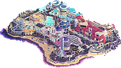
Expo Miami - Transport Yourself to a Brighter Tomorrow
-
1 fan Fans of this park
-
Full-Size Map
-
Download Park
235
-
Objects
1
-
Tags
Similar Parks
Members Reading
nedesigns
- Copyright © 2002-2025 New Element Designs
-
Community Forum Software by IP.Board
The match of all matches, to decide who will be crowned H2HX Champions. One last time it's teamwork makes the dreamwork, and dreams are where these two parks take us.
Expo Miami - Transport Yourself to a Brighter Tomorrow
concluded
Drink up, dive in—youth forever begins
Voting rules- The poll will stay open for ~96hrs.
- Do not vote unless you have viewed both parks in-game.
- Everyone may vote except members of either team. Any illegitimate votes will be ignored or removed.
- Anyone with an account that predates the start of H2HX, or who has been drafted onto a team, may vote in this
match. Anyone with a newer account must pass the admins' account integrity checks.
- Voting is monitored by the admins to improve fairness.
Wowie zowie! Oh my gosh this is totally bonkers! What a matchup between two heavy-hitting parks! I can't believe H2H is already over! This one is definitely gonna be one tough vote! Congrats to both teams! Gonna have to wait to make my decision on this one!
Cats, Jerks,
Great job capping off an exciting season!
Gonna let this one simmer for a bit and try to do a lengthy breakdown for each park. They both deserve it.
May the best team win!
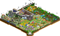
Expo Miami:
Expo Miami by the Soda Jerks
-Concept: **
It's a decent concept, but I was expecting a bit more from a Grand Final park. It relies more on the aesthetics than a strong concept in my opinion.
-Content: **
There's quite some content in the form of architecture, but I felt it was missing some 'meat' behind all the facades, some meaning, or just little scenes to keep me entertained after admiring the architecture and rides.
-Quality: ***
Here's where the park truly shines; Immaculate geometry and color design on the architecture. Also love all the lighting details in the park, really brings it to life!
Overall;
While the architecture is of very high quality, I also felt there were some imbalances here and there. For example the architecture on the west side of the park, near Cosmic Diner is highly detailed with lots of small deco details, while the building(s) around Ocean Explorers are pretty bland and underdetailed in comparison.
Same for the big dome around the Skyward Elevator. Not sure if it was intended this way or you just ran out of time to decorate/detail it a bit more.
The purple water is a bold choice, but I think it pays off. The gradienting helps a lot in selling more of a sunset vibe. The beaches miss some more detail, scenes or crunch I think. Feels a bit empty at spots, missed opportunity in getting in some more content. But overall a nice vibe.
The rides were very good and enjoyed following them along on the Main View. Test Track had some nice interaction bits with its building and the park entrance overhang signage, and its station was very well detailed and designed. Love the turnaround at the beach bit.
Cloud Strider also had great interaction with the architecture, especially loved the bits where it circled around the towers, the first big drop and when it pops in and out of the Test Track show building. The bit after the 2nd launch was one of those 'wow' moments for me, great flow into a nice set of inversions and then it drops below ground level behind that lovely car display bit.
Astro Orbiter was also a highlight for me, very well placed there, encapsulated by the big building, and then the peeps being able to view the ride from higher levels of the building. Great structure design as well on all the sloped trim bits and the rocket on top.
And finally loved seeing the Miami Mover travelling around the map. Transport rides are underrated, and can provide so many nice ride interactions. For example that bit in the screenshot below, where it comes out of that diagonal bit with the overhang, and then goes around the helix and towering bit of Cloud Strider.
The foliage was generally nice, but some patches were a bit too empty I felt, like in the backside around the aircraft displays. Like the opposite and middle parts of the path contain highly detailed flower-bush bits, but then there's just empty pieces of land around those displays. Bit of an imbalance there. At least could've used something to detail that up a tiny bit and keep it more in line with the rest.
The new animated ground tile objects created a very nice fresh visual around the paths, and really added a lot to the atmosphere. The 1j fade object to make the neon lights look radiating/reflecting on the paths was so clever and I think it could be a meta changer in sunset/nighttime parks.
Finally, shoutout to the custom (AI) music playlist found when you scan the qr-code of the attached png, I had quite a laugh listening to that
Overall, a very nice park park though, great unique atmosphere throughout, and although the palette reminded me of Buxom, I think it worked here!
====================
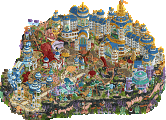
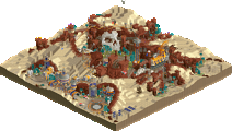
Vere Aeternum by the Jazzcats
-Concept: *
The concept wasn't entirely clear to me, something with a fountain and its name meaning 'Truly eternal'. The rides also all had fantasy names, which didn't make it any clearer, so guess it's just all about aesthetics and the beauty of nature..
-Content: ***
With all the terraforming, you've created lots of interesting content possibilities, and with turning the view another batch of interesting content was found.
-Quality: ***
Although it was very risky going with pretty much all the same colors and textures throughout the map, there was just enough variation in geometry and decoration/detail that it didn't become repetitive. Pretty much every parkmaking aspect was represented in very high quality.
Overall;
So while the concept was kind of a miss for me, as I didn't felt any deeper connection other than being amazed by the beauty of it all, I get why you went this route. I think seeing your line-up of builders that 'natural beauty' was what they care about most and fits their building styles, so why do a gimmick of any sort when this is what you guys like building best. And I felt you guys really had a lot of fun building this, it shows.
The heavy use of 'argonath misc 16' was a bold choice, but I think it resulted in a fresh take on terraforming design, combined with the Fisch rock boulders here and there. Loved how you integrated the foliage batches here and there for variation, and the greens made for a nice aesthetic in front of all of the brown from the rockwork. The waterfall bits created a nice variation in the terraforming, and almost reminded me of the heavy waterfall-ing I did in Droomvlucht I think the waterfalls are my favorite feature of the map and makes it really unique and standout. Really created that 'epic' style I think you guys were going for. They also interact so well with all of the architecture and rides, well done to whoever implemented them!
Aeternus was great to follow along on the Main View, especially loved that diagonal bit after the first big drop into that turnaround, where it interacts with Revivesco and Amnis; great visual! The looping after that is unique too, not sure whether I like it or not, but appreciate the thought of making it look different Also love that Revivesco is diving inside of the loop. The pre-lifthill bit where it circles around the building is also very nice; lovely architecture and clever interaction.
Revivesco's station was amazing. Love how it sits on the top of that little mountain, with all the waterfalls and height variations where it interacts with itself, diving under the station. Very nice geometry, structure design, texturing and color scheme on the station building as well. The layout itself also was great, lovely little interaction with the queue at the start (a wonder that those waiting peeps don't fall off though! ), then it turns into a lovely little horseshoe bit after the lifthill (best to see when you turn views tho!) and then it plunges right underneath Aeternus' custom looping. The bit after that where it goes around that little tower with blue dome and those waterfalls besides it, was one of my favorite bits of the map. Such a nice visual! Then the bit right before it enters the station again, also is so nice where it comes out of the mountain underneath the waterwheels.
The diagonal splash on Vitalis Splash was clever, and that the boat is at a horizontal angle while splashing down had me giggle a bit Someone needs to create sprites for that! Almost looks like it's flying right into that bunch of waiting guests for Revivesco
  Love the cutout bit right before the big final splash, as well as the little details in the mountain edges.
Amnis was a nice supporting ride, and love the bits where it popped in a out of the mountains, and also like on Vitalis; the diagonal splash. The other supporting rides where well placed and were nicely integrated into the landscape.
EDIT: Forgot to mentioned the clever hacking(/TI copying) and awesomely themed Sanitatem Aquis (the topspin). Very unique, and with the waterfall bits spilling over the supporting arm structures is just so nicely done!
The pink color on some of the foliage was a risky choice, but I think it provided a nice insertion of color into an otherwise very monotone color scheme. Clever use of invisible color on some of that. The various wooden canopies with the foliage on top were also nicely done.
Overall a very well designed park, loved the 'epic-ness' you guys managed to display.
====================
I think I've made up my mind where to vote for now, but I'll just sit on it for some more to be really sure of it.
Well done teams, and a nice conclusion to an awesome H2HX season, imo the best season we've had.
Both of these parks are wonderful. They're not necessarily ambitious in a traditionally grandiose sense, but they commit to a singular vision and succeed in executing that vision at the highest level. Vere Aeternum has a beautiful aesthetic, with the architecture, landwork and foliage blending into each other in a graceful way.
I was especially fond of this coaster station, with the curved buildings enmeshed into the rockwork so seamlessly.
You could imagine being tucked away in this cove here, surrounded with mountains, trees, and the splash boats all around and above you.
I loved this diagonal flume drop through the waterfall. The lines and angles throughout the map are so dynamic.
Everything curves and flows into one another, which on some maps could fall flat, but on this one that aims to subdue you into its tranquil world, it has a perfect effect.
The gold aqueducts popping against the background are very satsifying.
I love the color work in this back garden here, with the bright pinks and blues subtly battling against the sea of warm beige and greens.
Expo Miami is just smooth, clean, but also not afraid to experiment and push the bounds with architectural forms, really well implemented neon objects, and great colors.
One of my favorite parts of this whole map for me is actually similar to Vere Aeternum, in the way that everything is designed to flow and blend into each other in a way that makes the map very satisfying to dance around on. The way that buildings flow from bright to dark blue, to purple to pink works really well. This map edge here, and the way that the water shifts from dark to bright, complemented by the square holes effect and neon lines is so cool.
The black void foliage and flamingos here are a great touch of surreal Floridian naturalism on an otherwise futuristic map.
I love the forms of this building here, combined with the roof patterns and pools on the roof. The ships and aquatic elements... Might be my favorite area on the map.
These neon floors are an amazing effect. A great way to add flow and movement to what would otherwise be mostly negative space. The colorwork implemented on making these paths change depending on the area they're in is one of those subtle touches that are really just so smart, making the map feel connected and vibrant.
I love this square effect from the cel shade object in the water. Unfortunate use of the Tesla Truck here, could be make or break for the voting.
Loved these nets and canopies here over the paths. As a sidenote, there is a great balance here of making each area/building have its own unique voice and not get too same-y, while retaining enough motifs to not feel like you are viewing multiple different maps glued together.
Quick shoutout to the macro overview. The fluidity of shapes, the colors, came out so well.
Not sure who to vote yet so I'll just keep enjoying these two parks for now. Congratulations to both teams on great runs and on two great finals parks. I have to admit, without speculating, It's endearing that both of these parks are of a style and an aesthetic that I imagine are special to the builders. It's a great way to cap off a season.
Outstanding parks again.
These two are interesting because they both captured the magic of peak Disney park experience (the sounds in Vere Aeternum, the style in Expo Miami), while straying far from those themes. But both parks are also more grounded than some of the crazy ideas from this H2H, bringing it back to more classic RCT and theme park vibes.
The coasters in Vere Aeternum with their intersections and movements, and the terrain/landscaping, echo my favorite parkmaker, Mala, specifically almost like a 2024 version of Escalante River Falls and even some from Rift Valley. I'd be very curious about the inspiration from the parkmakers.
Miami is a work of art.
What a remarkable season, and one I've truly enjoyed as a pure 100% spectator. FYI mods, I think I voted to null my vote, but I can't tell if I accidentally clicked something else. My intention was to vote null.
Expo Miami : Ok, first of all the colours are great, I mean not just the palette, but the way the colours work together. I really liked the area around the building that houses Ocean Explorer, the blue and the paths are stunning. The same goes for the attention to detail inside the central building. The overall architecture is bold, at first I thought it looked a bit lacking of detail, but in the end it's also very coherent and minimalist as it should be for this kind of architecture. I love the way Cloud Strider's layout blends in beautifully with the architecture. My criticism would be that it sometimes lacks a bit of life, particularly along the paths and on the beach, but that's a minor problem that doesn't in any way prevent you from enjoying the park. Great work, great team, great park !
Vere Aeternum: Beautiful park, there's so much to look at, nothing has been left to the chance and there are so many details. I really liked the landscaping, especially these cliffs which are a nice change from the traditional Fish Rocks, the coaster that runs through them is splendid, and the station building is wonderful too! I like a lot Aeternus station, with its curves, simple but very poetic and pleasing to the eyes. My negative point is a certain repetition in the architecture, like a motif that seems to be repeated with a few variables, but to bring nuance is also what gives a lot of coherence to the whole and gives to the park a unique look. I think my favourite area is the corner near Revivesco, you turn the view and wow, you come into this little hidden valley with lots of flow! Really great work here !!
I'm having a really hard time choosing, perhaps because I find Vere Aeternum's execution a bit superior, but I also admire Expo Miami's theme and boldness, which seems a bit newer and fresher. It's a really cool match, between 2 great teams!
what a season, what a final, what excellent parks to end on. thanks so much to both teams, i think on the balance of the whole season both teams deserve to be in this matchup, and i'd imagine it's a close one.
Expo Miami
waporwave is an aesthetic that i love, and one that is incredibly easy to mess up. luckily, you guys are artists, and this map looks beautiful. music and sounds is one part of parkmaking that i often overlook, mainly because i build with the sound off, and often view parks with the sound off. this h2h has really opened my eyes to the power of sound design to support a theme, and this might be my favorite example of it all season. the music is AMAZING. you guys have killed it all season in that department, actually.
the first thing i noticed was a tiger entertainer named "Gloria Estefan". this prompted me to check out all the staff names, and, well, you guys know what you did. little bits of flavor like this really add to the experience - it's one of the things i don't like about all the peep objects we have now - they're great for creating a fuller atmosphere, and definitely a net positive overall, but i always want to hover over people to see what's going on.
i'd like to mention the palette, and let me first say that in general i find palettes to be overrated. in too many cases they are used in a slightly gimicky way, and i often enjoy the maps just as much (if not more) with the natural RCT colors. this is NOT one of those times. the colors here are so interesting, so different, so masterfully blended, and you've created a really beautiful atmosphere throughout the map. again, artists.
this map really shines in 2 places for me. first off, the blue coaster is up there with any from this whole season. so lovely to follow, and the double inversion after the second launch is genius. it spans most of the map without feeling boring, and invites you to explore more to find out where it's going next. love it. the second thing that really stands out is the architecture, which can be hit or miss with this "expo" style. retro-futuristic styles abound, a really interesting color mix, a great blend of intricate detailing and large, bold shapes... obviously the fake rockwork building is an impressive highlight but i also loved the back side of the map with the big round buildings, the awnings and the netting. i don't think anything like that has ever been done before, major props on creating something new and interesting.
the map edge is also something that can be overlooked imo - we've seen lots of different ways to blend the map edge out in this contest, and this is one of the best. i can't even imagine how long it took to make it look this lovely, and the end result is stunning.
overall feelings about this park is that it's something that feels like the future of RCT. it's different, bold, mold-breaking and visionary. always risky to create a new aesthetic in RCT, but you guys have nailed it. also i just left the window open for ages to listen to the music.
Vere Aeternum
if the last park felt like the future, this one felt classic to me. in the best way, this feels like a park i would have loved to make. the aesthetic feels recognizable without being played out, a new twist on an old favorite. the pink and yellow color pops are incredible, and the maximalism is something that i love when it's done well. and it's done SO well here. also, while we're chatting about sound design, the waterfalls and animal sounds. FUCK. it's amazing. every park of mine will have this in there from now on. it adds so much. why has no one really done this before. we're all idiots.
it's easy to fuck up an overgrown theme like this one. if you go too dense you'll lose all readability, but it has to feel organic and natural. you've managed to cram in so much stuff onto this map, but the end result is still easy to explore and fun. i mean this with love: it feels like the planning for this one was like "what if we added this as well? FUCK IT yes let's do it. is it cool? then yes we'll add it. is there potentially too much stuff? don't worry about that it's all cool."
obviously the landscaping and the foliage rocks. the height variation is incredible. the sideways palm trees are incredible. the waterfalls are incredible. the 2 main coasters are both great, lots of interesting interactions and settings. the back corner that's kinda hidden from the first view is my favorite section of the map, the station for that coaster with the red awnings is brilliant. the water cascading down the waterwheels is brilliant. the waterfalls coming out of the towers is brilliant. colors are spot on here.
someone referenced mala and i agree - just really cool stuff right next to a load of other really cool stuff. overall takeaways are that it's a map full to the brim with excellent work, and treads the line of "too much" absolutely perfectly. i love it all.
Great work on the part of both teams. I'll keep it brief so I don't spoil who I voted for.
Expo Miami. I like the lighting. Two of the tracked rides are clearly based on Cheetah Hunt and Test Track but they're executed very well. I really like the water colors and the modern architecture is top shelf.
Vere Aeternum. I like the coaster interactions with each other and the environment. The combination of a regular park and water park is done well enough to be believable which is no small feat. I'm not a huge beige person but it works here for me. Lots of interesting little details to look at.
I will say more when I know how the vote went and until then, great work from both teams and a great end to the contest!
First off, huge congrats to everyone from both teams that made the finals. Round after round, both the Jazzcats and the Soda Jerks produced some of the best RCT we've seen in ages. A lot of innovation, fresh ideas, and superb execution. So to whomever wins, or loses, you have a lot to be proud of.
Expo Miami
This almost feels like and reads like the prototype models of what EPCOT was supposed to be. If I squint, this conjures the memory of seeing the EPCOT model while riding the Peoplemover at the Magic Kingdom. As a Disney nerd, this pulls on some nostalgia heart strings that I don't think many RCT parks have elicited from me. So kudos to you lol. There's a lot of fresh architecture here that is at first quite unassuming, but the longer I spent viewing the park, the more appreciated the shapes, motifs, and thoughtful additions. Really for whatever reason loved the cresents on top of the Hovercraft Station station. The main coaster was nice. I was a little bit bummed about Test Track.. seemed a bit too simple? Unfortunately in comparison to the real test track, there wasn't that build up of anticipation for the outdoor launch section. All in all though, this is a refreshing way to end the contest. Really wonderful park.
Vere Aeternum
We go from a flat map to the opposite here. I think at first glance, the rockwork was a bit unreadable for me. The overuse of the Argonath and Fisch rocks was repetitive and muddied the elevation changes a bit too much. Despite that, I think this park also does a great job with waterfalls and foliage. So it balances out I suppose! Everywhere you turn, theres a ride that's tucked away, or a coaster helix that I haven't seen yet or a new waterfall. There's so much to explore here. I didn't see the top spin until my 3rd viewing.. geez! Overall I was left wanting more color.. more to help differentiate as a viewer some of what I was seeing. Seemed like 95% of the map was 1 of 3 colors... it all sorta just blended together... but maybe thats tired eyes writing a review before I go to bed? Most likely.
Also, I have to mention as others have how wonderful the ride design is here. If we compare the two parks purely from a ride design perspective, this wins out. Amazing coasters, amazing flume. Amazing swans I guess? Sure why not!
Jazzcats, you guys amaze me with how much content and creativity you can produce round after round. It seemed like every match you brought your A game and a final round quality park. Mind-boggling.
expo miami: I almost dont even know how to write about this park. I like so much of it, and I really want to like the whole thing. to start, the infrastructure is really phenomenal. I love the tomorrowland retro rides, the animated neon lines and the abundance of modern-not-modern retro futurist architecture. I think it's held back a bit by the overall map composition, feeling quite flat and like a bunch of 'islands' put down on path. I know its an expo so that makes sense, but it is inherently just a bit stale as a result. I suspect if the coaster layout was stronger or the test track ride worked into the park more, it could have counteracted that. I almost wish you had dropped the more realistic 'expo' setting and leant into a more outlandish future world which would allow more verticality and stacked rides and shit. but that criticism aside, I keep returning to how good all the individual buildings are. the submarine one in particular is stunning with the pillars, and the infinity and beyond one is my other favorite. all up a really strong showing, and I think it could win for sure. it pushes forward with some awesome new aesthetics, even if I think its held back by overall composition a bit much for me.
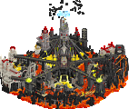
heavens kitchen: in contrast, this park feels massive and really fleshed out. its not exactly flashy or completely groundbreaking, but I found myself really captured by the soothing atmosphere and seeking out details. I particularly loved that back corner where the stations all are, with the top spin and the giant water wheel going around the queue coming out of the mountain. curves are flowy, foliage is lush, and the coasters are deliciously tangled. I actually have always been pro-lotr rock and I think it works excellent here. the drooping pink flowers are a real highlight for me. I love the music and the nature sounds and I can't quite put my finger on it but it does genuinely give me the right 'transcendent' quality that the theme is trying to sell, like this is some ethereal magical place we can fantasize about after life. I think I will always be kinda sold on parks which depict heaven/afterlife/olam habah/wherever you go when you take a lot of acid/etc as a theme park. I can't explain it but it kind of captures the magic I feel when I imagine the perfect theme park, and what we're all striving for here. Anyway cheesey shit but it got my vote in the end, although I will admit it was close, and I really wouldn't be surprised to see either of these win
Jazzcats
 I think it's especially powerful in the main street - white and purples. The light blue lettering pops so nicely here! The pink blob I don't like as much, but it doesn't bother me and I appreciate the visual variety is offers. The beaches are a nice motif, though not super interesting in itself - I think you could've done more with this. The 'club' with the pink ornaments and flashing lights is one of my favourite bits of the map. Cloud Striker's station is also cool with the blue lattice stuff. Then there's the two white round cilinders with the orange bikini bottom awnings, and the blobby netting around. Really interesting look, I like it. Map edge: good. Path texturing: good. Soundtrack: good.
Within a second of opening the map I adore the colours and circular motif. The water features want me to look at them, but the swoopy pre-lift turns on the woodie get my attention first. I love how this is embedded. While I watch the train go up the steep (nice) lift, I spot Sanctus. I don't think I've ever seen an Intamin first gen freefall in a non-realistic park, and the splash is a smart addition. Back to the woodie: pre-drop turns matching the pre-lift stuff, nice. I like the stuff that follows, heavy interaction with the landscape and other rides. Sadly, I lose track and even with invisible scenery and land it takes me a minute to figure out where the coaster went. Small minus points for readability. I think this landscaped section was a bit rushed? Shit happens. While exploring this section I spot a curved palm tree. New? Nice.
I will speed up the rest of my review with bullet points of what stood out to me.
- I like how the aquaduct Amnis traverses is a larger system with several splits, rather than just the log flume itself.
- Loving the architecture/theming around Amnis's station. I think I recognize someone's style here.
- Cool sundial
- The blue domes are a very nice looking motif
- I like the big tree under the dome
- The station area for Revivesco is also stellar, not just the execution with the zigzag canvas stuff, also how it's perched atop this rock within this hidden valley. The waterworks and the big hacked water wheel are a great backdrop. Amazing work here.
- Love the caverns/subterranean hot springs (?)
- Revivesco and Aeturnus embracing each other in that turnaround with the log flume threading it twice is one of the best interactions on the map
- I like the balloons in the swimming area
I can name more things but these are the things that stand out to me first. Overall I really like the map and it has a lot to like. Readability is a minor problem here. The park reminds me of the classic RCT2 parks, and more directly it reminds me of the Eden area in Islands of Enchantment, which is definitely not a bad thing. One thing that those parks had that this parks lack, that is quite instrumental to the aesthetic, is large negative path spaces to offer contrast and breathing room from all the theming and ride madness, and to guide you through the map. I think Vere Aeternum needs something like that. I must also mention that I like this park's theme. There's some ambiguity I think, but my take on it is that these are the fountains of youth and people come here to bathe in hopes to live forver. It's not the perfect park but it's a very nice ending to your season and to H2HX as a whole. Great job sqeeuzing out one more park like this at the end of a long season!
Soda Jerks
Vaporwave again... I feel conflicted. I like the vaporwave aesthetic, but it also a bit thematically hollow perhaps. We'll see what you've done with it here! I can quickly tell this is probably the most advanced take on it we've seen in RCT so far. I'll look at Cloud Striker first. Very good layout, one of the better coasters this contest I think. I especially like the large double inversion after the second big launch. The indoor section on the other hand I felt was unnecessary. Theming: good palette, glad to see Buxom's influence here.
Some more details that stood out to me:
- Main street banners
- Tiny fountain/sculpture after entrance
- Wobbly astro orbiter
- Moon lander sculpture and some of the other vehicles
- Volleyball player should've been topless
- Gloria Estefan? What?
- The tile floor under the water!
- Neon palm trees
Overall this park is very visually stunning, and you did a good job adding original execution to an unoriginal theme/aesthetic. Like I feared I found the park to be a bit thematically hollow. There was nothing to 'get', nor were there many small things made me go 'oooh'. But it's a really, really nice vibe that I want to submerge myself in. Drown me like you drowned that saxophone player who sounds like he's playing somewhere underwater.
The match
My SJ review is shorter, but that's because it's not as content packed as Vere Aeturnum. In terms of quality, both parks have their strengths and weaknesses. Vere Aeturnum wins for me simply because it resonates with me a little more.
The poll is now closed. The final voting score was:
The moment we've been waiting for has come: Huge congratulations to Team Jazzcats on becoming Champions of the tenth rendition of Head-2-Head!
Of course super happy about the reception of our park. Kudos to everybody on my team, especially to Leon for showing great leadership.
Last but not least huge thank you to the admins for the everlasting professionalism in the presentation and running of the contest. You know how greatly appreciated all your efforts are by the whole community. One might say you actually surpass yourselves every season.
Vere Aeternum:
+ This park is very pretty. I've been struggling to find the proper words for this but I think pretty feels right. It's a great blend of serene and busy and sets up an idyllic atmosphere. There's some nice use of color throughout, such as the deep pink flowers breaking up the beige.
+ This park feels huge! Even with the same 70x70 space as the other playoffs parks, you've gotten a lot more out of it through verticality. The layered-ness of the rides and scenery add to this, and I love how much there is to discover just by rotating the camera.
+ Love how consistent yet varied the architecture is throughout. Revivesco's station is the architectural highlight for me. Love the shell shape on the top with the wooden lattice in between and the towers with the waterfalls coming out.
+ Great ride design across the board, and I love the dueling curves between the woodie and the RMC. The bridge across the RMC drop facing the woodie loop is a great bit of path interaction. The log flume has some great moments but the highlight for me is the layered curves with the waterfall in between. I'm also a fan of the freefall through the water complete with the invisible water coaster boat. I was wondering if hacking in a splash like that was possible on Land Before Time Before Time. The three-wide top spin is a really cool idea. Would have loved to see the waterwheel motif integrated into it by having two of them powering the top spin.
+ Love the bit with the balustrade roofs in the east corner. Definitely feels like a touch of Tolsimir genius. The nearby cutaways are really neat too.
= Landscaping does wonders to give this park a grand sense of scale and lushness. The dark brown rocks kinda blend into each other though which affects readability.
- Theme-wise it feels a little safe. It makes sense for a large park with a tight deadline; do something many of the builders can confidently tackle and iterate motifs around. On the flipside, it was very obvious to tell who was behind it as it didn't exactly feel very adventurous or different from what they would usually do. Maybe my expectations were just high for the H2H finals but still.
- Readability-wise this park is not doing it from me, both zoomed in normally and viewing the park as a whole from far away. It feels very blobby and hard to follow with so many homogenous colors everywhere. A lot of stuff feels just kinda there. I swear this isn't just me being bitter; this is a very beautiful park with a great level of execution and polish. Congrats Cats!
Expo Miami: This is Auntie Scoop's sixth child in the last few weeks so the full backstory of this park is not mine to tell. Either way, this was a park I was excited to play a big role in since the beginning.
For me, this one's real bittersweet, like a nice big scoop of mocha chip. I'll just get this out of the way; this is a very hard loss for me to take and it'll sting for a while. It's one thing to be completely washed and at least take comfort in the fact that there wasn't much you can do. It's another to come so close in the most important moment of any NE contest and just barely fall short. We had a lot of availability issues throughout the team, but I had a wide-open schedule and was working a part-time job. Unfortunately I got COVID for the first time in my life which put me out for two weeks, and I also juggled Expo with a personal project for a week which so far has had zero return on investment. The time I spent building was nerve-wracking, and I often found myself freezing up or not knowing what to build. Even if the entire team disagrees with me, I really do think If I had just gotten slightly more broad strokes done in advance or found my groove a bit earlier, I think we could have clinched it out. I think we had an amazing layered idea but just did not have the time to fully flesh it out and polish it. There is so much we wanted to add but just did not have time for. I hold no ill will towards the Jazzcats, who have put out some of the best RCT in recent times, nor my fellow Soda Jerks who have been a dream to be with.
On the other hand, this is a hell of a park and I'm so glad we were able to finish. The whole team managed to come together in the last few days to really push it over the hump. I'm proud of what I was able to contribute, both to Expo Miami and to the Soda Jerks as a whole. This was an amazing first H2H to be part of and I have almost zero regrets. I've learned a lot from both building on collaborative maps and watching other parks develop. It's pretty shocking that I was the third biggest contributor to our finals map, and I definitely would not have seen this coming a year ago. Even if we lost, we put up a good fight and most importantly made a strong impression as a memorable H2H team. Big ideas, impeccable vibes, almost zero drama; exactly what I wanted from H2HX.
My contributions to Expo Miami included:
Land Pavilion:
Nice Write up Gustav! I have my own thoughts that I'll share when I have the time and energy.
Wow what a close final, congrats to both teams. two high quality parks, very different styles, that seemed to split the vote. looking forward to hearing everyone's backstories for the season/these parks. also great to see so many players involved on both teams, creating parks that look like one person built them. great meshing of styles.