Park / Bayon Falls
-
 08-October 08
- Views 8,497
- Downloads 1,076
- Fans 4
- Comments 16
-

-
 80.42%(required: 65%)
 Design

postit 95% geewhzz 90% Xcoaster 90% CedarPoint6 85% ChillerHockey33 85% Fr3ak 85% posix 85% RCTFAN 85% Magnus 75% Milo 75% zodiac 75% nin 70% chapelz 65% Evil WME 50% 80.42% -
4 fans
 Fans of this park
-
 Full-Size Map
-
 Download Park
1,076
-
 Objects
239
-
 Tags
Tags


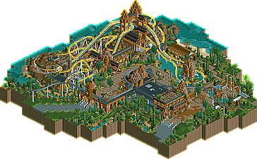
One can only wonder what drives 5dave to build park after park...
Don't own RCT2? Click here for a full scale aerial.
The ride itself looks pretty fun - particularly the first major drop, bunnyhop and turnaround over water. As well as being pretty unique for RCT, you captured the Aquatrax look perfectly with the water-slide track underneath the coaster track. However, there were a couple of gripes - the same as geewhzz mentioned: the launch is too instantaneous and there's a chainlift instead of LSMs (although that is a very minor point!). I also thought that the section between block-brake and chain-lift hill was a bit pointless - a dud spot on the ride perhaps - and I guess the final brake run is a little too 'squeezed in' as well.
Would have been nice to see a few more water features too. I know the Aquatrax at Lotte World is very much a rollercoaster, but it does manage to come off as a water-ride as well. This design didn't quite totally capture that water-ride element IMO; a few more water features may have helped pull that off better. But yeh, overall, it was really awesome as a whole and definitely deserving of a design spot, congrats.
Off course, you could always nit-pick on small things like the somewhat messy/chaotic structures that supposed to be Cambodian temples or ruins and some missing water ride-interaction features, but this is just a high quality design..
It would be awesome to see a full scale park like this of yours!
SF
Best regards, Prodigy
Edited by prodigy, 09 October 2008 - 06:25 PM.
Kevin Enns Offline
But looks good from here, see you tomorrow!
It's obvious that this is a fantastic design, but I don't like it much. It doesn't have any conventional architecture, and when I was looking at it, I just found myself getting stressed because of it.
I'm not going to say I thought it was a bad design, because it was one of the best designs since ArchAngel (Which is still the best btw), but I didn't like it.
Great work.
James
I thought it was fantastic. The architecture was incredibly well done, it takes a lot of thought to pull off irregular shapes like that. My only gripe would be that around the coaster there were a lot of glitches due to the scenery encroaching on the track, which made it look slightly messy.
The coaster itself was nicely done, I can't really comment on the real life aspect of it as i've never seen one before, but maybe the launch was a bit too fast? The coaster seemed to be going very fast all the way around, and it hit the very small breakrun with a lot of speed.
Colours wise, spot on. Perfect colours for the track, the architecture, and the foliage (love the purple flowers). The custom flat ride was lovely. The route for the monorail was perfect, although it doesn't stop anywhere? A pity.
It reminds me slightly of Kukuana foliage and setting wise. Overall, very nice design, well deserved, my love affair with your work continues.
very novel and the whole area was done well.
You made a building with very little colour look superb
disneylhand Offline
-disneylhand
Thanks for all your replies!
Yeah, I know the launch was kinda extreme. I used a fast launch, as I wanted the lifthill to be slow, and if I had build a chain launch, the lifthill would have been strange in the end, or too fast.
And I planned to add some small water jets near the turnaround at the small lake, but it seems I've forgot to Parkdat them in...
And I agree, it's mostly brown, but Turtle explained exactly what I wanted to do: brown foreground, yellow coaster and the water as a contrast in the back.
And I don't think the archy is repetive, as I wanted to make a enclosed area with a similar but still harmonic style and color. IMO different architectural forms would distract from the tempels and would look messy, just my opinion.
Thanks for all your replies!
"MFG"