Park / Starflight
-
 25-December 08
- Views 5,112
- Downloads 1,007
- Fans 2
- Comments 12
-

-
 78.85%(required: 65%)
 Design

RCTFAN 95% Steve 95% Xcoaster 90% chapelz 85% Evil WME 85% CedarPoint6 80% nin 80% zodiac 80% Magnus 75% posix 75% 5dave 70% Fr3ak 70% geewhzz 70% Milo 70% FullMetal 60% 78.85% -
2 fans
 Fans of this park
-
 Full-Size Map
-
 Download Park
1,007
-
 Tags
Tags
![park_3338 [H2H7 R2] World's Fair](https://www.nedesigns.com/uploads/parks/3338/aerialt3037.png)
![park_3334 [H2H7 R2] Bermuda: The Lost Colony](https://www.nedesigns.com/uploads/parks/3334/aerialt2938.png)
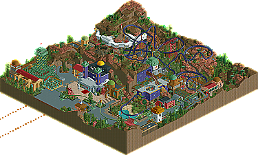
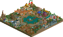
2x Spotlight winner and now 3x Design winner, Turtle returns to our screens with his second design with star in the title, Starflight takes us on a journey through an alien landscape, a theme not usually associated with him. However, his creative spark is very much still here and instantly recognizable. The whole area feels like it has been lifted straight from a Jules Verne Novel, and some inspiration must have been taken from a certain parkmaker. There are only two other rides on the map being the Skyway, an inverted monorail complete with tunnel-esque pylons and Comet chasers, a simple 3D/4D attraction. Read on
The structures are very appealing too, nice use of shapes and straight lines!
But still was one of the better designs we've had and I thoroughly enjoyed taking time to look over the intricate buildings. Congratulations on your 3rd design!
Congrats on your fourth design, I'm looking forward to more!
I'd very much agree with this review; I picked out a load of positives when I looked at the Design, but there was just something missing for me... the coaster itself never really excited me. It's hard to put my finger on exactly why, but meh, that's what I thought.
I liked the pre-ride bit, before the proper launch - I liked how it was clearly visible to peeps before they got in the queue, and I liked the 'hole' in the land, which led to the second launch. I also liked the outro to the ride - the dive down into the final immelmann inversion; a really strong ending.
Archy was nice, and there was good use of trackitecture - the Eiffel Tower, the multiple 'tunnels' on the track. The hole in the station roof was cool. I didn't get the 'crashed' spacecraft - it just looked like some random white walkways. Initially liked how the map was split up into two, with the land division, but I'm not sure it worked in the long-run; it made the coaster awkwardish? I'm not sure. Theming good; different but realistic and immersive, and did look quite a bit like Tomorrowland at Disneyland Paris which is the same theme.
So yeh... hard to put my finger on why I didn't LOVE the design, but I thought it was nonetheless a really good design and well worth the download.
First, the coaster.
When I looked at it the first time, I thought I was probably going to give it a low score. Once I started watching it run some more, though, things got a lot better. I looked away from the realism aspect, and just looked at it as a ride package, which I think works fantastically. The launch tunnel is fantastic-- that would be a great view overlooking the ride before the thing even starts. There's a good mix of inversions and turns, and you keep stuff happening until the end. I like how the height changes in the land work with the ride so stuff is still close to the ground, yet well paced. The station is fantastic with the holes in the ceiling. It all has a great kind of fantasy space, Verne feel to it, which I love. All the little tiny details and scenery pieces really made that.
The architecture is pretty fantastic all around. Of course, the Eiffel Tower is the highlight, but I also really liked the observatory off from the station. It really captured the mystical feel with everything. You made a really strange combination of stone, wood, and metal look pretty nice. The amount of color in all of it really stands out too. It's not overbearing, but it's not too dark, either. I think I'm with some of the others in that I didn't get crashed space station out of the white stuff on the hill. It looked like a lab or something to me and worked just fine like that, but I'm afraid I didn't see space station until you said something.
All in all, really nice stuff. It's good to see something that I feel deviates from a lot of the usual designs. It's a cool theme and a great, unique coaster to go along with it. Hope you keep building stuff!
Great job!