Park / Donkey Kong Country
-
 06-August 24
- Views 6,880
- Downloads 212
- Fans 1
- Comments 24
-
-
 79.00%(required: 70%)
 Gold
Gold

CoasterCreator9 85% RWE 85% chorkiel 80% Mulpje 80% pants 80% Terry Inferno 80% wheres_walto 80% Xtreme97 80% Babar Tapie 75% ottersalad 75% posix 75% Scoop 75% 79.00% -
 Description
He's the leader of the bunch, you know him well
-
1 fan
 Fans of this park
-
 Full-Size Map
-
 Download Park
212
-
 Objects
1
-
 Tags
Tags
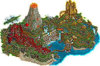
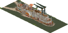
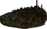
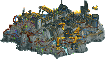
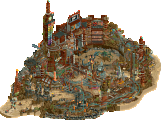
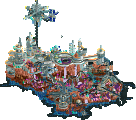
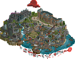
The second Play-Off match sees the Lonely Hearts Club and the Jazzcats facing off again straight after their last bout in Round Robin. One team brings banana-fuelled fury, the other a mechanical showdown. Who will leave victorious?
He's the leader of the bunch, you know him well
concluded
THIS IS MECCHA - FIGHT TO THE DEATH!
Voting rules- The poll will stay open for ~72hrs.
- Do not vote unless you have viewed both parks in-game.
- Everyone may vote except members of either team. Any illegitimate votes will be ignored or removed.
- Anyone with an account that predates the start of H2HX, or who has been drafted onto a team, may vote in this
match. Anyone with a newer account must pass the admins' account integrity checks.
- Voting is monitored by the admins to improve fairness.
donkey kong, so hot right now
Donkey Kong Country:
Really impressive landscaping, with some nice dramatic cliffs and and use of swaying foliage to give it some extra liveliness. Also like the ride design, the kart track is fun and winds through the map way, and the steel coaster has a cool aesthetic.
Meccha:
This is awesome, the amount of detail is unreal and makes this park come to life so well. Absolutely nails the gritty post-apocalyptic city feel and is a ton of fun to explore. The fact that this has such a chaotic junkyard setting and yet I haven't had any trouble with readability and it's all coherent and ties together is so impressive.
First impressions, Meccha is pretty damn close to the perfect H2H park for me, so much flare and innovation throughout the map. I love everything about it. Great job to the builders and the team. It's an honour to go up against this.
Meccha: Meccha's builders don't play the same game as us, or they're on another planet. This park is breathtaking, I can't remember a park that goes so far in attention to details. It's like a hyper-detailed drawing or film storybook. Each tile in the park is filled, each element of the architecture, from the tiniest, from the most basic to the most sophisticated is carefully thought out and build. Every single detail I look at makes me think « holy shit, it's so obvious and clever » (that plane for example…). I also find that the coasters fit really well here, . It's a great, great, great job. It would take hours to admire all the jeweller's work in this park. Without doubt the greatest park of this H2H to me. Wish good luck to those who’re going to post a more detailed review, because there's so much to highlight here.
DKC: Really cool to see another Nintendo park. If I opened Meccha last night, I've kept this one for this morning. I hope it doesn't suffer from comparisons with the Soda Jerks park, here it's a different approach and a different vision. It's super cool in every sense of the word: beautiful, fun to discover and chill.
The panels are brilliant, the detail is amazing and the variations used to create the shadows are incredible (the gameboy one for example). At first I thought they were external objects, but no, I think they're great, especially in this meta where we tend to create objects rather than imagine creative solutions with existing ones (this isn't a criticism of object creators ofc). The flying Krock is superb, as for the volcano, and I also love the way you've managed to integrate the Mario Kart circuit. The Mine Cart Carnage is also very, very well thought, this way to discover this part of the park works really well and adds a bit of surprise.
Meccha
Very impressive structures and sculptures, and cool vibes. Maybe just a tad too busy for me, I found it hard to see what was going on sometimes. Individually there are some awesome ideas and details though.
DKC]
Very fun and recognisable vibes here, and some breathing room as well! Well done, I voted for this park in the end, but it was close.
DKC
This is such a classic H2H map. Packed with ideas and cool rides. The landscaping was outstanding. Not a big DK guy so a lot of things probably went over my head, but I enjoyed many of the rides. The go karts track was awesome and I also liked the water ride a lot. The landscaping was outstanding and the volcano a hilarious feature. Wasn't a huge fan of the factory coaster and the simplicity of the mine area. While I kind of liked the open station thought it looked underdetailed. Overall a very solid H2H park, great job!
Meccha
You can see this park was built with a clear vision or at least a strong directive. There's a lot of small little areas that all come together nicely. It makes the world feel lived in and gives it a sense of history. Great job!
Meccha
This is a bit ridiculous guys, wtf. Fun and clear concept executed to perfection. For the amount of detail here, and there is an insane amount, it’s remarkably legible and well defined from a macro perspective: colours and shade are used very well to give a clear spatial sense and to give prominence to the beautifully designed focal points and to soften the textural background noise of the scrapheaps. This could have been a fairly typical Mad Max style wasteland/junkyard vibe but the inclusion of the 1950’s googie vernacular is an inspired touch - it gives it a unique but crystal clear identity. I think this might be park of the contest for me ahead of Screameasy - I just feel it has a touch more aesthetic freshness and daring. Wonderful work Jazzcats
DKC
Tough luck on this matchup guys, and the minor bedroom incident with SF1. I don’t think it’s a close vote but that’s not to say I don’t love this park in it’s own right. There’s tonnes of charm and fun details - the swaying palm trees, the crazy spaghetti of factory frenzy, all the immaculately drawn pixel-art signage, and of course the smug/angry mountain haha. Great work LHC, a park you should be proud of ending a season you should be even more proud of.
Really great matchup. Love the concept in Meccha, the arena and mech designs are pretty astounding. Love the screens and little details at play. Super cool inclusion of some uncommon ride types. I think what I find super cool about it is that it has a unique identity; a bit of Mad Max, a bit of Fallout, a bit of other things - but all coming together to really create something genuinely unique. DKC is pretty fun and recognizable, and I really appreciate the dedication to the theme. All of the pixel art was really well done, but I'm wondering why some of it was included (like the Game Boy, for example). Factory Frenzy was a bold inclusion. A very strong park that had the same bad luck we had of going up against another Screameasy level park from the Cats.
Donkey Kong Country
as i mentioned, i'm not a big nintendo guy, so a lot of this i'm sure went over my head. but there's lots here to like on a purely artistic level also. the macro layout is a pretty good one with the big volcano and the bay really highlighting that middle part of the map. gives you a nice place to start and notice the main feature which i'm guessing is the kart ride.
the big jump in front of the crowd and the waterfalls is a really excellent vibe. very fun, and the big windmill is also lovely. from there my eye went north to the diagonal sign and further round to the river ride. landscaping and foliage is pretty spot on all over the park, if not slightly repetitive in places rockwork-wise. the back of the park suffers a little from this feeling a bit samey samey and making it kinda hard to pick out distinct levels.
the red coaster sticks out for me, but without feeling like a different area.. just kinda feels plopped on top rather than incorporated and belonging. there are interesting parts and lots to see, but it's hard to follow with all the pipes etc. and ends up feeling like a big red bit of the map. i have a similar feeling about the backside of the park with the mine ride. it's a big area of the same colors and textures and that makes it kinda hard to read what's going on honestly.
there are a number of high points on the map - the whole go karts track, tons of details, fun to follow, love it. the signage around the park is mindblowing. i like the big golden temple, although a couple of accent colors might have helped. the overall skill level is obviously really high, and the landscaping and foliage for the most park is excellent. just unfortunate that it has to go up against...
Meccha
...come on now. stop it. it's getting ridiculous. this is the best park this season (so far). i think it's important to say at this point that i have historically been VERY negative towards "junk" themes in general... i've just almost never seen them done well. too many times it ends up feeling messy. and unreadable. and too busy. but this is so good.
first of all, the concept is so great. like, i can't imagine the development of it, mentally. the name is so clever. it makes perfect sense, it's like nothing i've seen before, it's interesting, the deeper you get into the park, the deeper the theme development gets... just incredible RCT. there isn't enough time to pick out all the amazing parts/ideas/scenes... so here are a few that caught my eye.
every single large structure is unique, interesting, believable. every single small structure is, too, but the large ones are perfect. the movement, the signage, the colors (damn, the colors). this whole map is FILLED with areas that feel so real with stories behind them, organic development.. i'm finding it quite hard to put into words. every ride makes perfect sense.
i cannot wait to hear where the inspiration for this map came from. it feels like Mad Max, Dogtown in Cyberpunk 2077, the Jetsons, Robot Wars and about 50 other things mushed together.
the coasters are genuinely excellent duelers. the robot battle stadium is fucking amazing. the car hammer. the hammer ride tower (best bit for me). the go karts station (and whole layout). the over/under monorail. the octopussy sign. the huge number of named staff giving rich backstory and fun scenes.
it's undeniable quality levels throughout the map. it feels organic and lively, and the level of readability is a MASSIVE step up from every other similar theme i've ever seen. i will still be finding new things on this map hours from now. it seems impossible that you might put out another park of this quality in the final, but i cannot wait to see you try. thanks so much.
Episode Semis, Part 2: gamma is still in a rush
Yeah, I'm still short on time, so shorter reviews it is. But, trust me, these two definitely deserve longer ones. Oh well.
Donkey Kong Country
Well, there it is. A bona fide bedroom park incident. We're sorry?
Of course, this is a completely different take on DK from ours. I can definitely see shades of a certain park concept that's been in the making for about six years, and it's great to finally see it come to fruition. Park-wise, I think almost everything on the map is genius. The landscaping is definitely the highlight for me, and the pixel art everywhere is cute and fun (why a Game Boy, though?).
The big sticking point for me, unfortunately, is Factory Frenzy. I totally get what you went for here, but I think it does lead to a lack of cohesion with its immediate surroundings. Additionally, a nitpick I have is that the map edge looks a bit clunky in some spots, even though I love how it looks near the water.
Still, really good map. Great job!
TL;DR: fun, creative, bedroom.
Meccha
Are you fucking kidding me? Like, really?
I could probably spend hours gushing about every single detail on this map that I absolutely love, but... I just love everything here. Before, I was still debating whether VERB or Screameasy was my favorite park of the season, but that's no longer necessary. This is it. (By the way, you guys are ridiculous. My top 3 favorite H2HX parks are all yours.)
I can't point out a single flaw here, and the positives are everywhere to be seen. This is pure mastery of RCT at play, coupled with an extremely strong concept to boot. Unfair.
TL;DR: peak.
Goddamn, these semis are fiery. What a good season of Head-2-Head.
Fair play to Donkey Kong I thought it would get my vote when I opened it first. Really love park with lovely landscaping and some great nostalgia from the games. Really enjoyed it but god damn Mecca is just fantastic. Great dueling coasters, amazing signage and atmosphere, and the Mecca Monsters scattered throughout the park are just so creative and clever.
Two great parks but Mecca had the edge
Dunkey K0NG Cuntry -
I've been saying it for a while and now I'm certain of it: everyone who plays rct will eventually become walto. It's inevitable, don't try to fight it.
This is a tough review to write having just built a Donkey Kong area in a vastly different style, but I'll try to avoid comparing/contrasting and focus instead on a few things I thought worked or didn't work.
+ pixel art around the map looks awesome.. from the front side. Not entirely sure why they're there or why this place would have pixel billboards, but who cares they look awesome
+ pipe supported red coaster. This thing is a chaotic mess in the best kind of way, totally unique look that is somehow reminiscent of pre-toontowner support objects
- I don't always know what this park is trying to be. It's a weird contrast between hyper-meta landscaping with crunchy rocks (beautifully done, I especially admire the grass-topped krypton rocks) and cartoony features like the volcano face. It feels like maybe there were some creative differences in the build process
It's unfortunate that this had to go against two parks this round, it's nice for what it is
Meccha -
I have pretty much zero attachment to any of the IP here. Battlebots is the only thing I somewhat enjoy from my childhood, and the rest of the junkyard wars stuff I pretty much only know from watching the show on Discovery. I know basically nothing about Mad Max. That being said this park is ok. It was super risky going for a completely new look with a whole park of junk and I'm not sure that paid off either. The main reason for this is you couldn't get everything consistant. I'm not even sure if this is a park. Maybe it is just me, but I think you guys are lucky you went up against another park that is also undeniably divisive.
Now that the stupid comments are out of the way, I can look on the bright side..
This park fucking rocks. I've never seen anything like it in rct before. In a strange way, I think the closest thing is madinat for the sheer intensity, density, and overbearing sense of intimidation that it creates. It's like you took all the best parts from Raveland, Bugs and Bots, and Screameasy, then made them even better.
Structurally, this is unbelievable. I can't imagine how it came to be and I'm dying to see concept art and sketches. The signage, robots, even the junk is interesting. But it's the level of care to make every single detail intentional and stylish. The dueling coaster station roof is warped in shape, the progressive jackpot rainbow tower is a stunning macro piece, I'm just really stunned at how innovative and cool every single part of this park is. This is something special. Who cares about winning the finals, I want to build with you guys again
Donkey Kong Country:
+ Great landscaping across the board. The swaying foliage hasn't failed your team once.
+ The ride lineup is the strong point of this map for me. Among the more prominent rides, the launch barrel is a really fun easter egg. The barrel conveyor for the water coaster is also a really neat touch and makes it feel like part of the Donkey Kong universe. Rambi Rally is a great way to tie the whole map together, and the huge jump in front of the stadium and the bridges over the ocean are great setpieces.
+ The enormous volcano (with a great animated face) and golden temple with that insane golden monkey head on top form a very strong overview. In general the sculpture work is on point.
+ The new scenery and CTRs are a joy.
= Pixel art signs are a really cool idea, although some of them border on tacky like the random Game Boy.
= Factory Frenzy is crazy. Not sure if I've seen this kind of Smiler-style layout done very often, if ever. Unfortunately it just feels kinda tacked on. I'd understand a big evil factory wouldn't seamlessly integrate into a tropical paradise, but it doesn't have much around it justifying its inclusion and it even clips into the ground a few times!
Meccha:
+ Come on guys. I was frankly pretty terrified to see what a Jazzcats semis park would be like and you all delivered. Just a ridiculous-ass park all around. I still haven't fully wrapped my mind around it and voting is almost over!
+ First off, what a name. So snappy, so clever, so ripe with potential to shape a unique world around it. Would love to know who came up with the name and the concept.
+ Some of the best archi I have ever seen when factoring in both uniqueness and quality. I struggle to imagine how these towering heaps of greebles even took shape. The post-apocalyptic Mad Max look works well on its own, but combining it with '50s Googie signage is not just a wildly different layer but feels like a perfect compliment to the cobbled-together grunge. I didn't even question it at first. It works that well. Shoutout to the Yucca Steakhouse sign. Good taste.
+ Love the land texturing. I've been chasing that cracked sand look for a while. I'm noticing the meta shifting towards the Tolsimir muddy ground textures on top of vanilla land, which I feel would be a lot faster than spamming land blocks and crunch textures everywhere.
+ Mechs everywhere. What the actual hell guys. They're all so good. Like the buildings, both the core ideas for each one and how you pulled them off are mind-bending. The ones in the robot wars arena are the highlights for me. While not exactly a mech, the Jazz Air Lounge is the best looking plane I have seen in this game.
+ Speaking of which, let's talk about that. Robot Wars dude! The arena frankly feels like an entire park in itself. The animated LCD screens, the scoreboard with the portraits of the dueling robots below, and the backside with all the frozen staff scenes are so so good.
+ The trash heaps. How?! You gotta be doing something right when you're making me question gigantic piles of random scenery stacked everywhere. Somehow you still get clean forms out of it too! Love how a corkscrew from Smok Wawelski is poking out of the mess.
+ Every ride is a scene in itself, with the second pair of incredible Intamin duelers of the semifinals tying everything together. Hammer Game would make absolutely no sense if you pitched it to me, but somehow it not only fits perfectly into this park but forms a stark setpiece that takes the macro composition over the top and has a gem of a hack with the hammer coming down. Absolute masterclass.
+ I can't believe Bjork somehow perfectly nails the vibe of this park. I'm not crazy familiar with her discography, but damn y'all made her work so well here.
+ There's no flaws. I can't find a flaw. The Jazzcats are the final boss of this contest and I can't take to take another whack at them with my Jerks. See y'all in finals!
Donkey Kong Country
Man this is a park that I've wanted to see in this game for quite a while. And given the builders on this team, it shouldn't surprise me to see it built! Macro is great, concept is solid, and it's hitting all of the right nostalgic notes. Donkey Kong Country on Super NES was one of the games I played a ton as a kid, and Donkey Kong 64 was my favorite game as I got older. The music immediately takes me back. I can appreciate a ton of the little references throughout the map, and I sincerely applaud the team for continuing to put out maps of this quality this late into the contest. New CTRs are a big highlight here as well. There's so many that I wish I could have used on my own park! Also a huge shoutout to mamarillas and parker for what it looks like a fantastic effort on creating new objects. High quality stuff all around. I love the volcano eyebrows. Such a simple but brilliant idea executed perfectly. Great work all.
Robot Wars
Screw you guys, seriously. This is one of the coolest maps I think we've ever seen in this game. There's so many layers to this concept. Junkyard + giant robot battle + googie signage + cocaine + madness = this park. I love graphic and signage design, and it's almost upsetting how incredibly talented you guys are at this aspect of RCT. It just feels so seamlessly well done. It's practical and aesthetically pleasing, and never fails to add character and atmosphere to an already incredible map. The giant robot sculptures are insane. Thank you for building them. Now I don't have to listen to Scoop talk about wanting to build a giant kaiju themed h2h map anymore. This is the pinnacle that won't be topped. For such a visually noisy and cluttered map, it's surprisingly easy to decipher. You're not asking the viewer to do anything aside from simply spend the time to view and enjoy. No plugin or cutaway nonsense - it just stands on it's own and invites you to explore. With parks like this, we all win.
Tough luck hearts, I don't think anybody would have beaten this one aside from maybe the jazzcats.
Qualified for Grandfinal
The poll is now closed. The final voting score was:
A dominant win for the Jazzcats who continue a streak of sublime parkmaking, matching Disney's American Waterfront's once-untouchable H2H accolade score (eclipsed by their own R4 park no less). The Lonely Hearts Club unfortunately couldn't go the distance here, but will be eligible for the 3rd place matchup.
Now that's how you build a Volcano.
Now, I'll try my hand at doing one of these! The construction of Meccha: The story
So this is a map with a history as chaotic as the map itself. I was the only constant builder throughout the entire ride. It went through countless macros, styles and concepts Let me sketch it out:
Started out as a Week 2 park with Jene/94Noah/Bux.
It was moved to a Week 5 park with Jene/AVC/mbux - Atomic Cowboy/Fallout/Cyberpunk. AVC Wanted in on the fun, and it needed much more time to be fleshed out. It got swapped with Castello Altovento.
Jene shared the happy news of becoming a father again! Meaning his baby got prioritized over H2H (sigh). Leon stepped up to save the day so we now had the Leon/AVC/Bux.
Finally, the rule change allowed us to add Saxman to the team, the final boss being AVC/Leon/Bux/Sax
For the theme we always wanted to stay clear of doing exact recreation of IP's like Mad Max. We would generally use inspiration from several sources like Mad Max, Fallout and a million smaller games like Stray, Welcome to Kowloon, Cyperpunk 2077 etc.
The original proposal was Atomic Cowboy with junk and more junk. We knew pretty early on that we wanted some aspect of 'betting' and 'festival' having merchants ride in on their mechs, but it took a lot of time to refine the concept.
Very early on while r1 was going on, I started practicing with CSO, getting the very first Mech fleshed out:
In the end, he was adapted to a more 'Junky' theme rather than the wooden atomic cowboy. This was only the beginning of shitting out mechs and assets since I wanted to leave the macro for the Pros. AVC finally came in Swinging after VERB! The first macro was based on a Wasteland desert with a giant city in a pit of rockwork. The battle arena was meant to be a minor part in the back corner of the map:
We got pretty far with this macro. At some point I suggested 'Mecchapotamia' as a name (lol). Leon replied 'Meccha is kinda funny on its own lol'. Two messages later 'the question is, do we want to make mechs our entire personality or not'. The rest is history: Have the whole concept be centered around the mechs, and a giant arena as a focal point.
Now, it would be a shame to say we all just built happily from there. The macro went through countless versions I will not bother you with. Let's just say that readability was a huge struggle.
This also meant that we didn't have much of a build flow on the map for a long time (other than assets). Macro was unkind to us, the style was so difficult to nail, and the Leon/AVC duo was pretty burned out after VERB and Screameasy. This map had an incredible ability to just mentally stun us all. We would all open the map with intent, motivation and happiness only to close it an hour later stating 'I didn't know what to do'. Even as Saxman joined, the same thing happened.
One faithful day we all had just had it with this map. There were three weeks left at this point and we all started panicking. Nothing was readable, everything sucks (you all know the process). Fortunately, AVC and Leon are absolute pros: 'Change the ground texture to sand. Don't do anything else until that is done'. I'm not gonna lie, I couldn't see how this would fix anything. I was ready to delete half the map being at my wits end. Ground texture was changed, nonetheless.
Boy, was I wrong! It changed the entire nature of the map. From that point on, we pretty much just built in a flow. We had tons of assets ready to paste in and find its space. It became the Meccha we know today.
So who did what? It's actually really hard splitting up this map into who did what, because we all worked on all areas at some point. However, here's the rough idea:
AVC: Garbage corner with giant round centerpiece over the furnace, most of the tall structures, Coaster station, go-karts + station, Half-pipe
Leon: Hammer Game + Sign, Entrance area with three towers, oil river, plane, detailing dumpster diver, Meccha Metro + station
Leon/AVC: Arena structure and stands around the arena, dueling coasters, a ton of amazing signs, pathing
Monsterbux: Mechs, Dodgems, Ferris Wheel structure, Small archy assets (like container homes and trashpiles), Mech bay interior + roof and sides, peep scenes
Saxman: General Mech Bay structure, rockwork supporting coaster in the back, added VIP stands around arena
Shared: rockwork, pasting, detailing, crunch
Signs:
Leon: comet lounge, jazz air, inferno circuit, Octopussy, Cinnabar (with AVC), dumpster diver, Yucca steakhouse, Cafe, and Hammer game signage
AVC: PC issue sign, Atomic cowboy lounge, Junkyard Karts, Hotel, Meccha under zero g roll, Halfpipe, Meccha on tower, Cinnabar (with leon), the Overlook
Monsterbux: Mech VS LED, Mech scoreboard
Hacks:
94Noah: Ferris Wheel, Dumpster Diver
Mr. Brightside: Helped figure out the spacing of the leaderboard text so it lines up top to bottom
CTR’s:
Tolsimir: Animated billboards
There is probably a ton more that could be said about this park, and I may have missed a few things. Hopefully it somewhat gave an insight into the process!
Before I end completely, I want to mention that AVC, Leon and Saxman are absolutely amazing partners. I am not only so happy with the end product we came up with, but also the great teamwork we had during this build. The fact that we simply cannot make a dot map is proof of this.
What a ride.
DKC - I'm really not familiar at all with the DK games, outside of the few tracks in Mario cart so I fear a not of the nods are lost on me. Overall it's a really well made map, I love the landscape and composition of things. Perhaps a little undercooked from a details/content perspective though. Still a very solid park and one I'm glad we finally got to see fully realized lol
You're insane Bux. Not everyone they can say they came into H2H with only some casual CSO experience and left with 25% of a 90%+ park to their name. I see really big things in your future and this better not be the last we see of you. Also big props to AVC and Leon for being the best in the game and Saxman for being clutch. Can't wait to beat your asses in finals.