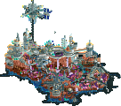
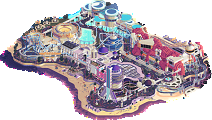
Park / Super Nintendo World
-
 04-August 24
- Views 10,499
- Downloads 402
- Fans 3
- Comments 35
-

-
Description
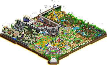
Experience all the excitement of SUPER NINTENDO WORLD, from the fun of Mario Kart and the joy of the Mushroom Kingdom to the legendary adventures in Hyrule and the thrills of Donkey Kong Country!
-
3 fans Fans of this park
-
Full-Size Map
-
Download Park
402
-
Objects
1
-
Tags
Similar Parks
-
The Yards
-
Cedar Point's Maverick
-
Constellations
-
Void Extraction Research Base
-
Sea of Symphonies
-
Expo Miami
The Play-Offs commence with two non-park parks, each transporting us to a different universe. It's the knockout phase now, so do or die. Good luck to both teams.
Experience all the excitement of SUPER NINTENDO WORLD, from the fun of Mario Kart and the joy of the Mushroom Kingdom to the legendary adventures in Hyrule and the thrills of Donkey Kong Country!
concluded
I read the news today, oh boy
Four thousand holes in Blackburn, Lancashire
And though the holes were rather small
They had to count them all
Voting rules- The poll will stay open for ~72hrs.
- Do not vote unless you have viewed both parks in-game.
- Everyone may vote except members of either team. Any illegitimate votes will be ignored or removed.
- Anyone with an account that predates the start of H2HX, or who has been drafted onto a team, may vote in this
match. Anyone with a newer account must pass the admins' account integrity checks.
- Voting is monitored by the admins to improve fairness.
XD
I can't help but think I'm not the target audience for either of these parks! There is undeniable skill present in both submissions - no doubt in my mind - and I do find myself confidently concluding that one is executed to a slightly higher degree, but I can't help but think that neither really resonated with me. I love Nintendo games, so it was really fun to see a semi-realism/semi-fantasy take on Super Nintendo World. The use of cel-shaded objects is commendable, but ultimately I'm not entirely sold on the macro nor the ride design as a whole. I do believe that you executed the concept quite well. Gardens of Light is definitely surrealism at its finest, which is always a risky move. The individual scenes are generally well done (though the desert is a bit too minimalist, I think), but as a whole I think it lacks a certain degree of polish to it. I actually loved the coasters and thought they were the best part for me; reminded me a bit of Trippin' Chiang Mai's dueling coasters - in a good way.
Overall, clearly a huge amount of skill and effort was put into both of these parks. I feel a little bad that I perhaps don't enjoy either in the manner that the builders intended, but I admire both teams for the work that they put forth.
Just some thoughts for now. I haven't voted yet.
Let's begin with the Dambusters: I really love this park. Most of the time with these surrealist parks in RCT, the narrative (if one exists) goes straight over my head, and with this park that's no exception. However, I am not too bothered by that given the park simply looks really cool, and I can follow bits and pieces of the story. The music file was also quite cool for this map — I loved the ethereal/desert vibe with the chimes at the beginning. The little pueblo area was actually a highlight for me; it was really nicely executed given that architectural style. I enjoy how the stark white center of the map is flanked by more realistic edges, which provide helpful visual context for the more abstract center of the map. I also enjoyed how you all took the 4900 tile limit to your advantage and added some interesting shapes and things going on toward the edge of the map within the void. The coasters were pleasant and very fun to admire, but my favorite ride in the park was actually the log flume. Really cool park, Dambusters!
Now for the Soda Jerks. I grew up with Nintendo games, so I of course enjoyed the IP references and stuff. I want to highlight how cleanly constructed this park is, given how many very distinct themes are present in a rather small space. The semi-realistic, indoor park angle with walls was a smart choice in this regard. I think my favorite overall area was the entrance with the standard Mario theme. The new objects were employed very smartly to make all those land textures. And of course, the Mario Kart go karts were so fun!!
I can't hold myself back any longer, though. Let's talk turkey: all those new objects. I am a little conflicted about them. Though my comments definitely will seem like they come from a negative angle, I want to preface by saying I have SO much respect for all the effort this took. The end result is quite convincing. It does LOOK Nintendo, and it looks quite cool!
However, when I view the park, I have this unshakeable feeling that to construct something like this, I would have to learn so many skills that don't feel achievable to me, nor do I really want to learn. When I see the park, I often find myself asking — is there any other way to solve this problem without simply opening the object editor? And oftentimes, that answer is: “I'm not sure.” Not “no,” but definitely “I'm not sure.”
The way I see it is thus: almost every park has new objects, and new objects are really cool. I personally haven't taken the time to learn how to make objects. Maybe I should! What makes this park different for me, though, is it feels like it might not have been possible without devoting so much effort to new objects. Personally, I am more interesting in exploring aesthetics we already have in the game, not making hundreds of new objects.
With that said, I am actively trying to look past that, get used to it, and explore all angles of the park to try and see it from all perspectives (both literally and figuratively). That's why I haven't voted yet. I think both parks deserve more than several viewings before deciding. In addition, I completely understand that there are many ways of making a cool, winning park, and I am by no means suggesting that the SJ park (with all its objects) is somehow the only way. Super Nintendo World is an awesome, innovative, flat-out cool park that you all should take your time and enjoy viewing. That goes for Gardens of Light, too.
What a way to begin semis! Great work to both teams!
Alright, so I really feel like I need to review these.
GoL: This park really reminds me of the game The Unfinished Swan. And honestly I feel like the name kind of applies. I don't know to what level the busters feels this is complete, but to me it feels very rushed and undercooked, with not much content on a map that feels small. Sorry if that feels harsh but I really wanted more because it has it some incredible areas! The Japan area is amazing! The purple roof building is one of my favorite buildings in this h2h, and the surroundings are beautiful. The Italian area is also top notch! If more of the park looked like this, I think it would have been an easy vote for me.
The rest of the park was just not it. The white void (and palette for that matter) was a really risky choice. It's not that it didn't pay off, it was just the white void was overused. This park has a real high concept art feel and that is not typically a thing I enjoy. There are pretty things but also so much that feels completely random to me. There are not enough gardens in a park that has it in the name. Another positive, though, is I do think the macro is good. The way the 3 corners sit is nice and I think the way the coaster interacts with them is cool. Overall, not my favorite. It gave me a taste of something delicious but I never got the full meal I was expecting.
Nintendo: I have pretty much zero attachment to any of the IP here. DK is the only thing I somewhat enjoy from my childhood, and the rest of the mario stuff I pretty much only know from visiting the park in Hollywood. I know basically nothing about Zelda. That being said this park is ok. It was super risky going for a completely new look with a whole bench of new objects and I'm not sure that paid off either. The main reason for this is you couldn't get everything consistant. Most notable is the rides and peeps are way overtextured compared to the rest of the park (also a few objects scattered around). And I'm not even sure if this is a park. Like you have recreated Super Nintendo land and Mine Cart Madness, but it doesn't seem like this is meant to be an actual theme park because everything is the cartoony textures, even the show buildings. And stuff like that makes me think it is supposed to be a theme park but then the Mario Kart ride is just a video game, as well as the blue void and clouds outside of the map.
I don't know what the goal of this park is and that frustrates me seeing recreations in what I think is a fantasy world? Now, I will say there are things I like. There are some great scenes/landscapes. Most notable to me is the castle area and the jungle area. Zelda area feels sad in comparison to the rest of the park with more drab colors and weaker set pieces. So yeah, I don't feel great about this park, but what won me over is solely the DK coaster. Despite the extreme departure from the asthetic of RCT2, it does still capture a weird feel of the real life ride, in rct2, and manages to be more detailed and lively than the rest of the park. Maybe it is just me, but I think you guys are lucky you went up against another park that is also undeniably divisive.
First impressions are that both teams have done an amazing job, some great touches in both. Great job teams 6 out of 7 parks down!
Soda Jerks park is very impressive. Creating an entire different aesthetic in this game that still works with the isometric perspective. And while I do appreciate the time/effort/skill, I'm not a fan. Supposedly I have a more conservative preference in the game. On the other hand it's not really weird that as a fan of RCT work I prefer the RCT aesthetic. I already had this issue with some of the palette+object creator tycoon parks. This seems even a step further. My favorite area was probably the deku tree and surroundings, my favorite ride was definitely mine cart madness, and my favorite thing in general was the Yoshi CTR. Hope to see that ride get more use in the future. Love Yoshi.
The Dambusters park is very confusing. After a second viewing I'm still not sure what the story, or even the main theme is exactly. I dig the aesthetic though, and the park did resonate with me for some reason. Always intrigued when rct parks trigger other emotions than joy. Although it could also be the minor panic attack your soundtrack induced lol. Obvious highlights were the coasters! Good stuff!
I’m very impressed by the Soda Jerks park - it is not only a visually fresh take using custom objects in the game, but it also is very very accurate to the IRL Nintendo world in execution. I’ve voiced this in discord but I think what could have elevated this is if it included the gritty rct graphics for backstage areas and mechanical elements to place this in a real-life park setting; the juxtaposition on the overly smooth, oversized scale of the nintendoland faux facades with realism infrastructure would have made this more digestible and grounded in RCT. This would have also allowed you the opportunity to build a lot of the park with existing objects and limited the number of CSO for the park, which would have helped with planning, timing and collaboration. However, I also don’t mind the creative decision to create a fully-embodied world like this. If I were to be critical, the least successful aspect of this otherwise very successful park would be in the macro stitching the different areas together. Parks with indoor areas are always difficult to make aesthetically pleasing in a macro sense, and this does suffer a bit from that blockiness (particularly in the indoor Mario Kart area). While the macro was great in the main entry Mario area (looks almost like a one-to-one recreation of the real park!), there also lacked a level of detail throughout that we’ve come to expect in H2H today. Still, a very impressive park that is surely going to gain a lot of votes and attention for the innovative approach! Got my vote.
Nintendo World
So cool. First impression upon opening was childish excitement and the thought of "is this even RCT?". Never was a big Mario/Zelda guy, but building Super Mario World in RCT with this art style is so unique. The style here is so fun and feels like a great representation and homage to the real land. Highlights for me would be the entrance plaza and the Donkey Kong area. The coaster and the zone in general are super well done. The rapids ride was cool too. The one area that held this back for me was the overall macro of the park. The Mario Kart ride seems sorta shoved in there and lacks cohesion with the rest of the park that feels more realistic. Other than that, I feel like AVC said everything that I wanted to say! Nice work guys.
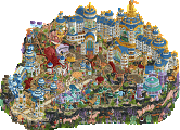
Gardens of Light
Is there a narrative here? If so I'm guessing the alien guys are creating a virtual world? The dueling moments on Blueprint and Evolution were really cool and the station area too was intriguing. Overall, I think this feels a bit too empty and perhaps too abstract. For a semi-finals park I would've expected something that has more depth or polish to it. Some parts seemed underbaked or rushed.. namely the area with steps under the log flume drop. On a brighter note, the Asian area is really cool and atmospheric.
interesting matchup this one. two really different parks, both pretty unorthodox. both of them feel like h2h-only ideas, in a good way.
Super Nintendo World
this is a big idea, and one that imo doesn't really work unless you commit to it 100%. luckily, you guys did commit, so hard. a whole new aesthetic (well, an old one, but you know what i mean) is hard to achieve, and you pretty much nailed it. i'm not a big nintendo guy, so probably lots is lost on me, but i don't think that matters for good RCT.
the amount of new scenery pieces you've made to commit to this is amazing. i especially love the RCT trees and things that are still recognizable despite this new style. the foliage in general is really interesting actually, i think it works really well and could potentially be overlooked because it just feels natural. same thing for the pathing/landscape. it looks so simple because of the art style, but i'd imagine it's actually a pretty big challenge to plan and execute in RCT.
my favorite parts were the rapids ride/ship area, and the mine cart ride. they both felt a little more full and lively than some other parts of the map. great bright color schemes and the foliage/rocks with the water look excellent. also want to shout out the diagonal entrance upon opening - having this castle head on really nails the old school video game aesthetic too.
my one nit-pick is that on a map with so much consistent style, object-wise, there are a few objects that really stick out to my eye because they don't have the black outline. the column fence used around the yoshi ride is the main offender for me, that's one that i tend that stay away from in the normal RCT palette and it really sticks out here.
i think overall this map has the potential to feel a little gimmick-y upon first glance, but will grow on people the more they sit with it. even if you take the aesthetic out of it there's still some super solid stuff going on, and the overall idea/aesthetic really elevate the content for me. long story short, it looks plenty cool enough to justify the idea itself. this sits above the many nintendo crossovers we've seen, for me, just because you've committed so hard to the idea.
Gardens of Light
well, here's another new and exciting aesthetic - more RCT obviously, but still so new and fresh. it's a level above, conceptually, to do this, and i really appreciate the effort.
the opening scene is amazing. the loops, the prismatic colors (which aren't too bright as to be an eye-sore), the pinks and purples work really well with the white. the coasters are really great, lots going on, unorthodox and interesting elements and duels. two of the best in the contest, for me, great work.
i pretty early on was looking for the asian stuff from the screenshot. i'll admit that i was a little disappointed that there wasn't more of it. i almost think that i could have done away with the other 2 areas completely and had way more of that asian area... very possible that i'm not understanding the theme well enough here, but that's a risk you take with an abstract build like this.
my overall takeaway from this park was that it SHOULD be right up my alley - abstract, artistic, new and interesting, cool coasters. but i found myself wanting more of the best bits, and not particularly vibing with some of the other parts. feels like one of those things that might make more sense knowing the background concept. the asian part and some of the white void transitions are up there with anything in this contest, quality-wise, just not quite enough of it for me. still, a beautiful park overall and i'm excited to learn more about the inspirations.
thanks very much to both teams, good luck in the final.
Gardens of Light – Dambusters
Opening the park . . . did this update fuck my settings up . . . did I fuck up something with a plugin again . . . oh wait, no I think this is on purpose. That’s an interesting aesthetic then and I’m not against it. Just took me a while to adjust. At second look, I really love those shades on the coaster. Reminds me of bubbles and oil on water. The turning blocks of ice look kind of weird to me though. The fading sides and lines of the edge of the map are great. The Frontier layout is fun. I like it swirling between the cacti. The archy is very crude though. Maybe fitting with what it’s based on, but it looks like it’s missing some texture. Alright, the Fab Four playing in the background. Awesome. A mediterranean vignette. Looking nice. I like the white and invisible archy. Towers look a bit strange though with that big blank space. Could’ve maybe gone with some more hints of the structure continuing. Subtle lines or something. Japan vignette. Looking lovely as well. I really like that giant yellow tree under the coaster. That’s a very nice part of the layout. Layout has multiple interesting interacting elements. Interesting holes along the outskirts. Also, interesting doors. The ‘dreaming’ theme is stronger in this one, than it is in The Sailor imo. I am kind of shocked though in how fast I’m done with the viewing. Is there some cut-away views I’m missing . . . No, this is it. Alright, that feels quite small for a semis.
Super Nintendo World – Soda Jerks
Opening the park . . . why is RCT looking like I loaded a different game? It’s cool, it’s really cool looking. The music and visuals just immediately take me back to playing Mario as a kid. Love the nostalgia. But . . . it just isn’t RCT anymore. I’m sure we are going to see so many Mario/Wario/Luigi/Yoshi etc remakes thanks to these objects . . . or workbench? Which I’m glad, but I’m having a hard time shaking of this feeling of ‘this game is not supposed to look like this’. Okay, now that I’ve let that out, for now let’s just roll with it and check the rest of the park out. The opening scene and plaza look wonderful. Really great rec of what Universal recently build. Moving along, that Donky Kong area is banana’s (haha). I was secretly hoping somewhere in H2HX this coaster would be recreated and you guys did it! And you guys did it perfectly. I love this corner. This corner gives me the kind of dreams I hope the Dambusters will never base a park around. The Mario Kart and Zelda area’s are nice too, but don’t wow me as much as DK. The Fred-moon is a nice touch though.
Conclusion
Congrats to both teams in reaching semis and delivering interesting parks that stretch boundaries and spark debate about what is or should be in a H2H park. Both are interesting, containing unique aesthetics and both have their flaws. In the end, there is just one view I can not get enough of . . . and it’s the Donky Kong corner in Super Nintendo World. So my vote goes to the Jerks.
Gardens of Light: Super bold and very conceptual, which is quite rare on NE. I was a bit worried when I opened it because I thought I'd missed a trick, but I didn't. The palette is wonderful, the colours of the coaster are just ... wow! I think it's a park that leaves a lot to interpretation and imagination, it’s really cool and that's what art should be according to me. Finally, it's in line with what I thought of The Sailor. A lot of poetry, I loved the Mesa Verde architecture, it's very simple at first look but quite subtle in the choice of shapes and details. My main criticism concerns the white zone, in a way it makes sense with this idea of purity and therefore the presence of fewer details, but on the other hand it sometimes feels a bit empty. But on the whole it's still a very good park !!
Super Nintendo World: One of my dreams was to remake the Nintendo zone at Universal Japan, but I can now remove it from my list as it's just been brilliantly realised, and I think we'll be able to wait a long time to see another one as successful. It's a great park, again with a great concept. The palette, the objects and the music are just perfect here. You've taken the game a step further, but what I really appreciate here is that there was no plug-in needed: just great work in creating the objects and a coherent world. You must have had so much fun on this park, I really enjoyed exploring it. I'm not familiar with Nintendo games, but my heart goes out to Yoshi's Adventure and the Search for (...) Hoard area. Oh and I loved the little nod to Fred, it's brilliant! A really great park, I think it's the perfect concept for a semi-final !!!!
My vote goes to Super Nintendo World, because the execution of the concept to its maximum is brilliant, it's a pure H2H park, the kind of concept you'll only see during this competition. Thanks to both teams for this great semi-final!
Gardens of Light. I like the atmosphere of this park. The white palette void works pretty well here. I really like the dueling coasters. It's just a fun park to enjoy while I listen to the accompanying music. I like the deeper meaning related to the song lyrics. It's not all positives though. It felt incomplete in parts and underwhelming in others.
Super Nintendo World. The aesthetics are brilliant. I like the Yoshi ride. But the rides overall don't sell it for me. It's so locked into the blocky aesthetic but feels more to me like Lego Land than Wild Mouse, at least aside from the Mario Kart go karts. I really wanted to get into this park but the lack of visibility on the Mario Kart attraction made it hard to get into and that's the number one ride.
So, I ended up voting for Gardens of Light. It's clearly the more flawed work but it had more stuff in it that I really liked. I expect that most people will vote the other way and mine won't make any difference but that's the way I feel after looking at both parks more than once.
Gardens of Light:
Love that station, great opening shot. A very intense and bold aesthetic, I like the bright shimmering station effects and the crystal-like colors on the coasters. And the layouts of the coasters are awesome, great dueling and cool moments.
Super Nintendo World:
Impressive art style to see in RCT, and I like how deep it goes with the scenery. I don't know a ton about all the games here (Played some Mario though so recognize most of that) but can recognize some details and can tell a lot of care was put into capturing the feel of the games.
Really tough to vote on this match as I like what both parks did to stick to a bold art style.
Huh? I am so confused right now. lol
Gardens of Light -
There's parts to this that are really really cool. White void is a dramatic choice, I like that the negative space bleeds right into the park (both buildings and path). The scenes in color around the perimeter offer nice compositional contrast. The overall look feels fresh and experimental.
Evaluating this from a logical perspective seems to miss the point. Applying meaning is probably a fool's errand, so I'm just taking this in as an abstract expression of style. In that sense, like all of your other work, this park thrives in its small evocative moments. Compared to something like the Sailor (or your micros), there are fewer scenes that capture feelings but plenty that impress me as a builder in their creativity. The tall white towers separated by glittering void space, holes reflecting the night sky in the southwestern area, the stunning large yellow tree with peeps raking leaves beneath, the glass use with this unusual palette (I wish there was more!), all of these things provide wow moments.
But I think in the context of H2H, this needed more time and more connective tissue to fill out. Hopefully you'll continue to build free of that expectation, and maybe free of competition entirely
I've hidden a post that disclosed (or speculated about, technically) a builder which against the rules. It can be restored after the match has closed.
post-match edit: walto's review is visible again.
You do realise it's based on/ a near re-creation of the real Mine Cart Madness ride opening at Universal Studios Japan and Epic Universe in Orlando right? Like it's not just a concept pulled out of thin air...