Park / Gardens of Light
-
 04-August 24
- Views 7,920
- Downloads 208
- Fans 1
- Comments 35
-
 72.50%(required: 70%)
 Gold
Gold

Turtle 85% chorkiel 80% G Force 75% Scoop 75% wheres_walto 75% Xtreme97 75% J K 70% Milo 70% ottersalad 70% Terry Inferno 70% posix 65% RWE 65% 72.50% -
 Description
"I read the news today, oh boy
Four thousand holes in Blackburn, Lancashire
And though the holes were rather small
They had to count them all" -
1 fan
 Fans of this park
-
 Full-Size Map
-
 Download Park
208
-
 Objects
2
-
 Tags
Tags



Maverix, on 07 Aug 2024 - 7:16 PM, said:
But Jimmy... Wild Mice!!!Episode Semis, Part 1: gamma is in a rush
I'll be on a plane tomorrow, so I wanna get these out while I still have access to my main computer. Unfortunately, this means that my reviews for both matches will be pretty short, but, if you think my yapping is unbearable, maybe that's a good thing. Anyway, on with the show:
Gardens of Light
First thought: Jesus Christ my eyes. Okay, now that we're past that, let's talk about the park.
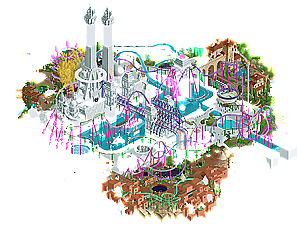
As my review of The Sailor might have indicated, I'm definitely not the target audience for this style of park. So, I'm afraid most of this park's higher artistic or conceptual value will sail right over my head. That said, I can definitely appreciate the individual parts of it that are obviously executed very well (coasters, architecture in the colored areas). Unfortunately, I just can't piece together how it's all supposed to form a cohesive whole. Again, that's likely because this "school" of RCT is just not my cup of tea. Like with The Sailor, I do believe you were able to create a memorable piece of RCT, so you should be proud!
TL;DR: white, fascinating, slightly confusing.
Alright, not much time for closing remarks, I need to move on to the next one!
Gardens of Light
I'm not really a big white void guy - I didn't grow up in one, but can still appreciate the references you managed to pack in here, so well done team. This park is unique and truly beautiful, and I can't speak highly enough about what you guys have put together. Is it a little messy and potentially unfinished or rushed? Sure. Does that matter to me? Nope. This map is dripping in style and embraces a unique aesthetic that hasn't been explored much in this game, and I applaud the choice to go in this direction. It very much feels like a stream of consciousness build, and I personally wish more of those style of parks existed. The movement, the iridescence, the bold pops of color, the negative space - it's just all so good. I think my favorite moment is the mini golf under the golden yellow tree. Surreal, and makes me want to be there. The coasters are great too - love the colors, and the interactions are awesome. Also a big fan of the usage of the animated light objects. So much fun. I also really love the stone bridge slowly shifting into the white void. Just so classy and well done. I also particularly love the hole cutouts in the pueblo section that reveal the night sky. Wicksteed remains my favorite RCT builder, and this park being even remotely considered as a homage to his style makes me happy. Well done guys, this is art.
Qualified for Grandfinal
The poll is now closed. The final voting score was:
A commanding win for the Soda Jerks, qualifying them as the first team in the Grandfinal with one finger on the trophy. Congratulations Scoop and team on living up to your Round Robin top placer reputation. The Dambusters will be eligible for the 3rd place match.
Gardens of Light:
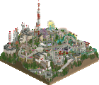
+ One of my favorite takes on a surrealist theme in a hot minute. The holes and pure white buildings are done so well. I love how the "gaps" in each area feel empty and detailed at the same time.
+ The Asian section is easily the strongest of the map. Archi is great and I love the gigantic yellow tree with the Cheetah Hunt turnaround poking out of it. The yellow leaves covering the golf course are very convincing too.
+ I'm a huge fan of the untextured white architecture and outskirts. The fading foliage, doors and holes with little scenes inside, and the objects slowly turning white are such a strong aesthetic. Love the bridge that slowly turns white.
+ Blueprint and Evolution are some of the coolest duelers I've seen in a bit. I especially love the loop/immelmann duel and the way the little airtime hill goes through the loop while staying parallel. Props to whoever did those layouts.
= I'm still not sure why we need the soundtrack to play in a media player instead of inside the park. It fits, but it doesn't feel like there's much that doesn't justify it just being music for a ride.
- I'd hate to say this, but this feels pretty undercooked especially for a semis match. The pueblo section is the biggest offender. Even if pueblos are damned to be very simplistic by nature, it still feels like it's below that semifinals bar. The quality between the three "colored" areas feels very inconsistent.
Super Nintendo Land:
The year is 20XX. Everyone draws objects at In:Cities levels of perfection. Because of this, the winner of a spotlight depends solely on art skills.
@Panelists, the file for Gardens of Light has been updated to include custom music now that match is over. Please use this version when accolade voting.
SJ (had dmed but let's bring it over)
Your park was absolutely wonderful to me. The aesthetic swap was one thing, amazing in itself, the sheer effort it must've meant to produce what feels like a full alternate set of game assets, and done with great authenticity and cleanliness that together reached a quality most snooty object makers of today don't. But then the map itself was just incredibly enjoyable. The macro was dense and complicated, as the source material might command, but it was also stripped back and "isometric-simplistic" because of it, which is a mix that can very easily look either frantic or dull. But here it all came together and produced such immersion into the unknown-known. Even just small things like trees meant as (rare) background fillers were placed so perfectly that it boosted the overall experience. I really enjoyed it.
DB
some quick reviews and general thoughts
Mario Land 2: 6 golden coins: really an incredible effort here, and the first screens I saw completely blew my mind. I love how it feels like a living brochure or park map, as I said in discord. Its such a novel way to 'do realism' (/recreationalism). Sometimes we forget that default RCT is a style, and this was a good reminder that the thing we do is not the only way to do it. Some of the most revolutionary graphical changes perhaps ever. The theme park itself is quality, especially the DK area with the new additions. zelda and the mario kart ride itself are slightly undercooked but understandably so. and regardless, it all looks awesome and flows seamlessly. I'm very excited to check out the real one soon and compare it to your vision.
Gardens of Light: watching this park come together was really enjoyable, I felt like we were almost doing something naughty and sneaky with how last minute it all was. (There was a moment when I was worried that the jerks might submit something unfinished and we would win...) But even despite its creation story, I think this park is something a little bit wonderful. I love the big white voids in the middle of those tall towers, the fish in the holes, the chromatic glass (need to see more of that!) and the giant yellow tree is a highlight. The park really felt like it pulled itself together weirdly naturally, like the team was kinda just humming along. Our team had no preconceptions that we were making a 'winning' park, all we wanted to do was making something pretty and interesting, and to lovingly direct people to wicksteed's wild and unique original park. I wish Liam would have let us cheat so I could have built on it though...
Some general philosophical musings: (Not aimed at anyone, and said with loving intentions.) A lot of people reacted to our park in a kind of expected way: 'its not for me', 'i couldn't figure out what it meant or what the narrative is', 'I'm not the audience / I dont get it / etc' . I want to reiterate something: This park is for you. You are the audience and you are the voter. Try not to worry too much about saying the wrong thing. We want to hear what you think about it! It doesn't matter if you only build realistic parks, or ncso miniparks, or whatever. Whatever your parkmaking context is, you probably do have something interesting to say (even if thats negative!). This community is one of the most talented niche scenes in the entire world. I have complete faith that anyone interesting enough to spend time here, is capable of digesting, analyzing, and dissecting any RCT park that comes your way. I would 1000x rather hear a transfer track nerd describe what the coasters reminded them of, than just to hear them say they felt excluded from discussing this park. what did it make you think of? what did it make you feel? were you bored? did anything catch your eye? It's not only okay to be critical, but I actively want to hear about your reaction to it. Maybe the act of writing down these thoughts will help grow an appreciation to new parkmaking, or to build a more concrete picture in your own mind of what RCT works for you and what doesn't, and how to get the most out of your own practice.
I couldn't agree more.
We also shared some frustration at the number of comments that began with "I'm not a Nintendo guy" or "this didn't connect with me". Aside from the obvious: what kind of freaks don't recognize Mario or Zelda? Say something about the park, anything at all. Just don't be a chode and talk about wacky worms or whatever the hell Ge-Ride was on about.
Shane is right: believe in your perspective, and the act of expressing it will improve the thought behind your own work. Everyone who sticks around in this community has a meaningful creative perspective. Nobody is "bad" at the game these days. Hell, write the review in German or Dutch or French or Portuguese if you have to. Google translate don't cost nothing.
Seeing what other players create, spending time exploring their work, seeing it critically while deconstructing their methods is part of being a good contributing member. For the amount of effort and care that goes into these parks, giving a few minutes of time to explore and offer something more substantial than a one-click vote or a discord reaction is a small token to give. It may not always be positive or kind, but that's damn sure better than getting nothing or watching mundane conversations about long-retired (and probably dead) German builders from two decades ago.
Speaking as a builder, it's the long-form written reviews from thoughtful, imaginative players like AVC, FK, Turtle, and Cocoa that motivate me to keep playing. I like seeing what they create, I like showing them what I create. I especially like writing to express admiration and offer critiques of the things they worked so hard to build, and receiving the same in return.
I could have phrased it better but I was just firing back at the "You can't dislike this if it's based on something real." perspective. Some real rides are boring. Frankly, there's a lot of boring amusement parks. All I'm saying is that you shouldn't get a punched ticket for basing your park on something real. If you don't like that, then too bad.
Ge-Ride, on 13 Aug 2024 - 12:40 AM, said:
You absoluetly can dislike something if it's based on something real, but saying you dislike it only because it's based on something real is absurd. Intent and execution are two entirely different things. Many people, in this thread no-less, have come out and said Nintendo isn't their thing, which is totally fair. Clearly the Mine Cart ride isn't for you, but to say "oh I don't like this ride in real life, so therefor this interpretation of it is bad" is absurd.
To put it another way, Mr Brightside did a fantastic job recreating Maverick, but if you went and said "I don't like Maverick, you should have done Millennium Force instead" that would make zero sense. If you don't like Maverick that's fine, but the builder tried to recreate Maverick and that's what it should be judged against.
I think if anyone here has a uniquely informed perspective on both nintendo and maverick, it is you^ lol
Would rather not have this thread devolve into nonsense though
Gardens of light
I've opened it up quite a few times by now and while some stuff did grow on me a bit, this whole map is not my cup of tea. The whole white area in between is just plain weird to me, not really getting the idea here as it seems just doing whatever.
The Italian part is my favorite one here, pretty lovely and I like the added maze which works really well there. Asian area was good too, the Meso-Indian part looked very undercooked which was a shame because that's such an interesting theme. Coasters were neat, not a fan of the colors.
Super Nintendo World
At first I thought what kind of weird plug-in or palette they've created... until I learned that it's all custom made objects. Wow. Quite stunning how you managed to get Nintendo into RCT. I'm weirdly conflicted on how it on one part doesn't like like RCT at all anymore but on some bits you def recognize and feel an RCT feeling.
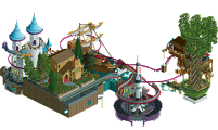
This is quite genius, played some Nintendo so this kicked in some youth nostalgia. Really liked the pirate ship with the rapids, which was the nicest area of this map imo. Mine Cart would be a cool ride IRL just as the Mario Kart ride. I did however not recognize where the area with the big tree and church comes from...
Also cool to see my ugly face in a flying theatre haha. Genius guys.
FredD, on 14 Sept 2024 - 10:24 AM, said:
My ex-teammate turned into the moon.
Reviews:
Gardens of Light:
https://youtu.be/kDXMTDdJPYI
Super Nintendo World:
https://youtu.be/Ph3ZcbfNWY8
Loved how different both of these parks were. Always nice to see visual and conceptual progression in the game. Great job to the teams!