Park / Cedar Point's Maverick
-
 18-July 24
- Views 9,125
- Downloads 264
- Fans 2
- Comments 44
-

-
 84.50%(required: 65%)
 Design

CoasterCreator9 95% In:Cities 90% pants 90% RWE 90% Babar Tapie 85% J K 85% Mulpje 85% bigshootergill 80% G Force 80% Recurious 80% Scoop 80% Xtreme97 80% 84.50% -
 Description
The Old West was never this wild!
-
2 fans
 Fans of this park
-
 Full-Size Map
-
 Download Park
264
-
 Objects
1
-
 Tags
Tags
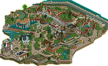
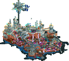
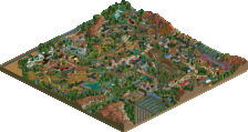
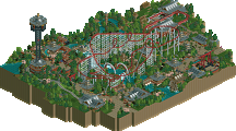
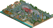
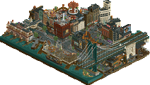
Pretty bold move to criticize the choice to adapt one of the most well known roller coasters in one of the most well known amusement parks in the world (where another recreation of a roller coaster from this park is regarded as one of the best H2H maps ever).
But hey, recreating a Polish castle is a much better choice to adapt in H2HX. Well done, but it's not for me unfortunately.
Chateau -
Lovely vibes here, the JK voiceover is a nice intro that effectively introduces the park. I adore the village area: fall foliage is some of the best I've ever seen, the fallen leaves and colors are excellent. I love the pumpkins sprinkled throughout, the waterfront area is perhaps the single most pleasant space I've seen in this contest. Music in this area is so good. Great bridge, great waterfall, more lovely foliage below. I'm not so bothered by the scale/repetitiveness of the chateau. I think the colors are quite nice and you capture impressive scale without dominating too much of the map (clever map shape also helps avoid that trap). Most everything on this map gets a plus from me, maybe it does fall more into the GT genre but the atmosphere is good so I'm not complaining.
Maverick -
They say on a long enough timeline, everything eventually becomes a crab. Maybe in RCT terms, eventually everyone will become walto.
I kid (mostly). I really enjoyed this park and it would have gotten my vote. I'm deeply impressed at how well you captured the weirdness of the ride: Maverick operates 6 trains, I have no idea how you managed to have trains simultaneously sitting in the station, sitting at the bottom of the lift hill waiting, and sitting in the block sections ready to arrive at the station. That's exactly how it works in real life, but it's not trivial to achieve in RCT. It was the small attention to detail on things like that which I found most enjoyable.
Things like using different water color for the rapids ride (so simple but such shows a great touch), mechanics changing the signage to Six Flags (@Liam SF and Cedar Fair just announced a merger), the Taco Bell sign (half diagonal stardust slot machine CTR, that's inspired). I can say emphatically that this is an excellent recreation. The station and queue are absolutely perfect: the exit stairs going up then down, the queue partially closed off, you've really nailed the details. I guess the one thing missing from my recollection are the timed fountain bursts as trains enter the post-launch turnaround. The music also went a long way for me: I loved the Fleetwood Mac cover, instant atmosphere. You could have gone the pure realism route and included some in-park sounds ("welcome back riders how was your ride?") but I prefer the western vibes you chose.
Two awesome parks, both deeply enjoyable for me
Well it's been a hot minute since I've sat down to write a review, but the Jazzcats are gonna bring me out of my cave.
LHC, you guys put together a beautiful piece of RCT with a dramatic landscape and beautiful architecture. That bridge too is stunning. Unfortunatley for me, this went up against one of the best recreations we've seen in the game and it's of my namesake. Not much you could have done to counter that, but what you guys put together is still absolutely amazing.
NOW.
I'm not so sure the Jazzcats set out to please exactly one NE member with a round of H2H but I'm sure everyone breathed a sigh of releif in their discord when my vote for Maverick popped up.
This thing is spot on.
It's the park I grew up at, and the ride that made me an enthusiast. It holds a special place in my heart and you guys captured it perfectly. Not just the coaster itself, but the rest of Fronteirtown as well (or what H2H map size limits allowed you to fit). Being so familiar with the source material, I found myself looking through the map almost to see what liberties you had to take to make this work in RCT and honestly there aren't any. The layout of the paths, buildings, and rides are as they are in real life. The path texturing and styles are exactly how I remember them. You've even got all the ride control conduit on the brake runs and lift, AND stupid seagulls hanging out everywhere ready to ruin someones day.
On top of all the that, you have some lovely storytelling of what the day-to-day operations are like at the park through all the staff around. The techs getting yell at by their boss, the landscape team watering flowers mid-day, staff complaining about taking out trash, it's all so accurate. Although, I'm not sure if they plan on putting a Six Flags sign on the town hall, but it's a great way to include the recent merger in the park as well
I could go on and on listing the accurate things included, but suffice to say everything is. If anyone questions why something was done the way it was done, book a trip to Sandusky, Ohio to visit Cedar Point and find out for yourself. Well done Jazzcats.
-Maverix
Chateau Frontenac is such a cozy map, down to the choice in music. Sick architecture in the town, and the twist of an autumn festival just adds a nice layer of uniqueness. The whole vibe of fall trees, pumpkins, tent booths selling what I imagine to be art, crafts, local produce, etc, the music in this secion... it all ends up really reminding me of Stardew Valley, in a way. I would love to go here as a peep and sit in one of the outside seating areas by a cafe. Even the chimneys let out smoke in a chill way, haha. The fleur de lis looks excellent, the merry-go-round is also really good looking, and I'm a fan of the way the mossy growth along the pier edge was done with diagonal boiler room walls!
The church and that corner mansion were so cool, and the street details:
Before taking the train over to the hotel itself, went down the waterfall and what a great area. Between the town and this wilderness section, nature looks so full of motion. Very good waterfall, the grass swaying gently in the wind, autumn leaves falling all over, saw a bird flying around, some fishes in the river, Fly Fisherman with a wild freeze frame as the fishing cable swings wildly, haha. Perfect camping, adventure retreat vibes all over.
Going up the rocks again and wow, I think the coaster visually compliments the stuff around it very well, framing things together. The bridge looks so well done, tying the town together to the hotel. Arriving at the station, you definitely get the idea that this is a more reserved area, in contrast to the town. Great music! I could listen to this for a long time, really helps set expectations for what vibes this hotel represents. Tolsimir! Golf course is sick for this area! Can imagine there being white lunch tables under shade somewhere off map, people having tea. I wish that what's there was a more active scene with maybe moving peeps, or even more motion overall through animated objects, maybe crowds chatting and the like, or more golf related stuff?
Loved this scene:
Coming in to the entrance of the hotel, I love the peeps in black and white. I don't get what it represents, but it looks like maybe hotel staff welcoming guests? Or guests in black suits for some event? It looks cool! The street level detail does feel a little less, coming from the town. Sick valet service that gives off old elegance and going with the music of course. I'm afraid I found the hotel itself to be a little flat. It must be a challenge to do because of the real thing, but I think some creative liberties would have won me over here. Details like extra balconies or scenes of people repairing stuff, maybe painting stuff, a window planter here or there, even peeps looking out the windows! As it is, the simple windows and lack of details to break up the repetition made it seem just slightly underwhelming. I only say it that much because I imagine the map's main narrative is of journeying to Chateau Frontenac. But what a surprise to find a very decent interior! The lobby area was amazing with the grand piano, and also quite a few rooms were very nice too! This interior gives me the feeling that if time wasn't an issue, the life I missed outside the hotel would have absolutely been all around inside!
Overall I loved two areas, liked the third, but wish you guys could have maybe had more time to develop that third. Maybe it didn't come across how much I enjoyed it, but this is really such a good park. Lovely vibes all around.
It's not for you because your preferences don't extend beyond making stale jokes about the appearance of other NE members
Just wanted to point out the very obvious irony in criticizing a teams choice of doing a roller coaster rec in a roller coaster tycoon competition, while also being disappointed that people didn't grasp your own recreation of something less relevant.
Chateau Frontenac:
+ Right away the landscaping is mind-blowing. It feels so lively with the falling leaves and new moving grass objects. I'm left speechless by that waterfall too.
+ The town section is adorable and immersive. One of those little scenes I can imagine myself being in despite never being anywhere near Quebec. Archi is beautifully detailed and gives the town a proper rustic look. The little fair section with the flat rides is so cute too. It's so funny how despite LHC only have two remaining builders, their styles are incredibly obvious on this map and play so well into the overall theme.
+ The middle section is the easily highlight of the park for me. The bridge is absolutely stunning and executed so well for such ambitious structure. I can tell SM was your best friend here. The landscaping also comes into full effect here, and I love how the tiny cabins are dwarfed by the bridge. I'd absolutely love to spend a day here.
+ Love Circulaire du Chateau. Even if it may be argued that it's in there just so the H2H park can have a coaster, I think it's a net positive. Love how the layout plays off the landscape, especially that last big dive.
= Great sound design all around. I like the addition of the church music, but unless you're crazy zoomed in it kinda blends into the town music a bit.
= The titular chateau is very impressive in both scale and detail. Considering it has interiors, I almost wish you used transparent windows so you could see inside. That may have also broken up the structure a little more. Also what is the hotel waffling about? I scroll over to it and suddenly all I can make out is "madame", "putain", and "Tolsimir." Little bit of Jazzcats smack talk?
- While not a huge flaw, it does feel a little disconnected between each section. Right away I can tell which parts each builder did. I'm not weighing this too heavily because this is a recreation of a real place, or at least one that can fit into a Head-2-Head map.
Cedar Point's Maverick:
+ I want to make this clear before getting into my review. I am not a thoosie, I have never been to Cedar Point, and I am not crazy familiar with the actual layout of the park itself. With that said, between word of mouth and the vibe I get from this park on my own, this is insanely accurate and immersive. Someone had to have built this right in the middle of Cedar Point. It's a bold claim to loosely reference one of the greatest R1 parks in H2H history, but just like Raptor this is a very detailed, gritty, and accurate recreation of a Cedar Point classic. Just add shadows and it's a true successor!
+ The star of the show really feels like the real deal, from what I know about it at least. All the iconic moments are there and it flows very well.
+ Landscaping and ground texturing are just ridiculous. The muddy ground texture is putting in so much work. New Fisch rocks are always a treat too! Chateau has some serious competition here.
+ Where's the grid again? The consistent path line/crack motif that seamlessly adapts to straight, diagonal, or half diagonal really adds to this.
+ The new peep editor came in clutch here. Love all the little staff scenes throughout, especially the mechanic hammering in the Six Flags sign. The new peep objects from ACEfanatic also really help push the atmosphere into peak hours.
+ Love the detailing in Thunder Canyon, such as the rotating blocks pushing the water along and the peep walking along the rotating platform. I also love the gross artificial water color.
+ Everything is functional, even rides that get cut off! Really makes it feel like a living, breathing slice of a park. The Cedar Creek Mine Ride's supports look amazing too.
+ Genius use of the Stardust slot machine elements for the Taco Bell sign.
+ The drone with the YouTube link is such a cool easter egg. Seriously, I'll probably take up an entire page if I have to point out every detail. I genuinely do not see a flaw here.
I was discussing the park, to me it seems unnecessary to drag Wawel into it with a bunch of sarcasm. What does that accomplish?
For what it's worth, I liked Wawel. But I also spent a good amount of time online trying to figure out what you were recreating by researching of the context of the area. It added to the immersion and appreciation for me. For some people, that's a fun aspect of these maps. My point being, if we're building parks (or specifically recreation type maps), it's a given that some people will not immediately latch on to them as a recreation of an existing place and might desire more context to fully appreciate it. And while it's valid to consider that as a criticism, it just felt odd to me to focus on that as a point of critique when A: you did the same thing on your park, and B: this is essentially a modern version of (the generally well regarded H2H map) Cedar Point's Raptor - just focusing on a different coaster a little deeper in the park. The sarcasm came from copying the tone of your original comment and flipping it so you'd see how it might have came across to the builders. I guess thats just hypothetical though, so my bad for taking it there.
On the plus side, we've brought some more comments to the match
Ah, so it's just tone police bullshit.
Glad to see we all learned a lot here.
what is wawel-esque
The poll is now closed. The final voting score was:
A close win for the Lonely Hearts Club who earn their fourth of the contest and complete their Round Robin journey with a victory largely secured by two of their lower seeded players, more than proving their weight in points. An unfortunate loss for the Jazzcats, however their earlier dominating wins in the contest enshrine their place in the Playoffs.
First off, congratulations to the Jazzcats on their AMAZING Maverick recreation. With Cedar Point being my home park, I was amazed by how spot-on the recreation was. If I could have voted for the park, I would have! Hahaha.
Now, on to our park. Can you believe this park was created in ONE WEEK!?!?! After a schedule change, we had one week to create an awesome Round 5 park. Rob, Mama, Sammy, and I were bound and determined to release something that did not look like it was done at the last minute. With this being my second park release ever, I wanted to ensure we could all be proud of what we created. I told JK that I had two goals: to create an amazing, realistic park and to create the best autumn park that has ever been released. Rob came up with our awesome theme and shared reference pictures that sparked our creativity. With that, we got to work!
In the end, I think we created something that is not only at a high level of detail for its extremely short work window, but also something that our whole team can be proud of!
Map Contributions
Parker:
Rob:
Mama (Mike):
Sammy:
For my first major experience with H2H, I could not have asked for better partners on this map. We all worked so well together, especially given our insanely short work window, and created something amazing!
Absolutely fantastic work from everyone who built in this match. I am shocked to find out y'all did Chateau in a week, and this is coming from a member of a team that did the exact same earlier this round. The landscaping and rockwork are incredible; I was positive it was deanosrs and not the dude with one landscape-less micro to his name. Amazing work Parker, really looking forward to a solo release from you. All love to Rob, Sammy, and Mama as well; fantastic work in such a tight timeframe.
And obviously MASSIVE shoutout to MrBrightside for the 80% on such a stunningly accurate recreation. I know we had a talk about recreations to say the least, but to be able to recreate a slice of an existing park so accurately other members are pointing out the exact tables they sat out is a skill in itself. I would be shocked to see you leave this contest without a colored name, and just like Parker I'm really looking forward to seeing that big solo finished. Massive respect to everyone who partook in this memorable match.
two great park, outstanding work to get a win in a week, massive congrats.
i voted the other way, but either park could have got my vote here - seems to be that way for most people, with personal preference being the deciding factor rather than actual skill on show.
i'm usually not a huge fan of recreations, i have historically found them kinda stale, which is probably because i'm not personally a theme park enthusiast and have only been to a few. so i miss the personal memories and feelings a lot of people have, i'm sure. but this one was such a high skill level, and still managed to just be a really nice and well thought out (slice of) park.
roll on semis, can't wait to see what both teams bring to the table.