Park / Ghirardelli's Dream
-
 14-July 24
- Views 8,271
- Downloads 173
- Fans 0
- Comments 30
-

-
 67.50%(required: 60%)
 Silver

RobDedede 75% Xtreme97 75% Babar Tapie 70% G Force 70% Recurious 70% RWE 70% chorkiel 65% pants 65% Scoop 65% wheres_walto 65% Liampie 60% Turtle 60% 67.50% -
 Description
Chocolate: a taste that feels like a dream.
-
 No fans of this park
-
 Full-Size Map
-
 Download Park
173
-
 Objects
3
-
 Tags
Tags
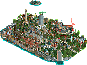
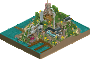
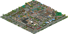
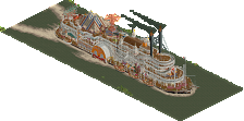
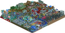
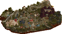
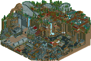
People might be surprised by the outcome of this match, but I think it demonstrates that macro can still win matches in this competition, even if the park is vastly under detailed.
SJ
People say it was "unfinished" but I'd personally argue that it was finished and just vastly unpolished or undercooked. I loved the ice block shapes and how they projected into and around the structures. The one section of buildings in the park is great. I really see a cyberpunk Kowloon inspiration going on there. A lot of the other buildings on the map were pretty repetitive. Dueling coasters not dueling is another strike. Custom music was bangin', hope to hear more RCT remixes in the future.
Canes
Upon opening this park, I really wanted to like it. I love realism parks, I love urban cityscapes, and it's got the Golden Gate Bridge in it! However, it kinda let me down as I looked through things. While the land and road CTRs might be useful in niche cases, they don't look as clean or textured as good old-fashioned path and land blocks, and I think 80% of the use in this park could've been normal land blocks or scenery items. Everywhere you look there is slight glitching/vibrating, and it gets really distracting. The relative texturelessness also further limits the use cases. While the archy had some good areas, other areas seemed pretty underdetailed, and the quality was kinda varied across the park. The biggest issue for me however, was that the park seemed created purely to be a road and land CTR showcase, and didn't really seem to hit a narrative for me other than that. I love pushing the technology of the game that goes on here, but if you're going to do it in H2H, it's gotta be part of a larger theme and better execution. Technical innovation won't win a match by itself, and I think that's exactly what happened here. Now, if the archy quality had been great across the map, paired with a more distinct reimagining of San Francisco, more of a narrative regarding what this Ghirardelli fellow is dreaming about, and more textured and deliberately placed road and landscape CTRs, I think this would have been a clear winner in my mind.
I'm sorry if any of this comes off as harsh, but there's accusations flying all over regarding strategic voting, I feel like I had to justify why I voted the way I did. In the end, the overall package of the SJ park beat out the Canes park.
I agree with most of what you have to say - except this bit. I don't think our park was underdetailed, but almost overdetailed in spots. By the nature of it's construction, it ended up being fairly unbalanced in the end with some sections getting much more love than others haha. I'm still such a sucker for Ziscor micro detailing, so it 100% won me over as I watched them build it.
Super proud of our boys for pulling out not just a completed map but bringing home the W. As stated in discord, we pivoted very late in the contest with this round, and despite not technically "needing" the win, the boys rose up to the challenge and banged out a killer map in an absurdly short amount of time. We're extremely proud of their hard work and late hours put in on this!
Hurricanes, I'm sorry to see you guys lose this one. As a team, we all thought we were going to lose this round as soon the match started lol. Split, Terry, and Ballpit are without a doubt some of my favorite builders in the community. I'm interested to hear more of the backstory of this park and how it came to be.
Well done all!
Ghirardelli's Dream:
+ I'm a sucker for alternative blacktiles so the foggy gray got me immediately. I can see myself using those new cloud objects in the near future.
+ Raspberry Whirl is my favorite layout of the park. Love me a good classic Schwarzy and the track layering works really well. Chocolate Dipper also has some really neat supports, and go-karts through the streets is a fun idea.
+ Ghirardelli Square is the highlight for me. I've never been to San Francisco so I can't say how accurate it is, but I trust Split and Terry on this one.
+ Pier 39 is so cute with the carousel and the multicolored houses. Love the scene with the hanging shark as well.
+ Funnily enough, the tiny vignettes may be the highlight of the park for me. They're done convincingly well using just the right objects to match the real deal. Are they supposed to be floating in the sky or poking out of the fog in the distance?
= This park's big "gimmick", the CTRs for roads and landscaping, has yet to convince me. Outside of being oddly flat, their impact on the game's performance is the dealbreaker for me. I will say I do love the organic shapes though, especially with the landscaping.
- A lot of the architecture is very underdetailed.
- There's a pretty big issue with Caramel Drizzle where part of the queue clips into itself so guests can't actually board the coaster. I had to put it in test just to see it go. Quite a few of the coasters drag in places too.
- This is gonna sound kinda scathing, but just bear with me and know that this is not my Soda Jerk bias talking. If you were to pitch me your idea of a H2H park based on a San Francisco chocolatier's dream, I'd be head over heels. I could imagine the famous sloped streets of San Francisco to a new level, topped with a sickeningly sweet dreamlike twist of surrealism and fantasy! The Sailor meets Billy Wonka! The next Le Reve! Unfortunately this park just does not deliver on any of the three main themes it pitches to me. It's a technical summary of San Fran with all the landmarks and influences, but I just don't get the spirit of San Francisco. Likewise, the chocolate/candy theme only really goes as far as Ghirardelli Square and the names of the rides, and the dream aspect really only boils down to a foggy backdrop with floating vignettes. It just feels like it had so much potential as a theme but missed the mark in execution. If this wasn't the full intention then I understand, just what I was able to glean from viewing this park. I would love to know more about the idea behind it and how it came to be.
Neo Hot Springs:
I don't want to say too much and let the builders do the talking instead, but this was a concept that was pitched early on and I was very interested in. It ended up becoming our round 5 in a pinch, and I couldn't fit in because our remaining builders and the two behind the concept left no room for me to join. This park was built in the wake of several changes of plans and was thus built in an insanely short timeframe. I feel like once exactly how long this park was built is revealed, a lot of minds will change. Trust me, it's not unfinished but just barely. We had to deal with the hand we were dealt and get something done by the deadline, which we indeed did. Proud of dr dirt for clutching it out and going 3-0 in RR, ITM and Sens for the support, and especially Gamma and Ziscor for getting a win after having a rough go at it this entire contest.
Concept doodle I whipped up before this park was in the plans for round robin, based on a lot of ITM's earlier ideas. The original pitch was a lot more mechanical than what we ended up with.
Neo Hot Springs
Visually very striking theme! Also with great music, enhancing it. The ice between the buildings works so well. Obviously there's a tiny layer of unpolishedness to it and I realize that's partly me to blame for... I wouldn't call it unfinished since it's just tiny stuff, the biggest one being the RMC's not set up to duel.
The RMC's are pretty cool, also liking the colors of it. A bit of a shame you have to use cutaway view to see most of them. That being said, it is crazy there's like a whole street made, themed and all, only being viewable when using cutaway view! The motor coaster was cool and pretty good implemented. Crane didn't do much to me tbh.
For a park that I think was a speedbuild, it is a pretty good one.
Ghirardelli's Dream
Cosy setting you guys recreated. Scale is small, a bit too small for my likings. My fav buildings on this map were the ones that are a bit bigger, the Ghirardelli building and the skyscraper with the canopies at the bottom. I like you guys pushed for curvy roads but as said before, a bit of a shame it goes at the cost of texture.
I liked the coasters, always good to see a classic woodie and a good old Schwarzkopf. I don't get why there are little diaromas in the sky, but they were cool. Alcaraz was my fav one. Also a shout to the Pier carroussel which I really think is greatly done.
Episode 5, Part 1 (the one after 2): gamma builds (and chats)
So yeah, this is why I did the other match first. I'm finally on the board, and there's a lot to talk about. So forgive me if the review part of this comment is a tad too short - I'm already having to cut our park's write-up so that it can actually be read in one sitting
Ghirardelli's Dream
Having been to San Francisco (and specifically the area around Ghirardelli Square) last year, I really enjoyed seeing it portrayed in RCT for this contest. The rides are great, they're all well integrated into the environment. While a bit rough around the edges, I do think the architecture is effective here - highlights for me are the square itself, the Fisherman's Wharf area, and the little Chinatown street.
The road and landscaping CTRs are a cool innovative idea, and I do believe they mostly work, apart from a few spots where it just looks unnaturally textureless. I also have to say, the little (not-)floating dioramas didn't really do it for me, despite being a creative idea. Nonetheless, I like this park for what it is, and I definitely think there are flashes of brilliance (and innovation) sprinkled throughout!
TL;DR: picturesque, creative, unexplored.
- - -
Neo Hot Springs (and gamma's mental decline)
Oh, so you thought Gustav was the only yapper on our team? Think again. It might be strange that I'm the one doing a write-up, but I was given the go-ahead by the other builders. So, unfortunately, you're stuck with me for the next thousand lines or so.
It's hard to do a retrospective on how this park came to be without mentioning the elephant in the room: yes, we had to make changes to our schedule and improvise a bit after Fred's unfortunate exit from the contest. What you might not know, however, is that we had to make another change deeper into the contest (for reasons I won't get into now), which solidified our Round 5's status into an obligatory speedbuild park. Of course, it means that neither me nor Ziscor were able to show our full potential, but I hope you'll come to see that we still took this build as seriously as we possibly could.
So, let's start from the beginning (of this project). With about four weeks to go until the R5 deadline, (an unspecified) disaster struck. We scrapped whatever we had, and started anew with an idea originally devised by dr dirt: "Samurai Hot Springs". For further conceptual elevation, we added the cyberpunk/neon angle to it, and made the conscious decision to build the whole thing in an old-school style, due to the time constraints.
In a couple days, dirt posted the first save, where he did the main landscape with the kanji in ice. We all loved it, but were still unsure how to proceed, as far as turning it into an RCT map goes. dirt kept pushing, adding coaster sections and some macro, and this was the state of the save with three weeks to go:
Since dirt had laid out some macro, he then asked the rest of us to try and detail the buildings and facades he had already placed, so we could get a handle on a building style for the rest of the map. What actually transpired:
dr dirt: gamma, please try out some archy on the harbor walls
gamma:
And that's how the (unfortunately relatively unpopular) gamma corner came into existence. Not satisfied with how much I had already ruined the macro, I then had this terrible idea:
But enough from me, for now. Eventually, Ziscor decided to finally bite the bullet and add stuff to the map itself, and casually shat this out one day:
Everyone popped off.
After that (with about two weeks to go), we hit the ground running. dirt started laying out more macro, ITM started work on his green area, Ziscor turned my terrible skyscraper idea into one of the map's highlights, and I kept manicuring my castle area into something slightly less terrible. However, time started creeping up, and, with less than a week to go, the map still looked like this (and no, I'm not exaggerating):
Reality set in. We weren't panicking (especially since, at this point, we were already in play-offs), but we had all accepted that it was gonna be a wild, stressful week. dirt was already working at a great pace on the macro, but it was time for me and Ziscor to kick it into high gear and put speed at the top of our priority list.
I say that, but I still spent like two or three days just working on my little corner (and Ziscor on specific hyperdetailed buildings), until we realized that it was time to start filling the damn map.
This is when my RCT experience shifted into something more akin to a hybrid between those therapeutic coloring books and life as an English worker during the Industrial Revolution.
I was mostly tackling the upper areas of the map - the generic nondescript "traditional Asian" architecture, while basically everyone else was scrambling to fill in the ocean of rusty walls below. Sens chipped in to help me add some grunge to the red castle, and ITM did what he could to finish up his green area and help with the docks below, but, at that point, it was dirt trying to make the ambitious landscape work, me playing Hong Hu Simulator, and Ziscor still struggling with making his building style less amazing to fit the time crunch.
Let's talk about the weekend, and the real deadline rush. The landscape wasn't done yet, 30% of the map was virtually empty, and we were all running on fumes. I realized that there was way more rusty wall stuff on the map than Roman wall stuff, so I had to pivot and help the others with that. That's when I switched cartridges and started playing Iron Tiger Simulator. These shabby apartments scattered around the map are mine.
Ziscor had done enough, and crashed out (no, he was actually busy during Sunday). dirt pulled an all-nighter, went for a 15-minute power nap, and woke up three hours later. Luckily, I had cleared my schedule, so it was gamma time. Apart from a "quick" intermission where dirt literally finished the entire landscape in one sitting, Sunday was "gamma tries his best to make this park look finished" day. I had to scrap even the idea of naming every stall and staff member. It all culminated in me scrambling to finish the entire map edge manually, while listening to heavy Drum 'n' Bass, in the last 15 minutes before the deadline.
We had fucking done it.
So, yeah. The park was rushed, and ended up very unrefined. But you'll have to forgive me for not sympathizing with the "Neo Hot Springs is unfinished" gang. Like, sure. Think whatever you like. But the fact is, I, dirt, Ziscor, ITM, and Sens all busted our asses in that final week to make sure that the park looked like a complete product. And when I see other H2H parks that also have clear signs of a time crunch get a free pass while ours gets ostracized despite winning the round, I can't help but feel a bit disappointed with how this community treats people's hard work. But let's not dwell on that for too long, I have no reason to feel bad about this experience.
dirt is the MVP. Ziscor is a beast. ITM and Sens are amazing. And I finally contributed more than 1% to a park. I just don't want this win to be cheapened by people in the future.
TL;DR: vibes-based RCT.
- - -
Hell of a match, Hurricanes. No hard feelings, I hope.
Finally some time to review this.
Ghirardelli came about from the fact that I really wanted to make a park based on San Francisco, a city I have lived in for some time and really have come to appreciate as one of the most unique cities in the US if not the world. It's a beautiful place.
The Ghirardelli layer came from pondering how to fit a park concept on top of that. Originally I had imagined that it was simply either an alternate reality where Ghirardelli had constructed an actual theme park in and around Ghirardelli square, or that it was something he was imagining. In this version, I pictured the map looking very realistic, both the cityscape and the Ghirardelli Park. During later discussions Terry suggested that it could actually be a dream, which would "allow" for coasters to not be confined to a specific park area, but to be present all around the map. It would also "allow" us to place the main landmarks much closer together, and somewhat more arbitrarily located, though they do roughly correlate to their real relative positions. I really liked this suggestion so we quickly went that direction.
But, I was quite adamant - I didn't want this to go in the whimsical direction too much. I didn't want it to be like Billy Wonka, and also people might remember I built Cafe Lux for GT, where pretty much everything was made of chocolate, so I didn't want to go that route either, plus something like that seemed too on the nose. I wanted to keep it pretty balanced between fantasy and realism and I think it landed about in the spot that I wanted. Possibly it could have been interesting to lean more heavily into the dream aspect, but I think it would actually have been better to call the park Ghirardelli's Daydream - it's not really meant to depict his subconscious, I think it is more that he is sitting somewhere in San Francisco and imagining these things.
For the comments about the archy, I completely agree - it is underbaked in many areas. I so wish we had another week to polish it, I think it could have ended up looking great. As it is, I really understand the feedback. Still, there are many spots I am quite happy about, mainly Ghirardelli square but also some of the houses here and there.
I also wanted some specific feature that would feel unique to the map. I quickly settled on two things:
- A perspective trick, since I felt that would fit a hilly cityscape where you would have many different focal points in real life
- Big focus on smooth, steep hills and dramatic topology. I basically wanted to do for smooth and flexible landscaping what Fisch did for rocky landscaping in Villerouge. This would also entail making smooth roads to follow the smooth landscaping.
For the perspective trick, it turned out to be difficult to fit these views directly along the map edge without messing with the tile limit or blocking the view in a weird way in other angles. SF fog to the rescue - we decided to shroud the map in fog, and then have these faraway views peek through openings in the fog. This allowed us to raise them up a lot, so that they didn't obscure anything in the other views, and so that we could cover them up with the blank fog void in these other views. I think this turned out quite nice, but probably we should have tried to put in more of those faraway views in each angle to convey the idea.
For the landscaping, I feel like we pulled it off. It looks really good in my opinion. I made the basic CTR with the angles and then Realsteel helped to add texture which really sealed the deal. I also think the roads work great. Realsteel tried to add a texture but it turned out too crunchy and he had no more time to rework it before the deadline, so we decided it was better to go with the flat look. Despite some comments about that, I think it really looks great.
Furthermore, I had from before H2HX draft hoped that I would get drafted with Terry - because he is a brilliant RCT player, and because he is a Bay Area resident. So I figured that he would be into the idea, and it turns out that he was. He did an amazing job with idea generation, and of course with building the Chinatown area and plopping down two very nice coasters.
And big shoutout to BallPitWarrior - I think he wasn't super-well known before this H2H, but I think it evident to everyone that he is a quality player. Pulled a lot of weight close to the deadline, had a ton of great ideas, and really nailed the wharf. Expecting him to be a contender for a much higher draft next time around.
_______________________________________________________________________________________________
Big congrats to SJ for the win, I think you deserved it! The concept was cool and I am myself a sucker for this kind of hyper-classic but ambitious RCT, this feels like a poster park for the concept of a NE RCT competition. Simple, cool, fun, great.
_______________________________________________________________________________________________
I had a blast this H2H and hope to be able to join in next time around. Until then I will kick back and enjoy the spectacle that will be the remainder of R5 and the play-offs. Peace!
a lot of people complained about the sparse texture of the roads. we tried to texture them as you can see on this screenshot, but there were some bad overlays in some places which are of course stronger with the texture than without.
I expected this matchup to be close, and it was. Congrats to the Soda Jerks for winning this!
there you see it better faas
just some quick belated thoughts from me
hurricanes: its weird seeing this after just having been there in real life. in one sense it helps because i enjoy seeing it in game, and in one sense it hurts, because it feels a little underbaked to me. there are some cool moments, like the coit tower and the wharf, and the ghirardelli lettering, and i applaud you for trying something new with the roads, even if it comes off kinda glitchy and smooth. I think the park could have done with being built in a much bigger scale---the floor height is miniature and so many buildings look like little model buildings as a result. I like the fog vignettes a lot, but the idea had to be explained to me. I almost wish the whole park had actually been done at that micro scale though! that would have been something...
tiny problem which should be easy to address: the music overlaps! (at least for me...) so i'm stuck with a cacophany unless i mute it.
jerks: ok firstly, that remix is an absolute banger. i kept my view on that half of the park for a really long time because i wanted to keep listening! second point: theres so much of our unfinished cyberpunk park in here, I love it. third point: in contrast to some rather surprisingly antagonistic remarks, i dont see this park as unfinished at all, or even more unfinished/rushed than its competition. its got some rusty spots for sure, but they both did... does having bare land wall texture count as unfinished in today's rct??? I think the macro here is quite fun (if a bit cheesy) and i love the coasters and overall environmental interaction. its really just a fun vibe all over, it almost feels somehow like classic rct underneath all the whacky shit.
if i had a computer jerks would have gotten my vote here
Reviews!
Ghirardelli's Dream
https://youtu.be/BQ4OJP4EJGU
Neo Hot Springs
https://youtu.be/sb4u4UXDBtw
While the Canes put some pretty interesting new concepts and ideas together, I don't think the whole worked as well as the Jerks' park did. It was a close vote, but I leaned that way in the end.