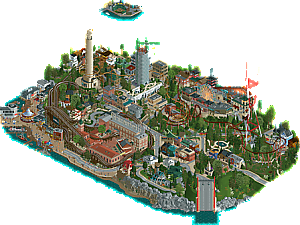
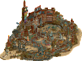
Park / Ghirardelli's Dream
-
 14-July 24
- Views 8,772
- Downloads 218
- Fans 0
- Comments 30
-

-
 67.50%(required: 60%) Silver
RobDedede 75% Xtreme97 75% Babar Tapie 70% G Force 70% Recurious 70% RWE 70% chorkiel 65% pants 65% Scoop 65% wheres_walto 65% Liampie 60% Turtle 60% 67.50% -
Description
Chocolate: a taste that feels like a dream.
-
No fans of this park
-
Full-Size Map
-
Download Park
218
-
Objects
3
-
Tags
Similar Parks
-
[H2H6] SF - Hurricanes - Rowling Versus Tolkien
![park_2455 [H2H6] SF - Hurricanes - Rowling Versus Tolkien](https://www.nedesigns.com/uploads/parks/2455/aerialt2205.png)
-
The Great Carolina Quarry
-
Mythos
-
Roman Vice
-
Meccha
-
Void Extraction Research Base
Members Reading
nedesigns
- Copyright © 2002-2025 New Element Designs
-
Community Forum Software by IP.Board
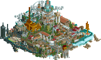
An icy neofuturistic paradise of steel and steam faces a chocolatier's idealized vision of reality in the first of three pivotal matchups. H2HX is still anyone's game.
Chocolate: a taste that feels like a dream.
concluded
Neo Hot Springs, So Hot It's Cold!
Voting rules- The poll will stay open for ~72hrs.
- Do not vote unless you have viewed both parks in-game.
- Everyone may vote except members of either team. Any illegitimate votes will be ignored or removed.
- Anyone with an account that predates the start of H2HX, or who has been drafted onto a team, may vote in this
match. Anyone with a newer account must pass the admins' account integrity checks.
- Voting is monitored by the admins to improve fairness.
Neo Hot Springs
I think it's going to be far more useful to focus on the things I did like: I liked those tiny little boats. Awesome. I also really liked the areas down near the water with all the neon signs and really great micro detailing — seriously impressive, especially given the chosen bench. The layout was quite cool… why doesn't it duel?! I suppose that was a last-minute deadline thing. With all that said, however, there were parts of this park that felt downright unfinished, especially toward the center of the map with the exposed default paths and blocky ice sculpting. This park was clearly a speed build, and I have a lot of respect for what you all were able to build, given that. Also, remix of Asian theme was cool for custom music!
Ghirardelli's Dream
Really cool SF theme here. Much of this park really felt like a diorama to me in the way it was presented — the scale felt small everywhere. In some cases, that helped and was really cool. In other ways, it ran into some issues, such as the buildings looking minimal relative to the coasters. I enjoyed the perspective trick of various SF locations in the sky. The looping coaster was a highlight for me with its elevated supports over the ground. Lombard Street recreation is so fun as well. The Ghirardelli chocolate bar sign on the coaster was also really fun, with the bite taken out of it. The CTRs for landscaping were cool and achieved a unique look in most spots. I am finding myself liking more things in this park than disliking, which is why it's earning my vote. Cool park, Hurricanes.
First impressions: SJ is unfinished, and that is a shame! However with multiple coasters and several almost finished sections the park is certainly enjoyable, so your efforts are not wasted. I don't get the concept yet, but there is time. HC is one of the most eccentric parks of H2H so far. Again I don't fully understand the concept, but I like what I see, quite a bit actually. In some ways this is defnitely a H2HX park (the roads! Inventive), but in other ways it feels like a park that was built in H2H8 or H2H7 such as Erlebnispark Raubritter - and I'm quite grateful for that. This is certainly the most old school match of the contest so far.
Extended thoughts later during the match.
Neo Hot Springs
Whether it was a time-crunch thing or not, I really enjoyed the relaxed style this had with the use of default pathing and the old-school approach of simply going with different roof colours to mark out different districts around the springs. Yellow area was definitely the most fleshed out and gave a good idea of what a more finished overall map could have looked like.
Since the hot springs are key to the theme it would have been nice to see a bit more effort put into those to sell the narrative - some peeps bathing in them and some bathhouse type infrastructure would have gone a long way. Also just in terms of balancing detail level on the map. I didn’t mind the simplicity of the landscaping at all. The broad strokes were there and it was very striking.
Ride design was a bit odd, I couldn’t work out at first if it was intentional that the blue track of the RMC ‘froze’ at the top of the lift hill but then there were no moments where they were interacting so I assume it’s an error. The motorcycle ride was a fun and unique choice though.
Cool rafts.
Ghirardelli
Im sure others will be enjoy all the CTR landscaping, roads, pavement etc, but I have to say, it’s not for me. I don’t think what is gained in terms of shape is worth what is lost in terms of surface texture and cleanliness. However, I do appreciate that you matched the flat style of the CTR stuff quite well in the architecture - in terms of scale and detail level everything looks cohesive which is important. Like Robdedede said it has a miniature diorama vibe which is really cool.
I didn’t quite get the chocolatier narrative, beyond the rides having chocolate themed names and there being a small factory building (love the giant sign btw). but at the same time I also enjoyed that it was just a simple urban scene and not over the top fantastical. But then with it being a dream maybe some level of surrealism would’ve been welcome.
I like both parks quite a bit, nice palette cleanser somehow. Gonna sleep on this one.
Ghirardelli
Not really sure what this was supposed to represent, other than something to do with chocolate and San Francisco. Why are the roads in the dream textureless? Is it a reference to some stuff in dreams being more vague? It would have been cool if the letters were jumbly, because in dreams I can never read stuff. Not sure if the street has texture in my dreams, would be cool to figure that out. Also, because of them having to be on a (half-) diagonal, some buildings are a bit too underdetailed for my, like mintmania's station building for example, or at the waterfront.
I liked the coasters, and the diorama-like (textureless) street scenes.
Hot springs:
I like the cyberpunky vibe, and the coasters. Unfortunate that they didn't duel, but for the most part the unfinishedness didn't bother me that much.
Neo Hot Springs : The boats are sooo cool !! I really like the lower part of the park, the one that's got this steampunk feel, there's cool detail on the buildings and it's visually punchy in some places (especially in the corner). I'm not so enthusiastic about the Asian top part, I find it very repetitive and visually more classic. Not a big fan of the surface either, but in a way it's hard to bring a bit of variation to this ice, however I appreciate the detail of the Kandji (thanks to the discord) !
Ghirardelli's Dream : Very nice font for the panel. I'm also a big fan of this canopy,an ingenious architectural design. The tram on the micro part is brilliant (I love everything micro anyway, and the whole part is particularly well done here). Not a big fan of the roads texture, and also of the whole right-hand side of the map. These hills are also unique, I really like them. On a final note, I like the sound mix, the music is well chosen and fits well with the atmosphere !
My vote goes to the Canes
a strange matchup here, i voted for the hurricanes as i think finishing the park should be rewarded, but my favorite parts of both maps were on the Soda Jerks' park. genuinely a tough voting decision, which seems to be par for the course this h2h!
ghirardelli's dream
there were parts of this park that i found really impressive and parts that fell a little flat for me - my overall feeling is that i liked it but i didn't understand it enough for it to make me feel strongly. i've been to san francisco and to ghirardelli square, and have fond memories of both. but honestly this park didn't evoke the good memories i'd hoped for. it just didn't quite feel deep enough theme-wise. if it's meant to be a dream, i would have liked it to be way more trippy/whimsical, and it wasn't quite high enough quality-wise to be a great recreation of any of the areas.
pier 39 is such an iconic area and it felt kinda tacked on last minute, same with the golden gate bridge in the corner. i think maybe in trying to add a number of different locations, they didn't mesh well enough and kinda didn't get deep enough into any one iconic area.
there were some high points for sure, the curved land/street CTR is really interesting for everyone. i very much liked the font work on the sign, and the miniature floating scenes (especially alcatraz). other highlights were the large tower, the wavy solar panel building, and the go karts which were fun to follow around.
neo hot springs
a shame this is probably not finished to the level that it might have been had this been a must-win matchup, but that's totally understandable, and a smart move in terms of the contest. no arguments from me here, but i have to judge this park in terms of what's there and not in terms of what it looks like it could have been.
first off, a very interesting theme idea which i like a lot - the ice kanji is such a great macro idea and even unpolished it is a great effect. the music is the first thing that hits, and it does indeed hit hard. love it. some really cool verticality going on in the opening scene, and very interesting layering. i do think a lot of the colors aren't really connecting for me, it's slightly haphazard and a more cohesive color scheme probably would have tied the whole map together. but the flashing lights, the smoke, the coasters, they all combine to give a very lively atmosphere.
i think overall my feeling is that it's a theme that i'd personally love to build. there are enough ties to existing things to ground it in reality, while still being an obviously unrealistic setting. feels like a solid 50% base of a park, and it's obviously a shame that we don't get to see it at 100% in terms of detail and atmosphere. but that's contest life baby. looking forward to semis!
I think both parks are quite close together quality wise, and it wasn't easy to pick a favourite. In the end I went with HC because I preferred its landscaping and overall execution. Although there were odd performance dips here and there, which I assume are due to excessive landscaping made out of rides (?). I would avoid this if you can.
The SJ idea was good but a bit too wild and unrefined, and I didn't understand why the coasters wouldn't duel? Maybe I'm missing something but it seems like a massive oversight. Some of the structures you were able to do looked amazing though.
Ghiradelli's Dream:
The first thing I want to do is commend y'all for going bold with the CTR streets, sidewalks, and landscaping. This could not have been an easy task and I applaud the team and the builders for taking on such a challenge! Some areas like the curved hills near the bridge were a hit, but unfortunately other areas were misses (the strange flatness of the roads were aesthetically not pleasing overall). I think the highlight of the park really was the little vignettes floating in the sky - some really creative work in creating these dioramas which isn't an easy thing to do at such a micro scale. Alcatraz was perfectly done, but on the other hand, I didn't understand why there was a little empty road as a vignette. There were also some great moments of atmosphere, such as the curvy Lombardy street, the main Ghiradelli sign and courtyard, and the squiggly canopy (very unique and looks great). However, the overall park is just very confusing and I am not really sure I understood what the vision was... I am assuming this is a chocolate maker's dream, with fantasy floating bits to create a surreal dreamscape. The concept really just fell flat for me when it came down to looking at the scenes throughout the park - the flat textures and empty backsides of buildings were so jarring, and while they do kind of bring a surreal touch to the park, the execution was just not there to sell it. I felt there was a real lack of detail throughout, with some facades looking like they were pieced together in a few seconds time, while others were fully fleshed out right adjacent. The golden gate bridge felt underbaked. The use of base game music is not a slight against the park, but the overlap between two themes so close together was a miss as it created another very jarring experience as a viewer. In terms of the coasters, all three were misses for me - Raspberry Whirl was probably the best layout in this match, but the single suspended was sprawling and shapeless, and the Chocolate dipper was middle of the road, a big miss with the underground ending directly into the station. At some moments I even wondered if the park was finished or not, and that is not a good question for a viewer to be pondering when exploring a park.
Neo Hot Springs:
The concept here is great, despite cyber-oriental fantasy being a little cliche. First off, the macro planning is unique and brings some unexpectedness to the park, which is a major plus for me. The massive kanji ice over the top of the buildings is a great idea, executed well enough to sell it. Highlights for me include the finished areas with the street life and illuminated signage / storefronts were vibey and atmospheric, and there were some really convincing scenes that were well done throughout the different nooks and crannies. The floating boats were cool, as is the way you used elevation to create these massive walls of buildings. Unfortunately, that's about where it ends. There were too many unfinished or underbaked areas that did not look intentional which is really unfortunate. Empty exposed base paths and land spikes littered the backside, taking me out of the fantasy. All 3 coasters were lacking and missed the mark big time for me - the duelers didn't duel and the layout was hard to follow being so swallowed up in the buildings, Crane's pacing was all over the place, and while the yellow coaster was a slight improvement over the others, it felt too much like a secondary / tertiary ride that it didn't help redeem the poor coaster lineup. Luckily for the Soda Jerks, the overall macro, the concept and what was done there with the nightlife areas was enough to justify a vote here against your opponent.
I agree with pretty much everything AVC said, but I disagree about the biker coaster. I think that was the best coaster of the match and had great supports to boot. That and the oriental style song remix were what swayed my vote. That song will keep me coming back every now and then.
Ghiradelli's Dream
This was a cute park that was hit or miss for me. The ambition of the landscaping and roads is admirable, but there were a decent amount of areas that felt too raw. I also don't think I fully understand what the idea was behind the "dream" of the chocolate maker. Some more hints or more integration of chocolate motifs would've gone a long way towards making the park come together.
Loved the vibe of this waterfront.
This clump of buildings here was one of my favorite parts of the park.
Solar Panel design coupled with the weaving roof pattern was another cool design moment.
Very clever object usage in these mini aerial vignettes. Wish we would've seen more of this level of detail in the main park itself.
Ultimately a relaxing and enjoyable park. I think a bit of extra oomph or bite would've given it the edge over its competitor.
Hot Springs
Jerks' park was frustrating because it has the skeleton of a truly great park, but it feels undercooked in a way that makes me wish we could've seen this idea developed to its full potential. The "Hot Spring" Ice kanji is a great moment. In some areas, the density of the micro is imaginative and alive, and in others, stale and stiff. There are strange and yet really fun choices, like taking the time to detail the entire alleyway that can only be seen with cutaway. Intricate moments like this suggest that there was real potential for life to be breathed into this whole map.
Having the kanji "click" as a macro moment was pretty dope, really cool idea.
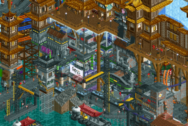
Great moment here, with the mixture of neon colors sandwiched between two vertical icy paths.
Such an interesting vibe on certain structures like this one, don't know if we've seen anything quite like it before. Loved it.
The lines and colors here create a kindof layered depth that I love, chaotic but not completely illegible, creating a feeling of realness, making us want to see more.
I was paying attention to this tiny, detailed storefront hidden behind the layers, when I used cutaway and found that this whole alleyway was fully detailed. It's a decision that fascinates me because it doesn't make much sense to do this from a contest perspective, where immediate impression is of paramount importance, but it does add even further to the uncanny liveliness of the park.
This corner really needed something to break it up and add some energy to it. Too much chunky red.
All-in-all, while it didn't entirely stick the landing, the fundamentals were enough to push it through: strong concept, strong macro, and moments of life that left me wanting more. I'd love to see the builders revisit this if they were ever curious to, because I think there was a massive amount of potential here!
Ghirardelli's Dream - Hurricanes
This park uses a lot of CTR´s and I don´t really understand the use a lot of the times. Lacking texture and twitching. I did really like the canopy one on the modern building. I think the little vignets around the main map are fun. Shame there aren´t more of them. There are big differences in quality of the archy on the main map.
Neo Hot Springs - Soda Jerks
This park is quite crude in a lot of areas, looking partly unfinished, but I like it as a whole. The Street Gang Motor area is my favourite. Like the snowy top and waterfalls is old-school and the bottom is modern. Was this a choice or just time pressure?
With respect to all builders involved, both parks didn’t wow me as much as earlier parks have and I can understand that given R5 is a hard one (player fatigue, choosing which park goes to semi’s or finals). The Hurricanes park had nice areas, but didn’t capture me and Neo Hot Springs just won me over more on the totality.
Ghirardelli's Dream
Fun music! It really sets the vibe for this park. I will start by saying I appreciate the innovative CTRs. The shallow grass slope vehicles give the landscaping a unique look, and the street vehicles actually blend in really well in the dock area (where the go karts start)! One thing I also loved was how well this vehicle works with downward-sloped curvy roads like in the picture.
My favourite area of the park would have to be the pier area. I love the seal show and the guests taking photos with the hanging shark there! The miniature scenes would have to be a close second place, really neat object usage to make it immediately clear what the scenes are portraying.
For the rest of the map, I would have to say it is made up of buildings of varying quality. The bigger buildings, like the one with the solar panel canopies or the building that is under construction, were the best of the map. When you compare that to the small-scale buildings on the rest of the map, some just pale in comparison (I wouldn't say rushed, but more lacking the details to push it to the next level in terms of execution).
Overall, I would say that this is a fun and enjoyable park with a solid concept that could've used a week or two more in the oven to get the less-developed areas of the park up to the quality that was shown in the miniature scenes and near the pier.
Neo Hot Springs
Compared to Ghirardelli's Dream, I would say this park has the higher highs and lower lows. But let's start with the positives! Upon opening the map, I was greeted by some neat looking macro with the text written in ice (shoutout to hoobaroo for pointing out the translation of the text on Discord!). Throughout the park, there's some flashes of brilliance shown in the architecture with all the awesome light effects and detailed shopfronts.
While the duelling(-ish?) coaster was hard to follow, I absolutely loved the motorbike one! It doesn't have the height or other stats of the more imposant coasters but I really liked it's twisty, low-to-the-ground layout. With that said, I do have to point out the landscaping/rockwork which was practically nonexistent below the icy text. I would have loved to see the current rocky terrain be combined with some 1K Ruin Rocks or Tolsimir's Land Wall Rocks to amp up the level of the landscaping and to fill (or even hide lol) those bare-looking land walls.
I'll end off by saying that this was (to me) the closest match-up this contest. Was very close to a null-vote. The overall macro, cyberpunk archi and cool animated billboards almost swayed my vote, so I hope you guys are proud of the work you put out here! Like c'mon, look at the 1-Up Mushroom!
G's Dream : Cute, miniature, innovative, curvy, america coded
Things I liked : The hillside ctr, the small island, the scale. Very fun and quaint.
Neo Hot Spring : Cyberpunky, grimey, other world like.
Things I liked : Texture and details in places, the floating ice blocks. Neat and stylish.
Ghirardelli's Dream
I am very torn on this park. At surface level, it feels refreshing in part due to the landscaping and road CTRs, but the end result feels a bit stale and even uncanny. Maybe there could have been some subtle variation or little details that add some life to the very pristine surroundings. I can't deny that it's very clean! Almost to a fault though, as the scenes all kind of blend together for me. The standout of the park is definitely Ghirardelli Square, but the actual square is so cramped! I think you guys may have gone a bit overboard on the archy, toning down the density of structures would have greatly helped to add balance and breathing room to the map. One thing I love about this park is that it is a whole interconnected city! I liked the suspended coaster a lot, actually the most out of all the coasters, though I had trouble getting it to run. Fisherman's Wharf is probably my favorite part. Ultimately this is a good park with a strong vibe, but it falls short in terms of macro, forcefully smashing together its impressive setpieces and citybuilding.
Neo Hot Springs
I am also very torn on this park. I wanted so much more, but I'm ok with what we got. At first I thought the theme needed more time in the oven, but the more I looked at it, the more I came to see the light. This park shines in the big picture. I originally thought a palette might have improved it, but I'm rescinding that opinion because the blue kanji-ice brings a much-needed pop of light and contrast to the darker, muted colors of the architecture. It pains me that the entire map was not as detailed as the storefront sections that others have highlighted so far. I was able to get the coasters to duel consistently by setting minimum wait time to 30 sec, and while it was satisfying to finally get that sync, I ended up wishing for better views of the coaster and more prominent points of interaction. The other parts of the park fell a bit flat without the crazy detailing and movement achieved in its best areas. In all, the level of liveliness that you guys managed to pull off in a park that feels so unbalanced is impressive.
I felt the temptation to null, but I resisted, for I know it is truly man's basest folly
Tough match. Also because I think I just didn't get both of the parks. Didn't immediately recognize San Francisco in Ghirardelli's and the chocolate dream is a bit lost on me. Would have loved it to be more surreal. The esthetic was a bold choice which I appreciate! As for Neo I just accepted that I couldn't place the park, because I liked the esthetic. It's a bit rough/unrefined/whatever's been said but I feel like you know plenty well where this park could have been improved.
checking out these was slightly frustrating to me, as i think both concepts have quite a bit of potential but im not sure whether they fully realised it. both parks seemed to have a lack of polish on them, definitely hot springs more so than ghirardelli. in ghirardelli i had a hard time getting into the ctr's used as landscaping and roads. i took that the intention was to create a dreamy atmosphere, but unfortunately to me it made the map mostly look more sterile and flat than it otherwise could've been. the macro was a bit questionable to me as well, the worst offender probably being the awkwardly positioned golden gate bridge funneling into a two-lane street. in many cases this park just left me wondering what exactly the intention was behind some of the stylistic and compositional choices that were made as i couldn't quite figure it out at times. in hot springs some areas felt quite unfinished, the completely unpopulated springs and the coasters not properly duelling are probably the worst cases for me. however, both parks do have some really decent moments overall; i really liked the attempt at lombard street in the canes park (for me the only moment where the CTR road use is fully justified). my favourite area of the map is probably the waterfront - really pleasant atmosphere there and a great sign pasted onto the lift of the woodie. in hot springs i was a fan of the overall macro and dramatic landscaping doubling as kanji signs, great idea. the corner with the black/beige industrial buildings and chimneys is the most successful part of the map for me, really love how the ice canopy creates a sense of depth there. there's a lot of interesting architecture as well as atmospheric nooks and crannies to explore in this park.
overall i found the parks to be pretty close together in quality, but i ultimately connected to the SJ park a bit more because of its strong macro composition and overall atmosphere.
The poll is now closed. The final voting score was:
Possibly the most intense nailbiter we've seen all contest, with the teams exchanging leads at least 4 times. A tough one to stomach for the Hurricanes as this win would've helped tremendously regarding PlayOffs qualification. Congratulations Soda Jerks on yet another win. You now stand a chance to end Round Robin as the top placing team.
I think a lot has already been said here. There's some really neat innovation, the sloped grass hills in particular stand out as useful for new curved/rounded shapes. The roads weren't as successful, the textures weren't as clean as the shapes. I liked the miniature scenes, though they do feel a little random floating above the park. The map itself didn't really feel like San Francisco to me, it seemed like the most recognizable features (Alcatraz, Giants ballpark) were reduced to miniatures, and I think more could have been done to include classic features like steep sloping streets and signature bay window houses. The golden gate bridge not including any of the iconic towers also feels like a missed opportunity. Sorry you guys lost, too many people needed it to happen and our boys dug deep to get our park done
Ghirardelli's Dream:
Really like the overall composition and clean style of this, also like the small scale of things, it's all very pleasant to look at. Really nice accurate scenes of the area, and I like the ride design, the coasters all fit in well with the surroundings. (My PC however did not like this, the park was chugging around from all the CTRS)
Neo Hot Springs:
The macro here is so cool, love the lettering ice like that. Also like how vertical things are, and I like the dense and varied architecture. Some rough edges here and there, but overall cool and feels very "Old school H2H".