Park / Sea of Symphonies
-
 05-July 24
- Views 11,102
- Downloads 388
- Fans 2
- Comments 39
-
-
 84.50%(required: 70%)
 Gold
Gold

RobDedede 90% no Terry Inferno 90% no Babar Tapie 85% no G Force 85% no J K 85% no ottersalad 85% no posix 85% no Turtle 85% no Xtreme97 85% no Cocoa 80% no pants 80% no RWE 80% no 84.50% 0.00% -
 Description
Welcome all to the greatest spectacle beneath the waves; The Sea of Symphonies at the magnificent Grand Shellios Hotel.
-
2 fans
 Fans of this park
-
 Full-Size Map
-
 Download Park
388
-
 Objects
2
-
 Tags
Tags
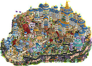
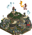
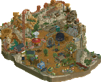
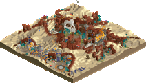
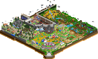
Sea of Symphonies:
There were some really cool elements and moments in this park, but overall there was just too much going on for me to really enjoy the aesthetics or remain focused (something I have been struggling with with a lot of the parks this H2H).
The hotel was impressive and I liked the thematic consistency.
Raveland:
These are the parks I enjoy most. "regular" often used themes (this time a western/mine theme) with a twist. Very well done and I loved some of the rides. Loved the armadillo stage with the triangular roofs and the Purple Haze coaster.
With both parks (and almost all parks so far) I am still trying to get used to the new style of very detailed park edges. It's like I am trying to enjoy some good food, but I keep getting distracted by the plate.
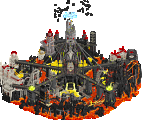
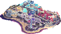
Raveland
While I will admit that I'm not personally a big fan of edm festival culture, this park allowed me to experience it from the safety of my computer! There's so much on this map, the theme really comes to life in the details; my favorites being the foam party, music notes coming out of the cave, the famous artist H2HX arriving, and all the little sculptures and art installations around. This is without a doubt the best representation of a music festival we've seen in RCT, and I'm a bit surprised it took so long to get here, but you guys knocked it out of the park! I love the bits of old machinery/industry infrastructure which give the scene so much character, and while it is dense, readability is not an issue here. Fantastic coaster, which also lends a great splash of blue across the red and greige surroundings, however I feel that it dominates a bit too much space in the center, leaving the rest of the park to feel pushed into the corners. Overall, this is a damn good park that is fun to look at and rewards a close eye, definitely one of the best parks we've seen this H2H.
Sea of Symphonies
This park is so beautiful it puts me in a trance, and all of the peeps getting stuck seem to agree. While I sometimes think themed map edges are gratuitous, the coral reef map edge is just magnificent and really ties a bow on the wonderful park inside. Very effective use of space with the rides peeking through as well. The color use is top notch; for an underwater park, using blue only for the rooves (the "water") while leaving the rest of the map open for all of the green, purple, pink, orange, red, and black, is the work of a mastermind. Speaking of which, we've seen a fair few underwater maps, but none of the whimsical variety (unless I'm mistaken). It lends itself very well to RCT and I could imagine myself going here. The hotel is imposing and feels especially massive from the back side. I love the park entrance and how it opens out into the trident main street and plaza. Giant octopus is a huge W. Coaster is very well integrated, almost to a fault; it is a bit hard to follow in a few spots. Norwegian loop wrapped around the hotel entrance plaza is another W. A lot of peeps look like they need to pee though. Don't they know they can just go? It's the ocean. Fintastic park! Definitely one of my favorites.
I opened Raveland first. I liked the planes and the blue coaster in the center as well as the various musical events going on. The custom rides were very good and I liked how you used the partial ferris wheel with null colored cars as arcs going over the path. Nice nighttime atmosphere.
I looked at Sea of Symphonies next. The park was oozing with atmosphere and reminded me of several Disney Silly Symphonies. The main coaster was nice. The hotel was very evocative but fit in with the rest well. The musical notes were a nice touch. It's the sort of park that just looks fun to be at, beyond just the content.
I voted for Sea of Symphonies. But I really liked Raveland too. Good work from both teams. Both are worthy parks worthy of an H2h contest.
two really creative parks, jam-packed with content with strong themes that feel pretty well fleshed out.
Raveland
never really been a raver, but i don't think i need to be to get this one. solid theme that makes sense and tons of little details to tell the story properly. EDC is a big thing here in vegas so i'm sure i see the parallels, along with burning man... an unorthodox RCT theme for sure but one that works well here.
it's gritty, it's realistic, sometimes to the point of sacrificing looks for the viewer, but in a way that makes sense for the theme, so you have to respect it. personal highlights were the many sculptures, the frozen staff and peeps that i can hover over to see what's going on, and the little hidden areas like rave cave. feels like a really fun place to be, overall. great fun work.
Sea of Symphonies
been a while since we've seen a good underwater theme, outside of realistic renditions in indoor rides etc. well, this is a very good one. probably the best, as far as i can remember. a theme that can only really be an h2h concept - standalone, commit hard to it. and you guys did.
such a vibrant atmosphere overall, someone said maximalism and that's definitely the vibe. it's almost to the point of being overcrowded honestly, but this manages to stay just on the side of classy rather than unreadable. interesting rides, with an anything goes approach to theming, made for an interesting park to explore. at first i thought it may be the weaker of the 2 parks in terms of little details to sell the theme, but the more you dig the more you find, and it's certainly not light on content.
personal highlights were the colors (mad but strong), the map edge which added a lot of depth to the map imo, and the many fish pun easter eggs to find.
a strong matchup here, i think that overall a more vibrant visual theme got my vote but it was a close one for me.
The poll is now closed. The final voting score was:
A match of notably high quality ends. The park with the slight margin wins with a much more pronounced result than you would expect. Well done Soda Jerks, this likely clinched the PlayOffs for you!
Raveland:
+ One of my favorite parks of the contest so far. So much detail everywhere, both in fidelity and in the little scenes you can find all over. I'm definitely not going to be able to recount it all here, there's just so much!
+ Main stage is a hell of a setpiece and those laser objects really make it pop. Love the half-diagonal video screens too, and the moving speakers really capture the over-the-top rave vibe.
+ Landscaping is bonkers! Love the use of Krypton rocks and the detailing with the Fisch boulders. Unfortunately nuked my GTB because I was thinking it was barnNID.
+ Sculptures and themed buildings are insane and I'd love to know who made those. The abstract armadillo canopy is such a perfect addition. I also love the giant boombox and turntable building.
+ Leave it to Belgian to go absolutely insane on the ride design. Raver is a beautiful tangled spaghetti mess of Gerstlauer goodness.
+ Interior cutaways are a treat! Love the decorations and unique themes for each.
+ Ghost projection near Vampire of the Abandoned Mines is such a cool idea.
+ BELGIANGUY BANGER!!!!!!! I know the music has gotten mixed feedback but this might be my favorite original track for a H2H park so far. Also the first time in H2H history where two original scores have gone against each other! Proud to be part of this historic moment.
- My only gripes are Floral Flip gets a little slow at the top, the edge of the map is kinda messy, and the hall with the eight canvas spires turned out a little ugly. Minor complaints for a fantastic park. Really wish neither park could lose here.
Sea of Symphonies:
There's a lot I could gush about, and Ethan and the gang made what is undoubtedly my second favorite park of the entire contest. Ethan is a superweapon in almost every way, and Scoop did a perfect job grounding his maximalist insanity while Mulpje and ITM were perfect additions. Too bad we're not gonna talk about them because I DID ANOTHER H2H SONGHGSHGDHGHS!!!!!!
Even before the park took on a musical theme, everything about the musical influences that went into Sea of Symphonies spoke to me, from Donkey Kong Country and Pokemon Ruby to Mort Garson and Oneohtrix Point Never. I nudged about doing an original score again and then just straight up started begging. I was confident I could absolutely crush whatever vibe they wanted, and Scoop eventually sent me the music for Droomvlucht as a launchpad. Right away I loved how Ruud Bos was able to modulate and transition between two very different sections using some funky chords. Josh loves his super long loops too, so my plan was to feature a mellower underwater section that would escalate into a grand fanfare as you approach the hotel.
I had a very busy May unfortunately, and then immediately after was a busier June than I expected. I had to squeeze this song into a week while juggling it with a game jam I was doing pretty much everything for! Some overall ideas had slow-cooked in my head, but a lot of it ended up being improv. Big shoutouts to Ethan for nerding out with me about theory stuff; the minor-to-major modulation in the first section was based on something we both noticed in Plantasia. The first section was more or less my take on an underwater theme a la Aquatic Ambience that would start off mysterious and somber before opening up into optmistic bliss. The second half I ended up borrowing quite a bit from John Williams. I'm very proud of this song, but it definitely feels like 25% of my true power. 100% would have negative effects on the human population.
The process was the same as Valley of the Kings; I just opened up JummBox and sketched away. Once again, Josh came in clutch with the mixing and mastering, and he was especially ready to try out a shiny new copy of Kontakt 7 he just bought. His orchestration ended up sounding incredible, and he tweaked a few of my melodies and extended out the second section about another minute. We also wanted to export each track to line up with each musical sea creature; for instance you'd hear more pronounced brass upon encountering Louis Starmstrong. Unfortunately time was short and we had trouble setting it up so we just used it as it was.
Once again I can't stress how much of an honor it is to bring my musical skills here. If y'all think I go goo goo over this game and this community, never ask me anything about writing music. Also I do want to stress that even if you're not a composer, you can still help influence a song! Just look at Scoop and Ethan. I've also come across this in other teams I've worked with, and I always tell them their influence matters. I don't write music for other music nerds. It's a universal language understood by all even if they can't write it themselves. Josh and I gotta release the H2HX single after this contest.
Soda Jerks, you guys made one of my absolute favorite builds ever. Ethan is the RCT equivalent of The Cure’s Disintegration. Or maybe it’s Head on the Door with this one? Either way, your dreamy, impressionistic style really clicks in here, as it’s complimented by more precise and simultaneously larger-than-life detail. In particular, the hotel, which has to be possibly my favorite structure anyone has made in this game. Seeing the time lapse gif in the discord just blew me away. While an 86% average is a great and respectable average score (as of typing out this review), I strongly feel this park deserves to sit in the upper echelon of 90% + work. It’s that good.
For the Gardners, I think there are a considerable number of great aspects of this park. The rave theme, music, and various scenes are real winners in my book. But as others have said, I think the Western look of the park needs more after seeing it done before, so the twist has to be really compelling in order to sell. Still, I think seeing a park that’s more spaced out and carefully calculated is nice on the eyes, and I can absolutely see why viewers prefer this over Sea of Symphonies.
Raveland
Very cool concept, a western canyon with a Tomorrowlandish/hipster festival in it. I like that it is very readable and clean, yet full of cool little details. The coaster in the middle works as the perfect weenie to build around. Loved the layout of it, Raver is a pretty cool coaster with some nice features like the vertical launch and the triple launch.
Stuff I really liked in particular: the flamingo, raveland entrance, foam party, the radio podium and all the custom rides. Landscaping was very good. Great park.
Sea of Symphonies
Holy cow this park changed so much since last time I saw it! It really recieved multiple layovers of polishing and finishing, and it shows. The hotel really is spendid, grandesque... really amazing! There's so much atmosphere here and what you guys did with the park edge is genius, makes this map really bigger and more alive at the same time.
The Coral Coaster is great but I also have to say for some reason, I'm in love with the little Boomerang. It's just so perfect! Landscaping and the crunch game is spot on in this map. Love all the special sea creatures with extra love for the big octopus Gill Collins Love all the naming too ofc haha. So much details here. What a banger of a map!
Great job Jerkers!
Raveland -
This was a nice park that suffered most from comparison. The park concept itself felt closely tied to the Yards, which we had just seen from your team in the previous round. I don't really understand the logic of making a follow-up park that a) overlaps with something done recently but b) doesn't stand up to the original. The structure below stood out as particularly egregious as a bad imitation.
I think you can draw the same lines between this and Cirque Macabre: carnival-like atmospheres in less common settings that lean heavily on stylized sculptures. In effect, you just built the same park with a slightly different twist. It was cool the first time (I voted for Cirque!) because it captured a cool atmosphere in an interesting setting. Raveland felt like a rehash of that basic idea without enough unique character to stand on its own. The screen below to me show the same formula: themed lettering, a tall non-coaster, 4-armed tower ride, a few sculptures, a kiss of the main coaster, textured path.. it's just the same thing with a different coat of paint.
The last park this suffered against was Yucca. Being intimately familiar with that park, I do believe the landscaping of Raveland is distinct enough to stand out its own. Yucca is explicitly a Mojave Desert park, so the flora leans heavily on yucca plants, Joshua trees, and cholla. We intentionally avoided wild cactuses because stereotypical saguaros are commonly found much further south. Given the red rocks and presence of saguaros in your park, I assume Raveland is more Arizona/New Mexico than Nevada/California, but I doubt that your team put in the effort to make the clarification.
The architecture at times was a bit uncanny to me. While there are not 1:1 copies, I thought the general style was similar but worse across the board than what was present in Yucca. Particularly egregious to me was the "graffiti" tag, especially in comparison to the gritty style I presented in my own park. Graffitied western shacks with triangular banner flags made mostly from wooden materials can only be done so many ways, but I think the execution here suffered by comparison.
Also uncanny was the presence of vehicles as decor. Your park included a train (with awnings as cow catchers), a tubed fuselage, a truck (with corrugated roof hood), which were also done in Yucca. Being only separated by one round, I doubt that these were copied in any way, but it is unfortunate that the overlap exists.
The last note I have, which is a statement on more than just the park, is the presence and execution of tents. As is a pattern with this park, I've seen it done better before elsewhere. In this case, my DTLA micro. That park, like Yucca, was built on personal experience and exposure to something in real life. I tried to capture the reality of what I saw. Raveland feels like a tourist's cheap imitation of what they think they see. Something for rich assholes who go out into the desert to "find themselves" then come home and copy other people's styles because they can't form original thoughts of their own. That's how Raveland made me feel, so congratulations if that was your intent.
As I said in the first sentence, this is a good park that suffers when compared to other parks that executed the core parts better. The rides are awesome, the new animated objects are awesome, the sculptures are awesome, the landscaping is quite good, and the overall vibe is pretty cool. But I don't feel anything real when I look at it.
Show me on the doll where the Evergreen Gardeners hurt you.
I promise it's not that deep, bro.
Fun park, Gardeners. Let's all keep having fun and enjoying what we build and how we build it.
I wish to know that as well. I can understand some points of the feedback, but others feel very far-fetched, especially those where comparisons to your own stuff are made, Walto. In between the lines i also get a very negative sentinment against me and my team. Especially considering the troll vote for your own team's park you did on this. To this day i don't know where it is coming from. If you want to seriously talk about things i just want to say i'm always here, feel free to hit me with a PM or something. That's the best way the grudge you're holding against me/us might go away, stuff like the troll vote or this review won't help.
Imagine being Mrs Walto
SEA : Fantastical, whimsical, aquatic, animated, brassy.
Things I liked were the music notes, colors, and the big octopus.
RAVE : Energetic, dusty, America coded, flashy, skrillex.
Things I liked were the big flamingo, boombox, and the colorful cacti.
Sea of Symphonies:
Knew this had to be an Ethan led park as soon as I opened it. Amazing density of contest, maybe a bit hard to read sometimes but it also really brings it to life, it very much feels like a thriving reef ecosystem (Also, the floating musical notes, cool touch there). The height of the edges and the imposing hotel make this feel absolutely huge for the size, and the main paths being a trident like that is a really cool touch. Another park with some good immersive sound design too, and a great original soundtrack.
Out of all the matches, this was the most difficult to vote on for me. Both parks have so much to love, and it really came down to splitting hairs.
Sea of Symphonies:
Absolutely incredible vision for this park - from the macro planning of the shell-shaped map, to the beautifully realized hotel complex, to the perfectly made sculptures of different marine life, to the interesting coral formations with unique object usage. There isn't much more to say than what has already been said by other reviewers, but this park was stunning and very fun to explore. The coaster layout is really well done, super flowy and pretty easy to follow. I think my favorite bit is the little boomerang coaster and the way it wraps around itself. Music was top notch and really sold the concept. Amazing work throughout - with some minor nitpicks: even with a maximalist aesthetic, there is so much texture and color that some areas do read as visual soup. Some editing would have brought this to another level, with some neutral backdrops to allow the setpieces to shine. Parts of the map edges also clashed in terms of color choices - I was not a fan of the black rocks vs. all the colorful coral. These are minor things, though, as this park was really one of the best of the season for me.
Raveland:
I'll have to preface this by saying this is a concept that is near and dear to my heart as a raver myself. I had a blast exploring all the little scenes and stages here! Overall, the park was really well composed with some masterful layering of scenes and rides. I'd say the ride lineup here is on par if not stronger than SoS, with some really nicely integrated custom flats. I loved the main stage although I wish this would have been larger as the centerpiece instead of having the coaster centerstage - Raver was a good layout but veered on the spaghetti layout territory in some views. The biggest standout to me were all the little artistic installation around all the perimeter: the mushroom houses, the little tents under the string lights, giant record player ride, flower sculptures, the giant human figures reminiscent of Burning man, the underground strip club. So much to see here and I really enjoyed this park! I do have to apologize to the builders for trashing the music here... it just did not give the vibe I was hoping for and I wished there were multiple songs, either at different sides of the park or just an extended DJ set with transitions, which would have sold the concept further (sound bleed is a real thing at raves). I think a few things were a little on the nose (Raver, Life Laugh Rave), and other core rave tenets were missing (PLUR, candy making)... I really want to commend the builders here though, y'all really did a fantastic job in capturing the atmosphere. It is very unfortunate that you had to go up against SoS, as I suspect this park would have beaten a lot of others we've seen thusfar.
Sea of Symphonies
An underwater/coral reef setting is a fairly well trodden theme in RCT but the musical aspect gave it a unique twist, and it fits really well visually because of how much the tubular coral looks like organ pipes. In general I loved the aesthetics, but a downside for me was the colouring of the hotel - wish it had more organic tones (maybe something shell-like) rather than the blue and gold which felt a bit dissonant with the pastel tones elsewhere. The ornamentation was magnificent though, as were the giant fish/crustaceans playing instruments. Such a fun park, great work.
Raveland
Another park packed with fun details to discover. I particularly enjoyed all the various abstract or psychedelic sculptures dotted around and the design of some of the temporary structures - notably the armadillo stage. I also thought the western architecture was tastefully made. I liked how subtle it was, almost to the point that it was like a backdrop. I can imagine you guys might have had doubts after Yucca dropped but it’s good you didn’t chance course.
Also worth mentioning the great ride design in this park - the main coaster had a visual presence that we rarely see in h2h and it was clear a lot of care and effort had gone into all the custom flat rides.
Unfortunately I didn’t have time to check these out fully and vote when the match went up, but it would have been a really tough call. The voting outcome doesn’t do justice to how closely matched these parks are in quality - and in general I think EG have been very unlucky with their matchups this season.
Thought I left a reply.. my apologies!
Raveland:
Very dense, immersive experience. Feels lived in. Really enjoyed all the various music stages - can tell that this is something the builders put a lot of care into. The tents (to Walto's point) to me were a great map edge - really confined the space with a nice detailed wrap around if that makes sense. Music was intense, but fun. One drawback for me though was the big ball of spaghet that is Raver.
Sea of Symphonies:
Wow this is majestic. Sensory overload to a degree though. But that's a matter of personal preferences. This level of crunch, detail, etc is out of my league but also not my favorite either. But that's okay! This park makes up for that with amazing architecture, amazing coral reefs lining the map, silly and fun custom music and sounds, big moving set pieces. Love the crab, the starfish playing a trumpet... really fun and immersive details. Everywhere I look theres a fun detail or something that blows me away. Kudos.
Reviews!
Raveland:
https://youtu.be/IjfnUOPgRu4
Sea of Symphonies:
https://youtu.be/PA93f6rVXUs
I couldn't figure out who to vote for on this one. Both very high quality. In the end, I abstained. Giving it several weeks since then, I think I lean Raveland slightly, but it's definitely tough as they're both excellent parks.
I've made a dot map a few weeks ago, but somehow I forgot to post it in here. Here it is for anyone who wonders who did what on our park:
When I joined the Gardeners, Belgian Guy had already finished the coaster and rockwork in the middle part of the map and MK did some architecture. They asked me to focus on adding the festival vibes, just like I did earlier on X-Games Alcatraz. I really enjoyed building all the smaller festival stalls and art installations, like the lemonade stall, the colorful cacti and the flamingo observation platform. Fisch was added to the map in the last week to polish some areas, add some cool details and push the overall quality of the map. We all had a lot of fun building this map and the end result came out better than we would have expected. I'm especially proud of how we managed to have a decent macro composition despite all the loose and small elements. We were unlucky to face such a strong map though and the Soda Jerk victory was well deserved.