Park / Raveland
-
 05-July 24
- Views 8,580
- Downloads 228
- Fans 1
- Comments 39
-
-
 80.50%(required: 70%)
 Gold
Gold

Babar Tapie 85% no J K 85% no posix 85% no Cocoa 80% no ottersalad 80% no RobDedede 80% no RWE 80% no Terry Inferno 80% no Turtle 80% no Xtreme97 80% no chorkiel 75% no wheres_walto 70% no 80.50% 0.00% -
 Description
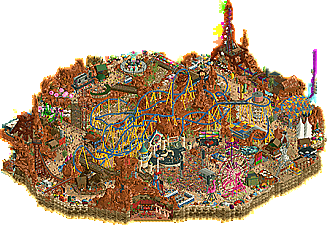
After 5 days hiking in the desert, I stumbled upon an abandonned mining town... There are a few cool caves that are still accesible from the mining equipment that I'm looking forward to explore...
-
1 fan
 Fans of this park
-
 Full-Size Map
-
 Download Park
228
-
 Objects
3
-
 Tags
Tags

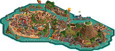
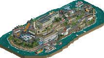
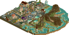
The last match of Round 4 sees two blowout parks that share a motif in their affinity for music and intense landscapes, yet are starkly contrasted in their style and setting.
Welcome all to the greatest spectacle beneath the waves; The Sea of Symphonies at the magnificent Grand Shellios Hotel.
concluded
After 5 days hiking in the desert, I stumbled upon an abandonned mining town... There are a few cool caves that are still accesible from the mining equipment that I'm looking forward to explore...
Voting rules- The poll will stay open for ~72hrs.
- Do not vote unless you have viewed both parks in-game.
- Everyone may vote except members of either team. Any illegitimate votes will be ignored or removed.
- Anyone with an account that predates the start of H2HX, or who has been drafted onto a team, may vote in this
match. Anyone with a newer account must pass the admins' account integrity checks.
- Voting is monitored by the admins to improve fairness.
i'm gonna null
Can't vote opening with a fatty null will enjoy these next week.
Just to say, early vote only because I am travelling the next 3 days!
First viewing, both parks are awesome. Ride design in the EGs for me was standout, foliage and landscaping in the Jerks was great.
Gonna be a tough vote.
Just some quick thoughts for now:
Raveland:
I'm always down for some southwestern landscaping, so great start there. Unfortunately, for me, it's hard not to compare the landscaping between this map and Yucca, and for me Yucca wins that battle, so it's a victim of comparison. Other than that, the ride design was quite cool: great main coaster layout. A nice moment for me was that wooden man statue. Overall a very solid park, but frankly it wasn't my favorite theme choice and there was a relative lack of content compared to its competitor.
Sea of Symphonies:
This park puts Point Nemo to shame. Simply stunning work on the main hotel building. Sculptures were another huge highlight for me. The crab playing the violin was so dang cool! I also adore the underwater landscaping with the moving kelp objects... it's all just so well-executed and maintains a fresh look without being overly cluttered. Simply amazing work here, Jerks!
wow, three amazing match-ups here in round 4. needless to say, im going to have to consider my vote really carefully.
i do think these two parks are a good example of too much of a good thing - all the content is astounding, i just really with there were more breathing room? especially when watching both of the big coasters, i found that it wasn't as fun as it could be following them because there was so much stuff absolutely everywhere.
maybe im too smallbrain to comprehend it, but i really do value readability over content 95% of the time. i feel comfortable making this comment on this match-up because both parks suffer from success of having too many amazing ideas
Sadly these parks seem to have broken my game and I cannot open any of them anymore. Last night I did manage to get a look at Sea of Symphonies, and I was impressed with the general aesthetic foremost. Lovely colours and shapes everywhere! The octopus sculpture also stood out, super impressive! I didn't spend enough time with the map to figure out how the park is about music exactly, other than the floating notes in specific places. Was that a new music note CTR btw?
I've only seen a few screenshots on discord from Raveland. Good sculptures. That's all I can say sadly.
Hope someone will figure out why I can't open the parks soon so I can give them a proper look...
It's lowkey annoying how almost everymatch someone says this is the toughest match yet, IDK who to vote for, blah blah blah.... There have been some matches that I felt were difficult to decide but I have never felt so torn between 2 parks like I do now. This is easilest the most evenly matched parks of H2HX. I don't want either of these to lose, or win over the other. I want to null vote but out of respect for the contest I will think about it over the next couple days and choose. But it will not be easy. Great job to both teams.
Sea of Symphonies really won me over with its amazing animal and coral sculptures. i keep finding more and more and they all make me smile. my favourites so far are probably the spacek pipes used as corals/musical instruments under the valley of the coasters' first drop and the huge shrimp framing the norwegian loop. overall macro is rock solid too, love the big lead-in to the hotel as well as the trident path decal. in some places i wish you would've shown a bit more restraint to let the set pieces of the map really shine, but i suppose the complete maximalism also has its charm.
Raveland is a great park, too. it's funny that y'all dropped two rave/party parks in a row haha. this map is packed with great designs. some standouts for me were the armadillo (?) stage design, the laser tower and the robot sculpture near the entrance. The little Evergreen Gardeners DJ booth as a tribute to the fallen soldiers is cute as well. Getting a slice of the campground in is a good idea, i would've loved to maybe see a bit more of that as it's such a fun and unseen aesthetic. i also think a bigger mainstage with an even bigger crowd would've been nice; the one that's there is cool but just like the tents in Cirque i kinda wish you went bigger and more "all out" with the set pieces.
Super impressive matchup - both parks are fantastic, definitely among the top tier of the contest so far.
Raveland:
Awesome idea and executed really well. On its face the idea of "rave in the desert" might seem like a thin premise but you've elevated it a ton with a lot of attractions and really creamed so much detail into the map. The main stage area is a cool setpiece, great to see all the activity that makes the whole place come alive. Some great structures like the flamingo, and the metal and wooden person sculptures are awesome. Coaster is really fantastic, perhaps a bit overlong toward the end of the layout and bordering on becoming too crowded. However the flow is excellent, though I had to watch a Voltron POV to understand what the mid-course transfer is meant to do lol. Landscaping overall is really solid, at risk of becoming monotonous but you've shaped it well to produce that canyon vibe and the new Krypton rocks are wonderful. Last thing I want to mention is how much I love all the little artistic moments and scenes on the map edge. So much to discover in the map and makes it feel very full.
Sea of Symphonies:
Crazy strong competition here, this is exactly the maximalist "everything and the kitchen sink" style I've become accustomed to from this team's lineup. Again, this map is absolutely filled to the brim with scenes, almost makes it impossible to digest it in one go which might begin to hold it back. The architectural style is pretty breathtaking, god knows how long it took to construct the hotel. The central area is really cool, love the sea creatures playing instruments and the musical notes vehicle. Also appreciate the macro touch of the trident motif being seen in the path layout there. The landscaping at the edges is rather insane, so much detail and tons of objects thrown in together that somehow work. Easily the best marine landscaping I've seen, love the object combinations and the imaginative quality it has combined with the music. And the custom music is another highlight lol, would probably be here all day mentioning the puns haha. On the whole a really stunning map, though I think the over-maximalism does hold it back a little as there isn't much room to breathe and it begins to lose legibility.
I'd say this is the strongest matchup of the contest for me and certainly a very difficult choice. Went with Sea of Symphonies in the end, by a smidge. Both teams should be incredibly proud of their achievements, this is the kind of stuff H2H is made for and really motivates me to elevate my game much further.
Raveland was good! Lots of fun little details. I liked the stages in the caves. Like others, I think I also would have preferred the map with more room to breathe. Now it felt more like a festival in a park (in an abandoned mine) rather than the festival being the central thing. A bigger mainstage in the center could have already done that.
Really enjoyed Sea of Symphonies. Thought it was a nice twist to the underwater theme. The sculptures were amazing. The octopus made for a very nice centerpiece. Also really enjoyed the landscaping/foliage. Very impressive esthetic you managed to pull off.
sea of symphonies: a lot to love here. the giant animals are awesome, the crazy decorative architecture and massive hotel (epic universe? freddy fish? shark tale??). love the coral, the marching band, the overall unapologetic goofiness. its vibrant and the aesthetic is completely fresh IMO. a relatively minor qualm i had was that i had to ask josh where the funny red carpet announcer was coming from, it didnt seem tied to any part of the map very specifically. And I kind of wish the overall park layout was a bit more complicated than just a kind of flat oblong in front of the hotel.
one thing though was that palette. couldn't stand it at all, so i changed it something with a bit more contrast and texture, I think it looks way better this way. and besides that, i'm not sure the concept really made sense. I think the park would have been better as a realistic area, perhaps like the under the sea area at tokyo disneysea, so i went to the liberty of adding some exterior walls too. much better IMO!
raveland: another awesome park, although I do think its a bit weird to have back-to-back party parks. a really awesome map here soaked through with tiny details to get into. I love the western archy mixed into the modern burning-man esque sculptures and party gags. landscaping is great, texturing is crunchy and detailed, and its super funny to me that theres a purple haze coaster here. love the raver layout but i do wish it had a visible station...same problem to me as in yards. the impulse goes really well though, such a simple layout but it always looks so good. i particularly love pressure pump and the haunted shack nearby, such a good corner IMO.
however, i again thought the palette came through quite flat. something with a more sunburnt desert look could really sell that party-into-the-night vibe, so i took the liberty of reviewing your park with a more normal sunset palette. and on top of that, i actually kind wish this was really just a straightforward wild west park. so i replaced all the peeps with horses. now my eyes can finally rest easy
another great matchup / i really can't choose / both parks deserve to win / i wish i could kiss them on the lips sloppy like
Cocoa I am dying
hahahah quality reply cocoa
Sea of Symphonies
This looks like the obvious winner at first, but I’m not so sure because because both parks are rather insane. Giant sea creatures playing music instruments. Who came up with this random ass theme? It shouldn’t work as well as it does. You came up with a great aesthetic to make it work, the colours are great and the coral foliage is easily the best we’ve ever seen, making all other coral reef parks we’ve seen obsolete. (I kid). There’s some really creative object use here, like the way in which you used the new spacek pipes to make coral as well as brass instruments. I don’t understand everything, like why there is a gym interior scene. Just another excuse to make a joke about posix’s butt? I like humour in my parks but honestly posix thick faas short steve old liam bald jokes have become too stale to be included in good RCT. The park doesn’t need it at all. I like my parks a little more focused. Sometimes I’d click on something to figure out what it was, and then it was just something random that didn’t really develop the concept further. Not really a big criticism though, as there is so much to love. The domes and towers are beautiful. The sculpture work is excellent, with the octopus being the most notable one. I love the crab playing the violin too (brilliant animations), but why is ‘Eugene’ the smallest violinist? Aren’t these animals huge? Is this another meme reference for the sake of it? Anyway, back to the cool shit. The painted glass with neptune on it among other things, masterful. Family boomerang, cool layout and aesthetic. The spiral walkway using flying carpets in the hotel is also an ingenious touch. Cool soundtrack, sadly I can't make out what the words are very well. One last thing I want to mention: best use of the map edge walls in the contest so far. Instead of doing some kind of rock texture all the way down, or a fade, you filled it in with coral to make the map feel much larger than it really is.
Raveland
I’ve only just been able to check out this park, as I’d given up trying to open it on my main laptop. It works on my old laptop, however. I’m glad I managed to open it at last, because I was pleasantly surprised! This is a really cool map, with some unique aesthetics and an easy to digest layout which I find important. The huge crowds gathering around the stages became part of the aesthetic, a texture. I hate the rave scene but I would enjoy visiting this festival (assuming good earplugs) as there is so much to see and do. Best get the obvious out of the way first: the coaster. It’s really good, again quite unique, and it just keeps going… Which I suppose is fitting for a Raver. I suppose drugs play a role here. I must say I dislike the train, they are way too big to look good (frog hopper too) and they don’t even have sprites for all the elements. But yeah, tunnels, rock arches (not overdone here), strange loops, lopsided corks, cool stuff. Speaking of the rock work: it’s not the best we’ve seen, some of the use of krypton rocks didn’t blend in, but the fisch rocks were used excellently and they look gorgeous in this shade of red. Purple Haze obviously doens’t have an interesting layout, but that laser light tower adds so much. Great stuff, one of my favourite things on the map. The smaller rides are good too. With the exception of the Disco, they all offer something of note. Floral Flip stole some tricks from alex, but it’s not used cheaply.
This will be a really long review if I go over everything that stands out to me in this detail. I think I’ll just make it a list. Animated speaker objects. Flamingo sculpture. Wire frame windmills. Iron giant with skirt (!). Chill zone. Evergreen gardeners stage on the rocks. Drones. Toilets. Strip club. Haunted house with projection. All the tents and wacky vehicles. Mr Techno Tycoon Coaster. The Merry Go Rave. Rave cave. Foam party!! With slide! Shroom tomb with mushroom house in front, and strange elephants inside. Mad max-esque steam locomotive, what the hell is up with that? Ferris wheel bridge. Fire breather. Cactus ornaments. That cool big stage with triangle awning construction. Is that an abandoned airplane??? Water tower in US flag. I can keep looking, and I know I will find more stuff to like. And I must add that everything is done with such attention to detail and high level of execution, it is really impressive. Oh, urinals.
So. Two brilliant parks, both perhaps top 5 of the contest so far? I haven’t made a tier list yet so no guarantees there, but let there be no mistake about how much each map impresses me. I will sleep on my vote tonight.
Two of my favourite teams going against each other, I knew there was going to be fireworks but you guys pulled out all the stops.
Raveland
Awesome theme, I too thought it was brave after the Yards concept but massively different in its execution and amazing rides as we've come to expect from the team. Coaster was awesome, I watched it many times, I didn't feel the urge to see a station so I'm glad you guys went with it. Landscaping and small detailing was exceptional, as I've come to expect from an EG park. Custom rides were also some of the best of the competition, I'm a sucker for an EDM park, no matter what the setting. Loved it.
Sea of Symphonies
Modern meta underwater theme... sick! I think this park felt like it had much more content than its opponent and I appreciate the Shellios hotel in there to break up the crazy and just deliver great architecture, as the centrepiece for the park. Some of the best large structure work we've seen thus far. I think for me I was just struggling to see the connection of the hotel to the underwater surroundings... was it a fish hotel, or was it a guests travelling underwater to the hotel? Were the rooms built for fish, or peeps or both? On top of this there was the symphony backstory and whilst I loved the giant sculptures playing instruments, their aesthetic sometimes got a little lost in its surroundings. For example the crabs claw was made of a stone object and then a CTR, both very different textures, sold the idea but around the sheer mix of textures this park has, it was a little noisy. same for the T-rex CTR and the hermit crab shell. Trackitecture was superb as I've come to expect from one of the builders I think was on the park, overall atmosphere was great and I loved the boomerang and all the intricate indoor rides in the Shellios. This is by far the best underwater theme we've seen in RCT. Lots to love, lots to admire and this is a fitting R4 entry with some amazing talent on the park.
My Vote
What it came down to for me was ease of concept and getting the story straight away. The clarity of Raveland was straight out of the gate so I could relax into the concept (whilst raving) and the park kept layering that great RCT experience for me.
Great matchup, two captains clearly understanding what their team can do and continuing to put their stamp on the competition.
Wow, what an incredible park, Soda Jerks!
Episode 4, Part 3: gammaJam
Just trying to get a review in before the results are announced this time. I know it doesn't achieve much since I know what the scoreline looks like, but let's just pretend I have a good reason for this, okay?
Raveland
Well, I've never been to a rave before, but now I really want to. The music slaps, definitely one of the best tracks we've seen in the contest so far. I could just sit here staring at the screen for multiple loops and jamming to it, but I have a review to get to, so let's get moving.
Really cool bombastic opening scene with the planes, and it sets the stage for the rest of the map. There's just so much to look at - and it's all interesting and eye-catching. I especially appreciate how all the content (especially the rides) is well integrated into both the rave theme and the desert environment. Speaking of which, the custom flat rides are all top-notch! I can't even point out a favorite, because they're all so well done.
Let's talk centerpieces. The main stage looks great - love the object use there. Purple Haze is an awesome take on the Intamin launched invert - love how it integrates the laser tower (and embedded drop tower). And how can I not mention Raver? Definitely a contender for best coaster layout in this contest. The way it's half-buried in the landscape but still manages to take center stage (hah) in the map is impressive.
My favorite (potentially underrated?) aspect of this park is just the sheer amount of movement in it. All the rides, peeps, and animated objects (great uses for the newer objects we've seen in past rounds!) really give this park that extra level of dynamism that a theme like this warrants. Overall, amazing effort, Gardeners.
TL;DR: wild, dynamic, committed.
I do think it's pretty funny how both parks are themed to music. Maybe not enough of a coincidence to be labeled a bedroom park incident, but still an interesting factoid to be retold in the future. Good luck/good games/happy for you/sad that happened, Gardeners!