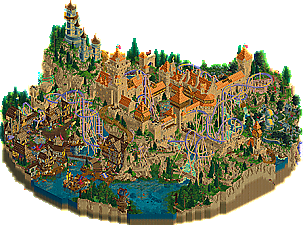
Park / Dambuster Home Video Presents: Buxom the Sunset Sorceress, and the Purple Haze at Castle Death
-
 02-July 24
- Views 9,224
- Downloads 180
- Fans 1
- Comments 34
-
 84.50%(required: 65%)
 Design

Babar Tapie 85% chorkiel 85% Mulpje 85% pants 85% RobDedede 85% RWE 85% Scoop 85% Terry Inferno 85% Turtle 85% Xtreme97 85% G Force 80% ottersalad 80% 84.50% -
 Description
Buxom3_full_1080p_VHSrip.mpeg
-
1 fan
 Fans of this park
-
 Full-Size Map
-
 Download Park
180
-
 Objects
2
-
 Tags
Tags
![park_4120 [H2H8 R4] Ruigrijk](https://www.nedesigns.com/uploads/parks/4120/aerialt3860.png)
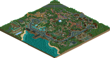
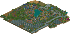
The poll is now closed. The final voting score was:
Quite possibly one of the best nailbiters we've had in a long time, certainly the best of the season so far. This match had several lives as it progressed, but ultimately Loneley Hearts Club come out on top. Big congratulations on two wonderful parks producing such a fantastic match.
congrats LHC!
The uncensored VHS cover:
ok nobody asked, but here's how to do the VHS trick. Honestly, the biggest disappointment for me was that no one really seemed to realize that this trick was a completely new idea, using custom flat rides---I have never seen 'opening theatrics' done before like this. (the gangland openings are ride vehicles, as are the dynamite dunes blocks for example). One person even thought it was a plugin...
The object itself is a twist (eg scrambler ride) where the sprites which are displayed when the ride is stationary are invisible:
(pic 3, 9, 17, 25)
I found which of the frames needed to invisible just by guessing and checking lol. You can replace the animated frames with whatever you want. Confetti, fade from black, fireworks, ...fog...., as long as you don't mind 4 of the frames being invisible.
All you have to do is place the ride, set it to test, then close it and save the park. It will play the animation until its done and then it'll be invisible. The twist animation runs for quite a while so you may have to wait a bit before saving the game.
I placed the ones in this park really quickly by building a stack of them, and then scenery managering that stack around the park. Note that this doesn't look very good in software rendering, but works great in opengl. You can mess with the timing of them to your hearts desire so that they're all in sync, out of sync, whatever.
Here's a zip of the folder so that you could use buggy's ridemaker yourself and just replace the images with whatever you want. Here's a very easy tutorial for buggy's ridemaker. The size and alignment of the images are already worked out correctly.
downloads: 66
If you need any help just dm me
I never figured out how you did it and this is a crazy ass solution. It's awesome how even with plugins in existence, we can still find these wacko yet practical solutions for effects like this. Probably because most of us don't know Javascript but still.
Told myself I would wait until this one was over to review, so here I am. I liked both parks, but in the end I thought VHS had the better overall package. I don't have much to say that people didn't already, but I'll drop some key points below.
Murder:
- What a great story that kept me engaged until the end! Loved the scripts, and the ending had me cracking up.
- The mansion was nicely detailed, but also felt a bit dead. Maybe why you guys had so many raking peeps, but I think I would have added some isolated staff members walking around as well. The interiors were impressive, but a lot of the stuff was way out-of-scale with peeps (like the pool table and shower). I know its hard to do, but imo sometimes you just need to build smaller with less detail and hope people get the general idea.
- I thought the best part of the map was the village. Had a nice vibe going, tons of detail to explore.
VHS:
- I personally liked the palette. I said this on Discord, but it, along with the opening, gave me the "sitting too close to a CRT TV" vibes. The dualchrome color on the coaster was great.
- I thought overall this map had a higher level of RCT execution. Things were well done all over the map. I greatly enjoyed the landscaping and how it blended in to the overall picture.
- The whimsy of the 1990s direct-to-VHS movie came through fairly well throughout the map, which was obviously the goal.
In summary, I thought VHS had the better RCT in most areas, while Murder had the better overall narrative and story direction. In the end though, this is an RCT contest, and while narrative helps a park a lot it shouldn't be the primary voting focus imo. Both parks were great additions to the contest!
I absolutely loved Buxom. There were many standout moments, but a couple that deserves special highlighting:
1. The palette is sick. I don’t understand the criticism here, it works perfectly to create a plasticky early-tech atmosphere and I loved the duochrome elements. It really added a lot to the concept and atmosphere for me.
2. The architecture was fantastic throughout. Parsing through the castle and the village areas, there is a real mastery of texture combinations that feel effortless that not many parks have.
3. Purple Haze is one of my favorite coasters so far. Beautifully flowing, unique arrangement of elements especially with the middle corkscrew area (really smart to hide unslightly bits with architecture and landscaping, great integration into the macro), and was very long to boot. The ending swirl around the batwing in the village is a top 3 macro moment for me thusfar.
4. The village is a highlight for me for unique forms that elevates a rather overdone medieval aesthetic. Love the entry arch and batwing combo, and the half diagonals were very smartly integrated to feel natural and not forced.
5. Landscaping as top notch - again, one of the strongest in the contest so far. Love the combination of tols and fisch rocks to create a new aesthetic, especially with the integration of grassy knolls and hilltops to break up the land in a very intentional way. Masterful.
The one area I’d say the park could have taken further is the narrative / concept. The VHS concept is brilliant, but beyond the color palette, there lacked additional content that would be more thematically relevant. While the underground scenes were spot on and really well crafted, those were the only areas that feel true to the concept. The rest of the map is just a beautiful medieval setting. I wish there was a bigger moment beyond just a castle that tied into 70s/80s VHS concept, as a centerpiece rather than a few underground scenes. It felt like you could’ve taken this further.
Conversely, Murder had such a well executed narrative as the centerpiece of the park and is overall a very fun idea, but it was missing the same technical quality I saw in Buxom. The music and atmosphere were well sold and the detailing throughout to create narrative scenes and thematic structures were really well done. I particularly loved the architecture by the piers and the unique boat shapes, and the integration of the fishhook coaster into the surroundings. The larger manor was great on the exterior but the interiors were just a tad out of scale for me. Although there were great details like the place settings on the tables and the pool table, the library (great new objects!), it looked odd with a curved cutout with the railing as that wouldn’t be how it actually function architecturally. I thought the brewery had some great hidden details and scenes, loved the secret fields of grain and the distillery infrastructure! The weakest part for me, however, was the woodie layout. It had some questionable moments and overall didn’t stand out to me as a centerpiece coaster. While there was so much to love with this concept, I personally didn’t vibe as much with a park as a backdrop for narrative instead of the other way around - as I mentioned before, the fundamental parkmaking in Buxom was just one level above in all aspects for me - macro vision, landscaping, architecture, and atmosphere.
Wow, this was tough. Two parks practically equal in quality and execution. My favorite parts about the Dambusters were the mystic colors (the skybox is lovely, too), landscaping, the castle, hidden scenes (seriously, that launch freefall is in such a cool spot), and most notably the coaster. Sure some of its sightlines weren’t perfect, but that invert is one of the strongest I’ve seen. What a whimsical, fantastic park.
What ultimately led me to vote for LHC is how it held my attention for a little bit longer. I think turning your park into a murder mystery is a clever way of keeping the viewer around to explore more, as I found myself really sinking into the map in order to find the magnifying glasses. But even so, it’s a funny, well-written story. Oddly enough, I actually enjoyed the Vekoma junior boomerang more than the woodie. Seeing it use so much elevation within the village and weave between the houses was a lot of fun for me. I also found the map to be slightly less noisy than its competitor, both with visuals and audio. I almost wish the Dambusters played more into the mystical, serene nature of their park.
Still, both parks are easy 85%’s for me. Sure one inched out the other, but I strongly feel there is enough content and high level park making from both teams to warrant further exploration long after H2H ends.
Buxom:
Thanks for providing our team with such an amazing, nail-biting match. I think the match was a testament to the fact that this park probably would have won many of the other “fantasy” matchups.
I want to begin by saying I initially was not a huge fan of the palette, not because it did not look good, but because I felt it washed out some detail on the castle. Likewise, I agree with walto's comment in that, to me, it was a rare instance where the castle seemed less detailed than it really was.
However, in the end I really enjoyed the look of the palette, and I began to appreciate the awesome detail of the castle. I wish the sight line to that glowy pattern on the ground were visible from more than one angle!
Next, the coaster, which was great. I loved its uniform, lavender color. Super fun to watch all around the map, and it was situated in the castle and landscape superbly.
The VHS trick was quite cool but actually bothered by eyes a little the first time I saw it, but I got used to it after multiple viewings. The music choice for this park was also awesome.
Overall, I agree with what many people have said, which is that this park just has excellent fundamentals. If I had to criticize anything, it would be some awkward sight lines toward the center of the castle, and some landscaping on the map edge, which maybe felt a tad rushed.
I also want to mention the small village area, which was also very pleasant to look at. Great work there.
A highly worthy opponent, Dambusters! Be proud of yourselves.
Buxom:
Big fan of this park and I think we'll talk highly of this park for years to come. Loved the palette, loved the music, coaster was awesome, lots of amazing building detailing and shaping, all so believable. All the underground scenes were some of my favourite and it just pushed that crazy theme further and further. I think there's a lot of synergy with the three builders on this park so I hope we can see this partnership again in the future.
The VHS poster is probably one of my favourite things to come out of the contest, just made me laugh a lot.
Great matchup.
Dambuster Home Video Presents: Buxom the Sunset Sorceress, and the Purple Haze at Castle Death


There is so much I can say about Buxom. It seemingly formed out of thin air early on; we had many ideas at the time, but the prevailing notion was that a fantasy park combining Andrew and Cocoa's best qualities would be sure to sweep any opposition. I awkwardly hung around as the idea started to solidify, taking 70s/80s fantasy (e.g. DnD, Frank Frazetta, and the swords & sorcery genre) as core inspirations. I was hooked by the concept, having an affinity for the aesthetic and great memories of a retro Frank Frazetta-themed pizza joint in Austin, TX.
There had been an idea to play with map shapes, which Cocoa originally proposed with a cross-shaped map.
Soon, Andrew had the idea to represent a pentagram inexplicitly through map features, and I played with the geometry until it worked.
Thus, I had just created the first save file of this park, cursing it in the process. I think you can still see the pentagram's influence on the final park, even though we abandoned the idea of making the pentagram shape obvious and visible. With that, Cocoa did some park planning, and we started the arms race for the best possible inverted coaster layout we could muster. It ended up being a combined effort with ideas from both of us and was also tweaked wherever needed to suit the macro.
Andrew insisted on representing the stylized colors of the 70s/80s fantasy art blowing around in the brainstorm, leading to the idea for a sunset palette. We were all pretty much sold as soon as we saw the first palette test runs. This was also constantly tweaked to get it just right. With that, the building began.
This being my first H2H park, I was completely unprepared for the thrill of watching one's teammates put together a park at a rate and skill level far beyond my comprehension. Simply put, I feel extraordinarily blessed to have been a part of this park, if only just for how much I learned from being on it. That being said, I am proud of my contributions. Regardless, I strived to keep pace and give feedback when needed.
It would be pointless to attempt an exact description of who did what, as there was so much iteration going on during building that everyone got their hands dirty in someone else's work at some point. That goes without saying, a lot of nuking occurred.
The environment and landscaping were a masterclass by Andrew, greatly complimented by Cocoa's scenes and setpieces. Every new Andrew screen of castle parts or rockwork was inspirational, and my jaw probably dropped when I saw Cocoa's nearly-finished cult ritual cutaway scene for the first time.
The castle was a major hurdle, and Andrew took to it in no time, with bits and pieces from Cocoa and me as well. We wanted the best castle possible and agreed that Romanian-style castles perfectly represent the vibe were going for. Luxurious and imposing, but still very old, and maybe even haunted.
Anyway, before long, a park started to take shape, and things really started to solidify. We cruised to the submission date and waited for the votes to come in. And then they didn't. Oh well. It was a tough battle, and a thrill to watch our park make a late comeback only to fall back down hours before the voting deadline.

The work I'm most proud of in this park is the stalagmites in the cave, gatehouse, trail, and bridge on the back side of the castle, and coaster supports. My only regret is that I didn't have as much availability as I expected and that this lil bridge didn't make it onto the map.
I am also proud of my musical contribution to this park: Fresh Fur by Castle Rat. Not only a sick song, it was released right around the start of this park and perfectly communicated the vibe we were trying to cultivate. There was a near-constant drip of shared music and media throughout the park's timeline for us to bond over. A great experience for all!
I'm not even really sure how it ended up tying in with Buxom - an obscure pulp fantasy VHS series the three of us serendipitously recalled from each of our childhoods - but its inclusion is undeniable and makes perfect sense. Buxom 4 lyfe! Also, Grimblo won our hearts, but we are heartbroken at the recent news of his late actor. This park is dedicated to him. May he rest in peace.
Murder in McAllan
Congrats LHC, good game and well played; your park is no slouch! The 1/4 Scot in me is happy to see a Scotland park. Indeed, when one thinks of Scotland, the first image is often dark, cloudy, colorless and depressing. However, this park proves the contrary with all of its excitement and vitality incorporated into the overall scene. My favorite section was definitely the village along the water, which incorporated the family shuttle so well and felt very true to life. The large manor is impressive as well as the interior, and while I could repeat the criticisms weighed against the wooden coaster, I will say that it doesn't get in the way too much and allows for the distillery architecture to stand out. In total, the sum of this map's parts are what really make it, allowing the viewer to get lost in each section, looking for details, so the murder mystery is a smart way to enforce that kind of close eye.
Favorites: wee chippy, cathedral ruins, brodie's tavern, waterfront, and distillery setpieces.
Fantastic work on this map Morgan. Knew you'd kill it with the layouts. I'm still such a huge fan of the aesthetic you three went for, far more than I would have expected. Thank you in particular for making me a Castle Rat fan. So so sick that people are still putting out acid-drenched sludgy doomy Sabbathy Stanley Cup triple-award winning dingleberry zaza goodness like this to this very day. You'd think this song were 50 years old. People say rock and roll is dead but they just don't know where to look. RIP my boy Grimblo, forever in our hearts and memories.
Buxom : This is probably park of the season for me. This just hit so many right buttons. Watching A N D R E W build sections was amazing, just so clearly talented. The landscaping and archy is some of the best stuff I've seen in game. Cocoa's sections were really brilliant so great at creating atmospheric scenes. This park clearly just vibes and doesn't sell me some cornball shit. Peak game design.
Murder : Maybe I don't have enough Scottish pride or whatever but this felt like a grey scaled DKS. I thought the color selection was insanely drab. The coasters schemes didn't really do much or were very contrasting. Not a big fan of coasters on the edge of maps they feel like afterthoughts. The centered fishhook one interesting but a weird ride type. This park does follow a more straight forward meta of audio logs and a more readable narrative for the community.
Reviews!
Buxom:
https://youtu.be/uHVwAci0R7E
Murder:
https://youtu.be/103hElcLm-s
This was a tough one to vote on. Buxom grew on my with every subsequent viewing and I'm still really impressed with the park as a whole. I ultimately went with Murder, however, as I really enjoyed the small village atmosphere and the very engaging exploration and story that came with the murder mystery. That was very well executed.
Buxom: Dark Fantasy Delight
Buxom is a dark fantasy dream, inspired by campy VHS aesthetics and spooky, death-themed art.
The Purple Haze coaster twists through stacks of graves, while the enchantress raises the dead with crystals of power.Vamp AF!
Floaty stuff is everywhere—like Slimer from Ghostbusters slimed this place!
Rockwork is painterly and medieval village details are fun and immersive. Grimblo oozing goo all over sets the mood. Cutaways reveal underground docks. The atmosphere is a perfect mix of spooky vibes, whimsical floatiness, and magical chaos.
  Life is fragile, but this park is unforgettable.
Murder in McAllan: Precision Perfect
Murder in McAllan, an exceptionally precise park. Like a well-calculated murder. No mess left behind. Clear motive. Clear methodology.
  Dump site for the body.
  Additional forensic countermeasures like gorgeous architecture and detailed micro elements that keep you exploring. Forensic distractions from the crime.
  Creative newspaper clippings tell the story.
  Pretty sick coaster with a custom train. Interiors are elite—absolutely above and beyond.
 The coaster’s color choice is amazing.
  Crunchy ruin site. Wow, so many little boats.
  Giant murder poster on the side of a building. Tavern vibes are spot on.
Stag head motifs and great micro pieces. Holy guacamole. Homey, lived-in buildings. Catch me at trout/bevs. Why would Liam do this? Stag heads everywhere.