Park / Nigloland Revisited
-
 29-July 24
- Views 1,336
- Downloads 119
- Fans 0
- Comments 9
-

-
 52.00%(required: 50%)
 Bronze

Babar Tapie 65% G Force 60% SSSammy 60% RWE 55% Terry Inferno 55% Liampie 50% posix 50% Recurious 50% RobDedede 50% Scoop 50% chorkiel 40% Turtle 40% 52.00% -
 Description
A recreation / reinterpretation of the French theme park Nigloland. Made in the first half of 2024.
-
 No fans of this park
-
 Full-Size Map
-
 Download Park
119
-
 Objects
3
-
 Tags
Tags
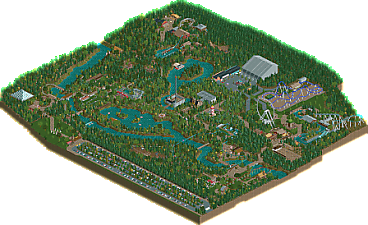
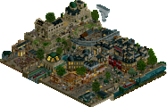
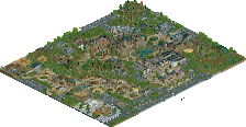
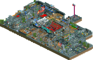
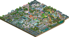
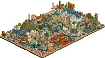
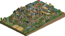
Had to look online to get an idea of the park, but this seems pretty accurate overall. Some nice building facades, foliage is a bit spammy/repeating in some areas but overall pleasant and seems to capture the woodland feel of the park well. It could use more detail overall (Like around the dark ride, one of the highlights for me) but it's got some nice moments.
I've never been to Nigloland but I've seen a lot of coverage of the Gelis brothers. So this is one of the first times I've been able to recognise the attractions, and it's really cool to see them transposed into rct2. It's a very cool park to discover, with a slightly retro style that's pleasant and coherent. I see you've even included their latest water coaster, that's great !!
If you want to improve a bit, I'd advise you to go into a bit more detail and choose more objects, but I have to say it's really great to see a recreation of Nigloland on Rct2, well done!
A really solid park here. Sure, it's not the most detailed thing in the world, but it doesn't have to be. The entrance area and initial path was a highlight for me. It demonstrated some very charming landscaping and atmosphere.
Sweet and charming park. In places just a bit too bare which made it feel undercooked. Your strength lies more in the gentler and tracked rides. Was nice to see as typically people concentrate on big coasters.
I apologise for my extremely slow response to this park, been in touch with you months ago but it's just H2H, work and traveling that took over my life. I did check it out a few times, and I just give it a final proper look before casting my accolade vote.
On the one hand, I think you did a pretty good job here, and completing a map this big is an impressive feat! I have fond memories of Nigloland and I can recognise many things in your map, even small moments like specific pieces of path or elements of a building. At the same time, I think you made a fundamental mistake with the planning here. I feel like the entire map is at least twice as big as it needed to be, and as a result everything is way too spaced out and feels more empty than the real park. Noisette Express is a small coaster, but I could build a B&M in the same space the way you set it up But again, I think you did pay attention to details and I can imagine that people who haven't been to Nigloland won't recognize the accuracy here, simply because of all the extra empty space you ended up with.
Stylistically I think the park is also a bit inconsistent. Some parts have that nice Crousibapt charm, other parts really are too unrefined/rushed looking. And the foliage is too muddy for me. I remember Nigloland being very nicely landscaped, but I don't see much of that here.
All in all: very good recreation with stretch marks. I've thought about doing Nigloland in RCT, but I'm stuck in daydreaming while you actually did it. You deserve credit for that! And I'm glad that it has been rewarded with a bronze accolade
Oh wow, my very first accolade in… what, 15 years?!
To be honest I wasn’t expecting that. Even though my RCT skills improved while building this park, I noticed that the general New Element level went to new heights with OpenRCT2 and all the plugins during the last 5 years or so. So, it’s a nice surprise and I’m really glad you enjoyed this map!
Thank you all for your nice comments. I do agree that it’s not the most detailed map ever (that’s an understatement lol), so I do hope I’ll find time to work on this particular « issue » at some point. I’m quite happy with how my parkmaking evolved during the last few months, but it still has room for improvement of course. :-)
@Liampie: Yeah in retrospect, I also think this map is way too big compared to the real life park. As I previously stated, I’m also quite bad at foliage and I find that making a forest-like / muddy landscaping is easier for now. I’d love to master the art of neat landscaping / foliage « à la disney ». Someday, hopefully.
I’d love to see your take on Nigloland though!
Really love this tbh. Some things could be better detail wise, texture i think would help a lot with some of the facades and such. A bit to spaced out in some spots as well, but I get the feeling you were going for though. Regardless, love everything else about this park, very classic vibes.
i didn't enjoy being the low vote on this, i think finishing a park of this scale should always be celebrated, so congrats! i wasn't familiar with the real life park but there were o really nice spots that made me wonder how it looked in real life - the large indoor coaster especially. good stuff, congrats on the accolade!