Park / The Screameasy
-
 30-June 24
- Views 9,436
- Downloads 306
- Fans 7
- Comments 38
-

-
 93.50%(required: 70%)
 Gold
Gold

RobDedede 100% yes Turtle 100% yes Cocoa 95% no J K 95% no Liampie 95% no wheres_walto 95% yes Xtreme97 95% no G Force 90% no pants 90% yes posix 90% no RWE 90% no Scoop 90% yes 93.50% 41.67% -
 Description
Eighteenth amendment passed: After one year from the ratification of this article, the manufacture, sale, or operation of rides and associated machinery for amusement within, the importation thereof into, or the exportation thereof from the United States and all its territories is hereby prohibited.
-
7 fans
 Fans of this park
-
 Full-Size Map
-
 Download Park
306
-
 Objects
1
-
 Tags
Tags


Base X:
I like the setting, and the landscaping is nice and dramtic with the height, with some nice ice effects. Wing coaster is a great choice for the theme and the layout has some nice interaction and the new vehicles are great.
There are rough edges though, the intro sequence was hard to follow with the tons of windows popping up, and I couldn't really tell what all the plugin was doing, other than making my game drop frames.
The Screameasy:
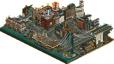
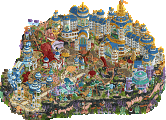
Absolutely stunning. The theme and concept is already fun and cool, and the execution is amazing. Architecture with top tier fine trim work, an incredible density of content with scenes and murals everywhere you look that really bring this to life.
Some of the cut-outs were a bit hard for me to read (A problem I have with a lot of those in any park), other than that I have nothing to complain about. But that cut-out revealinng the wooden coaster and the multi-layer indoor park is so good, it feels like something out of a dream.
Base X
The idea behind this park is pretty cool. A figher jet fight was a cool way to open this map but since it kinda moved over the whole map instead of just one area, it was kinda hard to follow. The landscaping is for me the best part of this map. Not only is it refreshing to see landscaping built up by something else than Fish Rocks (sorry Fish!), I also do think those Tolsimir land rocks work really well with the ice and snow.
The big land arch is also great, though kinda a missed opportunity to have not more interaction with it. The choice for a wing coaster is a fitting one, but not really a fan of the lay-out which is a bit too spreaded out and after the last zero-g it kinda meanders back to its end I feel. Music was a great addition here.
The base itself is done pretty nice. Overall I do feel this park misses something. I think with more time there could be done more to make this map a bit more interesting. Nonetheless a good park but a bit shortcoming for H2HX I believe.
Screameasy Park
Fuck it guys... I'll have to retire now...
Absolutely stunning park. It for sure can be named one of the best H2H parks ever made. The story behind is so cool and pretty clever. I really have no idea where to start naming stuff I like because there is so much there!
The closed down Riverland with the protesting peeps, all the signs, the posters, the custom peeps scenes, the music and sounds,... Architecture is phenomenal! Like those boat docks are incredible, just as all the building facades. So detailed and so clean still. The included rides are also topnotch, with an incredible wave swinger cover, very cool wipper snapper and old woodie. That whole part of Midtown Express is easily my favorite part of this park.
The amount of details in this park is staggering, you can open this park multiple times and still discover new stuff. Yeah, can't give anything else other than pure praise for this park. It comes so close to perfection. I feel bad for the Canes, but this park would've swept any park in this contest. It raises the bar up quite some notches.
I'm not so pro-accolades for H2H parks but if any H2H park comes close to deserving a spoltight win... it's this one.
Base X
Does this park contain the best set of new CTRs ever? The stealth wing coaster will definitely be re-used in parks going forward and the snow vehicles and fighter jets are so cool. Being limited to 1 tile does hurt the jets a little, but the runway scene is epic, love it.
I wasn't a fan of the intro sequence. It feels like the park is very demanding of the viewer's attention with the crash alerts popping up, but I wasn't totally sure what I was looking at throughout.
The plugin caused significant slowdown for me, and on my own, I couldn't easily spot the effects. Personally, I preferred viewing the park without which is what I did. (Specifically I created a post-crash save and deleted the plugin, so both things that only affected my first view of the park)
The landscaping was a mixed bag. I really don't like those rocks if I'm honest, although I do like how the snow sits on them and I love the floating ice CTR. That's really cool.
The splashes of navy/teal in the architecture I really liked. I think here the park just needed more time. The building at the back is really nice, good detailed structure but inside the glass it having zero inside it just broke the atmosphere for me, totally. I'm sure you guys ran out of time, but having Elon in there doing stupid experiments like fitting pilots with brain chips would have been really cool.
I really liked the coaster layout. Good pacing, landscaping interaction, just a lot of fun to imagine riding it.
Overall, for me, the park had some great moments, and is one of the best ideas I've seen this h2h. I just think you guys needed more time to test it, and get some more content/polish on the map.
Screameasy
When I see everyone fawning over a map, my instinct is to try my level best not to jump on the bandwagon. I just really struggle not to here though. The audio is lovely. Sets the scene and story for the park perfectly, and then goes into music which perfectly sets the atmosphere.
The architecture to me is the same level or a tiny little notch below Wrigley Field. That is to say, it's damn near perfect. Some lovely half diagonal buildings which look put together as though the challenges of building at this angle just don't exist for these Jazzcats.
The highlight of the map for me is the signs. Getting those letter CTRs on half diagonals looks so great. The bitmap images of the dude and the peanut are just absolutely priceless. The map oozes atmosphere, the subway station and drains below the ground are both real NYC "moments" for me.
The hidden parks for me are really good, but not quite up to the quality of the city, if I'm picking nits. I'd imagine that parks that were trying to hide from authorities would be a bit more grimey than this, a bit more dangerous (since no regulations to follow) and just a bit less polished. I guess I'm trying to say they're too good? And that being the only real criticism I can find kinda sums up how I feel about this.
It's the best park of h2hx so far. I don't think many people will have it below #1 in the contest so far. Every other park has some pretty unavoidable draw back to point to, some compromise it made. This one is such high quality and with only the tiniest little niggedly flaws, if any.
Incredible work Jazzcats, this is the park I dreamed of being able to view when I saw your roster. Truly incredible. Right up there with the best H2H parks of all times, Lenox, DAW, Siege, Stardust, Le Reve. And it stacks up really well with those too. Just love the concept, so simple yet so clever and prefect in execution. I don't really have much to say in terms of a conventional review, whenever we get a park of this quality and there isn't anything to criticize I find it hard not to get selfish wishing for things to be slightly different. Maybe some more conventional coasters, or something like that, but yeah, not really the point of the park anyway. Just man, that opening scene on "times square" is simply incredible, haven't felt that way about an RCT park in a long time. Fantastic work guys.
Hurricanes... well clearly this wasn't your best effort, I do like the concept for what is there, just very undercooked. Hopefully at some point in the future we can see a more fleshed out version of this. I guess it's good you didn't put out your best against the Jazzcats here as I don't know if it would be beatable in any matchup.
Base X:
I like the stylised look of this: the ‘flat’ snow colour against the harsh rock is really interesting and I applaud the boldness. It did mean however, that where there were undercooked spots they stood out quite a bit - for instance where the bright snow met the very dark water you could have done with some softer transitions. The concept doesn’t particularly resonate with me for some reason and I assume that there’s some kind of mini game component that I’m missing out on. It’s possible that I’m too lazy as a park viewer but it’s equally possible that the park asks too much and is a bit of a laborious experience. Either way, it didn’t stop me appreciating what was there at face value. Really tough luck on the matchup here.
The Screameasy:
There isn’t much to add to what’s already been said - it's truly a landmark release. The concept is crystal clear, is beautifully executed, packed with fun details and feels quintessentially H2H in the best possible way. Fantastic work Jazzcats.
Glad to see this get a great score, as you can tell from the review and also my vote, it's up there with anything i've ever seen in RCT. perhaps opens up a discussion on what a spotlight should be, as i'm sure everyone has different opinions. for me, i don't think there should necessarily be a minimum tile-limit for spotlights... i was just thinking, if someone asked me to show them the best ever RCT, what would i show them. this is right at the top of the list for me.
The poll is now closed. The final voting score was:
One of the most brutally one sided matches concludes at the hand of what would become the highest rated H2H park to date. Jazzcats, there aren't many hearts left your park could win.
Congrats guys, can't wait to tune in to Sammy's playback and hear how this park came to be.
Props to Saxman and Bubbsy and Brightside and Spacek, all of them are incredible builders that all played their part in an amazing vision. With that said, between this and Micro Madness I think we can safely call Leon the best player in the world. Almost no one comes this close to such a perfect balance of superhuman detail, perfect composition, wonderfully swoopy and flowy layouts, clever and addictive concepts that get taken a mile, and those little supporting details that just wrap it up perfectly. I can maybe think of enough players on one hand tops. Apologies to AVC but I definitely have a new RCT hero alongside you now.
Great write-up saxman, it's really great to see you come back to the game like this. You've still got it
great work everyone. it truly sucks to go up against the park of the contest. the worst part about this contest is that things that people have grafted hard completing have to lose and that can feel like wasted time. you have a lot to be proud of hurricanes, don't let comparison rob you of that.
Killer park Jazzcats... probably wise we didn't build anything very good, would have got crushed either way.
Here is a quick dot map of what everyone did. I think the idea was actually pretty decent, just the time crunch and a late start to the park didn't allow us to realize it's full potential. Either way, we had fun building it and edged out a Design accolade.
Probably one of the best things from this map was the CTRs the Kenos has provided the community for future use: Snow transporter, snowcat, snowmobiles, missiles etc.
One little note about the intent of the park... we were nervous that the community wouldn't appreciate a map about a military base, that it might be glorifying war. We wanted to steer clear of that idea at all costs, so we went with the "Elon Musk Military Tourism" angle.
As for the opening scene, our apologies if you didn't like all the explosions haha, we looked into having a plugin block those pop up boxes but Levis couldn't figure it out. Maybe there is a way, I have no clue about that stuff. In the end we still went with the scene so it would showcase the cool new CTRs, and create the atmosphere of what this tourist location could provide for it's customers. If there weren't any explosions the opening scene would have been kinda meaningless. We expected some would figure out to hold "backspace" and others would complain... and voila, that's exactly what happened.
In hindsight this is so obviously saxman there's a big bridge executed very well. Really impressed by the infrastructure on the cutaway columns.
The interiors almost felt like dreamscapes placed into the buildings which was very cool.
Base X : highway to the danger zone
Base X: There were some really fun moments here in this park. I personally didn't mind all the explosions, it brought me back to Battlefield days of RCT and was a nice hit of nostalgia! I do wish that the choreography of the planes were a little easier to follow though. In terms of the park itself, some really cool details with all the icy pathing and vehicles, and some nice scenes scattered throughout the park did keep me exploring a little bit. I think the coaster was OK - but could have used more shape instead of sprawling out so wide across the map. I did enjoy the wingcoaster head chopper cutout, which was a nice centerpiece moment. The large land bridge was a good idea but a little clunkily executed, which I think goes for most of the architecture in the park - the idea is there, but they were both a little underdetailed and a little too massive in some instances. I think the nice texturing of the snow and paths clashed with how clean the buildings were. Still, there were nice areas like the diagonal runway and some of the smaller round base buildings which looked very on theme. The biggest standout for me was the ice floes and how they bobbed / moved, a nice touch that really sold the concept and setting well.
What more is there to say on Screameasy?? An easy spotlight in my eyes and the best park of the contest. Huge congratulations.
Reviews for both:
BaseX:
https://youtu.be/MHgmJuEeUCU
Screameasy:
https://youtu.be/nQYwDXvc5WE
Screameasy: The Whimsical Wonderland
This park is raw penetration of imagination! Drats! I hate Leon and his goons
  , but I can't help loving the clever concept of Screameasy. Indoor rides as whimsical expansions of classic riverside park vibes
  . The idea of an "inside" park, with an exterior that feels recreational but hides a coaster and elaborate interior resembling an ice cream utopia is mind-blowing!
  The storytelling is phenomenal
  —a true sign of the times with cigarette ads shoved in your face, but heaven forbid you just want to take a spin on the Big Dipper.
  Secret entrances, mouse cars for custom flats, Gatsby-style bridges, and signage points that deserve a standing ovation
  ! The fonts steal the show! Watching Blind Tiger knit all the rides together scratches so many itches
  . Meow Wolf-style underground tunnels are an absolute dream!
Base X: Mechanical Mayhem

it:
Base X is a winter wonderland of destruction and mayhem!
 Giant turrets, moving pistons, and artillery
  turn this park into a mechanical marvel.
The custom wing rider slicing through the keyhole is the epitome of slick , and the giant rock arches bring beast mode to a whole new level. The bold choice of white snow flooding everywhere is like a big milk jug explosion. Moving targets with ships gunning them down add a layer of interactive chaos.
it: Ice tracks, floating ice, and mechanical door movements create a kinetic landscape of fun! : The destruction aspect—so good!
